
In our increasingly data-driven world of constantly evolving consumer expectations, businesses must make the most of the data they track and produce to stay relevant in any market. This involves understanding data, identifying trends, and making data-driven decisions. However, today’s sheer volume of data sets makes it nearly impossible to achieve all this using tabular data. This is where data visualization plays a key role. It helps users and stakeholders view large data sets in a visually compelling manner using different data charts, such as column charts and bubble charts. There are different types of data visualization. This article discusses the most important ones and their best practices.
But before we dive into the various ways to effectively represent data using data charts, let’s define data visualization.
Table of Contents
What Is Data Visualization?
Data visualization is the practice of representing large data sets in a visually compelling manner. Such that it is easier for users to identify trends and infer actionable insights.
Using easy-to-understand tools — charts, graphs, and maps — data visualization is a great way to display data to less technical audiences.
Why Is Data Visualization Important?
The human brain is quickly drawn to pictures, colors, and patterns. In fact, you can say we are visual creatures. Data visualization is raw data’s visual art form that easily engages users’ attention. When we see charts, graphs, or maps, we easily spot patterns and outliers. If you’ve ever tried to identify trends using spreadsheets, you’ll appreciate the importance of data visualization.
While there are different types of data visualization, they’re all equally important if used properly. Below are the most important types of data visualization charts.
What Are The Different Types Of Data Visualization Charts?
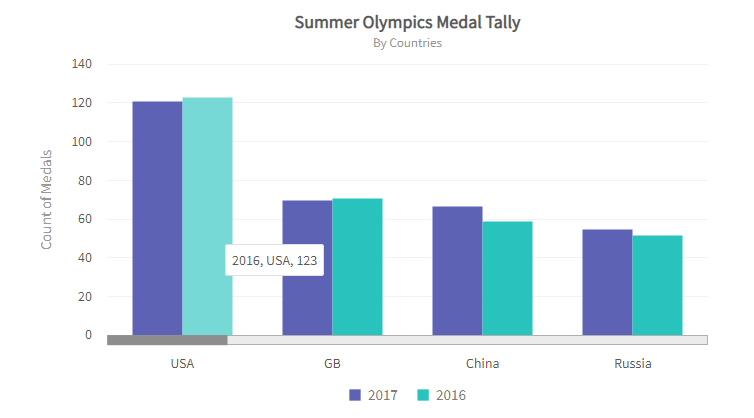
Column Chart
Column charts use vertical columns to represent the relationships between data categories. While a column chart will display the data you feed in, ensure that the number of columns is not too large. Otherwise, you defeat the purpose of data visualization.
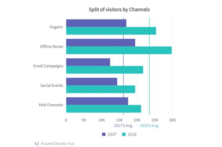
Bar Chart
Like column charts, bar charts represent data values using rectangular bars. However, a bar chart plots the variable value on the x-axis and the fixed value on the y-axis.
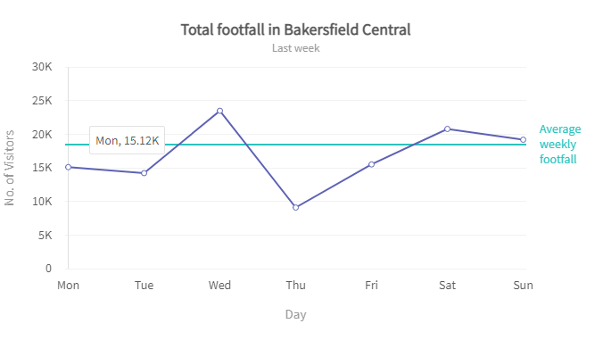
Line Chart
A line chart represents the change of data over short and long time intervals. It involves plotting several points along the plane and connecting each point using a straight line.
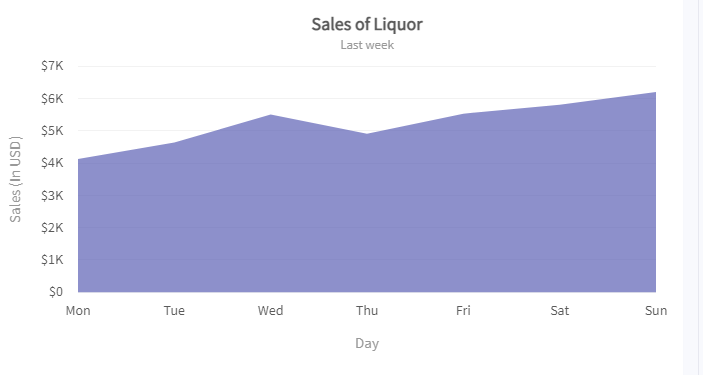
Area Chart
The area chart stems from the line chart. Only in this case, the real value is inferred from the area between the axis and the lines or between lines. Each area is marked using colors and hatchings. It is typically used to compare more than one quantity.
Read: Dual Line Chart vs. Area Chart
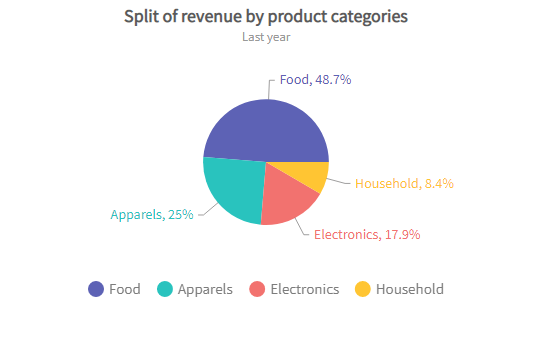
Pie Chart
The pie chart is a circular representation of the proportions of different classifications. The arc length of each pie chart section is proportional to the data value it represents.
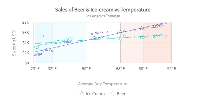
Scatter Plot
In a scatter plot, variables are represented by points on a rectangular coordinate system. A point’s location on the plot is proportional to its value. Also, the distribution of the data points tells the story of the correlation between variables.
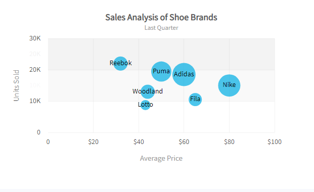
Bubble Chart
The bubble chart is a variant of the scatter plot used to compare three variables. It’s fair to say that the line chart is to the area chart what the scatter plot is to the bubble chart. While the location of the points is a function of the x and y-axis, the area of each bubble represents the third variable.
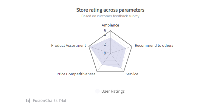
Radar Chart
The radar chart is used to compare data values over multiple variables. For example, comparing wines over features like texture and sweetness. The radar chart plots each variable with its own axis and joins all axes in the center of the figure.
Frame Diagram
The frame diagram is used to display the hierarchical relationship between data categories. It is in the form of a tree structure.
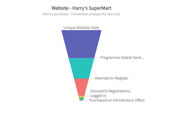
Funnel Chart
The funnel chart is a data visualization chart used to represent linear processes forming connected stages. For example, a sales funnel. Each stage visually represents the size of each module.
What Are The Benefits Of Data Visualization?
There are three key benefits to visually representing data, they include:
Making Big Data Digestible
We live in a world where businesses and consumers produce truckloads of data by the second. While data can never be too much for businesses looking to innovate continuously, large data sets can be difficult to digest. However, data visualization makes it easier to analyze and digest large data sets.
Big data and data visualization technologies allow for automated data mapping — which is core to AIOps. Thereby making it easy to gather and effectively utilize large data volumes.
Greater Accessibility
Accessibility is key to an inclusive world, and data visualization is at the forefront. Data visualization tools provide an easy way to communicate complex and robust data points. Thereby facilitating data accessibility by presenting data in multiple formats that accurately tell the story the data represents. This makes data understandable for everyone by ensuring users do not miss important information.
Greater Efficiency & Understanding
Traditional means of sorting data have always been strenuous and time-consuming. But, for a long time, it was the only way. Fortunately, data visualization provides a faster and more efficient approach to gathering and analyzing data. Data visualization tools, including charts, graphs, and maps, make it easy for stakeholders to quickly identify trends, patterns, and outliers. This, in turn, speeds up decision-making and implementation processes.
What Are Data Visualization Best Practices?
Note that the basic objective of data visualization is to make data more engaging, useful, and understandable to a wide range of audiences. Every best practice is ultimately to arrive at these goals.
Choose the Optimal Chart and Graph
While all data visualization charts and graphs can make it easier to understand data, there are chart types for different data types and purposes. Therefore, to ensure you choose the right chart for your data sets, start by defining your visualization objectives. Then map your objectives to the chart type that best satisfies your goal. For example, a line chart may be optimal if you intend to track data over time.
Use Templates
While reinventing the wheel can seem like a fun challenge, some things are best left unchanged. You don’t have to create visualizations from scratch; there are numerous data chart templates you can leverage for your projects. Don’t skew too much from the line. Templates are great starting points; you can explore them with different customizations. A sample template you can leverage is the React chart framework.
Leverage Color
As stated earlier, the human brain is drawn to colors. Therefore, colors can make data more engaging and easily understood when used correctly. For example, you should use different colors to display the bars or columns representing different variables in a bar or column chart. You can see colors for React charts here.
Don’t Distort Data
Don’t go overboard with your designs. Keep it simple. While excessive designs might look or feel compelling, they could inadvertently skew the values inferred. Pie charts, for instance, should always be 2D. Although 3D pie charts may appear more intriguing and perhaps attract more attention, the outcome makes it more difficult to understand each proportion of the chart. Any good graph, including pie charts, shouldn’t be difficult to understand.
Final Thoughts
Data visualization makes it easy for stakeholders to identify trends, patterns, and outliers, and also make data-driven decisions. Depending on your project needs, there are different types of data visualization charts. However, the chart type you choose should satisfy your goals. That said, building a foundation of analysis and data storytelling is crucial to visualize data effectively.
Are you ready to visualize your data? Download FusionCharts Suite XT and start your free trial.


