
A time-series chart is an excellent tool for evaluating and analyzing sequential data that changes over time. They assist businesses in analyzing and developing relevant insights from data collected over time. Time series models are becoming more useful as more businesses enter the digital space and recognize the importance of tracking internal and external activities.
Staying up to date with your data and extracting meaningful information from it is critical to competing in the digital race, whether you are a small business or a large enterprise. Given this, time-series, data visualization charts are among the most convenient and efficient ways to interpret complex, large-volume, time-dependent data. When done correctly, efficient data analysis using time series charts and a good data visualization tool can provide valuable insights that help your business grow.
In this post, you’ll learn about fusioncharts time series data visualizations and how to make a powerful time-series chart with fusioncharts and javascript.
Getting Started With FusionCharts Time-Series Data Visualization Components
Due to its extensive library of robust and beautiful visualization components, FusionCharts helps developers quickly implement time series chart components that are beautiful, responsive, and interactive. Best of all, they give you the capacity to deal with large volumes of data.
This blog post will look at how you can create and implement amazing time-series visualization charts with FusionCharts. The best part about FusionCharts is that it has complete source code available for developers. You only need to download it, plug it into your projects, and enjoy the results to get started.
How Can I Create a Time-Series Chart With a Large Number of Data Points?
As we mentioned previously, FusionCharts, with its robust library of predefined components, gives you everything you need to create beautiful time series visualizations. Using the powerful JavaScript components that come with the FusionCharts development suite, all you need to do is plug in your data.
With just a few lines of code and FusionCharts specific functions, you can create time-series charts in no time.
Assuming that you have already installed the FusionCharts development suite using NPM, you can use the following piece of code to import the dependencies needed to render the time series chart.
var FusionCharts = require('fusioncharts');
var TimeSeries = require('fusioncharts/fusioncharts.timeseries');
var $ = require('jquery');
var jQueryFusionCharts = require('jquery-fusioncharts');
After importing these dependencies, you need to initiate time-series and jQuery components to resolve their dependencies for the core FusionCharts library. You can do this as follows:
TimeSeries(FusionCharts);
jQueryFusionCharts(FusionCharts);
To keep it simple for the sake of this article, we will use the sample data stored on FusionCharts’ AWS servers. Using the following code snippet, you can fetch the time series data and schema. Both of these are the prerequisite entities for the charts display.
var jsonify = res => res.json();
var dataFetch = fetch(
  'https://s3.eu-central-1.amazonaws.com/fusion.store/ft/data/line-chart-with-time-axis-data.json'
).then(jsonify);
var schemaFetch = fetch(
  'https://s3.eu-central-1.amazonaws.com/fusion.store/ft/schema/line-chart-with-time-axis-schema.json'
).then(jsonify);
Once we have the data and its schema locally, we now need to create a FusionCharts data store. Inside the data store, create a FusionCharts data table containing our data and its schema:
Promise.all([dataFetch, schemaFetch]).then(res => {
  const data = res[0];
  const schema = res[1];

  const fusionDataStore = new FusionCharts.DataStore();
  const fusionTable = fusionDataStore.createDataTable(data, schema);
If you have followed the article so far, you have done all the prerequisite steps to display your time-series data. You can use the insertFusionCharts function and provide it with an appropriately configured JSON object. You do this using the following code:
$('document').ready(function() {
    $('#chart-container').insertFusionCharts({
      type: 'timeseries',
      width: '600',
      height: '400',
      dataFormat: 'json',
      dataSource: {
        data: fusionTable,
        caption: {
          text: 'Sales Analysis'
        },
        subcaption: {
          text: 'Grocery'
        },
        yAxis: [
          {
            plot: {
              value: 'Grocery Sales Value',
              type: 'line'
            },
            format: {
              prefix: '$'
            },
            title: 'Sale Value'
          }
        ]
      }
    });
  });
});
Once you execute this script, you will see your data mapped into a detailed and intuitive time series chart.
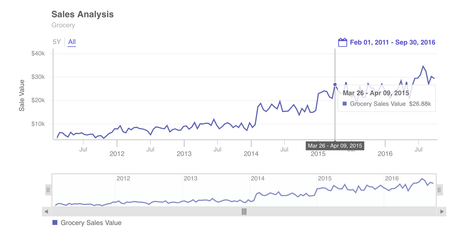
Changing FusionCharts Time-Series Granularity by Zooming in on Axes
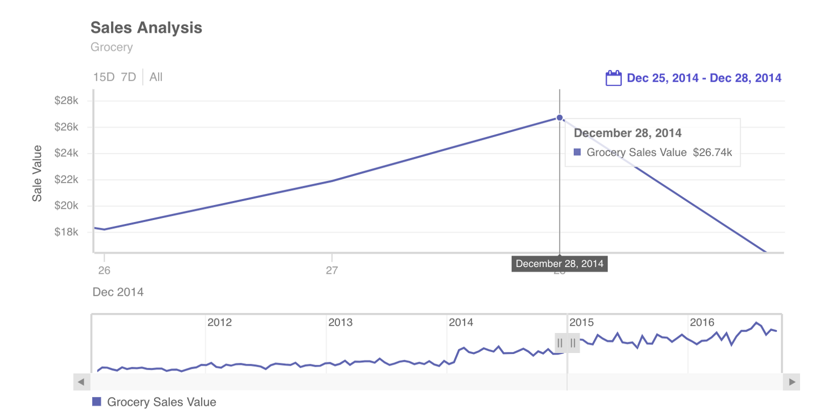
One of the best features of FusionCharts time-series visualizations is that they are interactive. They allow users to switch the scale of the axes. This means you can easily explore the visualization for any time window you want. As an example, the image below is the same as the figure above. The only difference is the scale of the time axis. This time, it is zoomed in a bit.
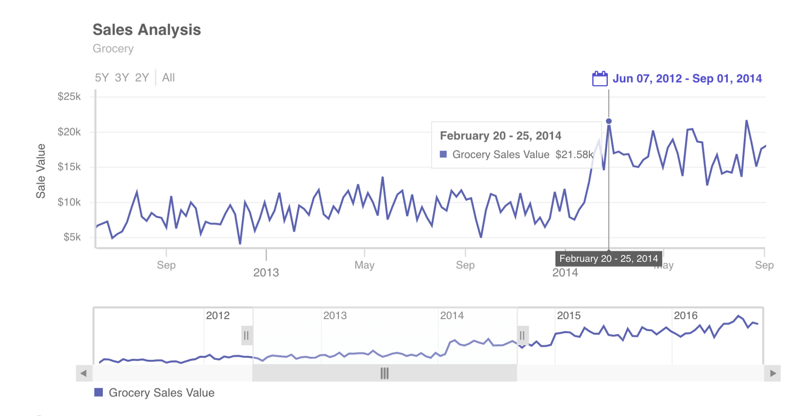
Similarly, we can zoom into the time axis until it displays the most precise, granular information available.
Source Code for FusionCharts and Time Series Demo
As you can see, FusionCharts makes it almost effortless to design time-series charts that display large volumes of data. In addition, FusionCharts supports a wide variety of bindings out of the box. These include Javascript, Angular, React, jQuery, Vue.js, Ember, React Native, AngularJS, Svelte, ASP.NET, PHP, Java, Ruby on Rails, and Django.
Let us know in the comment section how you have used FusionCharts’ components to create high performant time-series charts.
Download FusionCharts and get started today!