“A penny saved is a penny earned,” the wise man said. However, when you have so many things to spend your money on, saving may be the last thing on your mind. Some finance apps, on the other hand, are determined to make saving not only simple but also enjoyable. Money Dashboard is billed as the United Kingdom’s answer to Mint.com (the most popular personal finance management app in the US).
It is an online application that allows you to track, organize, and manage your money. Once authorized, it can connect to all of your bank accounts; provide real-time graphical analysis of your spending; enable you to set and meet spending goals, and set alerts. Money Dashboard, on the other hand, is a read-only application; you cannot conduct any monetary transactions with it. In this three-part series, we’ll look at three of these finance apps.
They are changing the way we think about personal finance management with their interactive dashboard interfaces. Money Dashboard is the first in our series. With the use of Fusionchart’s financial dashboard, you can create beautiful graphs and charts in your personal finance applications.
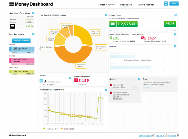
 Header has three main links—Past Activity, Dashboard, Future Planner, and Account Settings and Help. The labels used in the Header are short and precise and use title-style capitalization (the first letter of each word is capitalized), making them easier to read. However, the only indicator of a currently selected tab is a thin blue line as a highlight which is not a very strong visual cue for the user. There is also no visible connection between a selected tab and its respective content area.
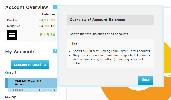
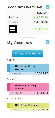 The left column remains constant across the app’s various pages and gives a quick snapshot of your linked accounts. Each section has a help icon, clicking on which an information box opens which shares some simple tips with the user. This feature is an excellent way to educate new users about the app’s functionalities.
 Clicking on Manage Accounts takes you to a new page where you can change the color used to represent that account, change login details of accounts, add new accounts and delete existing ones.
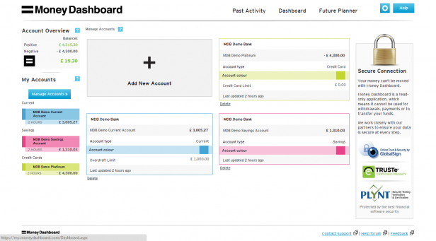 This page also gives you information about when your account details were last updated.
However, they should consider making ‘2 HOURS’ as ‘2 HOURS AGO’ across the app. Sometimes, making things fool-proof helps!

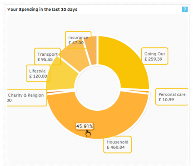 The doughnut chart provides an overview of your spending across categories in the last 30 days. This data contains both the amount and a percentage of total spending (in the tooltip).
You can drill down into details of your spending in each category. Let’s say we click on Household. The first-level drill down shows you another doughnut chart with more information about your household spending.
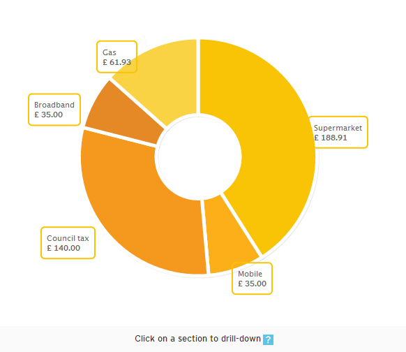 You can drill down into this doughnut chart further. Let’s say we click on Supermarket:
 We get a popup showing the specific details of our Supermarket visits (date, name of superstore, amount spent, etc.).
I like the detail they have gone into in this section. Also, to make users aware of a drill-down feature available for these charts, they have indicated it (Click on a section to drill down) in all the charts. (Related read: How to create an intuitive drill-down interface?)
However, the data labels of the doughnut chart make them look slightly cluttered. By avoiding overlapping of data labels and by connecting each data label to its respective wedge, they could make the doughnut chart look cleaner and less cluttered. (Here’s how we do it!)
 The big, bold numbers in this section draw your attention—the number of days to your payday and your credit card spending for the month. Both are crucial figures, but they generate opposite emotions in you. This feature is displayed in the choice of colors and the icons used in their representation.
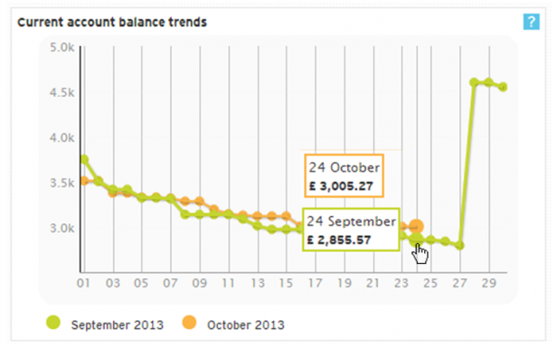 This section compares the current account balances for each day of the ongoing calendar month to the previous month with line charts. It helps you to understand the trend of your account balance. The details for each date can be seen in the tooltips. However, in the caption, the chart should mention the comparison to the previous month (e.g., the current account balance trends compared to the last month).
This will set the context for the users even before they go into the particulars of the chart. (Related read: 5 tips for writing great chart captions)
Clicking on this chart takes you to the Past Activity > Balance History page.
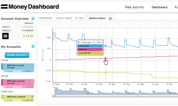 This chart helps in spotting trends in your balance history over a longer period of time. The checkboxes in the My Accounts section (left column) help you to select the accounts you want to analyze.
 At the bottom is a scrollable “mini-graph.” Using its sidebars and the bottom scrollbars, you can select the start date and length of the period of your analysis.
 The Clear Cash section shows the amount of cash available in your Current Account(s) before payday, considering your budgeted outgoings and incomings. Simply put, it gives you an idea of the money available at your disposal and helps you to know if you can still afford that exotic beach vacation with your spouse. The Adjust button takes you to the Future Planner > Budget Tracker section.
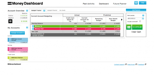 A process of gradual reveal follows on this page. At first, you get to see only broad figures of Money In and Money Out.
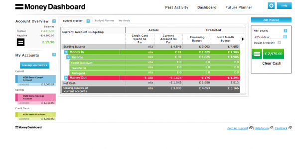 As you click on the arrows, you see more data. This reveal reduces the cognitive load on the user. More data is revealed only when the user shows interest (through a click).
 This section shows the actual and predicted income and expenses of the month. The big, bold numbers and the upward and downward moving graph icons indicate what each value represents. The predicted values are shown in black using a smaller font size. Proper prioritization of data is crucial in dashboard design, and here it is achieved quite well.
 This section allows you to set goals and uses a progress bar to indicate where you stand in terms of buying that SUV.
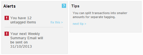 Though Alerts occupy an essential position in most personal finance dashboard layouts (e.g., Mint, where it comes at the top), in Money Dashboard, it occupies the position of least importance (bottom right). Due to its position and background color (grey), it somehow gets lost in the whole scheme.
Help tips are there throughout the app and are very useful for new users getting used to the app and old users trying to explore some new features.

Table of Contents
What is a Money Dashboard?
Money Dashboard is a comprehensive personal finance management tool designed to empower users with greater control over their finances. It aggregates financial information from multiple bank accounts, credit cards, and other financial institutions into one convenient platform. Users can track spending, set budgets, and monitor their financial health effortlessly through intuitive visualization tools and insightful analytics. This personal finance dashboard also provides personalized recommendations to help users make informed decisions and attain their goals. With its user-friendly interface and robust features, Money Dashboard simplifies money management, promotes financial literacy, and helps users build a secure financial future.Features of Money Dashboard
Transaction History
Money Dashboard offers a comprehensive transaction history feature, allowing users to view detailed records of their financial transactions. From purchases and payments to income deposits, users can track and monitor their financial activity in real time, providing valuable insights into their spending habits and cash flow.Budgeting
With Money Dashboard as your personal financial dashboard, users can customize budgets tailored to their financial goals and preferences. The platform provides intuitive tools for setting budget limits across various expense categories, enabling users to manage their finances more efficiently and avoid overspending.Payment Gateway
Money Dashboard integrates with popular payment gateways, facilitating seamless transactions and enabling users to pay bills, transfer funds, and purchase directly from the platform. This convenient feature streamlines the payment process, saving users time and effort while ensuring secure transactions.Multi-Currency
Money Dashboard supports multi-currency functionality, allowing users to manage finances across different currencies effortlessly. Whether conducting international transactions or tracking expenses from overseas accounts, users can view and manage all their financial data in their preferred currency, enhancing convenience and flexibility.Spend Tracker
Moneydashboard’s spend tracker tool gives consumers instantaneous insights into their spending habits and tendencies. By categorizing and analyzing expenses, users can identify areas of overspending or opportunities for savings, empowering them to make enlightened financial decisions and achieve their goals.Expense Groups
Money Dashboard enables users to organize their expenses into customizable groups or categories, providing a clear overview of their financial commitments. Whether it’s housing expenses, utilities, or entertainment, users can categorize and track their expenses efficiently, gaining better control over their finances.Spending Limit
This personal financial dashboard allows users to set spending limits or targets for specific expense categories, helping them stay within budget and avoid unnecessary expenses. By establishing spending limits, users can prioritize their financial goals, curb overspending, and work towards achieving more excellent financial stability and security.How does the Money Dashboard work?
Money Dashboard offers a comprehensive personal finance dashboard to streamline your financial management, ensuring clarity and control over your finances. Here’s how it works:Sign Up On The Dashboard
- Visit the Money Dashboard website and sign up for an account.
- Provide the necessary details to create your profile, ensuring the security of your personal information.
Log In
- After signing up, log in to your Money Dashboard account using your credentials.
- Access your personal finance dashboard, which is tailored to your needs and preferences.
Add Your Online Accounts
Money Dashboard facilitates the consolidation of all your financial accounts in one place for easy monitoring. This process involves two stages:Stage A: Select Your Provider
- Money Dashboard provides a comprehensive list of options for choosing your bank, building society, or credit card provider.
- From Abbey National to Yorkshire Building Society, all major providers are supported.
Stage B: Enter Your Online Account Details
- Enter your online account credentials for the selected provider.
- Money Dashboard ensures the security of your information by masking passwords during entry.
- Once entered, your banking usernames and passwords are securely stored and replaced with strongly encrypted keys for future sessions.
Pros of Money Dashboard
Consolidated Finances: Streamline Your Financial Overview
No more toggling between various banking apps or websites. Ideal for users with multiple building society accounts, Money Dashboard brings all your finances together in one convenient location.Smart Budgeting: Gain Insightful Financial Analysis
Gain access to Money Dashboard for detailed budget and spending analysis, helping you identify opportunities to save and optimize your financial resources efficiently.Robust Security
Utilize the platform to analyze your budget and spending, identifying opportunities for efficient savings and optimizing financial resources.Goal Setting Made Easy
Use the personal finance dashboard to establish and track your financial goals, maintain motivation, and stay on course with clear, measurable milestones.Extensive Provider Support
Money Dashboard supports 59 providers, including central high-street banks, enabling seamless account integration for a holistic financial overview.Cons of Money Dashboard
No Personalized Insights
They offer a convenient budgeting tool that projects future spending based on past expenses, providing users with an estimate of their available funds for the upcoming months. However, personalized advice on cost-saving opportunities is not provided, and the graphical interface is primarily available on the web application rather than the mobile app.No Payments to Other People or Rewards
Money Dashboard allows transfers between accounts but lacks bill payments, purchases, or splitting payments, making it less suitable for users prioritizing these features.No Calendar View
A calendar view for tracking bills over time is absent, though it is being considered for future updates. The lack of this feature may lead some users to seek alternatives that better meet their preferences.Elements of Money Dashboard
Header
 Header has three main links—Past Activity, Dashboard, Future Planner, and Account Settings and Help. The labels used in the Header are short and precise and use title-style capitalization (the first letter of each word is capitalized), making them easier to read. However, the only indicator of a currently selected tab is a thin blue line as a highlight which is not a very strong visual cue for the user. There is also no visible connection between a selected tab and its respective content area.
Left Column
 The left column remains constant across the app’s various pages and gives a quick snapshot of your linked accounts. Each section has a help icon, clicking on which an information box opens which shares some simple tips with the user. This feature is an excellent way to educate new users about the app’s functionalities.
 Clicking on Manage Accounts takes you to a new page where you can change the color used to represent that account, change login details of accounts, add new accounts and delete existing ones.
 This page also gives you information about when your account details were last updated.
However, they should consider making ‘2 HOURS’ as ‘2 HOURS AGO’ across the app. Sometimes, making things fool-proof helps!

Your Spending Section
 The doughnut chart provides an overview of your spending across categories in the last 30 days. This data contains both the amount and a percentage of total spending (in the tooltip).
You can drill down into details of your spending in each category. Let’s say we click on Household. The first-level drill down shows you another doughnut chart with more information about your household spending.
 You can drill down into this doughnut chart further. Let’s say we click on Supermarket:
 We get a popup showing the specific details of our Supermarket visits (date, name of superstore, amount spent, etc.).
I like the detail they have gone into in this section. Also, to make users aware of a drill-down feature available for these charts, they have indicated it (Click on a section to drill down) in all the charts. (Related read: How to create an intuitive drill-down interface?)
However, the data labels of the doughnut chart make them look slightly cluttered. By avoiding overlapping of data labels and by connecting each data label to its respective wedge, they could make the doughnut chart look cleaner and less cluttered. (Here’s how we do it!)
The Payday and Credit Card Spending
 The big, bold numbers in this section draw your attention—the number of days to your payday and your credit card spending for the month. Both are crucial figures, but they generate opposite emotions in you. This feature is displayed in the choice of colors and the icons used in their representation.
Current Account Balance Trends Section
 This section compares the current account balances for each day of the ongoing calendar month to the previous month with line charts. It helps you to understand the trend of your account balance. The details for each date can be seen in the tooltips. However, in the caption, the chart should mention the comparison to the previous month (e.g., the current account balance trends compared to the last month).
This will set the context for the users even before they go into the particulars of the chart. (Related read: 5 tips for writing great chart captions)
Clicking on this chart takes you to the Past Activity > Balance History page.
 This chart helps in spotting trends in your balance history over a longer period of time. The checkboxes in the My Accounts section (left column) help you to select the accounts you want to analyze.
 At the bottom is a scrollable “mini-graph.” Using its sidebars and the bottom scrollbars, you can select the start date and length of the period of your analysis.
Clear Cash
 The Clear Cash section shows the amount of cash available in your Current Account(s) before payday, considering your budgeted outgoings and incomings. Simply put, it gives you an idea of the money available at your disposal and helps you to know if you can still afford that exotic beach vacation with your spouse. The Adjust button takes you to the Future Planner > Budget Tracker section.
Money In/Out
 This section shows the actual and predicted income and expenses of the month. The big, bold numbers and the upward and downward moving graph icons indicate what each value represents. The predicted values are shown in black using a smaller font size. Proper prioritization of data is crucial in dashboard design, and here it is achieved quite well.
My Goals
 This section allows you to set goals and uses a progress bar to indicate where you stand in terms of buying that SUV.
Alerts and Tips
 Though Alerts occupy an essential position in most personal finance dashboard layouts (e.g., Mint, where it comes at the top), in Money Dashboard, it occupies the position of least importance (bottom right). Due to its position and background color (grey), it somehow gets lost in the whole scheme.
Help tips are there throughout the app and are very useful for new users getting used to the app and old users trying to explore some new features.
Best Money Dashboard Alternatives
PocketGuard
PocketGuard is a user-friendly budgeting app designed to streamline spending tracking, bill management, and goal achievement. Users gain an overall view of their financial standing by spontaneously categorizing expenses and bill tracking features. Notably, PocketGuard distinctive “In My Pocket” feature calculates disposable income after accounting for bills and savings, fostering more informed and prudent spending habits.EveryDollar
EveryDollar, crafted by renowned financial expert Dave Ramsey, stands as a premier budgeting tool meticulously engineered to aid users in crafting and adhering to a monthly budget. Built upon the zero-based budgeting principle, this personal finance dashboard assigns a purpose to every dollar, leaving no room for financial ambiguity. Through its intuitive interface and robust goal-tracking features, EveryDollar emboldens users to assert control over their finances and strive towards attaining financial independence.MoneyCoach
MoneyCoach emerges as a versatile financial management application dedicated to helping users accomplish their financial objectives via personalized insights and guidance. The app boasts comprehensive features, including expense tracking, budgeting tools, investment monitoring, and access to financial education resources. Leveraging AI-powered insights and customizable financial plans, MoneyCoach caters to individuals across all financial spectrums, accommodating beginners and seasoned investors. Whether users seek to track their expenses, establish budgets, or delve into investment ventures, MoneyCoach offers tailored support, ensuring each user’s journey toward financial success is optimized and informed.NerdWallet
NerdWallet has solidified its reputation as a reliable financial comparison website, offering users personalized recommendations across various financial instruments such as credit cards, loans, and insurance. In addition to its recommendation services, this personal financial dashboard provides a broad range of educational opportunities, including articles, calculators, and expert advice, empowering users to make informed financial decisions tailored to their needs. With its user-friendly interface and commitment to unbiased recommendations, NerdWallet is an invaluable resource for individuals seeking to maximize their financial potential and achieve savings.Final Thoughts
Overall, the Money Dashboard does an excellent job in helping users manage their personal finance by giving them a quick snapshot view of their income, expense, budget, etc., and providing them a platform for further analysis. The use of interactive charts makes the app furthermore engaging. However, they do need to improve on certain fronts. Their export feature is limited and currently allows the export of transaction details only. Their recently introduced weekly Financial Summary Email, which provides users with a snapshot of their finances over the previous seven days, somehow tries to make up for it. They need to make their design more responsive for their on-the-move users (It seems they are already working on it.) We recommend:- Some minor design changes in the Header (like a more robust visual cue for a selected tab and linking it to its respective content area)
- Also, adjustments to the overall information flow (like Alerts, should be placed at a more critical position) are needed. You can easily count this app amongst the best money management apps.




Ariel
July 6, 2015, 7:55 pmI’m surprised that CashControl wasn’t mentioned. It did miracles for my personal finances!