
A challenging problem in machine learning and data science is that of regression analysis. Regression analysis is about finding a suitable model to estimate the relationship between two or more variables. The final model predicts a variable, also called the outcome variable, from the value of one or more predictor variables. Therefore, FusionCharts provides an easy method for adding multi-series charts to your web and mobile apps to aid regression analysis.
For all regression problems, the first step is to visualize the relationship between the outcome variable and the predictors. Automated tools for creating plots, live charts, and maps are of paramount importance to the machine learning and data science community. FusionCharts has provided an extensive library of 100+ 2000+ maps to create stunning and powerful interactive visualizations.
Read on to find out how you can create an app to generate the multi-series chart of the well-known auto-mpg regression dataset provided by the UCI Machine Learning Repository.
Table of Contents
About the Auto-mpg Dataset
The machine learning community uses the auto-mpg dataset to test the accuracy of a regression model. It contains the information of city-cycle fuel consumption in miles per gallon of different cars and different attributes like cylinders, displacement, horsepower, weight, etc. We’ll use horsepower as the predictor variable for various brands of automobiles and create a multi-series scatter plot with fuel consumption as the dependent variable.
The Multi-Series Chart
The final multi-series scatter plot for the auto-mpg dataset looks as follows:
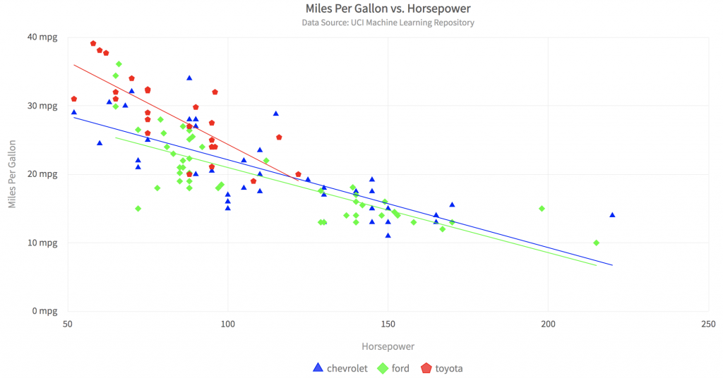
The plot has the following valuable features:
- Individual data points for different brands of cars are shown in different colors.
- The corresponding regression line for each vehicle is generated automatically and shown in the car’s corresponding color.
- Clicking on the legend below turns the plot of a specific car on or off.
- Hovering the mouse on a data point shows its information in detail.
- Everything in the plot, from the axis labels to the title and sub-title, is configurable.
Let’s get started on building this app.
Step 1: Setup the Webpack Project
Let’s create a new directory for the project and name it multiseriesChart. At the console, change the directory to the empty project directory and follow the given steps:
Step 1.1: Install Webpack and FusionCharts
Type the following at the console:
npm i -D webpack-dev-server html-webpack-plugin path webpack-cli fusionchartsStep 1.2: Make src+dist Directories and Create index.js
Enter the three commands at the console:
mkdir src

touch src/index.js

mkdir dist
The entire code for the data conversion and chart rendering will go into the index.js file.
Step 1.3: Create webpack.config.js and Enable CORS
Create an empty file called webpack.config.js in the main project directory and add the following code to it:
// webpack.config.js
const HtmlWebPackPlugin = require( 'html-webpack-plugin' );
const path = require( 'path' );
module.exports = {
   context: __dirname,
   entry: './src/index.js',
   output: {
      path: path.resolve( __dirname, 'dist' ),
      filename: 'main.js',
   },
   plugins: [
      new HtmlWebPackPlugin()
   ],
   devServer: {
       headers: {
           "Access-Control-Allow-Origin": "*",
           "Access-Control-Allow-Methods": "GET, POST, PUT, DELETE, PATCH, OPTIONS",
           "Access-Control-Allow-Headers": "X-Requested-With, content-type, Authorization"
         },
       proxy: {
         '/mlRepo': {
            target: 'https://archive.ics.uci.edu',
            pathRewrite: { '^/mlRepo': '/ml/machine-learning-databases/auto-mpg/auto-mpg.data' },
            changeOrigin: true,
         },
       },
     }
};
Step 2: Import FusionCharts Libraries
Open the file index.js. Import the FusionCharts themes and chart types by adding the following code to it:
// Include the core fusioncharts file from core

import FusionCharts from 'fusioncharts/core';

// Include the chart from the viz folder

// E.g. - import ChartType from fusioncharts/viz/[ChartType]

import Scatter from 'fusioncharts/viz/scatter';

// Include the fusion theme

import FusionTheme from 'fusioncharts/themes/es/fusioncharts.theme.fusion';

Also, add a div tag for the multi-series scatter plot container as follows:

//add the div tag for the chart container

const myDiv = document.createElement('div');

myDiv.id = 'chart-container';

document.body.appendChild( myDiv );
Step 3: Write the Top Level Functions
Add main() and renderPage() functions to index.js file.
async function main() {
    //Get the data
    let response = await fetch('/mlRepo');
    let data = await response.text();
    if (response.ok){
        renderPage(data);
    }
    else {
        alert('Error reading data from ML repository');
    }
}
//renders the html page when passed data as text
function renderPage(text){
    var classes=["chevrolet","ford","toyota"];
    var matrix = textToMatrix(text);
    var dataset = convertMatrixToJson(matrix,classes);
    var dataSource = constructDataSource(dataset);
    renderChart(dataSource);
}
Step 4: Convert the Data to JSON
FusionCharts requires data to be in JSON format for plotting. To convert the data file read from the UCI machine learning repository, we need to do the following:
Step 4.1: Convert the Data to Matrix
Add the following function to index.js:
//convert text to matrix
function textToMatrix(text){
    var matrix = [];
    var rows = text.split("\n");
    for(var i=0;i<rows.length;i++){
        var cols = rows[i].split(/\s+/);
        if (cols.length > 1)
        matrix.push(cols);
    }
    return matrix;
}
Step 4.2: Create the JSON Object for Dataset Key
The matrix created in step 4.1 can be passed to the convertMatrixToJson() function to return a JSON object for the dataset key:
//define the position of X,Y variables in data file
const CLASS_IND = 8;
const X_IND = 3;
const Y_IND = 0;
//returns JSON text for 'dataset' key
function convertMatrixToJson(matrix,classes){
    //JSON for dataset
    var dataset = [];
    var colors = ["#0000ff","#00ff00","#ff0000","ffff00"];
    for (var k=0;k<classes.length;++k)
    {
        var className = classes[k];
        var seriesObj = {seriesname: className,
                          color: colors[k],
                          anchorbgcolor: colors[k],
                          anchorbordercolor: colors[k]
                        };
        var data = [];
        var subset = matrix.filter(r=>r[CLASS_IND].match(className));
        for (var i=0;i<subset.length;++i)
            data.push({x:subset[i][X_IND],y:subset[i][Y_IND]});
        seriesObj.data = data;
        dataset.push(seriesObj);
    }
    return dataset;
}
Step 4.3: Create JSON for Datasource Key
The following function constructs the ‘datasource’ key for JSON. Note that the “showRegressionLine” option is set to 1, to automatically create regression lines for each car.
//constructs JSON text for 'dataSource' key
function constructDataSource(dataset){
    var dataSource = {"chart": {
        "caption": "Miles Per Gallon vs. Horsepower",
        "subcaption": "Data Source: UCI Machine Learning Repository",
        "xAxisName": "Horsepower",
        "YAxisName": "Miles Per Gallon",
        "ynumbersuffix": " mpg",
        "theme": "fusion",
        "showRegressionLine": "1",
        "plotToolText": "<b>$yDataValue</b> done by a <b>$seriesName</b> with horsepower <b>$xDataValue</b>"
    },
    dataset};
    return dataSource;
}
Step 5: Render the Multi-Series Chart
Add the following function to render the final multi-series scatter chart:
// Draw the chart
function renderChart(dataSrc){
    FusionCharts.addDep(Scatter);
    FusionCharts.addDep(FusionTheme);
    //Chart Configurations
    const chartConfig = {
        type: 'scatter',
        renderAt: 'chart-container',
        width: '80%',
        height: '600',
        dataFormat: 'json',
        dataSource: dataSrc
    }
    //Create an Instance with chart options and render the chart
    var chartInstance = new FusionCharts(chartConfig);
    chartInstance.render();
}
Step 6: Running the App
As a final step, you need to call the main() function to render the chart.
Run the webpack server by typing the following at the command line:
npx webpack serve --mode=developmentLoad the app in your browser using localhost:8080.
Can You Create More Data Visualizations Using Javascript?
FusionCharts is a comprehensive library of fantastic plots, maps, and graphs. You can find all kinds of interactive and beautiful visualizations for your next machine learning and data science app. FusionCharts enables you to create the next-level apps for your web and mobile platforms.
Download the complete source code for this app over on GitHub.
Enjoy FusionCharts!


