ReactJS is a popular JavaScript library used for front-end development. According to a StackOverflow survey conducted in 2017, the popularity of ReactJS among developers has increased by 311 percent.
While it can be used for a variety of applications, this tutorial will walk you through the process of creating charts with ReactJS. We will use the FusionCharts JavaScript library and its React-FusionCharts Component to accomplish this. This component enables developers to easily integrate the charting library with ReactJS.
In this post, you’ll learn how to create the chart with the use of a simple and easy-to-follow four-step process:
- Step 1: Prepare the data
- Step 2: Include the React and FusionCharts libraries
- Step 3: Create chart instance
- Step 4: Render the chart instance
Read on to find out how a React Chart can be created using ReactJS with Fusioncharts.
Table of Contents
Step 1: Prepare the Data
The first thing that you need to do is construct data in a format accepted by the libraries. Currently, FusionCharts accepts data in `JSON` and `XML` only. Hence we need to convert the raw data to one of these formats. For this example, we will use `JSON`. We now have to convert each data value into a JSON key-value pair.
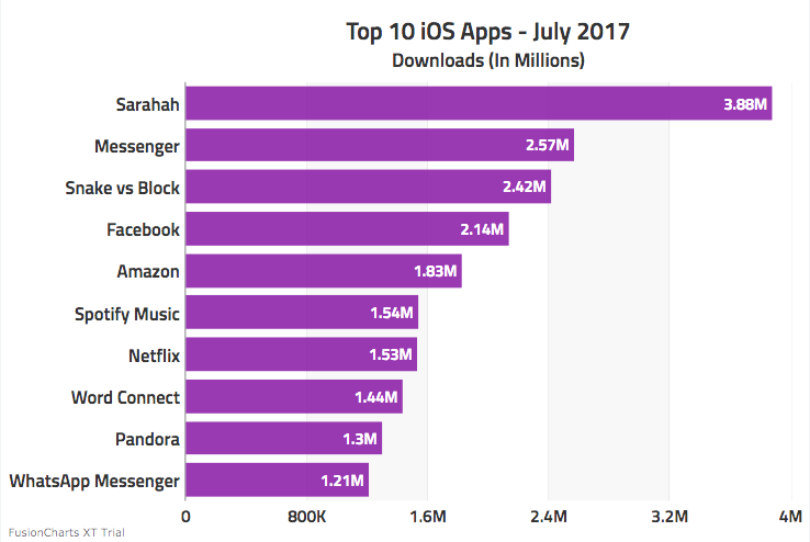
We’ll be using the following data:
| Apps | Downloads |
|---|---|
| Sarahah | 3880000 |
| Messenger | 2570000 |
| Snake vs. Block | 2420000 |
| 2140000 | |
| Amazon | 1830000 |
| Spotify Music | 1540000 |
| Netflix | 1530000 |
| Word Connect | 1440000 |
| Pandora | 1300000 |
| WhatsApp Messenger | 1210000 |
Since the data is comparative, we can effectively visualize it using a bar chart. Based on the requirement of the bar chart, we will convert our source data into `label` and `value` key-value pairs in the JSON format.
After formatting all the data, the JSON representation will look like this:
    {
      "label": "Sarahah",
      "value": "3880000"
    }, {
      "label": "Messenger",
      "value": "2570000"
    }, {
      "label": "Snake vs Block",
      "value": "2420000"
    }, {
      "label": "Facebook",
      "value": "2140000"
    }, {
      "label": "Amazon",
      "value": "1830000"
    }, {
      "label": "Spotify Music",
      "value": "1540000"
    }, {
      "label": "Netflix",
      "value": "1530000"
    }, {
      "label": "Word Connect",
      "value": "1440000"
    }, {
      "label": "Pandora",
      "value": "1300000"
    }, {
      "label": "WhatsApp Messenger",
      "value": "1210000"
    }
Step 2: Include the React and FusionCharts Libraries
To get started, you need to download the React-FusionCharts Component
The installation of the libraries is pretty simple. You need to include the fusioncharts.js and the react-fusioncharts.js script source links in the `head` of your HTML page, as shown in the code snippet below:
<html>
<head>
 <title>Top 10 iOS Apps in July 2017</title>

 <script type="text/javascript" src="https://unpkg.com/react@latest/dist/react.js"></script>
 <script type="text/javascript" src="https://fb.me/JSXTransformer-0.13.3.js"></script>
 <script type="text/javascript" src="https://unpkg.com/[email protected]/dist/react.min.js"></script>
 <script type="text/javascript" src="https://unpkg.com/react-dom@15/dist/react-dom.min.js"></script>
 <script type="text/javascript" src="https://unpkg.com/fusioncharts/fusioncharts.js"></script>
 <script type="text/javascript" src="https://unpkg.com/fusioncharts/fusioncharts.charts.js"></script>
 <script type="text/javascript" src="https://unpkg.com/[email protected]/themes/fusioncharts.theme.ocean.js"></script>
 <script type="text/javascript" src="https://unpkg.com/react-fusioncharts/dist/react-fusioncharts.js"></script>

</head>
</html>
To avoid misrepresentation, you must add the react-fusioncharts.js file after adding all other scripts.
Or, you can install the React-FusionCharts Component using NPM. However, the installation and rendering process would differ for this method.
For NPM, you will have to first render install the ReactJS and FusionCharts packages. Next, you’ll have to load the FusionCharts and Charts modules using the `require` command. You can read more on installing via npm.
Power up: You can do the entire setup by running just one command:
`npm install react react-dom fusioncharts react-fusioncharts –save`.
Step 3: Create a Chart Instance
With the dependencies in place, we will create an instance for our chart. The chart instance will consist of two essential parts – the ‘chart configuration’ and the `render()` method.
JavaScript/JSX:
  var myDataSource = {
    chart: {
      caption: "Top 10 iOS Apps - July 2017",
      subCaption: "Downloads (In Millions)",
      "canvasBgAlpha": "0",
      "bgColor": "#ffffff",
      "bgAlpha": "70",
      "baseFont": "Roboto",
      "baseFontSize": "14",
      "showAlternateVGridColor": "1",
      "alternateVGridAlpha": "5",
      "labelFontSize": "15",
      "captionFontSize": "20",
      "subCaptionFontSize": "16",
      "toolTipColor": "#000000",
      "toolTipBgColor": "#ffffff",
      "toolTipAlpha": "90",
      "captionFontBold": "0",
      "subCaptionFontBold": "0",
      "paletteColors": "#8E24AA",
      "valueFontSize": "13",
      "valueFontBold": "0",
      "animation": "0",
      "divLineAlpha": "15",
      "divLineDashed": "0",
      "plotFillAlpha": "90",
      theme: "ocean"
    },
    "data": [{
      "label": "Sarahah",
      "value": "3880000"
    }, {
      "label": "Messenger",
      "value": "2570000"
    }, {
      "label": "Snake vs Block",
      "value": "2420000"
    }, {
      "label": "Facebook",
      "value": "2140000"
    }, {
      "label": "Amazon",
      "value": "1830000"
    }, {
      "label": "Spotify Music",
      "value": "1540000"
    }, {
      "label": "Netflix",
      "value": "1530000"
    }, {
      "label": "Word Connect",
      "value": "1440000"
    }, {
      "label": "Pandora",
      "value": "1300000"
    }, {
      "label": "WhatsApp Messenger",
      "value": "1210000"
    }]
  };

  var barChartConfigs = {
    id: "bar-chart",
    renderAt: "chart-container",
    type: "bar2d",
    width: "100%",
    height: 400,
    dataFormat: "json",
    dataSource: myDataSource
  };

  var MyApp = React.createClass({
    render: function() {
      return (
      <div id="chart-container"></div>
      );
    }
  });
The chart `id` and the `renderAt` objects in the Chart Configuration define the chart and the rendering element, respectively.
`type`: attribute defines the JS chart alias to render. The bar chart is just one of the many chart types supported by the FusionCharts Suite. For the complete list of chart types supported by FusionCharts, you can refer to the list of charts.
The `width` and `height` define the size of the chart canvas.
Since we are using the JSON data, the `dataFormat` is set to JSON.
Configuring Chart Cosmetics Using Chart Attributes
To add to the visual appeal of the chart, we can configure chart attributes, some of which can are below:
Canvas:
bgColor – Select the background color of the chart.
showAlternateVGridColor – Creates alternating vertical grid bands by setting it to `1`.
paletteColors – Assigns colors to be used in the chart elements.
Animation – Selects chart animations on loading the chart.
divLineDashed – Makes the divisional lines dashed by setting it to `1`.
plotFillAlpha – Sets the transparency of the data objects in the chart.
Fonts:
baseFont – Selects any standard/non-standard font family for the text used in the chart
baseFontSize – Sets the font size of the values and text in the chart
valueFontSize – Sets the font size of the values
Tooltips:
toolTipColor – Changes the color of the text in the tooltip
toolTipBgColor – Changes the color of the tooltip background
toolTipAlpha – Sets the transparency of the tooltip background
These are only some of the attributes that help you customize the appearance of your chart. You can read the documentation on chart attributes for the complete list of cosmetic and functional attributes supported.
Step 4: Render the Chart Instance
To render the chart, add an HTML container element in the body of your HTML page, as shown in the code snippet below:
HTML:
<div id="top"><div>JavaScript/JSX:
 React.render( < MyApp / > ,
 document.getElementById("top")
 );
To summarize, in this example, we have created a React class that will render the chart element when returned.
To render the chart, we have called the `render()` method that will call the class we have created.
If you have been following along, your output should look similar to the image shown below:
However, if you’re unable to see any output, you can refer to this JSFiddle sample.
If you are still unable to get your chart running, we are just a ping away!


Mark Weson
August 28, 2017, 3:28 pmVery interesting. This is easier than using native react Js charting tools. I have one question: is it possible to use this tool with a combination of react js and node js?
Gagan Sikri
August 29, 2017, 1:53 pmHey Mark,
It is possible to use FusionCharts with ReactJS and NodeJS. It would help if you could share with us your specific requirement, so that we can suggest solutions.
hire reactjs developers
November 4, 2017, 9:14 pmGreat post! Thanks for sharing very powerful post, It’s very helpful. Keep it up.