
Microsoft Excel is a popular software tool used to organize and analyze numeric data sets. It is essentially a spreadsheet consisting of numerous cells ordered in columns and rows. It comes with a variety of tools and features, allowing you to use it for different purposes. For example, you can sort your data, apply different mathematical formulas and functions to your data, or insert a pivot table. But did you know Excel is also a great data visualization tool? This means you can use Excel to create different charts and graphs, such as an Excel pie chart, bar chart, or pivot chart, to visualize your data. If you’re looking to learn how to make a pie chart in Excel, this article is the right place.
However, if you want to create a React pie chart for your React web app, you can use an efficient JavaScript data visualization library like FusionCharts.
Table of Contents
What Is A Pie Chart?

A pie chart, also known as a circle chart, is a graph consisting of a circle divided into different pieces or slices. In a pie chart, each slice represents a data category, and the size of the slice demonstrates the proportion of the whole the category signifies. The purpose of a pie chart is to depict how a total amount is divided between various categories. These charts are helpful when you want to visualize data to show the percentage values of a whole.
The order of the slices is crucial in a pie chart, as it helps viewers understand the information. A best practice is to arrange the pieces of a pie chart from largest to smallest. However, when variables have a specific order, you should follow that.
How To Make A Pie Chart In Excel?
Here is how to quickly and easily make a pie chart in Excel:
Step 1: Adding Data
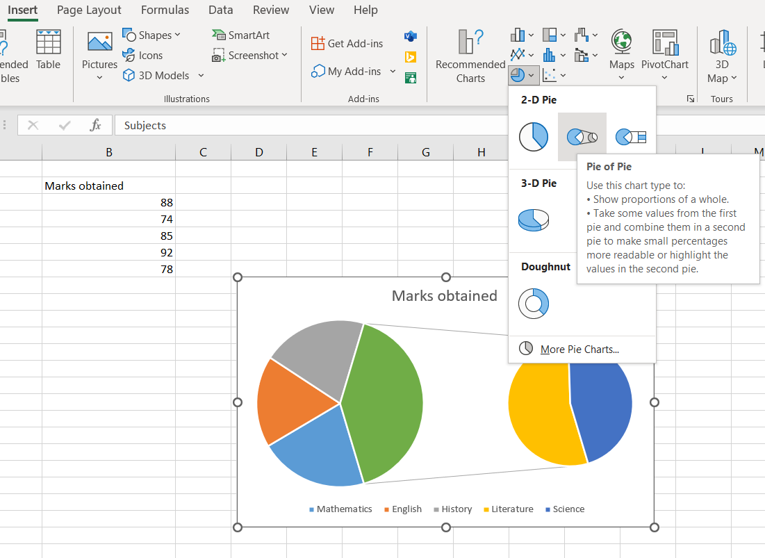
Open Excel and add the data you want to visualize as a pie chart. The Excel pie chart we’re creating consists of data about marks obtained by a student in different subjects. It’s best to label each category while entering the numeric data values, as it will help us display labels on our chart.
Also, keep in mind that a pie chart can use only one data series, and it can’t display zero or negative values correctly.

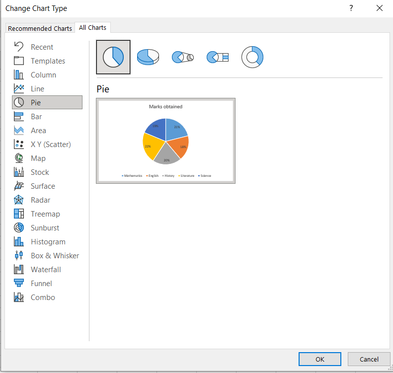
Step 2: Creating Excel Pie Chart
Highlight the data you entered in the first step. Then click the insert tab in the toolbar and select ‘insert pie or doughnut chart’. You’ll find several options to create a pie chart in Excel, such as a 2D pie chart, a 3D chart, and more.
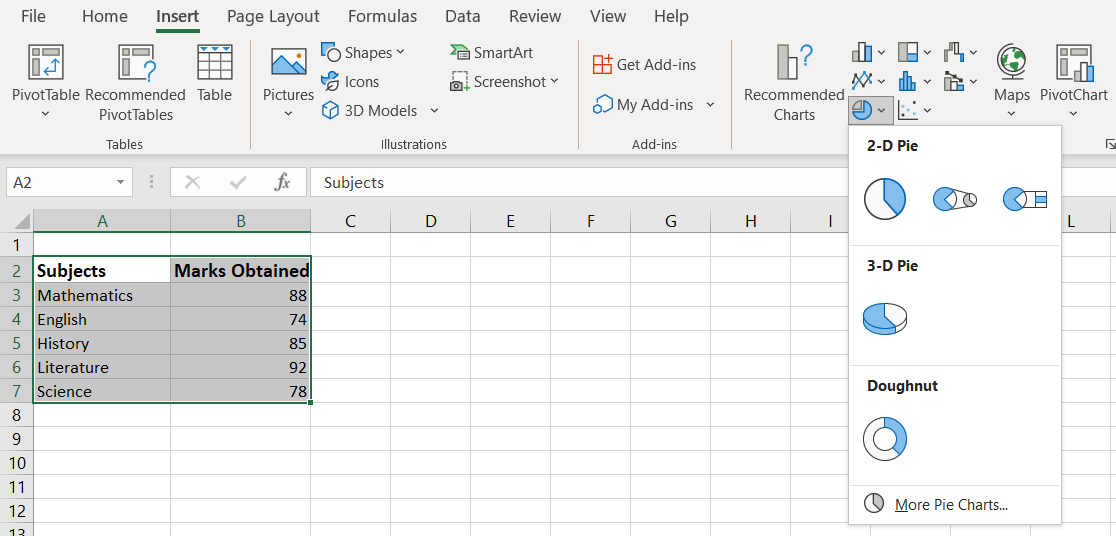
Now, select your desired pie chart, and it’ll be displayed on your spreadsheet.

Are you looking to create a pie chart in PHP and MySQL? Check out this article.
Step 3: Adding Data Labels
An essential step in learning how to make a pie chart in Excel is adding data labels. Adding data labels to pie charts or other visualizations makes them easy to understand and interpret. When you create Excel pie charts, a legend is included by default. If you’ve entered and selected the category names while making the pie chart, they’ll also appear on the visualization.
If you want to display numeric values, right-click on the pie chart, then select ‘add data labels’ option.
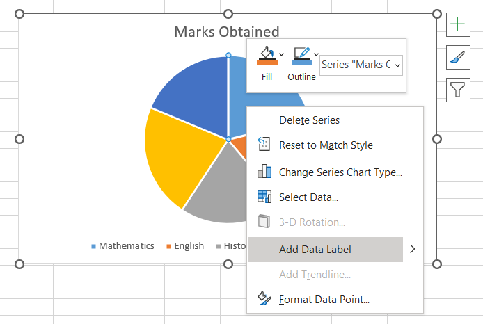

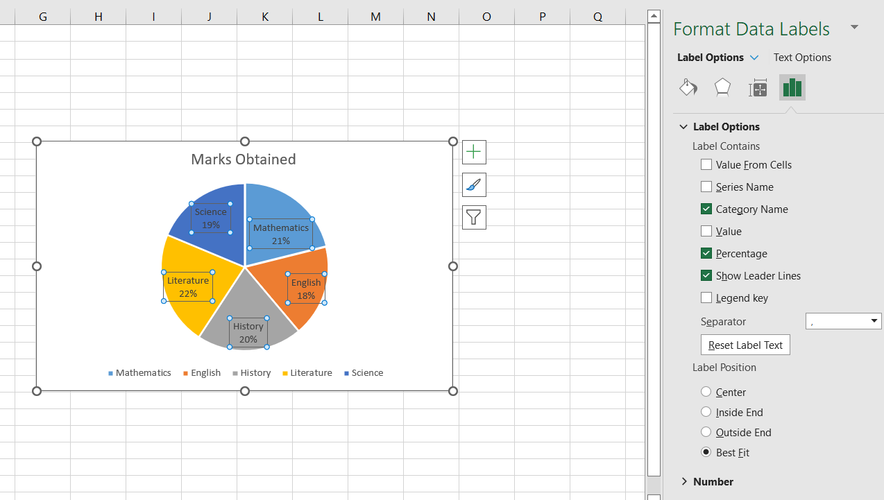
To format data labels, right-click on the pie chart, then click format data labels. You can select your desired options in the format data labels pane, such as percentage value, category name, etc. You also have the option to format data series. You can also change the font size and font color.
Step 4: Formatting a Pie Chart In Excel
Excel also offers several options to customize and format pie charts. For instance, you can change the appearance of the chart, such as changing the chart background color. To do so, right-click the pie chart and choose your desired formatting options. It also offers several chart styles.
Step 5: Moving The Pie Chart
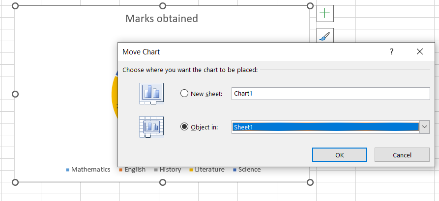
To move your Excel pie charts, right-click the pie chart you want to move, then select the ‘move chart’ option. You can now choose to move your pie chart to a new worksheet.
Step 6: Changing The Chart Type
If you want to create another type of chart or visualization for your data, such as a doughnut chart or a bar chart, you can change the chart type. To do so, right-click the pie chart, then select ‘change chart type’.
How To Create Different Pie Chart Types In Excel?
When you make a pie chart in Excel, you can choose one of the following subtypes:
2D Pie Chart
A 2D pie chart is a simple two-dimensional plain pie chart like the one we’ve created above.
3D Pie Chart
A 3D pie chart adds depth to a simple pie chart and makes it more appealing. You can make a three-dimensional pie chart in Excel, just like we’ve created a 2D pie chart.

Pie Of Pie or Bar Of Pie
Creating a Bar Of Pie or Pie Of Pie chart in Excel is super quick and easy. Once you’ve added and highlighted the data, go to the Insert tab and select the Pie Of Pie or Bar Of Pie option.
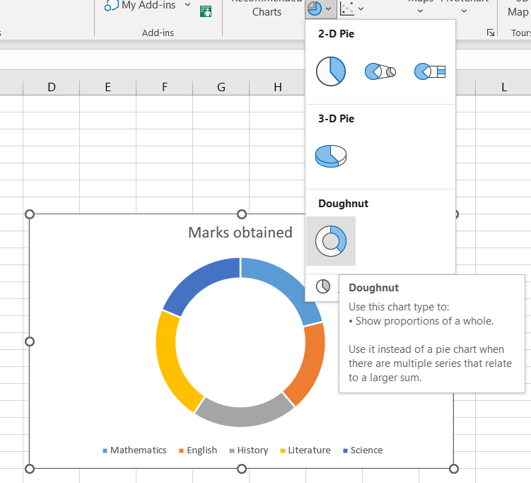
Doughnut Chart
Doughnut charts are like pie charts, but they consist of a blank space at the center for displaying key information related to the data. You can create a doughnut chart in Excel just like you create a pie chart – you simply need to choose the ‘doughnut chart’ option.
How Can You Edit A Pie Chart In Excel?
Now that you’ve learned how to make a pie chart in Excel, you should know how to edit and customize your pie charts.
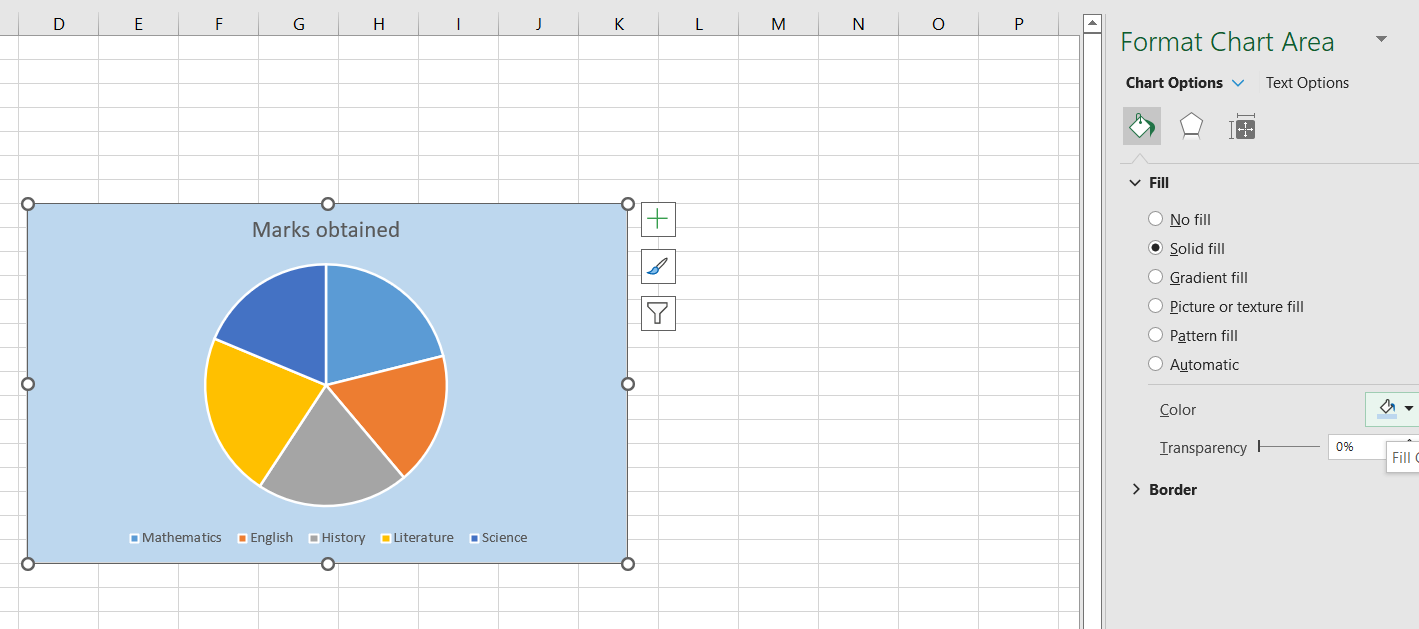
Changing Background Color
Below is how you can change the background color of your visualizations:
- Select the ‘Format Chart Area’ option.
- Click the paint buck icon, then click on the ‘Fill’ drop-down menu and choose your desired background color.
Editing Pie Chart Text
If you want to rewrite anything on your chart, simply click on the text within the chart and add more text. You can also move the text to a new area within the chart.
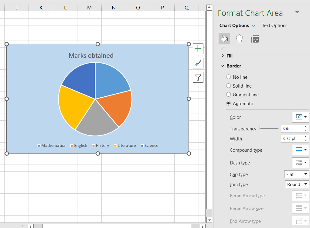
Editing Borders Of A Pie Chart
You’ll find the option to edit the border of your pie chart within the Format Chart Area pane. You can set the border transparency, width, color, and more.
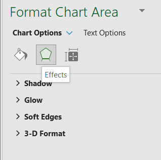
Adding Different Effects
You can also change the pie chart box itself, such as the box’s shadow, soft edges, and glow. To do so, click on the pentagon shape in the Format Chart Area pane.
Changing Colors Of A Pie Chart
You can change the colors of your pie chart by selecting the ‘Chart Design’ tab in Excel’s toolbar and clicking the paint palette.
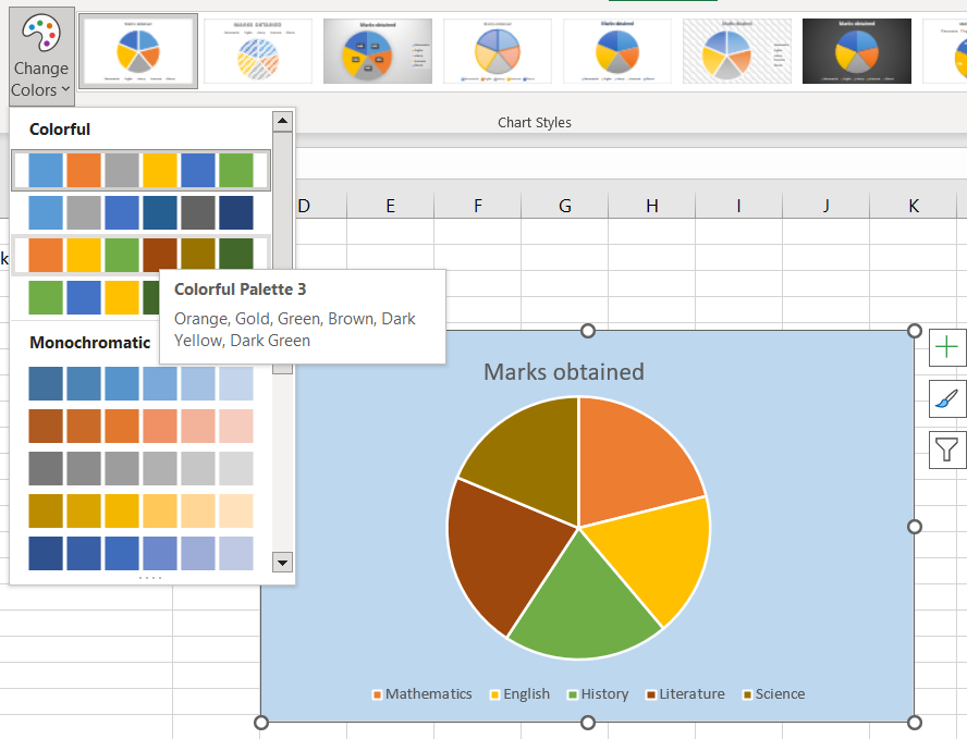
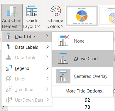
Chart Title
To customize the chart title, click on the ‘Add Chart Element’ option in the Excel toolbar, then click ‘Chart Title’ and choose your desired option.
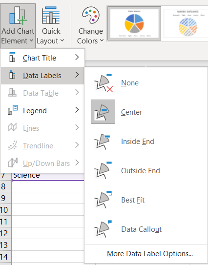
Changing The Position Of Data Labels
To change the location of data labels, click on the ‘Add Chart Element’ option in the Excel toolbar, then click ‘Data Label’ and choose your desired option.
How Can You Explode A Slice Of Your Pie Chart In Excel?
When you want to draw attention to a specific slice of the pie chart, you can pull it away from the rest of the chart. To do so, double-click on the piece you would like to pull away, then drag it to your desired position.

Ready to start building amazing charts that can be used on the web?
A pie chart is a chart or graph that you can use to show the percentage values of a whole. Microsoft Excel allows you to create different types of pie charts quickly and easily. This article explains how to make a pie chart in Excel quickly and easily.
If you’re looking to create a JavaScript pie chart or depth chart, you can use a JavaScript charting library like FusionCharts.
For more information, check out the FusionCharts library.