
Data visualization is one of the most important phases of any machine learning workflow. It helps a data scientist gain an understanding of the data and discover hidden trends that may not be obvious otherwise. Automated tools for plotting, charting, and creating maps of data are now of fundamental importance in exploratory data analysis. FusionCharts provides a comprehensive library for creating beautiful charts and stunning visualizations that can be easily integrated into your app.
When it comes to multi-dimensional data, it is hard for even the most skilled and experienced data scientist to comprehend it. Bubble charts, being an extension of scatter plots, provide an effective and powerful means of visualizing 3D data. FusionChart’s library and data visualization tool includes APIs for integrating bubble charts quickly and easily into your mobile or desktop app.
Read on to find out how you can build an app to display spectacular bubble charts of the well known
Challenger USA Space Shuttle O-Ring Data Set hosted by the UCI Machine Learning Repository.
Table of Contents
Bubble Chart of Challenger USA Space Shuttle O-Ring Data Set
The explosion of the US Space Shuttle Challenger in 1986, inspired the creation of the O-Ring dataset and made it public. The dataset is a collection of 23 data points with 5 columns or features representing data related to space flights. The ultimate machine learning task is to be able to predict whether there is a chance of flight failure based on the available data parameters.
Below is a FusionCharts bubble plot of three columns/features of this dataset.
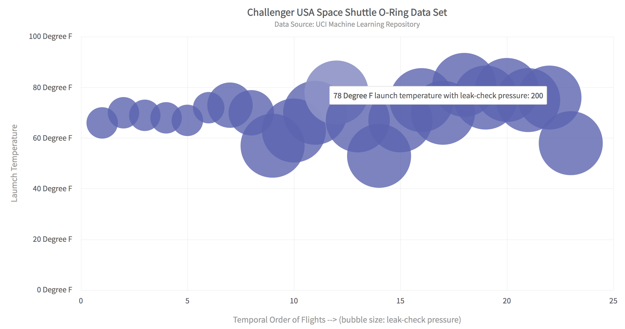
The FusionCharts bubble plot shows the following:
- The temporal order of flights is shown along the X-axis and the launch temperature along the Y-axis.
- The size of each bubble indicates the leak check pressure, hence making it possible to visualize 3D data.
- Hovering over a point shows details of that data point.
- All chart features including the hover text, x and y-axis labels, color schemes, title, etc. are configurable.
What Are the Steps Required to Create a Bubble Chart of the Challenger USA Space Shuttle O-Ring Data Set?
Here are four easy steps to quickly create an app to display a FusionCharts bubble chart:
Step 1: Set Up The Project With Webpack and FusionCharts
Create a project directory called bubbleChart. At the console, switch to this directory and type the following:
npm i -D webpack-dev-server html-webpack-plugin path webpack-cli fusionchartsNext, make two directories named src and dist in the main project directory. In the src folder create the index.js file. You can do this by typing the following at the command line:
mkdir src
touch src/index.js
mkdir dist
Step 2: Setup the Project Configuration
Create a file called webpack.config.js in the main project directory and add the following code to it:
// webpack.config.js
const HtmlWebPackPlugin = require( 'html-webpack-plugin' );
const path = require( 'path' );
module.exports = {
   context: __dirname,
   entry: './src/index.js',
   output: {
      path: path.resolve( __dirname, 'dist' ),
      filename: 'main.js',
   },
   plugins: [
      new HtmlWebPackPlugin()
   ],
   devServer: {
       headers: {
           "Access-Control-Allow-Origin": "*",
           "Access-Control-Allow-Methods": "GET, POST, PUT, DELETE, PATCH, OPTIONS",
           "Access-Control-Allow-Headers": "X-Requested-With, content-type, Authorization"
         },
       proxy: {
         '/mlRepo': {
            target: 'https://archive.ics.uci.edu',
            pathRewrite: { '^/mlRepo': 'https://archive.ics.uci.edu/ml/machine-learning-databases/space-shuttle/o-ring-erosion-only.data' },
            changeOrigin: true,
         },
       },
     }
};
This code allows downloading data from the UCI machine learning repository without getting the CORS error.
Step 3: Add the Imports Section in index.js
Open the index.js file and add the following imports at the start of the file. Also, add the div tag for rendering a chart on the HTML page.
// Include the core fusioncharts file from core
import FusionCharts from 'fusioncharts/core';

// Include the chart from viz folder
// E.g. - import ChartType from fusioncharts/viz/[ChartType]
import Bubble from 'fusioncharts/viz/bubble';

// Include the fusion theme
import FusionTheme from 'fusioncharts/themes/es/fusioncharts.theme.fusion';

//add the div tag for the chart container
const myDiv = document.createElement('div');
myDiv.id = 'chart-container';
document.body.appendChild(myDiv);
Step 4: Import the Data and Display the Chart
As a last step add the following code at the end of the index.js file. The following code reads the data from the UCI machine learning repository, converts it to JSON format, and creates the bubble chart. Note that the data key in JSON contains the x, y, and z keys. Their values specify the data along the X-axis, the value along the Y-axis, and the size of each bubble, respectively.
//define the position of X,Y variables in data file
const Z_IND = 3;
const X_IND = 4;
const Y_IND = 2;

async function main() {
    //Get the data
    let response = await fetch('/mlRepo');
    let data = await response.text();
    if (response.ok){
        renderPage(data);
    }
    else {
        alert('Error reading data from ML repository');
    }
}

//renders the html page when passed data as text
function renderPage(text){
    var matrix = textToMatrix(text);
    var dataset = convertMatrixToJson(matrix);
    var dataSource = constructDataSource(dataset);
    renderChart(dataSource);
}

//convert text to matrix
function textToMatrix(text){
    var matrix = [];
    var rows = text.split("\n");
    for(var i=0;i<rows.length;i++){
        var cols = rows[i].split(/\s+/);
        if (cols.length > 1)
        matrix.push(cols);
    }
    return matrix;
}

//returns JSON text for 'dataset' key
function convertMatrixToJson(matrix){
    //JSON for dataset
    var dataset = [];
    var data = [];
    for (var i=0;i<matrix.length;++i)
    {
        data.push({x:matrix[i][X_IND],y:matrix[i][Y_IND],z:matrix[i][Z_IND]});

    }
    dataset.push({data: data});
    return dataset;
}

//constructs JSON text for 'dataSource' key
function constructDataSource(dataset){
      var dataSource = {"chart": {
        "caption": "Challenger USA Space Shuttle O-Ring Data Set ",
        "subcaption": "Data Source: UCI Machine Learning Repository",
        "xAxisName": "Temporal Order of Flights --> (bubble size: leak-check pressure)",
        "YAxisName": "Laumch Temperature",
        "ynumbersuffix": " Degree F",
        "theme": "fusion4",
        "plotToolText": "<b>$yDataValue</b> launch temperature with leak-check pressure: <b>$zvalue</b>"
    },
    dataset};
    return dataSource;
}

// Draw the chart
function renderChart(dataSrc){
    FusionCharts.addDep(Bubble);
    FusionCharts.addDep(FusionTheme);
    //Chart Configurations
    const chartConfig = {
        type: 'bubble',
        renderAt: 'chart-container',
        width: '80%',
        height: '600',
        dataFormat: 'json',
        dataSource: dataSrc
    }
    //Create an Instance with chart options and render the chart
    var chartInstance = new FusionCharts(chartConfig);
    chartInstance.render();
}

//Call main method
main();
How Do I Run the App?
To run the app, at the console type the following:
npx webpack serve --mode=developmentYou can view the app in your browser by typing localhost:8080.
That’s it! We just created an app that displays an awesome FusionCharts bubble chart in a matter of minutes.
Are There Other Ways to Create Stunning Machine Learning Data Visualizations?
For your next machine learning or AI app, FusionCharts provides a complete library of beautiful plots, charts, maps, and graphs. You can explore more data visualization options including 100+ charts and 2000+ interactive maps to take your application to the next level. Download the trial FusionCharts Suite XT today and start building state-of-the-art machine learning apps.
You can download the entire source code for this app here. Happy coding!


