
Spring is a well-known framework with features that allow developers to concentrate on the actual code of their application rather than worrying about configuring configuration files, mapping, and other infrastructure details.
FusionCharts Suite XT includes a collection of JavaScript charts that accept data in simple XML and JSON formats. Furthermore, the charts in the package can be created with the Spring framework.
In this post, we’ll go over a tutorial that will teach you how to create charts in the Spring framework using a Graph Maker and fusioncharts.
Table of Contents
Requirements
Before we start:
- Download FusionCharts Suite XT. [Download link]
- Then, download the FusionCharts JSP Wrapper. [Download link]
Creating and Configuring the Application
- Open the Netbeans IDE.
- From the File menu, select New Project. The New Project dialog box opens.
- From the Categories box, select Java Web. From the Projects box, choose Web Application. Click Next. The New Web Application dialog box opens.
- Add the project name in the Project Name field, as shown in the image below, and click Next.
- Select the server from the Server drop-down box, as shown in the image below, and click Next.
- Select the frameworks you want to use in your web application checkbox, select Spring Web MVC.
- Click Finish.
You’ve created and configured your project.
Creating the Chart Object and Rendering the Chart
Now that the project has been created and configured, let’s look at the chart’s procedure.
Step 1
Create a Java class that will act as the controller in the framework. The output of this will be an entire FusionCharts string you will call within the JSP page (or the view). The chart will render when you execute this string in the browser.
Note: Include the FusionCharts.java file in the same folder you have created the above Java class. If you have placed the FusionCharts JSP wrapper inside a different package, import it into the folder with the Java class.
To create the Java class, create a controller file and name it chartscontrollers.java. Copy the following code and paste it into the controller file:
package fusioncharts;

/**
 *
 * @author fusioncharts
 */

import java.io.IOException;
import javax.servlet.ServletException;
import javax.servlet.http.HttpServletRequest;
import javax.servlet.http.HttpServletResponse;
import org.springframework.web.servlet.ModelAndView;
import org.springframework.web.servlet.mvc.Controller;

public class chartscontroller implements Controller{
    @Override
    public ModelAndView handleRequest(HttpServletRequest request, HttpServletResponse response) throws ServletException, IOException {
        return new ModelAndView("/WEB-INF/jsp/index.jsp");
    }

     public String chartmaker(){
        FusionCharts lineChart= new FusionCharts(
            "line",// chartType
            "chart1",// chartId
            "600","350",// chartWidth, chartHeight
            "chart",// chartContainer
            "jsonurl",// dataFormat
            "data.json"
            );


        return lineChart.render();
    }

}
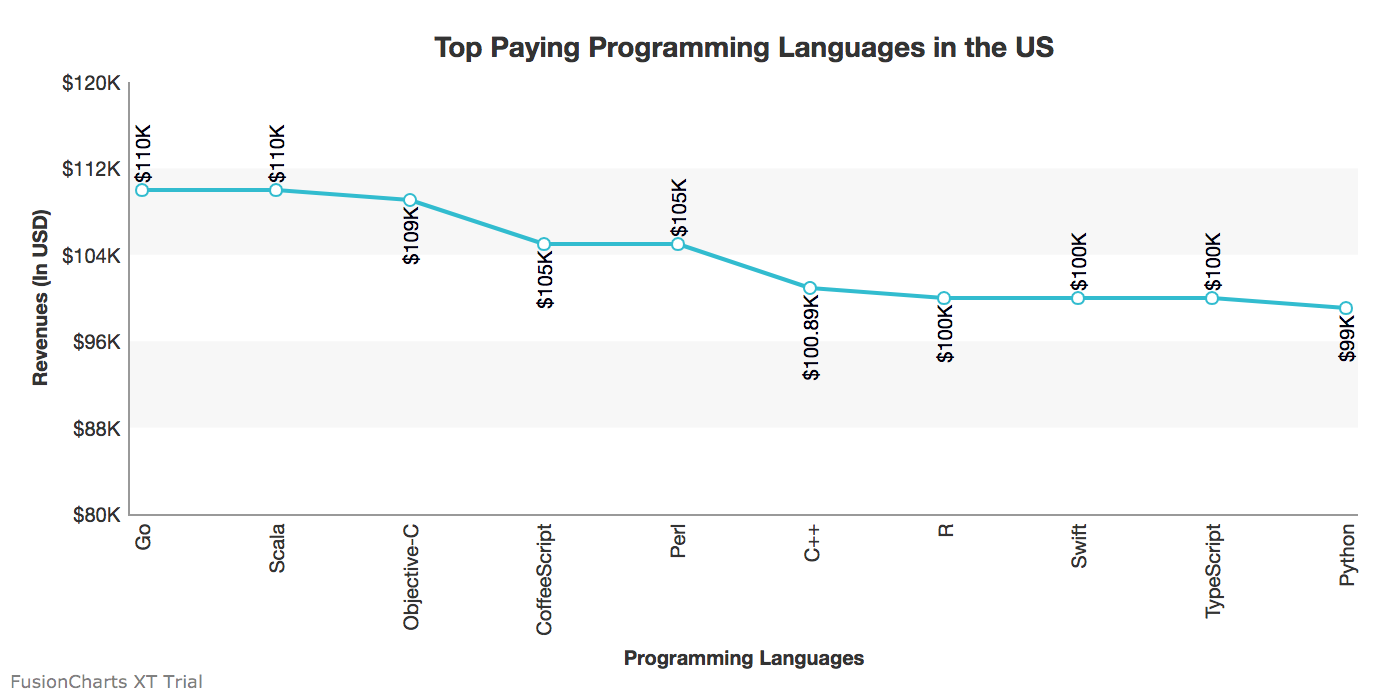
data.json
{
      "chart": {
        "caption": "Top Paying Programming Languages in the US",
        "theme": "fint",
        "xAxisName": "Programming Languages",
        "yAxisName": "Revenues (In USD)",
        "numberPrefix": "$",
        "paletteColors": "#25BCD1",
        "bgColor": "#ffffff",
        "borderAlpha": "20",
        "canvasBorderAlpha": "0",
        "usePlotGradientColor": "0",
        "plotBorderAlpha": "10",
        "placevaluesInside": "1",
        "rotatevalues": "1",
        "rotateLabels": "1",
        "valueFontColor": "#00000",
        "showXAxisLine": "1",
        "xAxisLineColor": "#999999",
         "yAxisLineColor": "#999999",
        "divLinealpha": "0",
        "yaxisminvalue": "80000",
        "showAlternateHGridColor":"1",
        "showYAxisLine":"1"
	 },
      "data": [{
        "label": "Go",
        "value": "110000"
      }, {
        "label": "Scala",
        "value": "110000"
      }, {
        "label": "Objective-C",
        "value": "109000"
      }, {
        "label": "CoffeeScript",
        "value": "105000"
      }, {
        "label": "Perl",
        "value": "105000"
      }, {
        "label": "C++",
        "value": "100890"
      }, {
        "label": "R",
        "value": "100000"
      }, {
        "label": "Swift",
        "value": "100000"
      }, {
        "label": "TypeScript",
        "value": "100000"
      }, {
        "label": "Python",
        "value": "99000"
      }]
    }
Step 2
Create a JSP page and name it index.jsp. This page will act as the view. On running, this will render the chart in the browser.
Copy the following code and paste it into the index.jsp file:
<%@page import="fusioncharts.chartscontroller"%>
<%@page contentType="text/html" pageEncoding="UTF-8"%>
<%@page import="fusioncharts.FusionCharts" %>
<!DOCTYPE html>
<html>
    <head>
        <title>FusionCharts || www.fusioncharts.com</title>
        <script src="fusioncharts.js"></script>
        <script src="fusioncharts.charts.js"></script>
        <script src="fusioncharts.theme.fint.js"></script>

    </head>
    <body>
         <div id="chart"></div>
        <%

         chartscontroller a= new chartscontroller();
         out.println(a.chartmaker());
         %>

 </body>
</html>
Note: Ensure that you import the Fusioncharts wrapper in the JSP page and include the FusionCharts JS library files.
Rendering the Chart
To render the chart, all you need to do is execute the redirect.jsp page that is automatically created by the framework at the time of creation and saved in the Web pages folder. This file will initiate the server and invoke the index.jsp file to run on the browser.
Your output should look like the chart shown in the image below:
That’s it! You’ve now created a Fusioncharts chart using the Spring framework.
If your output does not render as expected or if you have trouble with the configuration files, you can download the sample created for this tutorial from here and import it to your system.