
In the age of data, data visualization is a critical tool. There are so many data visualization tools on the market today, shower, that choosing the best one is a challenge. In this article, we will discuss the features of a great data visualization tool.
Table of Contents
Is It Possible to Customize Data Plots?
Data plots are graphical representations of data values in charts, such as lines, columns, regions, and pie slices. They allow you to quickly generate a visual from the data without wasting time on complicated tabular representations. Customized visual data plots are both appealing and easy to understand. These customizations include choosing colors, adding effects, and highlighting data plots among other things.
Does It Contain Annotations?
You define items or shapes in your chart using annotations. Annotations improve the aesthetic attractiveness of your charts while making them more insightful. Annotations also help end-users better understand charts. You can generate various shapes, photos, and text annotations to interact with your chart. The following is an example of a chart created using annotations.
Many data visualization tools such as FusionCharts support annotations. FusionCharts allows you to create charts with annotations. It also has additional features like customization, positioning, and dynamic control.
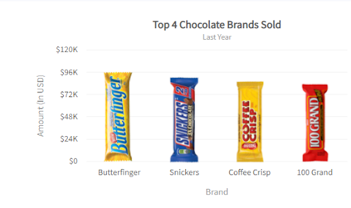
Is It Possible to do Chart Branding?
Many users configure charts based on their company colors/logo. It benefits both your brand and consumers if your branding is incorporated into your chart. Adding a corporate logo and a link to your firm’s homepage in a prominent location also makes your chart unique to your company. Your brand charts can also be saved as images and used in newsletters.
Does It have Chart Titles/Labels?
Text that appears on a chart provides context to your data visualization. Chart captions, axis titles, sub captions, data labels, and data values are all examples of text. For example, the X and Y axes are two of the most important components of any chart. It is critical to label these axes correctly so they clearly describe the data presented on each axis. A chart is incomplete without labels because they demonstrate the connection between the axes and the data visualization. Generally, the x-axis of a chart displays its labels. FusionCharts, however, has additional customizable properties based on user requirements. It also has smart label management, which prevents label overlap.
Can We Add Legends?
A legend explains a graph, most often in multi-series or composite charts. It shows the series name for every dataset. Most charts include a legend to help readers comprehend the plotted data. The legend is a default in most visualization tools when rendering the graph for the first time. However, some visualization tools like FusionCharts allow users to customize the features of the legend itself. Thes customizable features include legend appearance, legend font, and so on.
Is It Possible to Analyze Trends?
One of the most important roles of data visualization is to display trends. While it can take significant time and research to spot a trend in a document, a graph or chart can reveal it in a second. Trend lines are vertical or horizontal reference lines that aid in data interpretation. Because they are adaptable, you can use them to establish context and set limitations and objectives. Some visualization tools like FusionCharts support trend zones as well as trend lines. Trend zones are identical to trend lines even though they designate a whole zone instead of a line.
Can the Chart Loading be Visualized?
Most charts do not provide any indication that they are loading. Because some data-intensive charts can take a long time to load, the unexplained delay can be confusing. That is why a chart loading message is an essential feature of a great chart visualization tool. It indicates to users that everything is running as intended, and they need to wait for the chart to load.
Can We Add Axes and Gridlines When Needed?
The axes of a chart are critical for specifying data values. After all, a chart without a scale of comparison is meaningless. Sometimes, however, the axis lines can annoy the reader. That is why a well-formed visualization tool provides options to hide or show axis lines. Similar to axis lines, Gridlines are horizontal lines that divide the chart plot and indicate axis divisions. They help chart viewers understand what value an unlabeled data point represents. Gridlines provide essential information, especially for sophisticated charts. Because of this, managing both axis lines and grid lines is a must-have feature for a visualization tool.
Can We Navigate from One Data Plot to Another Chart?
Some visualization tools provide navigation from one data plot to another chart based on the information on that data plot. This is a valuable feature since it provides easy access to a series of important information on multiple charts. This feature is called ‘Drill Down Charts‘ in FusionCharts, where individual data plots operate as hotspots to more information.
What does FusionCharts Offer You?
FusionCharts Suite gives you the freedom to customize your chart in any way you desire, whether functional or aesthetic. You can customize charts using characteristics, add layers using annotations, and create complicated visualizations using events and the API. Most of the features mentioned here are covered in the fusion charts documentation, confirming that FusionCharts is a great data visualization tool.
So don’t waste time! Head over to FusionCharts and sign up to enjoy all the features of a great data visualization tool!


