
A great graph maker helps you visualize and convey information so your audience effortlessly understands key insights. A good graphing tool also helps you create better graphs while writing less or even no code. Luckily there are a variety of graph makers available online, but which is the best one? What is the anatomy of a great graph maker? In this post, you will find all the details.
Table of Contents
What is a Graph Maker?
A graph maker is a tool for demonstrating the interrelationships between different data sets with clean, simple, and interactive visualizations. These visualizations help your users make sense of the information you want to convey. As a result, businesses use graphs to understand trends and make informed business decisions.
What are the Characteristics of a Great Graph Maker?
- Ease of Use: A great graph maker doesn’t require you to spend hours to get a job done. Instead, it helps you to make graphs in minutes with less code. As a result, they can enhance your productivity significantly.
- Cross-Platform Support: By providing cross-platform support, a quality graph maker gives you the flexibility to create visualizations using different languages and frameworks. These include JavaScript, Python, PHP, React, Angular, and Ruby on Rails.
- Plenty of Choice: With a great graph maker, you get plenty of graph types to represent your data. For example, with a line chart, you can plot continuous data. If you want to help your audience quickly identify key information, then use a bar chart. You can consider using other types of graphs, like area graphs, scatter plots, or pictographs to suit different scenarios.
Which is the Best Graph Maker of 2022?
FusionCharts is the best graph maker for 2022. This is because it is the most complete JavaScript data visualization library on the market. It supports over 100 charts and 2,000 maps. This means you have plenty of options for every use case. FusionCharts also provides the best-looking graphs in the industry. Your audience will love them.
Why FusionCharts is the Best Graph Maker of 2022?
- Over 100 interactive charts and 2,000 data-driven maps
- Super-fast performance makes it suitable for real-time web applications
- Easy to learn and implement into your web application
- World-class customer support helps you to get technical issues fixed promptly
- Supports a variety of languages and frameworks, including JavaScript, Python, React, Angular, and Ruby on Rails
How can FusionCharts Help Me to Make Graphs Easily?
FusionCharts helps you make graphs quickly with less code. You don’t have to do anything from scratch. You just need to import the library and apply your data. This saves you both time and trouble.
In addition, FusionCharts provides tons of live code examples. By following them, you can easily create beautiful graphs in your web application. Let’s take a look at a practical example.
How can I Use FusionCharts to Make Graphs Easily in React?
React is the most popular JavaScript framework for front-end development. Developers around the world use it to create interactive web applications. FusionCharts is compatible with React so, you can easily use it to make graphs in your React web applications. Here is an example:
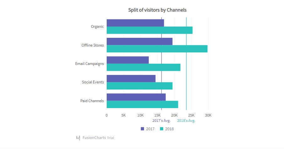
This is a grouped bar graph with multiple data series. To create it in React using FusionCharts, follow these steps:
1. First, you have to import the necessary libraries, including FusionCharts, charts, and ReactFusioncharts.
import FusionCharts from "fusioncharts";
import charts from "fusioncharts/fusioncharts.charts";
import ReactFusioncharts from "react-fusioncharts";
2. Then you have to resolve the chart dependency.
charts(FusionCharts);
3. Now, you have to create the dataSource constant and add this code:
const dataSource = {
  chart: {
    caption: "Split of visitors by Channels",
    placevaluesinside: "1",
    showvalues: "0",
    plottooltext: "<b>$dataValue</b> visitors from $label in $seriesName",
    theme: "fusion"
  },
  categories: [
    {
      category: [
        {
          label: "Organic"
        },
        {
          label: "Offline Stores"
        },
        {
          label: "Email Campaigns"
        },
        {
          label: "Social Events"
        },
        {
          label: "Paid Channels"
        }
      ]
    }
  ],
  dataset: [
    {
      seriesname: "2017",
      data: [
        {
          value: "17000"
        },
        {
          value: "19500"
        },
        {
          value: "12500"
        },
        {
          value: "14500"
        },
        {
          value: "17500"
        }
      ]
    },
    {
      seriesname: "2018",
      data: [
        {
          value: "25400"
        },
        {
          value: "29800"
        },
        {
          value: "21800"
        },
        {
          value: "19500"
        },
        {
          value: "21200"
        }
      ]
    }
  ],
  trendlines: [
    {
      line: [
        {
          startvalue: "16200",
          color: "#5D62B5",
          thickness: "1.5",
          displayvalue: "2017's Avg."
        },
        {
          startvalue: "23500",
          color: "#29C3BE",
          thickness: "1.5",
          displayvalue: "2018's Avg."
        }
      ]
    }
  ]
};
4. Finally, render the chart by using these lines:
class MyComponent extends React.Component {
  render() {
    return (
      <ReactFusioncharts
        type="msbar2d"
        width="100%"
        height="100%"
        dataFormat="JSON"
        dataSource={dataSource}
      />
    );
  }
}
That’s how you can easily create React graphs with FusionCharts.
Source Code:
You can get the source code right here.
As you can see, FusionCharts makes it very easy to make graphs in React. You don’t have to start from scratch. You just need to import the required libraries, add a data source, and render your visualization. There is no complexity and hassle. FusionCharts boosts your productivity significantly.
Documentation: Is It User-Friendly?
FusionCharts comes with extensive documentation. It covers all the features comprehensively. More importantly, it is very easy to follow. You won’t struggle to understand it. In addition, there are tons of live code examples in various languages and frameworks. These include JavaScript, Python, PHP, React, Angular, and Ruby on Rails. Using FusionCharts code examples, you can quickly make graphs for your web application. They make your life a lot easier.
Pricing: How Much Does It Cost?
FusionCharts is available in four different plans: Basic, Pro, Enterprise, and Enterprise+. The Basic plan starts at $499/year. It supports only one developer so it’s suitable for an individual coder. However, if you have a small team of 5 developers, you can choose the $1,299 Pro plan. Unlike the Basic plan, it provides full source code and professional technical support.
If you have a team of 10 developers, you can pick the $2,499 Enterprise plan. It provides support for SaaS apps and OEM apps. If you have a team of more than 11 members, you should go for the Enterprise+ plan. You can request a quote right here.
Should I Use FusionCharts for Making Graphs in My Web Application?
FusionCharts is a powerful graph maker. It allows you to create beautiful data visualizations effortlessly. Using the live code examples, you can make graphs in minutes. It is fast, simple, and very user-friendly so you should definitely consider using FusionCharts for making graphs in your web application.
FusionCharts is a powerful JavaScript library for making graphs effortlessly. Try it now for free.


