It is critical to get familiar with the data when conducting exploratory data analysis in machine learning. Automated systems for generating informative summaries and descriptive statistics are essential, especially when dealing with large datasets with numerous columns (also known as features). FusionCharts is a Javascript library that allows you to create beautiful and dynamic charts, maps, and plots to understand your data and its many aspects better.
A box and whiskers plot is a visualization of the five-number summary of a dataset, which includes the minimum, maximum, median, first quartile (center of the lower half of data), and the third quartile (center of the upper half of data). Plotting the five-number summary, therefore, gives not only a pretty good idea of the dispersion of data but also its skewness. This makes a box and whiskers plot a simple yet powerful tool for the statistics, data science, and machine learning community.
Read on to find out how to generate the box and whiskers plot for the various categories present in your machine learning dataset. We’ll use the well-known Iris dataset from the UCI Machine Learning Repository for creating its corresponding box and whiskers plot in our powerful data visualization tool.
Table of Contents
The Iris Dataset
The AI and machine learning community frequently use the Iris dataset to demonstrate the merits of a learning algorithm. It has four attributes:
- Sepal length
- Sepal width
- Petal length
- Petal width
There are also three classes present in this dataset that represent the flower species:
- The Iris Setosa
- The Iris Versicolour
- And the Iris Virginica
The goal here is to identify the species of a flower when given the various attributes. As a first step, we need to understand the distribution of attributes for the different species, and that’s where box and whiskers plots come in handy. Let’s set up the app to do just that.
Box and Whiskers Plot for the Iris Dataset
The image below shows the box and whiskers plot for the Iris dataset generated by this app:
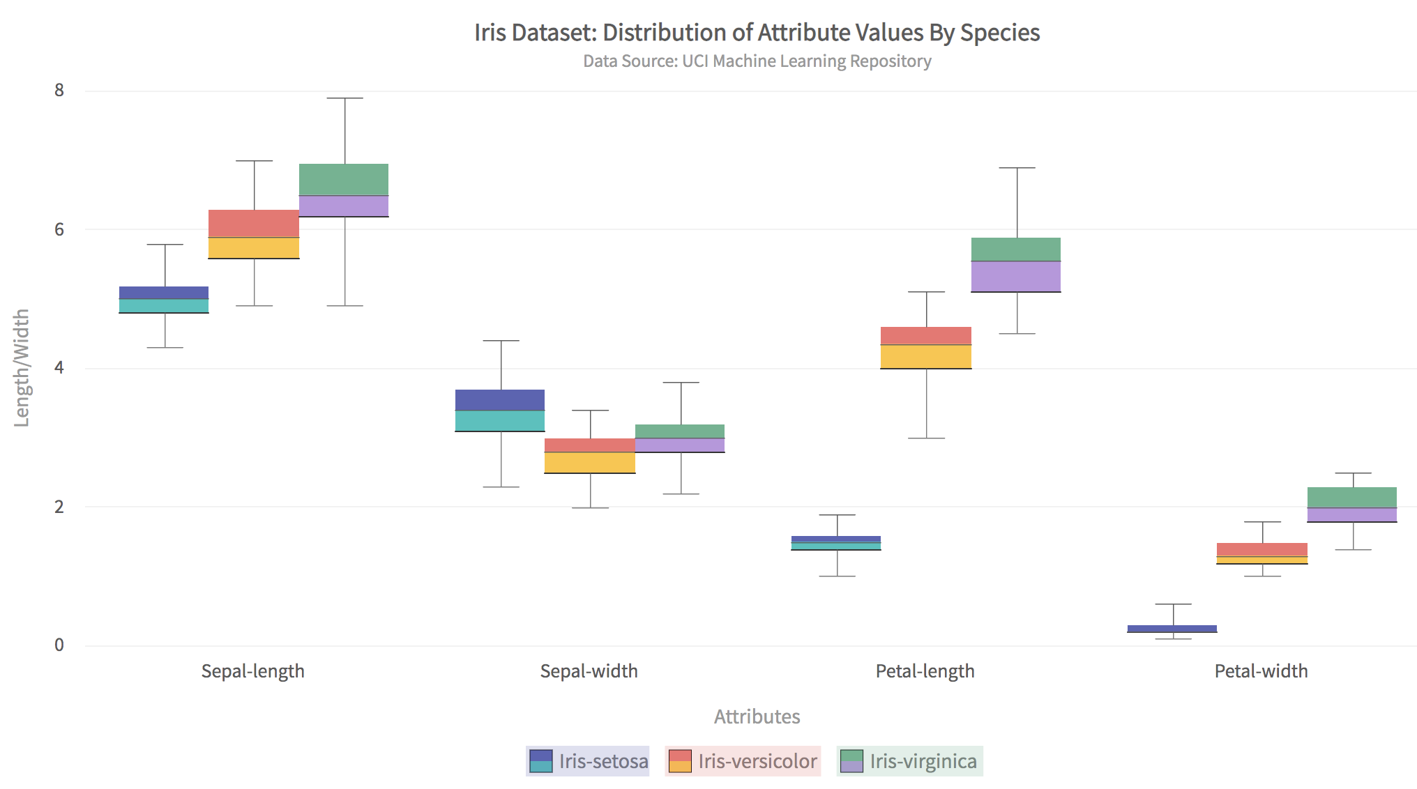
The above plot has some critical features such as:
- A separate box plot can be created for all attributes for all classes.
- Clicking a class/species in the legend displays the box plot for only that class.
- The colors of the box plots for each class are entirely configurable.
- All text in the title, sub-title, and axis labels are configurable.
- Hovering the mouse on any box plot shows its information.
Setting Up the Project with Webpack
As a first step to building a box and whiskers app, you need to set up the project.
Make a new directory for the project called BoxWhiskers. At the console, change the directory to the new project directory and do the following steps:
Step 1: Install Webpack and FusionCharts
Type the following at the console:
npm i -D webpack-dev-server html-webpack-plugin path webpack-cli fusionchartsStep 2: Make src and dist directories and create index.js
Enter the following commands at the console:
mkdir src
mkdir dist
touch src/index.js
The entire code for the data conversion and chart rendering will go into the index.js file.
Step 3: Create webpack.config.js File
In the main project directory create a file called webpack.config.js and enter the following code to it:
// webpack.config.js
const HtmlWebPackPlugin = require( 'html-webpack-plugin' );
const path = require( 'path' );
module.exports = {
   context: __dirname,
   entry: './src/index.js',
   output: {
      path: path.resolve( __dirname, 'dist' ),
      filename: 'main.js',
   },

   plugins: [
      new HtmlWebPackPlugin()
   ],
   devServer: {
       headers: {
           "Access-Control-Allow-Origin": "*",
           "Access-Control-Allow-Methods": "GET, POST, PUT, DELETE, PATCH, OPTIONS",
           "Access-Control-Allow-Headers": "X-Requested-With, content-type, Authorization"
         },
       proxy: {
         '/mlRepo': {
            target: 'https://archive.ics.uci.edu',
            pathRewrite: { '^/mlRepo': '/ml/machine-learning-databases/iris/iris.data' },
            changeOrigin: true,
         },
       },

     }
};
This step is necessary for enabling CORS for the UCI machine learning repository website and downloading the Iris data file.
Import Chart Type and Theme
In the index.js file add the following lines to import the necessary libraries:
// Include the core fusioncharts file from core
import FusionCharts from 'fusioncharts/core';
// Include the chart from viz folder
// E.g. - import ChartType from fusioncharts/viz/[ChartType]
import Boxandwhisker2d from 'fusioncharts/viz/boxandwhisker2d';
// Include the fusion theme
import FusionTheme from 'fusioncharts/themes/es/fusioncharts.theme.fusion';
Create a container for the charts by adding a div tag. Add this to the index.js file:
const myDiv = document.createElement('div');
myDiv.id = 'chart-container';
document.body.appendChild( myDiv )
Write the Main Function
Add the main() function to index.js file. This function does the main job of fetching data and rendering the html page:
async function main() {
    //Get the data
    let response = await fetch('/mlRepo');
    let data = await response.text();
    if (response.ok){
        renderPage(data);
    }
    else {
        alert('Error reading data from ML repository');
    }
}
The renderPage() function looks like this:
//renders the html page when passed data as csv-text
function renderPage(csvText){
    var irisHeader = ['Sepal-length','Sepal-width','Petal-length','Petal-width','Class'];
    var matrix = csvToMatrix(csvText,',');
    var dataset = constructDatasetJson(matrix);
    var jsonArr = constructDataSource(dataset,irisHeader);
    renderChart(jsonArr);
}
The renderPage() function is a high-level function that calls routines for converting the CSV text to a JSON object and rendering the box and whiskers plot.
Convert the Data to JSON
The box and whiskers plot requires the data to be in JSON format. Follow the given steps:
Step 1. Convert the CSV Text to Matrix
Add the following function to index.js:
//convert csv text to matrix
function csvToMatrix(csvText,sep=','){
    var matrix = [];
    var rows = csvText.split("\n");
    for(var i=0;i<rows.length;i++){
        var cols = rows[i].split(sep);
        if (cols.length > 1)
        matrix.push(cols);
    }
    return matrix;
}
Step 2: Construct the JSON ‘Dataset’ Key
To construct the JSON dataset key add the following two functions to index.js:
//helper function to get unique items in array
function unique(value, index, self){
    return self.indexOf(value) === index;
}

//returns JSON text for 'dataset' key
function constructDatasetJson(matrix){
    var cols = matrix[0].length;
    //find the unique classes (iris species)
    var classes = matrix.map(function(value,index) {return value[cols-1];});
    classes = classes.filter(unique);
    //JSON for dataset
    var dataset = [];

    for (var k=0;k<classes.length;++k)
    {
        var className = classes[k];
        var seriesObj = {"seriesname":className};
        var obj = [];
        for (var j=0;j<cols-1;++j)
        {
            var subset = matrix.filter(r=>r[cols-1].match(className));
            var col = subset.map(function(value,index) {return parseFloat(value[j],10);});
            var valObj = {"value":col.toString()};
            obj.push(valObj);
        }
        seriesObj.data = obj;
        dataset.push(seriesObj);
    }
    return dataset;
}
Step 3: Construct the JSON ‘Datasource’ Key
Add the following function to index.js:
//constructs JSON text for 'dataSource' key
function constructDataSource(dataset,heads){
    var category = [];
    for (var i=0;i<heads.length-1;++i){
        category.push({"label":heads[i]});
    }
    var categories = [{"category": category}];
    var JsonArr = {"chart": {
        "caption": "Iris Dataset: Distribution of Attribute Values By Species",
        "subcaption": "Data Source: UCI Machine Learning Repository",
        "xAxisName": "Attributes",
        "YAxisName": "Length/Width",
        "numberPrefix": "",
        "theme": "fusion"
    },
    categories, dataset};
    return JsonArr;
}
Render the Chart
You can now write the function to render the chart:
// Draw the chart

function renderChart(dataSrc){

    FusionCharts.addDep(Boxandwhisker2d);

    FusionCharts.addDep(FusionTheme);

    //Chart Configurations

    const chartConfig = {

        type: 'boxandwhisker2d',

        renderAt: 'chart-container',

        width: '80%',

        height: '600',

        dataFormat: 'json',

        dataSource: dataSrc

    }

    //Create an Instance with chart options and render the chart

    var chartInstance = new FusionCharts(chartConfig);

    chartInstance.render();

}
Run the App
At the end of the index.js file, add a line to call the main() function.
You can run the webpack server by typing at the command line:
npx webpack serve --mode=developmentLoad the app in your browser using localhost:8080.
Are There Other Ways to Visualize Machine Learning Data?
There are plenty of practical and powerful methods to create visualizations of machine learning data. FusionCharts has a great library of charts, maps, and plots, which effectively understand and get insights into your datasets. Visit FusionCharts today and start your free trial for building machine learning and data science apps with powerful data presentations.
You can download the complete source code for this app by clicking this link. Happy learning from data!


