An area chart has been seen before, perhaps monitoring stock market data, web traffic, or monthly income. But when should you use one and, more importantly, when should you not?
The chart type you select can end up drowning your message in data visual chaos. One of the most misused chart types is the area chart because it resembles a line chart, but it’s used very differently.
In this guide, you will learn what an area chart is, how it works, the different types of area charts, the limitations, and best practices for using them.
TL; DR
- An area chart is a line chart where the space between the line and the x-axis is filled with color
- Best used to show volume and trends over time
- Effective for part-to-whole relationships when used in stacked mode
- Ideal for visualizing cumulative data across a time period
- Not suited for exact value comparisons; use a bar or line chart instead
- Avoid using it for datasets with many categories, as it gets cluttered quickly
Table of Contents
What Is an Area Chart?
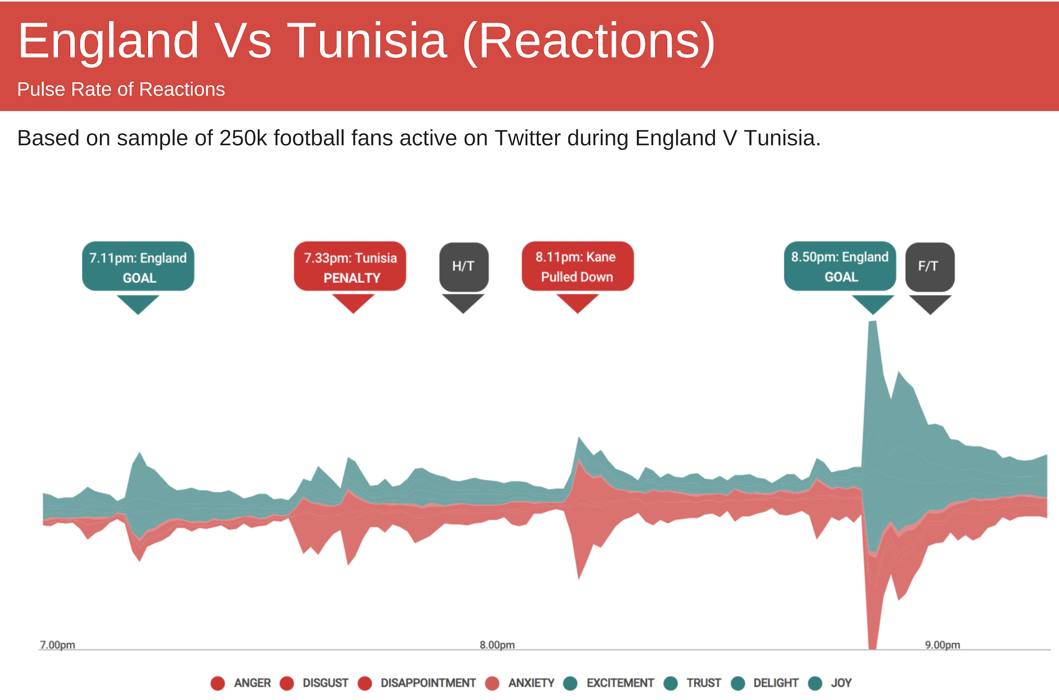
The area chart is a type of line chart in which a color or gradient fill is applied between the plotted line and the x-axis. Data points are represented on the coordinates as points, connected by lines, and the area beneath is visually presented. This distinction matters. A line chart highlights the direction of change; an area chart represents the volume, or amount of something, over time.
Why Use an Area Chart?
Area charts are more than just visually appealing; they serve specific analytical purposes that other chart types can’t fulfill as effectively. Here’s when they’re the right choice:
1. To Show Volume Change Over Time
Area charts are primarily used when the summation of quantitative data (dependent variable) is to be communicated (rather than individual data values). The area underneath the line(s) helps in graphically depicting quantitative progression over time.
2. To Analyze Part-to-Whole Relationships
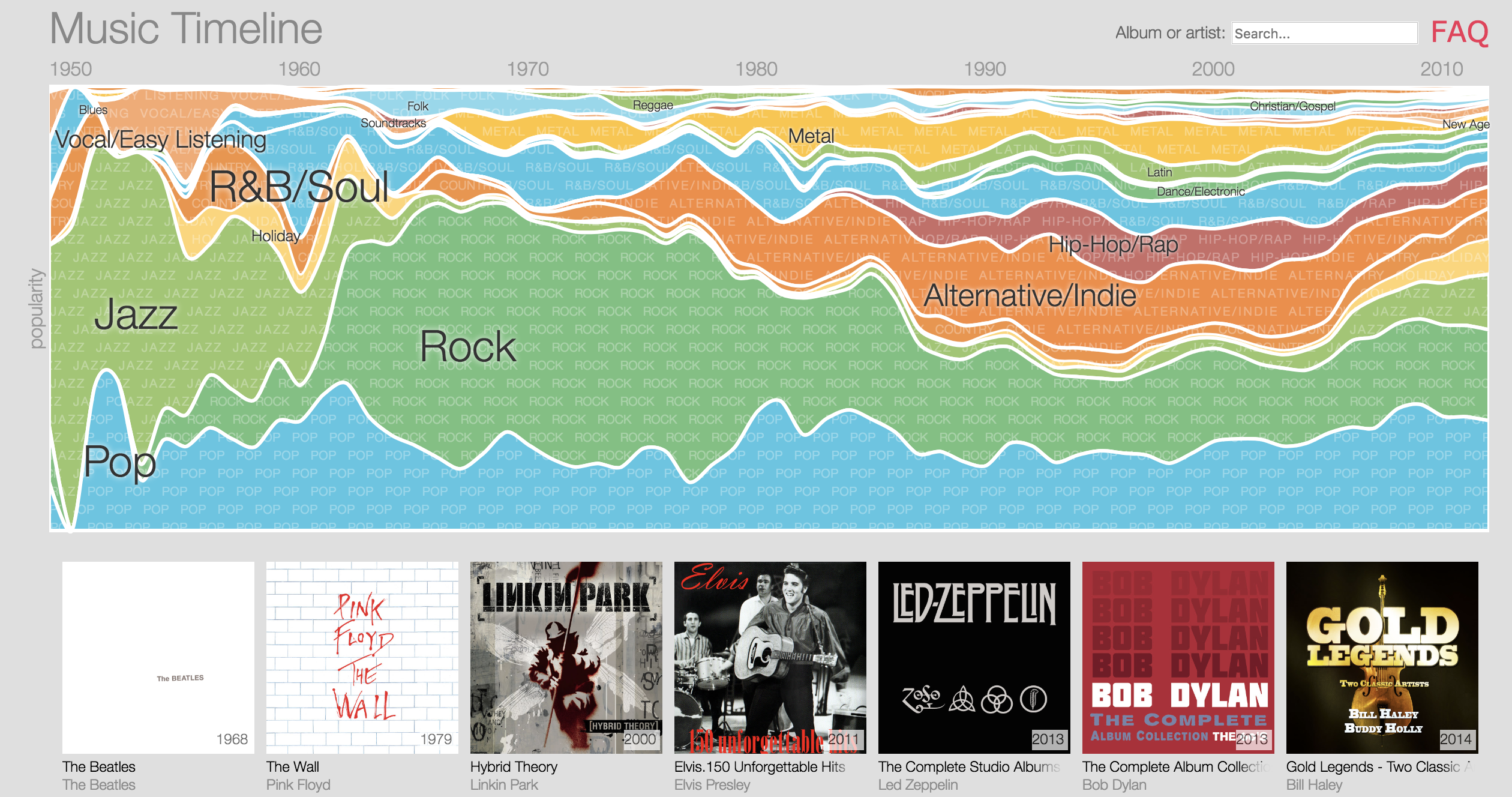
In stacked mode, area charts show how individual categories contribute to a total. For example, stacking sales by product line reveals both the overall revenue trend and each product’s share of it, and if the y-axis is expressed as a percentage, proportional shifts over time become even clearer.
Read more about how this compares to other cumulative visualizations in our guide to stacked bar charts
3. To Compare Magnitude Across Categories
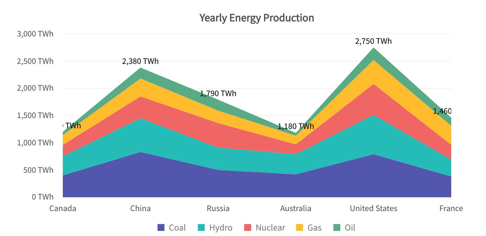
Unlike line charts, area charts let readers visually compare the scale of two metrics side by side. A consistent, stable metric will show a smooth, even fill, while a volatile one will show sharp peaks and dips, making performance differences immediately obvious.
4. Comparing trend/proportion of each category
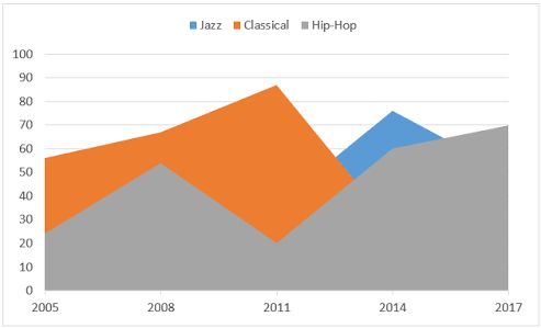
Area charts give a clear and concise picture of each group’s performance trends separately.
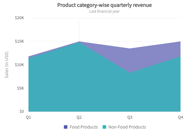
One glance at the stacked area chart on the right above gives you a clear understanding that while the food products’ sales have been consistent, the non-food products’ sales have shown a lot of fluctuations.
Area Chart vs. Line Chart vs. Bar Chart
| Feature |
Area Chart |
Line Chart |
Bar Chart |
| Shows trend |
yes |
yes |
no |
| Shows volume/magnitude |
yes |
no |
yes |
| Part-to-whole (stacked) |
yes |
no |
yes |
| Exact value comparison |
no |
no |
yes |
| Works with many categories |
no |
yes |
yes |
| Best for time-series data |
yes |
yes |
no |
Business Uses of Area Chart
Trend of magnitude of a single quantitative variable

Comparison of contributions of multiple members of a category (or group)

To distinguish the relative part-to whole magnitude of a trend component

What are the different types of Area Charts?
With FusionCharts, you can pick from all the major variants of area charts that come without any hassle: basic single-series charts, scrollable, etc. Here’s a breakdown of each:
Area with multiple series
The multi-series area chart is plotted with data values plotted as data points that are connected using line segments. The area between the line segments and the x-axis/edges of other charts is filled with color.
Where to use Area with multiple series?
- Cost vs revenue magnitudes over time for a company
- Export vs import magnitudes over time for a nation
- Birth and death counts over time for a region
Area with scrolling
A scroll area chart is used to show the magnitude of change over a period of time. A large number of data points can be rendered on the chart owing to the scroll interactivity. The chart is rendered with data values plotted as data points that are then connected using line segments. The area between the line segments and the y-axis is filled with color. A horizontal scroll bar is rendered at the bottom of the chart to navigate through the chart.

Where to use Area with scrolling?
- Count of deaths over time for a country
- Federal Bank reserves over 5 decades
- Volume of trade of a particular stock
Simple spline-area
A spline area chart is a specialized form of the area chart that can be used for plotting data that requires the usage of curve-fitting. Like the area chart, data values are plotted as data points. However, instead of using straight line segments to connect the data points, this chart draws a fitted curve to connect the data points. The area between the curve and the x-axis is filled with color.

Where to use spline-area?
- Web visits in a month
- Sales revenue for multiple quarters
- Forest Spread area
- Defence expenditure
- Volume of oil import
Spline-area with multiple series
A multi-series spline area chart is a specialized form of the multi-series area chart that can be used for plotting data for multiple categories of data that require the usage of curve-fitting. Like the multi-series area chart, data values are plotted as data points. However, instead of using straight line segments to connect the data points, this chart draws a fitted curve to connect the data points. The area between the curve and the x-axis is filled with color.

Where to use spline-area with multiple series?
- Spread of urban area and rural area
- Spread of hot days and cold days in a region
Standard Area Chart
The most common form. One data series, area below the line filled. Ideal for measuring a single data point over a period of time, such as monthly revenue, daily active users, etc. You can see it in the simple area chart demo, and follow the line, area, and column chart guide to build one.

Standard Area Chart
Each series is stacked on top of the previous one. At each point, the total height of the chart is the sum of all series values. Useful for visualizing individual contribution to a whole, such as sales by product category, which totals company sales. Explore the stacked area chart demo and the stacked area chart attributes for the full setup.
100% Stacked Area Chart
Similar to the stacked variant, but the y-axis is normalized to 100%. This 100% Stacked Area Chart removes the cumulative total and focuses entirely on proportional share, ideal when you want to track how each group’s percentage contribution shifts over time.
What are the Area Chart Examples?
1. Monthly Revenue Growth
A standard area chart is commonly used to visualize how revenue changes over time. For example, a SaaS company can track monthly recurring revenue (MRR) across a year. The filled area makes it easier to see not only the upward or downward trend but also the overall revenue volume generated during the period.
Why use an area chart?
- Highlights growth patterns
- Emphasizes total revenue generated
- Makes seasonal fluctuations easier to identify

2. Website Traffic Analysis
Marketing teams often use area charts to monitor daily or monthly website visitors. The chart clearly shows traffic spikes after campaigns, product launches, or promotional activities.
Example metrics:
- Organic traffic
- Paid traffic
- Total website visits
This allows teams to quickly identify periods of strong engagement and evaluate campaign effectiveness.

3. Sales by Product Category (Stacked Area Chart)
A stacked area chart is useful when you need to show both total sales and category contributions.
For example, an electronics retailer may track sales from:
- Laptops
- Smartphones
- Accessories
- Tablets
The chart displays overall sales growth while simultaneously showing how each product category contributes to total revenue over time.

4. Energy Consumption Monitoring
Utility companies frequently use area charts to analyze electricity usage throughout a day, week, or month. The filled area effectively communicates periods of high and low consumption.
Common use cases include:
- Household energy usage
- Industrial power consumption
- Renewable energy production
This helps organizations identify peak-demand periods and optimize resource allocation.
5. Market Share Trends (100% Stacked Area Chart)
When the focus is on percentage contribution rather than absolute values, a 100% stacked area chart is ideal.
For example, a streaming industry report may compare market share among several platforms over five years. The chart shows how each company’s share changes while maintaining a constant total of 100%.

Best for:
- Market share analysis
- Customer segment distribution
- Portfolio allocation tracking
6. Budget Allocation Across Departments
Organizations often use area charts to visualize how budgets are distributed among departments over multiple quarters.
Departments may include:
- Marketing
- Sales
- Operations
- Research & Development
A stacked area chart helps decision-makers understand spending patterns while maintaining visibility into total organizational expenditure.
What are the Merits and Demerits of Area Charts?
Like any visualization tool, area charts come with their own strengths and limitations. Understanding both helps you make smarter charting decisions:
| Merits | Demerits |
| Visualizes volume and magnitude intuitively | Hard to read exact values |
| Great for time-series trend analysis | Overlapping fills create visual clutter |
| Ideal for part-to-whole analysis (stacked) | Not suited for many data categories |
| Easy visual comparison across categories | Ambiguous when data values are far apart |
What are the best practices for Area Charts?
Picking the right data is only half the job; here’s how to present it effectively:
- Always start the y-axis at zero. Starting mid-way exaggerates differences and misrepresents volume proportions.
- Use transparent, contrasting colors. This preserves readability when fills overlap.
- In stacked charts, put volatile data on top. Stable series at the bottom create a steady visual baseline, making fluctuations in the upper series easier to spot.
- Use 100% stacked when proportion matters more than total. If the cumulative sum is irrelevant to your audience, normalize to 100%.
- Limit to 3–4 series maximum. Beyond that, switch to a line chart or use small multiples.
- Label directly where possible. Avoid relying solely on a legend; direct labels on each area reduce cognitive load.
For a deeper look at how these principles apply across chart types, see our full chart gallery covering line, bar, and column alternatives.
Conclusion
Area charts are a specialized graph, very useful in the appropriate context, but unhelpful in other contexts. The filled area isn’t merely a design decision – it has analytical meaning too. If that meaning is not adding to your communication, you should use a simpler chart type. Use an area chart for volume, cumulative trends, or part-to-whole relationships. Limit the number of series, adhere to best practices, and trust the data to tell the story.
Start your free FusionCharts trial
Get full access to 100+ chart types, including every area chart variant covered in this guide, and start building interactive, production-ready visualizations in minutes.
Download your free FusionCharts trial →
FAQ
Q: What is an area chart?
The area chart is a variation of the line chart between the line plotted and the x-axis, which is filled with a gradient or color. It is mainly used to show volume, trends, and cumulative data over time.
Q: What is the difference between an area chart and a line chart?
A line chart highlights the trend or direction of data, while an area chart highlights the volume of data. The filled area underneath the line gives depth and scale to it, which a line alone can not.
Q: What is the area chart also known as?
An area chart is also known as an area graph or mountain chart. In certain cases, the stacked variant is referred to as a stacked area chart.
Q: How to build an area chart?
Constructing an area chart with FusionCharts is very simple. You specify your data, choose the area chart type, and then FusionCharts takes care of the rendering. See our step-by-step chart guide to get started.
Q: Are area charts good for dashboards?
Yes, definitely for time series kpi’s where trend/volume context is relevant. Don’t use them for metrics that require a precise value; if necessary, combine with a data table.