Quick Answer:
Choose a JavaScript library based on the charts and interactions your application needs. Then evaluate performance, framework compatibility, customization, accessibility, licensing, and support. Test your shortlisted libraries with realistic data and a small proof of concept before making the final choice.
You can easily add a basic chart to a web page. But when your users need to explore data through interactions, choosing a charting library becomes more complicated.
JavaScript charting libraries vary considerably in their interactive features, performance, framework support, customization, and scalability. The right choice therefore depends on what your application actually needs.
This guide provides a practical framework for choosing a library to build interactive charts in JavaScript.
Table of Contents
TL;DR
- Define the data types, chart types, and interactions your application needs before comparing libraries.
- Test performance with realistic datasets, especially for large datasets and real-time updates.
- Check compatibility with your JavaScript framework and application architecture.
- Evaluate customization, responsive behavior, and accessibility before implementation.
- Consider the developer experience, licensing, maintenance, and support, not just the initial cost.
- Compare shortlisted libraries against the same requirements and build a small proof of concept before making your final choice.
What Makes a JavaScript Chart Interactive?
A static chart displays data, while an interactive chart lets users explore it. Instead of only viewing values, users can hover over data points, zoom into a time range, filter results, drill down for more detail, or trigger actions directly from the visualization.
Common interactive features include:
- Tooltips and hover states for viewing additional details.
- Clickable data points and selection events for triggering actions.
- Zooming and panning for exploring dense datasets or specific ranges.
- Drill-down for moving from summarized data to detailed views.
- Legend interactions and filtering for showing or hiding selected data.
- Cross-chart interactions for connecting multiple visualizations in a dashboard.
- Dynamic and real-time updates for displaying changing data.
- Exporting and sharing for using chart data outside the application.
However, an application rarely needs every interaction. Each one needs specific interaction requirements based on its usage.
- Executive dashboards may rely on tooltips, filtering, and drill-down.
- A monitoring dashboard may prioritize real-time updates and zooming.
- Financial applications may need range selection and zooming across large time-series datasets.
- Embedded reports may focus on tooltips, responsive behavior, and exporting.
The important question is not how many interactive features a library provides, but whether it supports the interactions your users actually need.
Start by Defining Your Visualization Requirements
Before comparing charting libraries, define what your application needs to visualize:
- Type and volume of data
- Required chart types
- Expected future use cases
Defining your data visualization requirements helps you decide which library is the right fit.
What Data Are You Visualizing?
Start with the structure of your data. Different data types often require different visualizations and rendering capabilities.
For example:
- Categorical data is commonly displayed using column or bar charts.
- Time-series data often requires line or area charts to show changes over time.
- Hierarchical data may require treemaps or other hierarchy-based visualizations.
- Geographic data requires maps or location-based visualizations.
- Financial data may require specialized charts for prices, volumes, or market trends.
- Real-time streams require charts that can update efficiently as new data arrives.
- Large datasets may require aggregation and efficient rendering to maintain performance.
Understanding your data early helps narrow down both the chart types and technical capabilities you need.
Which Chart Types Do You Need?
Next, list the visualizations your application requires. Most libraries support common charts such as column, bar, line, area, pie, doughnut, and scatter charts. The differences become more important when your application requires specialized visualizations.
For example, analytics and enterprise applications may need heatmaps, treemaps, gauges, funnel charts, Gantt charts, combination charts, financial charts, or maps. Check whether these are supported natively or require plugins or custom development.
Don’t evaluate a library only against today’s requirements. Consider how the application may evolve and choose a library that offers sufficient chart coverage. It will eliminate the need to replace your data visualization library over time.
Identify the Interactions Your Users Actually Need
Once you know what data you need to visualize, define how users interact with it. Instead of comparing libraries by the total number of features they advertise, evaluate the specific chart interactions your application requires.
1. Tooltips and Hover States
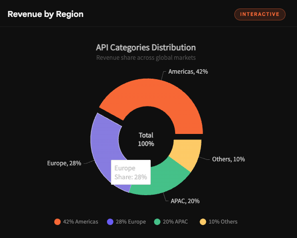
Tooltips let users inspect individual data points. You don’t have to display every value directly on the chart. Check whether you can customize their content, formatting, and behavior to show the information users need.
2. Zooming and Panning
Zooming and panning help users explore sections of a visualization without losing the broader context. These features are particularly useful for long time series, financial datasets, monitoring systems, and other dense visualizations.
Test how smoothly the interactive chart library handles these interactions with realistic data volumes.
3. Drill-Down
Drill-down allows users to move from a high-level view to more detailed data. For example, a dashboard might follow this path:
Summary → Category → Detailed data
Check whether the library provides built-in drill-down capabilities. Otherwise, you have to implement the behavior through custom events and application logic.
4. Events and User Actions
Charts often need to interact with the rest of an application. Check whether the library exposes events for:
- Data-point clicks
- Data selection
- Hover actions
- Legend interactions
- Chart lifecycle events
- Custom application logic
A data-point click, for example, might filter another chart, open a detailed view, or update another component on the page.
Learn more about chart events.
5. Real-Time Updates
For monitoring dashboards and other applications that display live data, evaluate how the library handles frequent updates. Charts should be able to incorporate new data efficiently without rebuilding the entire visualization after every change.
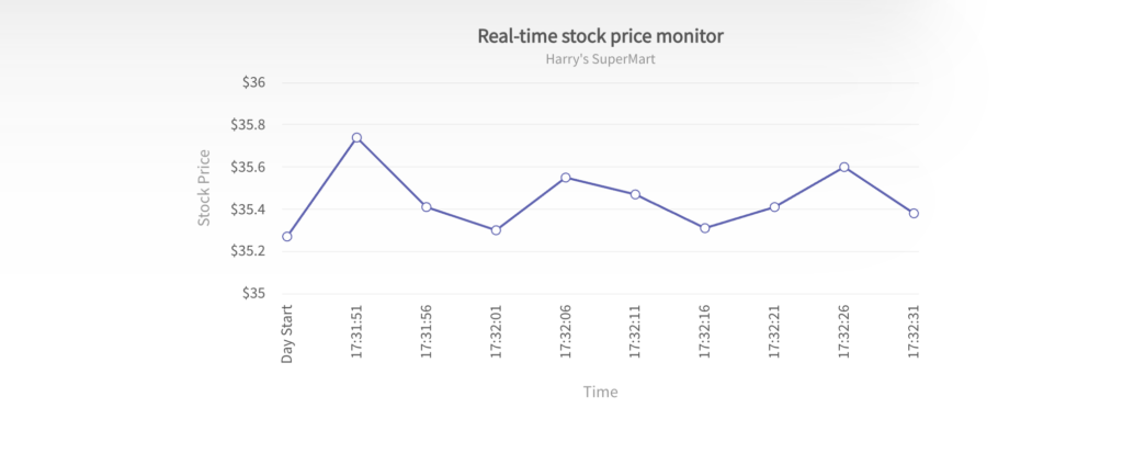
Explore more about real-time data updates.
The goal is to choose a library that supports the interactions your application depends on without requiring unnecessary custom development.
Evaluate Performance and Dataset Size
Performance of your interactive data visualization tools can change significantly as data volume grows. A library that renders 100 data points smoothly may behave differently with tens of thousands of points or data that updates every few seconds.
Test shortlisted libraries with realistic datasets and consider:
- Initial rendering time: How quickly does the chart appear?
- Update performance: Can the chart handle frequent data changes smoothly?
- Browser memory usage: Does memory consumption remain reasonable as data grows?
- Animation overhead: Do animations affect performance with larger datasets?
- Large dataset handling: Can users still interact with the chart smoothly at the expected scale?
- Real-time update frequency: Can the chart process live updates at the rate your application requires?
Testing with production-like data is more useful than relying only on small demo datasets.
Consider the Rendering Engine
The rendering technology of your JavaScript charts can also affect performance and interactivity. SVG provides scalable graphics and element-level interaction, while Canvas can be useful for rendering large numbers of graphical elements. WebGL uses GPU acceleration and can be suitable for extremely large or computationally intensive visualizations.
Each approach has different strengths. For a closer comparison of performance, scalability, and interactivity, see our guide to Canvas vs. SVG charts.
Check Framework and Application Compatibility of Your Charting Library
A charting library rarely operates in isolation. So, you need to check how well it fits your application’s existing technology stack. Depending on your project, this may include Vanilla JavaScript, React, Angular, Vue, or other SSR environments. You also need to check whether it supports mobile and hybrid applications.
For framework-based applications, look for official integrations or well-maintained wrappers. These can simplify:
- Component lifecycle management
- Data updates
- Event handling
- Reusable chart components
- Framework upgrades
For example, a React integration should work naturally with component lifecycles and changing props, while an Angular integration should fit its component and data-binding patterns.
Also consider future upgrades. A library may work with your current framework version. But it may become difficult to maintain if its integrations are outdated or rarely updated. Check supported versions, documentation, release activity, and upgrade guidance before making a long-term choice.
Evaluate Customization Without Creating a Maintenance Problem
You need to match the appearance of your interactive JavaScript chart to your application UI. Your users should feel like the interactive dashboard is a part of your application.
Evaluate how easily you can customize:
- Colors
- Fonts
- Themes
- Axes
- Legends
- Tooltips
- Labels
- Annotations
- Data markers
- Toolbar controls
- Interaction behavior
These customizations should not require adding a large amount of additional code. Additional code requires more effort for testing and maintenance. It adds long-term costs.
Responsive Design and Accessibility for Interactive Charts in JavaScript
Your interactive JavaScript charts need to handle different users, screen sizes, and devices. When choosing an interactive chart library, you have to evaluate this. You will have to put in additional effort and incur additional costs if you deal with them after building the dashboard.
Responsive Behavior
Your interactive charts may work properly on desktops. But test how they behave across other devices such as:
- Tablets
- Mobile
- Resizable dashboard panels
Especially check whether labels, legends, and tooltips remain consistent as the available space decreases. Also check whether the interactive features remain the same on touch screens when mouse hover is unavailable.
Accessibility Support
Your interactive JavaScript charts should be accessible for everyone. So it’s equally important to evaluate the accessibility features of your charting library.
When evaluating, consider:
- Keyboard interaction
- Screen-reader support
- ARIA attributes
- Color contrast
- Non-color methods of communicating information
- Accessible tooltips and labels
Check these features before choosing the charting library. It will add additional costs to implement these features later if your library does not support them.
Consider Developer Experience and Integration Effort of Your Interactive Chart Library
The JavaScript interactive chart library you choose may be feature-rich. But it may still be expensive if the implementation is complicated. You should test the developer experience and integration effort by testing:
- Installation process
- API consistency
- Documentation quality
- TypeScript support
- Examples
- Framework-specific documentation
- Configuration complexity
- Debugging experience
- Upgrade process
Suggested Practical Test
I suggest you take these practical tests before committing to a charting library. I built a small proof of concept when I chose an interactive charting library. It contained:
- One basic chart.
- One advanced chart required by the application.
- A responsive layout.
- An interactive event.
- Dynamic data updates.
It helped me overcome the integration limitations much faster than comparing feature tables alone would have.
Evaluate Licensing, Maintenance, and Support
When choosing the best charting library for your application, you should not consider only the technical criteria. You should also think about these factors:
- Open-source vs. commercial licensing
- Production-use restrictions
- Developer/team licensing
- Update frequency
- Release history
- Security maintenance
- Documentation
- Community support
- Professional support
- Enterprise requirements
Choosing the cheapest library initially is one of the biggest mistakes most businesses make. You have to consider the costs involved over the lifetime of an application. When you need predictive support, extensive documentation, and long-term support, a commercial option may be the best option for you.
Use a Decision Matrix Instead of Picking a JavaScript Chart Library by Popularity
The most popular chart library may not be the right library for your application. When defining your requirements, evaluate the shortlisted libraries using the same process.
You can use this simple decision matrix in your evaluation process:
| Requirement | Questions to Ask | Priority |
|---|---|---|
| Chart types | Does it support every required visualization? | High |
| Interactivity | Are zoom, drill-down, events, and tooltips built in? | High |
| Performance | Can it handle expected dataset sizes and updates? | High |
| Framework support | Does it integrate cleanly with the application's stack? | High |
| Responsive design | Does it work across target screen sizes? | High |
| Accessibility | Can charts meet accessibility requirements? | High |
| Customization | Can charts match the application's UI without excessive code? | Medium–High |
| Developer experience | Are APIs, examples, and documentation easy to use? | Medium–High |
| Licensing | Does the licensing model fit deployment plans? | High |
| Support | What happens when production issues occur? | Medium–High |
You can adjust the priorities to match your project. Score all shortlisted libraries with the same requirements.
When Does FusionCharts Make Sense for Interactive Data Visualization?
It’s worth considering FusionCharts when your application needs more than basic charts. FusionCharts chart library provides 100+ interactive chart types. It covers common data visualizations as well as maps, gauges, advanced charts, and real-time visualizations.
I have used this library for business dashboards and data-intensive applications. This JavaScript data visualization library is a good fit for applications that need interactive features, exporting, framework integration, and enterprise-oriented support.
However, the right choice still depends on your project’s requirements. Evaluate FusionCharts also with the same criteria and proof-of-concept you apply for the other libraries.
Explore FusionCharts with a free trial.
FAQ
What is the best JavaScript library for interactive charts?
The best JavaScript library for interactive charts depends on your application’s requirements. Some of them are chart types, dataset size, interaction requirements, framework compatibility, customization, licensing, and support. FusionCharts, Highcharts, D3.js, and Apache ECharts are examples with different strengths.
Explore more of the best JavaScript charting libraries.
How do I create interactive charts in JavaScript?
You can create interactive charts in JavaScript by following these steps:
- Use a suitable charting library
- Provide the data and configuration
- Enable the required interactions such as tooltips, zooming, drill-down, and events.
Learn more about creating interactive JavaScript charts.
What features should an interactive JavaScript chart library have?
An interactive JavaScript chart library should have the following features:
- Tooltips
- Events
- Zooming
- Panning
- Drill-down
- Responsive behavior
- Dynamic updates
- Accessibility
- Exporting
- Customization.
Are SVG or Canvas charts better for interactivity?
Neither is always better. SVG supports element-level interaction and scales without losing quality, while Canvas can perform better when rendering many graphical elements. The right choice depends on your data volume and interaction requirements. Learn more in our guide to Canvas vs. SVG charts.
How do I choose a charting library for large datasets?
Test shortlisted charting libraries with data volumes similar to your production environment. Compare:
- Rendering time
- Update frequency
- Browser memory usage
- Rendering technology
Should I use an open-source or commercial JavaScript charting library?
This decision depends on your project. Open-source libraries provide more flexibility and lower upfront costs. Commercial libraries offer advanced built-in features, dedicated support, documentation, and enterprise licensing. You should consider the total development and maintenance effort rather than licensing cost alone.
Conclusion
There is no single best library for creating interactive charts in JavaScript. The best choice depends on how your users need to use the data. The technical environment in which the charts will run also determines the best charting library for your application.
The summary selection process is as follows:
Requirements → interactions → data scale → technology stack → UX/accessibility → developer experience → licensing/support → proof of concept
Once you have decided your requirements, compare the leading options in our guide to the best JavaScript charting libraries.