As a developer, you must have created charts to visualize the data. You use a JavaScript chart library to easily create different types of visualizations, like line graphs, bar graphs, area chart, etc. It contains all the necessary functions. Hence, you don’t have to do anything from scratch. It makes your development process faster. There are lots of visualization libraries available online. But which are the best ones? In this post, you will find 10 top notch open source JS chart library for 2026. Let’s dive in.
Table of Contents
What Are Open Source Libraries?
An open-source library is a collection of resources that provides public access to the source code for free. Hence, you can inspect, modify, and enhance the code without any permission. Also, you don’t have to spend any money to use it.
Open source library allows you to adapt code easily to your project requirements. It enables you to conveniently develop dynamic interfaces.

How To Consider An Open Source Library?
Open-source libraries don’t offer formal support. However, they are maintained by a large community of developers. The community doesn’t focus on making the best business decisions. Instead, they emphasize making the best technical decisions. However, not all open-source libraries achieve massive popularity. Many of them can quickly fall out of favor. As a result, they can be completely abandoned.
That’s why you need to be very careful while picking up an open-source library. Make sure to follow these tips while evaluating any JavaScript charting library:
First Things First: License
The very first thing that you need to look at is the license. Make sure that the library offers a permissive license. It will allow you to modify the code based on your needs. Also, you can continue using it even if it’s abandoned.
Make sure to review the licensing material. It will help you to determine whether the existing license matches your project requirement or not.
Use Standard Libraries
You should use a standard open-source JS chart library. Don’t pick up a solution that is not widely used. Instead, you should choose a popular library. Because it will be easier to find answers to the potential issues.
Also, the standard library will provide long-term support from the community. It won’t be dead anytime soon. Therefore, it will be a safe option in the long run.
Well Documented Library
You should always choose a well-documented open-source JS chart library. It will make your life a lot easier. Make sure that the documentation is aimed at users and potential contributors. It’s a sign of the creators being open to receiving help from external resources. Hence, the library won’t die anytime soon.
You should take a close look at the documentation. Does it include an overview of the functionality? Is there any example of usage? Does the documentation provide a complete API reference? Is there any information about architecture? These are some of the questions that you need to ask yourself. It will help you determine whether it’s good documentation or not.
Also, you should take a look at how the code is tested. Are the specs currently passing to the main branch? Is there any major gap in test coverage? These are some of the most important factors. You should keep a close eye on them.
Analyze The Issues And Pull Requests
Is the open-source JS chart library available on GitHub or Bitbucket? Take a look at the open and closed issues and pull requests. Check whether the authors promptly respond to them or not. If you find them to be unresponsive, you should avoid using the library. Because you will not get the necessary support in time.
Also, take a look at the tone of the authors. Are they willing to answer the questions? Are they grateful for the help they are receiving from others? If they are grateful, it’s a very good sign. Are they willing to answer questions for the people hacking away at it? If there’s a strong desire, it’s another great sign. It indicates a healthy relationship in the specific community.
Are they combative, dismissive, or get defensive when questioned? You should avoid using the library. Because it indicates an unhealthy dynamic. It won’t help you in any way.
GitHub Stars Are Not Everything
GitHub stars give a strong indication of overall popularity. Some people often picking choose libraries based on the number of stars. However, it’s not the right approach. The number of stars doesn’t determine whether a library is good or not. There are repositories with a high number of stars. But internally, they are an absolute nightmare.
Best Open Source JS Chart Library Platforms for 2026
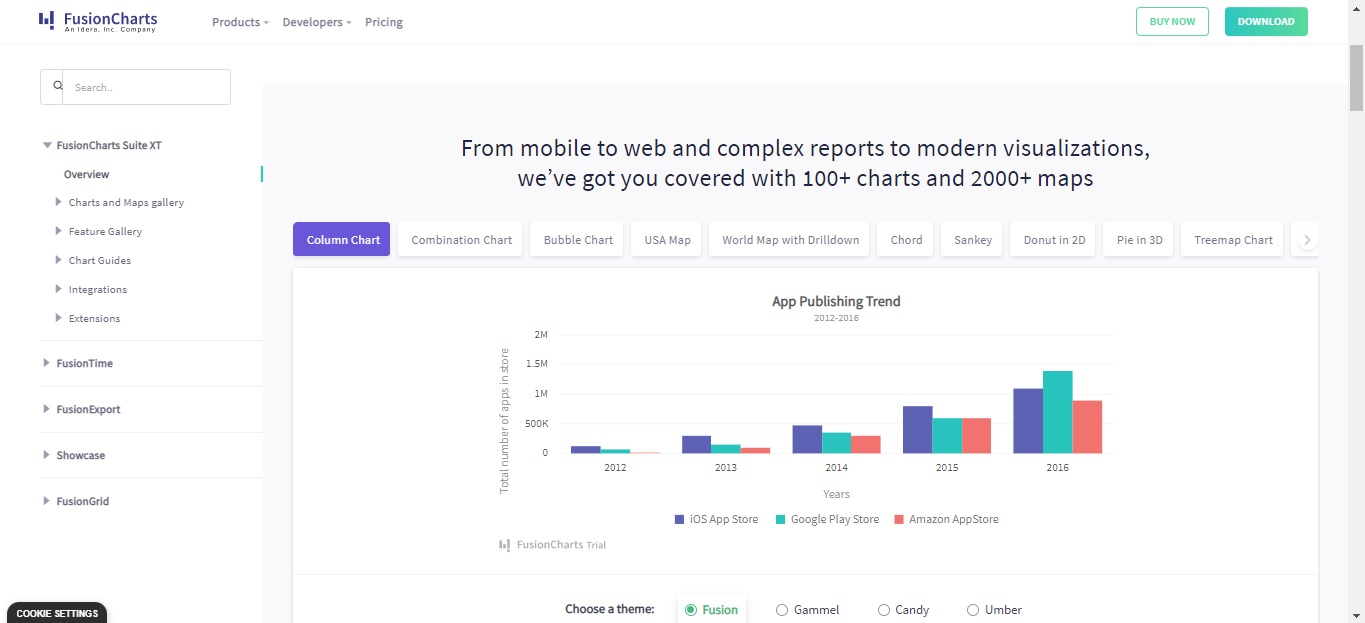
FusionCharts – The Best Open Source JS Chart Library for 2026
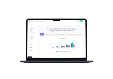
FusionCharts is the most comprehensive JavaScript Library on the planet. It offers more than 90 charts and 900 maps. The visualizations look stunning. In fact, FusionCharts is considered to have the best-looking charts in the industry. It is available in both free and paid versions.
The charts of FusionCharts are highly customizable. By making some tweaks, you can make them even more beautiful and effective for better interaction. Also, FusionCharts offers responsive design. As a result, the charts will flawlessly show up on all sorts of devices, like PCs, phones, and tablets. On top of that, FusionCharts offers strong community support and rich documentation. Therefore, it’s considered to be the best open-source JS chart library for 2026.
Read: Your choice of a JS library
Here is a sample code for creating a simple bar chart using FusionCharts:
const dataSource = {
  chart: {
    caption: "Lead sources by industry",
    yaxisname: "Number of Leads",
    aligncaptionwithcanvas: "0",
    plottooltext: "<b>$dataValue</b> leads received",
    theme: "fusion"
  },
  data: [
    {
      label: "Travel & Leisure",
      value: "41"
    },
    {
      label: "Advertising/Marketing/PR",
      value: "39"
    },
    {
      label: "Other",
      value: "38"
    },
    {
      label: "Real Estate",
      value: "32"
    },
    {
      label: "Communications/Cable/Phone",
      value: "26"
    },
    {
      label: "Construction",
      value: "25"
    },
    {
      label: "Entertainment",
      value: "25"
    },
    {
      label: "Staffing Firm/Full Time/Temporary",
      value: "24"
    },
    {
      label: "Transportation/Logistics",
      value: "23"
    },
    {
      label: "Utilities",
      value: "22"
    },
    {
      label: "Aerospace/Defense Products",
      value: "18"
    },
    {
      label: "Banking/Finance/Securities",
      value: "16"
    },
    {
      label: "Consumer Products - Non-Durables",
      value: "15"
    },
    {
      label: "Distribution",
      value: "13"
    },
    {
      label: "Education",
      value: "12"
    },
    {
      label: "Health Products & Services",
      value: "11"
    },
    {
      label: "Hospitality & Hotels",
      value: "10"
    },
    {
      label: "Non-Business/Residential",
      value: "6"
    },
    {
      label: "Pharmaceutical",
      value: "4"
    },
    {
      label: "Printing & Publishing",
      value: "1"
    },
    {
      label: "Professional Services",
      value: "1"
    },
    {
      label: "VAR/ISV",
      value: "1"
    },
    {
      label: "Warranty Administrators",
      value: "1"
    }
  ]
};

FusionCharts.ready(function() {
  var myChart = new FusionCharts({
    type: "bar2d",
    renderAt: "chart-container",
    width: "100%",
    height: "100%",
    dataFormat: "json",
    dataSource
  }).render();
});
You will get this output:
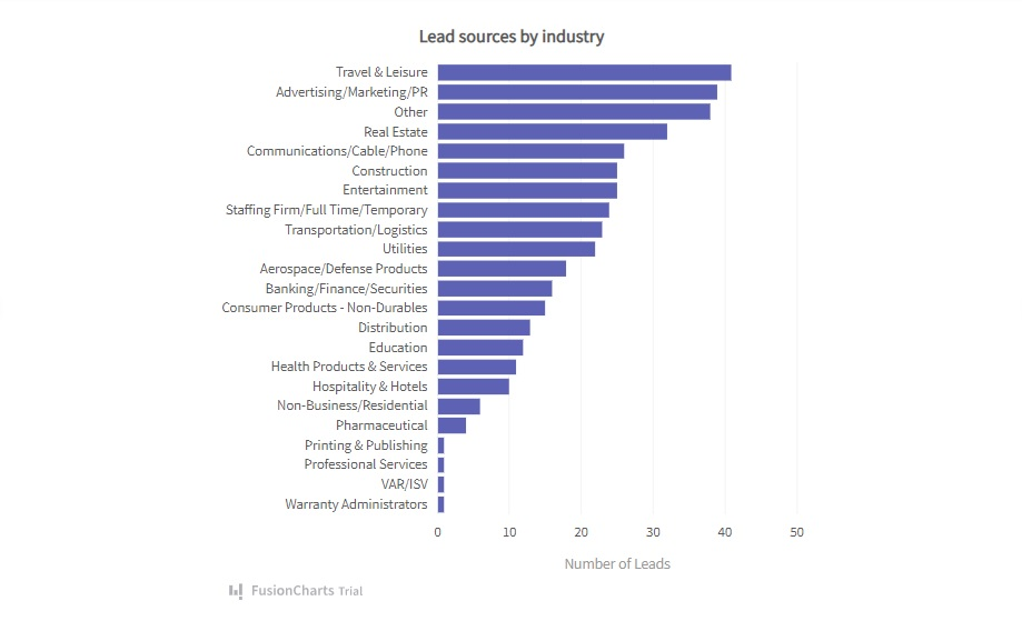
As you can see, FusionCharts makes it really easy to visualize data. You just need to write a few lines of code to create various types of charts. It can make your life a lot easier.
Chart.js – A Lightweight, Open Source JS Chart Library
Chart.js is a popular open-source JavaScript library. It’s very small in size (only 60 kb). Hence, it is lightweight and fast. Chart.js offers eight different types of charts. It includes radar charts, inline charts, pie charts, bar charts, scatter plots, area charts, bubble charts, and mixed charts.
Chart.js supports advanced animation features. Hence, it can flawlessly give transitions of every property in every element. Also, Chart.js offers user-friendly documentation. It provides samples for every chart type. Therefore, you can easily visualize data the way you like.
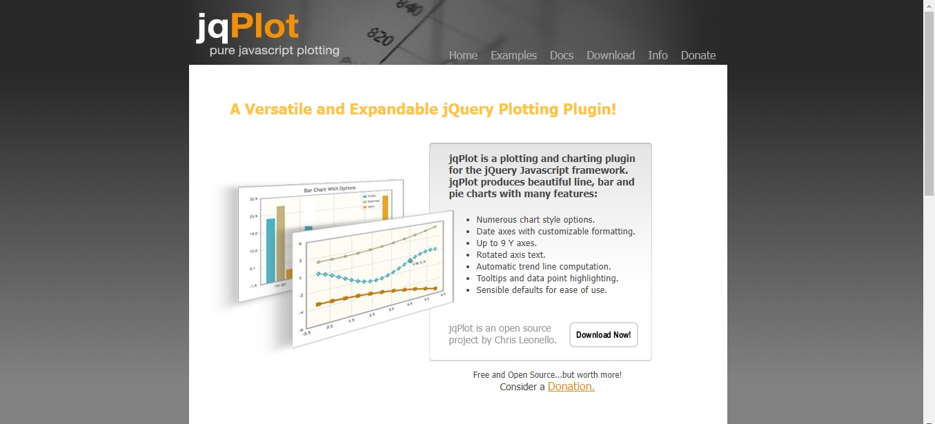
jqPlot – Best Open Source JS Chart Library for Dynamic Charts
jqPlot is another great option in the realm of dynamic charts. It renders content as static images. You can dynamically embed them. Therefore, you can update chart data via Ajax. There is no need to refresh the page.
jqPlot offers several chart types. Some of them support hover options. Hence, you can display related data on hover. Also, there are dozens of chart styles. However, the default themes seem to be bland. Therefore, you will need to put up a little effort to make it nice for your web apps. Nonetheless, it’s one of the best JS chart solutions out there.
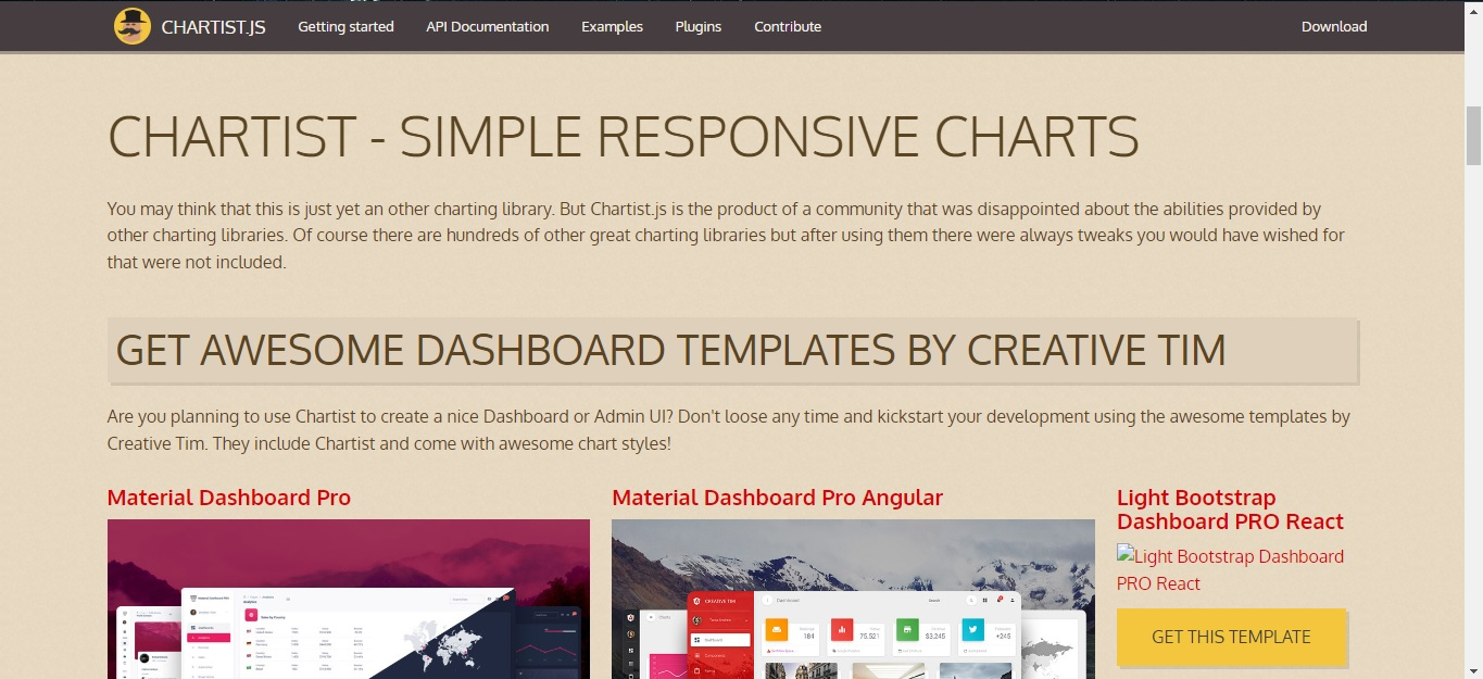
Chartist.js – Another Great Open Source JS Chart Library
Chartist.js is a simple JavaScript animation library. It enables you to create beautiful responsive charts. Chartist.js is an open-source JS chart library. It is available under the WTFPL or MIT License.
A group of dissatisfied developers created the library. They were not happy with the functionalities of the existing charting libraries. Hence, they come up with Chartist.js to offer amazing features to designers and developers.
Chartist.js is very easy to use. You just need to include the library and its CSS files in your project. Once it’s done, you can start building various types of charts, including bar charts and line charts. Chartist.js utilizes SVG to dynamically render the charts. Also, it supports amazing animations.
Here is an example of code that draws a pie chart using the library:
<!DOCTYPE html>
<html>
<head>

    <link href="https//cdn.jsdelivr.net/chartist.js/latest/chartist.min.css" rel="stylesheet" type="text/css" />

    <style>
        .ct-series-a .ct-slice-pie {
            fill: hsl(100, 20%, 50%); /* filling pie slices */
            stroke: white; /*giving pie slices outline */
            stroke-width: 5px;  /* outline width */
          }

          .ct-series-b .ct-slice-pie {
            fill: hsl(10, 40%, 60%);
            stroke: white;
            stroke-width: 5px;
          }

          .ct-series-c .ct-slice-pie {
            fill: hsl(120, 30%, 80%);
            stroke: white;
            stroke-width: 5px;
          }

          .ct-series-d .ct-slice-pie {
            fill: hsl(90, 70%, 30%);
            stroke: white;
            stroke-width: 5px;
          }
          .ct-series-e .ct-slice-pie {
            fill: hsl(60, 140%, 20%);
            stroke: white;
            stroke-width: 5px;
          }

    </style>
     </head>

<body>

    <div class="ct-chart ct-golden-section"></div>

    https://cdn.jsdelivr.net/chartist.js/latest/chartist.min.js

    <script>

      var data = {
            series: [45, 35, 20]
            };

      var sum = function(a, b) { return a + b };

      new Chartist.Pie('.ct-chart', data, {
        labelInterpolationFnc: function(value) {
          return Math.round(value / data.series.reduce(sum) * 100) + '%';
            }
              });
     </script>
</body>
</html>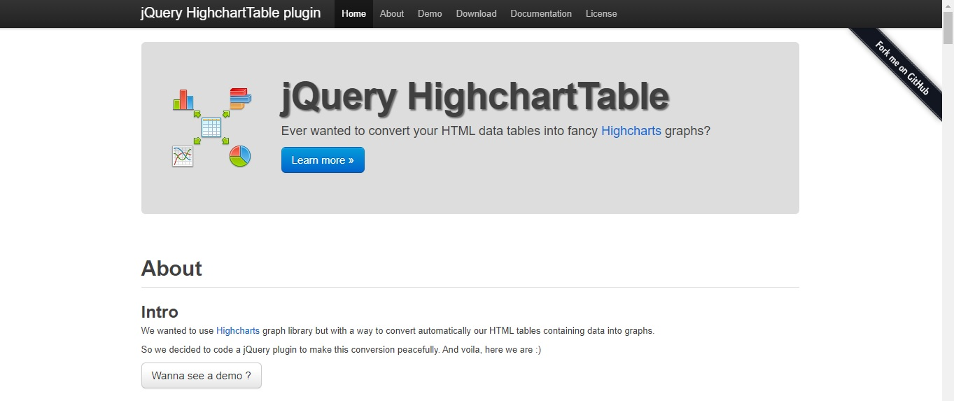
HighchartTable – An Amazing Open Source JS Chart Library
The name HighchartTable might sound a bit confusing. You might feel that it’s a solution for displaying HTML tables. But in reality, it’s a jQuery plugin for transforming tabular data into graphs.
HighchartTable is based on another library, named Highcharts. To make HighchartTable work, you will have to include the two free dependencies. Once it’s done, you can set up an HTML table. Then you can convert the design into a fully-fledged chart. It’s an amazing open-source JS chart library.
Read: 25 Best Javascript Libraries To Find In 2026
xCharts
xCharts is an open-source JS chart library based on D3.js. It can efficiently render in-page graphics and dynamic visuals. It is suitable for advanced users with good data visualization knowledge.
In xCharts, everything is written using plain JavaScript with array values for the content. It offers tons of samples. Hence, you can quickly create visualizations. Also, everything rendered through xCharts is customizable. You can easily add your own animations.
Read: Creating a map with the JavaScript charting library
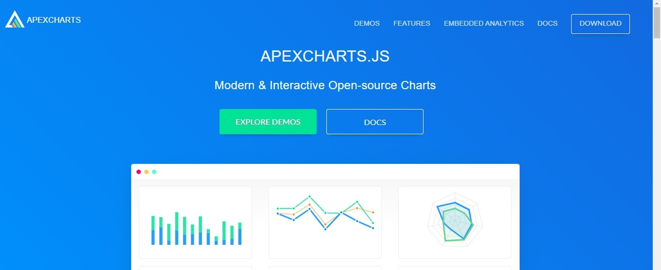
ApexCharts.Js
ApexCharts is a modern open-source JS chart library. It comes under the MIT license. Hence, it is free to use, even for commercial purposes. It enables you to easily create stunning visualizations for your application.
ApexCharts offers smooth and interactive animations. It can smoothly change datasets and load dynamic data. Also, it offers over 10 color palettes for the predefined color theme. On top of that, ApexCharts provides user-friendly documentation. It can help you to get started quickly.
Developers around the world love to use ApexCharts. It has 1 million+ monthly downloads. Also, it doesn’t require you to make any registration to get the JavaScript charting library.
C3.js
C3.js is another open-source chart library. It is based on D3.js. C3.js simplifies the way of rendering data charts onto the HTML page. It doesn’t require you to use a lot of custom D3 code. Hence, it is very easy to use.
C3.js is a highly customizable open-source JS chart library. You can customize everything from tooltips to graph colors. Also, C3.js is very easy to understand, especially for new developers. It won’t take long for you to pick up the library.
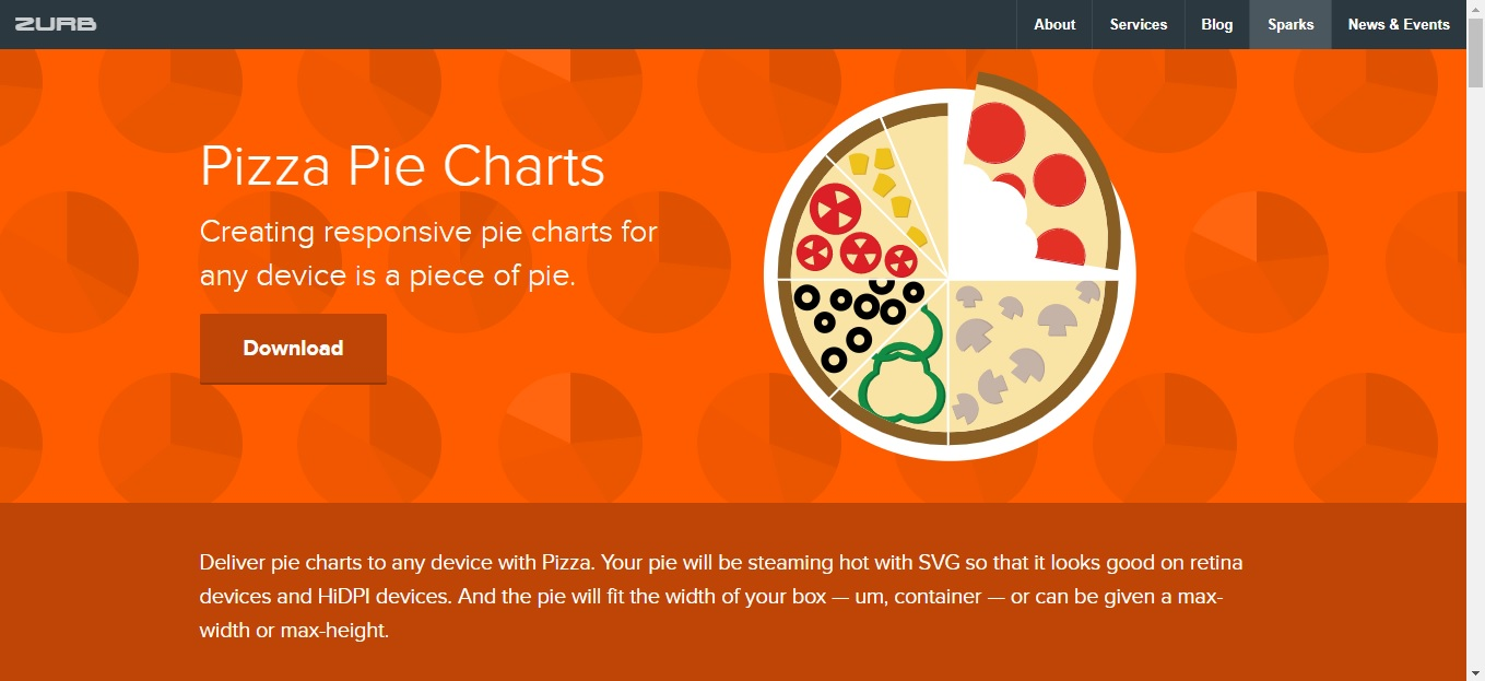
Pizza Pie Charts
Pizza Pie Charts is a well-known JavaScript library. It enables you to render SVG-based pie charts. It is highly customizable. You can modify display settings and other options using CSS or JavaScript.
The library has been developed by Zurb. The company has a reputation for utilizing trusted sources and quality code. Therefore, you can expect to get high performance and reliability. However, keep in mind that the Pizza Pie Charts library is best for rendering data into pie charts. For other chart styles, you should go for another solution.
Read: List of the best JS charting libraries
Flot
Flot is a plugin for jQuery. It offers a set of diverse features. By utilizing them, you can efficiently create data visualization.
Flot helps you to easily create animated plotting diagrams. It allows you to move data through a stream representing large groups of various results. It is suitable for engineering and scientific applications.
Conclusion
Now, you have found the best open-source JS chart for 2026. Therefore, you can start building amazing visualizations. However, make sure that the JS chart solution that you are choosing matches your project requirement. For example, Pizza Pie Charts is amazing for creating pie charts. However, it’s not suitable for other types of charts. If you need versatility, the best JS chart solution is FusionCharts. Because it supports all sorts of chart types, like line graphs, bar graphs, scatter plots, etc. Also, FusionCharts provides comprehensive documentation, strong community support, and tons of live code examples. Therefore, you can rely on it.
FAQ
What are JavaScript chart libraries?
The Javascript chart libraries are collections of visualization resources. They enable you to easily create various types of visualizations. Examples include line graphs, bar charts, and scatter plots.
What are interactive charts?
An interactive chart is a form of data visualization. It presents data in different stages. Hence, you can effectively emphasize the relationship between groups of information. For instance, you can use interactive visualizations to show data, like sales by the group over time and expenses by department.
What is data visualization?
Data visualization refers to the process of translating information into a visual context, such as a map or graph. It enables you to quickly understand complex information.


