
One cannot overemphasize the importance of data-driven decisions in a fast-paced economy. Consequently, businesses today leverage a JavaScript chart library to create maps to better analyze and represent geographically related data. Therefore, enabling users to understand and infer business values easily. In this article, you’ll learn how to create maps using a JavaScript charting library.
Before diving into this article’s nitty-gritty of creating maps with a JavaScript chart library, let’s discuss some prerequisites.
Table of Contents
Are You Using the Right JavaScript Charting Library?
First and foremost, you need to answer the question; what does “right” mean to me? Is it aesthetics, performance, speed, sturdiness, reliability, first-class technical support, ease of use, community support, pricing, device support, or a host of features? Would you be more efficient with a one-trick pony or a more streamlined solution?
The bottom line is that the “right” JavaScript charting library would be unique to the project it is meant for and the user’s needs. In other words, you need to consider factors like your end-users, rendering capacity, the platform you use, and the maps you want to produce, among others.
Do you require any extra services in addition to the charting library? More outsourced developer ability to jump-start your project or create a specific feature for you? These are essential consideration points, because certain JavaScript chart library providers, for example, FusionCharts, offer these services and can help you save time and resources.
However, to simplify the process of choosing the right JavaScript charting library, we compared the features of the top JavaScript real-time chart libraries. We found that FusionCharts offers all the core features for creating maps, alongside other unique features. In that case, we’ll use FusionCharts as this article’s case study.
What Are The Steps For Creating Maps Using Your JavaScript Charting Library?
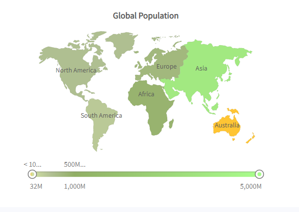
For a visual explanation of how you can create maps using FusionCharts, we’ll be plotting a map showing the population of different continents in the world. The following table lists the data of the continents we’ll be plotting.
| CONTINENT | POPULATION (Million) |
| North America | 515 |
| South America | 373 |
| Asia | 3875 |
| Europe | 727 |
| Africa | 885 |
| Australia | 32 |
Technically, there are four steps to creating maps using FusionCharts.
1. Convert Your Data To XML Or JSON
FusionCharts does not read tabulated or listed data. However, it recognizes both XML and JSON files. Therefore, you must convert your data to either XML or JSON format. Below are the XML and JSON representations of the data above:
JSON
{

    "chart": {

        "caption": "Global Population",

        "theme": "fusion",

        "formatNumberScale": "0",

        "numberSuffix": "M"

    },

    "colorrange": {

        "color": [

            {

                "minvalue": "0",

                "maxvalue": "100",

                "code": "#D0DFA3",

                "displayValue": "< 100M"

            },

            {

                "minvalue": "100",

                "maxvalue": "500",

                "code": "#B0BF92",

                "displayValue": "100-500M"

            },

            {

                "minvalue": "500",

                "maxvalue": "1000",

                "code": "#91AF64",

                "displayValue": "500M-1B"

            },

            {

                "minvalue": "1000",

                "maxvalue": "5000",

                "code": "#A9FF8D",

                "displayValue": "> 1B"

            }

        ]

    },

    "data": [

        {

            "id": "NA",

            "value": "515"

        },

        {

            "id": "SA",

            "value": "373"

        },

        {

            "id": "AS",

            "value": "3875"

        },

        {

            "id": "EU",

            "value": "727"

        },

        {

            "id": "AF",

            "value": "885"

        },

        {

            "id": "AU",

            "value": "32"

        }

    ]

}
XML
<chart caption="Global Population" theme="fusion" formatnumberscale="0" numbersuffix="M">
<colorrange>
<color minvalue="0" maxvalue="100" code="#D0DFA3" displayvalue="< 100M" />
<color minvalue="100" maxvalue="500" code="#B0BF92" displayvalue="100-500M" />
<color minvalue="500" maxvalue="1000" code="#91AF64" displayvalue="500M-1B" />
<color minvalue="1000" maxvalue="5000" code="#A9FF8D" displayvalue="> 1B" />
</colorrange>
<set id="NA" value="515" />
<set id="SA" value="373" />
<set id="AS" value="3875" />
<set id="EU" value="727" />
<set id="AF" value="885" />
<set id="AU" value="32" />
</chart>
2. Include The FusionCharts Library On Your HTML Page
Like any other JavaScript library, you must add the script tag onto the HTML page you want to display your map. Here’s how you can add the FusionCharts library:
<head>

    <title>A Data Driven Map</title>

    https://fusioncharts/fusioncharts.js

    https://fusioncharts/themes/fusioncharts.theme.fusion.js

</head>
3. Create A Container For Where You Want To Place Your Map On Your Page
You can do this using the HTML <div></div> tag, as shown below:
<body>

    <div id="chart-container">A world map will load here!</div>

</body>
4. Create An Instance Of The Map
To do this, house your map in a variable. For our example, our variable would be “populationMap.” Specify your map attributes (width, height, etc.), set color range, and set the JSON or XML data source. Note that each map must have a separate variable. Also, you must wrap your instance in the FusionCharts.ready() function to ensure it isn’t called before the FusionCharts library loads.
Here’s the code for our example:
FusionCharts.ready(function() {

    var populationMap = new FusionCharts({

        type: 'maps/world',

        renderAt: 'chart-container',

        width: '800',

        height: '550',

        dataFormat: 'json',

        dataSource: {

            "chart": {

                "caption": "Global Population",

                "theme": "fusion",

                "formatNumberScale": "0",

                "numberSuffix": "M"

            },

            "colorrange": {

                "color": [{

                    "minvalue": "0",

                    "maxvalue": "100",

                    "code": "#D0DFA3",

                    "displayValue": "< 100M"

                }, {

                    "minvalue": "100",

                    "maxvalue": "500",

                    "code": "#B0BF92",

                    "displayValue": "100-500M"

                }, {

                    "minvalue": "500",

                    "maxvalue": "1000",

                    "code": "#91AF64",

                    "displayValue": "500M-1B"

                }, {

                    "minvalue": "1000",

                    "maxvalue": "5000",

                    "code": "#A9FF8D",

                    "displayValue": "> 1B"

                }]

            },

            "data": [{

                "id": "NA",

                "value": "515"

            }, {

                "id": "SA",

                "value": "373"

            }, {

                "id": "AS",

                "value": "3875"

            }, {

                "id": "EU",

                "value": "727"

            }, {

                "id": "AF",

                "value": "885"

            }, {

                "id": "AU",

                "value": "32"

            }]

        }

    });

    populationMap.render();

});
Here’s our map:
Ready To Create Your Own Maps?
Maps as a data visualization tool enable the analysis and representation of geographically related data. This method of expression makes it easier for stakeholders to infer values and make data-driven decisions. However, the JavaScript charting library you use should be one with a comprehensive map library, amongst the other capabilities mentioned in this article. You should be able to find the appropriate map for the region you’re representing.
FusionCharts boasts an extensive map library of more than 1150 interactive maps. These include all the continents and major countries. Additionally, FusionCharts provides powerful ready-made JavaScript maps you can quickly add to your projects. You can download the FusionCharts XT Suite to get started.


