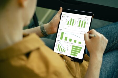
With the global availability of massive volumes of data, the value and importance of data visualization tools have skyrocketed. These tools empower managers, data scientists, executives, and other personnel to keep tabs on their organization’s progress. As a result, using powerful and effective data visualizations, CEOs and company executives can track and monitor key performance metrics and make important decisions.
When it comes to data visualizations, FusionCharts is a powerful charting and graphing library that helps you create beautiful and engaging data presentations. Moreover, if you are a React developer, there is an out-of-the-box React component for all types of data visualizations. It supports a wide variety of React charts, graphs, and maps.
Here are 12 tips to make a powerful React graph using the FusionCharts React component.
Table of Contents
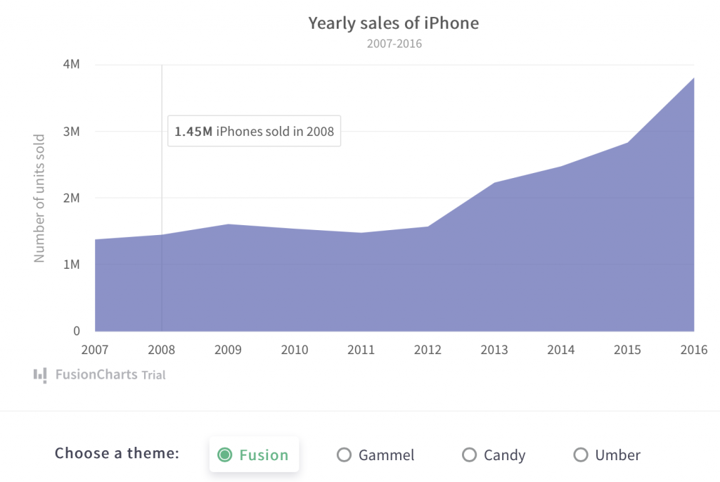
1. Which React Graph Should I Use To Show Trends Over Time?
Use area charts to show trends over time without emphasizing the individual data points. Data values are plotted and connected using straight lines in an area chart. The area enclosed by the X-axis and data values is filled with color. Here is an example of a React area graph that shows yearly sales.
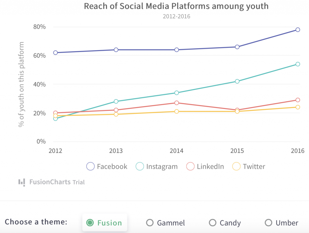
2. Which React Graph Should I Use to Represent Continuous Data Over a Continuous-Time Period?
A line chart is the best React graph for depicting continuous data over time. Line charts connect and plot Data values using line segments. This chart type is popular for showing continuous values such as foreign currency rates and hourly temperature fluctuations as well as daily earnings, and more. You can also use a multi-series line chart to show multiple data series on the same graph. This makes it especially easy to compare different parameters. Below is an example of a line chart with multiple series.
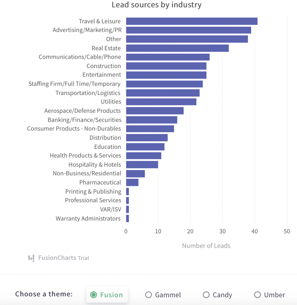
3. How Do I Represent Quantitative Information Using a React Graph?
A 2D bar chart is an ideal visualization for quantitative information. It shows data values by proportionately changing the length of horizontally aligned rectangular bars. This way, one axis of the graph represents a category, and the other represents quantitative information. This also makes a 2D bar chart an ideal visualization for comparing different categories. An example of a 2D bar graph is shown below:
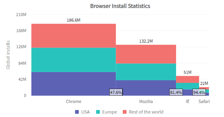
4. When Should I Use a Marimekko React Chart?
Marimekko charts typically visualize sales data as well as enable market analysis. This is because Marimekko charts display categorical data over several variables. The X-axis and Y-axis show the percentage relationship between data values using varying widths and heights. They also show the relationship between the sums of values within different categories along the X-axis with varying column widths. Below is a comparison of varying browser statistics in different parts of the world.
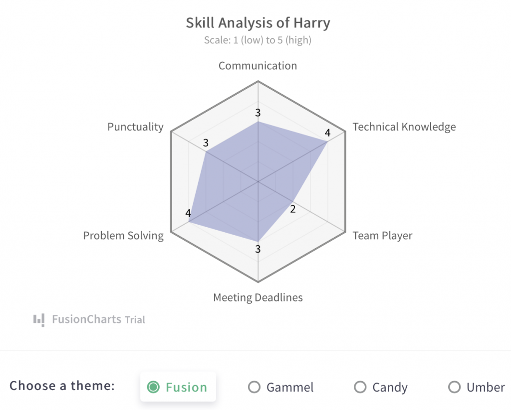
5. What are Radar Charts Used For?
Radar charts or spider charts represent data with multiple dimensions. They use a radial grid-like structure with the values from different categories on the chart’s axis. An example of a radar chart created using the FusionCharts React component is shown below:
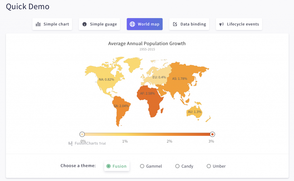
6. How Do I Show Location-Based Data Using a React Graph?
FusionCharts also has map graphs to show location-based data. Each map presents data about different locations using different colors. The FusionCharts React component supports 2000+ choropleth maps. Check out the example of a world map depicting annual population growth. You can also use the slider to study different portions of data.
7. Does Your React Graph Update in Real-Time?
Your React graphs should not be static entities. Instead, they should update themselves after a set interval. With the React FusionCharts component, you can create live or data streaming charts that automatically fetch data from the server and update without manual page refreshes.
8. Have You Added an Interactive Legend to React Graph?
You can add interactive legends to your Reach graph with the FusionCharts component. Interactive legends help you turn off/on or highlight a data series by clicking on the legend. This is another very useful feature that allows users to focus on different parts of data without distractions.
9. Can You Add Drill-Downs in React Graphs?
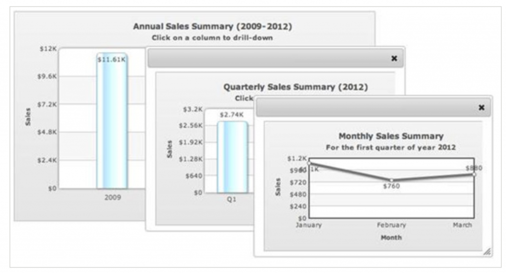
Yes, indeed! FusionCharts React component fully supports drill-downs. Drill-down interactivity lets each data point act as a hotspot. Depending on your requirements, when a user clicks a data point, you can open a descendent chart in a new window or add a tooltip to show more information.
10. Can the User Pan, Scale, and Zoom in a React Graph?
Again yes! All FusionCharts React graphs have panning, scaling, and zooming. This is especially useful when you have a large number of data values to display. Users can zoom out to get a holistic view of the data. They can also zoom in and look at only specific parts of data.
11. Is Your React Graph Interactive?
All React graphs created using the FusionCharts React component are interactive as well as responsive by default. You can also configure the React graph to override default behavior using the FusionCharts APIs. Finally, you can capture Mouse events, keyboard presses, data events, and more to create a customized response using our event handler.
12. Are You Importing Your React Graph?
FusionCharts offers an awesome ability to export a snapshot of your React graph using FusionExport. You can give your end-users the option to export the React chart to .pdf, .jpg, and .png, in addition to other formats. Users can easily export the graph to an email-ready format and disseminate it for further sharing and discussion.
Which Library Offers the Best Ready-to-Use Solution to Create React Graphs?
FusionCharts is a beautiful data visualization library. With more than 200 charts and more than 2000 map options, FusionCharts is the best charting and graphing library that offers a ready-to-use solution to create React graphs. In addition, the React component is easy to use, enabling you to get your data science and data visualization application up and running in no time.
Don’t miss out on the best charting library. Download FusionCharts today and get started!


