It isn’t a stretch to assert that data fuels today’s technological advancements. Individuals and teams in different industries leverage data to understand their markets better and improve their products. Making this happen requires data with varying levels of detail. In most cases, this means enormous datasets. Simply put, our era is the era of big data.
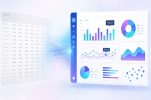
The rise of big data has pushed us to ensure that our data technologies are robust enough to manage gigantic amounts of data. In addition to improvements in the way we process and store data, the way we visualize big data visualizing big data is important. Since single visualizations are not up to the job, most companies need a collection of multiple visualizations presented on dashboards.
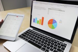
With big data dashboards, you can observe multiple facets of your data and explore trends in a single place. As a result, dashboards are critical to effective, analytics-driven decision-making. That is why data visualization tools like FusionCharts offer extensive dashboarding features for many different use cases.
This article takes you through some of the lesser-known details behind big data dashboards. Hopefully, this information will help you utilize your dashboard creation skills to build better and more effective dashboards that help achieve better productivity.
Table of Contents
What Are Some Lesser-known Facts About Dashboard Creation?
Is TMI a real thing?
Dashboards capture changing data trends and illustrate how your data evolves. Most people, however, make the mistake of including too much content during the dashboard creation process. As a result, their final product streams large amounts of data that compromises dashboard performance. In addition, users find the dashboard cluttered and unappealing. Because of these distractions, your dashboard fails to accomplish its primary goal.
Why Is Audience Crucial?
Knowing your audience is a fundamental factor in the dashboard creation decision-making process. After all, your dashboard is a resource for your audience — keep them in mind! Audience characteristics like data literacy, technical comprehension, and professional experience should inform your design decisions. You need to understand your audience and use your dashboard to make more effective instances.
How Can You Automate your Dashboard Creation Process?
Dashboard creation technologies have advanced significantly. They have shifted from simple data storytelling tools to proper analytics and exploratory tools. Many dashboard libraries can now automate the dashboard creation process. Steps like sourcing data, shaping it for visualization, creating reports, and sharing all happen without your intervention.
Why Do You Need a Clear Goal?
When you create something as technical and complex as a big data dashboard, it is easy to get distracted and lose focus on its primary purpose. In addition, trying to do too many things will take a toll on your dashboard’s final quality. Because of this, when you create a dashboard, keep a close eye on your primary goals, like educating your audience or forecasting data trends.
Why Is Color Theory Important?
A dashboard is a collection of data visualizations, and its appearance plays an essential role. After you choose the right charts and graphs, choose the right colors. Similarly, poor color choices are distracting and unpleasant to look at. The takeaway here is that you need to put in some time to learn about color theory and what colors play well together.
Why Predefined Templates are a Good Idea?
Many people think you need to create dashboards from scratch to ensure they suit your purpose. In reality, however, most scenarios don’t require all that extra effort. Usually, a pre-developed template will do just fine. With this in mind, always check whether or not there is a template you can use. It will save you time and effort. Many templates also have pre-configured processes, so you save on that effort.
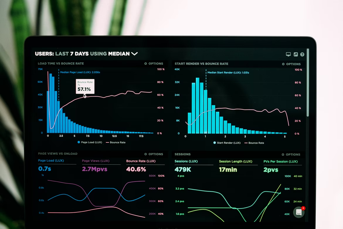
Why Interactivity Boosts Dashboard Quality?
Most people focus on ensuring their dashboards are visually pleasing. While this is important, however, simply creating static dashboards is just dull. Your audience wants charts and graphs to explore to understand your insights better. Make interactive dashboards to achieve this additional level of user experience and deliver more value.
Why Design Decisions Make Or Break Your Dashboard?
When you begin the dashboard creation process, you start with a blank canvas. Then you populate it with visualizations and metrics. The approach you take to populating the dashboard significantly affects its quality. Cluttering the space, non-symmetrical layouts, and a lack of consistency with your design choices kill your dashboard’s appeal. Be consistent and avoid clutter when placing your graphs throughout the dashboard.
Why Giving Numbers Context Good For Better Intelligibility?
If there is one element your dashboard creation process won’t lack, it is numbers. Numerical figures are central to data visualizations, so you must ensure you communicate them appropriately. Add extra details about your numbers. Explain to your audience why they are relevant to your overall data story. Understanding specific numbers on a dashboard can get confusing, and additional information can greatly help intelligibility.
Why Provide An Overview And Zoomed Perspective?
To simplify the database creation process, you can use this popular approach to ensure that you don’t compromise the quality of your dashboard. First, you provide an overview of your data and its trends. Then, after giving a holistic picture, you can start zooming in on or filtering out specific details to better present your data from up close. Finally, make your dashboard interactive, so your audience can explore it.
Why Inclusivity Is Rarer Than You Think?
When you manage so many details and elements during the dashboard creation process, it can be easy to miss out on minor aspects like inclusivity or preparing your dashboard for use by disabled audience members. It doesn’t take any extra effort, but, as an example, choosing the right colors means people that are color-blind can use your dashboard.
How Can You Collaborate On Dashboard Creation?
Most good dashboard creation tools encourage collaboration. You can use these features to get an alternative perspective and catch what alone you might miss. This can ensure that the dashboard delivers on all fronts.
How to Continue to Evolve Your Dashboard?
Although your dashboard may seem finished after you have put time and effort into constructing it, it is still incomplete. Therefore, it would help if you gather feedback to improve it further. Feedback is critical to enhancing your dashboard creation skills. For example, look at how different audience segments react to your dashboard and consider what elements you could add or remove to improve that reaction.
Many of these tips and tricks are often overlooked in the dashboard creation process. What is also often taken for granted is the tool you choose to help you create interactive and eye-catching dashboards. If you want to up your dashboard game, choose FusionCharts for powerful big data dashboards. FusionCharts has an enormous library of visualizations to choose from. With FusionCharts, you and your dashboards will hit it out of the park every time.
Ready to create interactive and aesthetically pleasing dashboards? Start using FusionCharts today and visualize data in the most efficient way.