
You interact with charts daily as you read the news, attend meetings, review sales numbers, forecast projections, and set targets. It is likely, however, that you rarely stop to think about what makes these sometimes-drool-worthy pieces of information so pervasive in the media and business spaces. Well, the explanation is simple: how you display data is just as important as the data you display. Charts are a way of organizing presenting information that makes it meaningful and easy to understand.
With that in mind, let’s take a look at five different charts you can utilize to supercharge your analytics and data visualization efforts with our powerful data visualization tool. We will look at treemaps, bubble and Marimekko charts, as well as Sankey diagrams, and finally funnel charts. We take a closer look will deeper dive into each of these charts and see how we can use them to best effect.
Let’s get started!
Table of Contents
How can I visualize my data using treemaps?
Treemapping is a data visualization technique that displays hierarchical data using nested rectangles as a data visualization technique.
A treemap chart represents hierarchical data with branches and sub-branches. You calculate the dimensions and plot colors by associating your variables with each rectangle—each rectangle represents two numerical values. With a treemap, you can theoretically drill down within the data to an unlimited number of levels. This makes it easy to distinguish between categories and data values at-a-glance.
Take a look at the chart sample shown below:
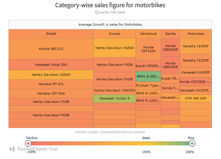
Take a deep dive to learn more about treemap charts.
How can I visualize my data using bubble charts?
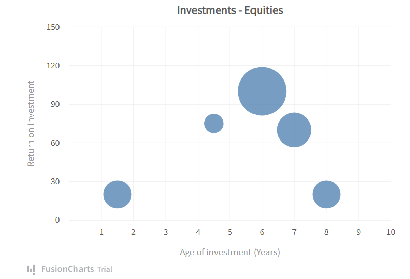
When you have a table with 3 related dimensions of data, how do you represent it on a flat 2D chart? Put three column charts side by side, one for each dimension? Or use two XY-plot charts? You could try, but both of them will be ineffective in putting together all 3 parameters into one elegant visualization.
Say hello to the bubble chart.
Bubble charts/Bubble graphs plot data using three distinct parameters. With bubble charts, you can compare items according to their positions on the axes, as well as their size.
Column and line charts have only 2 axes– a numeric axis and a categorical axis. The Y-Axis is the numeric axis for column and line charts. This means that the quantitative magnitude of the plot is indicated by the position of the plot with respect to the Y-axis.
Bubble charts are different because both axes of a bubble chart are numeric. Hence, the position of the bubble plot indicates two numeric values. The area of the bubble plot (or the scatter blot bubble size) is an indicator of the magnitude of the third numeric characteristic.
Confused, take a look at this example, it will all make sense.
Take a deep dive to learn more about bubble charts.
How can I augment my analytics with a Marimekko chart?
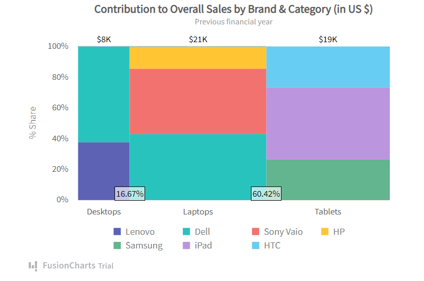
A Marimekko Chart (or Mekko chart) is similar to a 2D Stacked Chart. In addition to depicting data through varying heights (as in a regular Stacked Chart), however, they show an added dimension of data through varying column widths. In the Mekko chart example above, you can get the following data from a single chart:
Contribution of Sony Vaio to the total Desktop Sales (brand-wise contribution in each category )
Contribution of Desktop to the Overall Sales (category-wise contribution to the overall sales)
Let’s add another layer of complexity to our data. Suppose you had different brands in each of the product categories. For example, say you sell Desktops from Lenovo and Dell, Laptops from Dell, Sony Vaio and HP, and Tablets from Samsung, iPad, and HTC. How do you visualize the contribution of each in a single Marimekko Chart?
This is how:
Take a deep dive into building your own Marimekko charts.
How can I utilize Sankey diagrams to turbocharge my data?
Sankey diagrams are a type of flow diagram that shows the flow of material, energy, cost, or any measurable resource, proportional to the flow quantity. They draw the attention of the reader to the largest flows, the largest consumer, the main losses, etc. Mekko charts use different colors, and it is easy to intuitively understand flow quantities that have different dimensions.
Sankey diagrams use links with width proportional to the flow quantity visualized– if a flow is twice as wide, it represents double the quantity. A Sankey diagram has multiple nodes that connect by a link. Each node should only appear once and there can be no more than one link between a pair of nodes. Sankey charts are great for energy efficiency, marketing analysis, supply chain management, production systems, and many other industries.
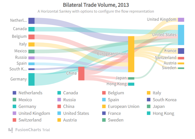
Take a deeper dive into Sankey diagrams and how you can use them effectively.
How can I effectively utilize Funnel charts to display data?
Funnel charts show the progressive reduction of data as it passes from one phase to another. They represent data in each of these phases as different portions of 100% (the whole). Like Pie charts, Funnel charts don’t use axes.
Each stage of the funnel is a part of the total. The first, largest stage is wide and the following stages are each smaller than previous stages. Typically, the first stage, the “intake” stage, is the largest.
Funnel charts are great for visualizing sales conversion data.
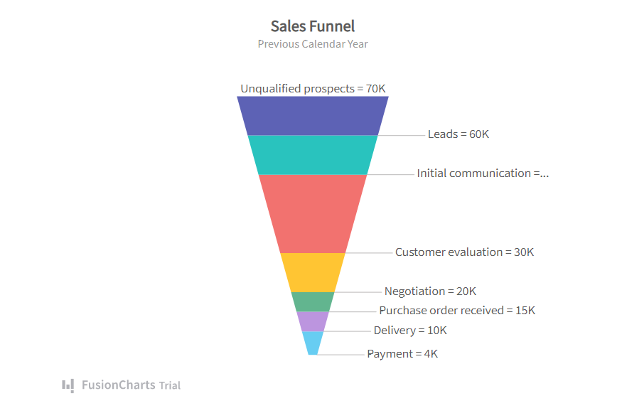
Take a deep dive into Funnel charts and supercharge your data visualization.
Now that we have investigated these 5 different charts for visualizing your data it’s time to take a deeper look at how FusionCharts can bring these charts to your software solutions. FusionCharts helps you build beautiful dashboards for your web & mobile projects. FusionCharts includes the five charting types above, in addition to many more. With extensive documentation, cross-browser support, and a consistent API, it is easier than ever to add interactive and responsive charts. From simple charts like line, column, and pie to domain-specific charts like heatmaps, radar, and stock charts we’ve got you covered.
Get started supercharging your analytics data with FusionCharts today!


