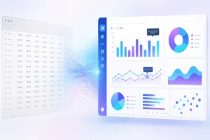
Even if people say that they aren’t important, first impressions are everything. Visual presentation counts. That is why creating amazing visualizations is essential for your data-intensive web applications. If your app doesn’t present your information intuitively and effectively, people will not use it. It won’t survive in a competitive market filled with other, better-designed products.
To create a visually compelling app that presents your data efficiently, you need to choose the right charting components. Hopefully, this post will shed some light on exactly how you can choose the right data visualization tool.
Table of Contents
How Can I Choose the Right Charting Component?
When you are designing your app and looking to select the right charting components, you need to ask yourself several questions:
- Will my app provide cross-platform and cross-browser support?
- Can I implement the component or library into my application easily?
- Which is the most suitable chart type for representing the data appropriately in my app?
- What reporting capabilities does my application need?
- What technical support options do my choices have?
Will My App Provide Cross-Platform and Cross-Browser Support?
Nowadays, people use their software on various devices, including desktop PCs, laptops, smartphones, and tablets. Because of this, any software you design or charting component you choose must be responsive no matter what device people are using. This means having cross-browser as well as cross-platform support. That way, it can run flawlessly on different web browsers and operating systems.
There are two libraries you can choose from when you implement cross-platform charting components:
1. Server-Side Charting Libraries
Server-side libraries accept data on the server through APIs. From that data, they generate charts in the form of images. Because they deliver images that can be scaled, they can also provide the same user experience on different devices. If you are using just one or two charts on your web applications, Server-Side Charting libraries may be the right choice for you. The most popular components for server-side charting libraries are Telerik (.NET), ChartFX (Java and . NET), and pChart (PHP).
2. Client-Side Charting Libraries
The second option is client-side charting libraries that use JavaScript. These libraries create responsive charts using JavaScript/HTML5 based charting components. If you are looking at a chart created by Apple, Google, Microsoft, or one of the other tech giants, they were likely created on the client-side.
There are two types of JavaScript/HTML5 based charting components: Canvas-based components and SVG-based components. In the case of SVG-based components, each of the shapes drawn is remembered as an individual object by the system. Conversely, in the case of Canvas components, only the complete drawing is remembered. As a result, if a user interacts with the chart, the complete graphic gets redrawn. This makes SVG better for creating interactive charts – it draws each shape individually without redrawing everything else after each user interaction.
Can I Implement the Component or Library into My Application Easily?
Nobody wants to spend hours figuring out how to implement their data visualization component or library into an application. On the contrary, what you need is an easy-to-use solution that gets the job done quickly. To achieve this, a well-defined and easy-to-use API will let you effortlessly connect your chart to its data source. Thankfully there are tons of useful APIs available online. The trick is to be sure the API that you choose comes with an easy-to-follow documentation. A well-documented API will make your life a lot easier. It is also a good idea to take a look at real-life examples of an API to give you a clear indication of its suitability for your application.
What is the Most Suitable Chart Type for Representing Data in My App?
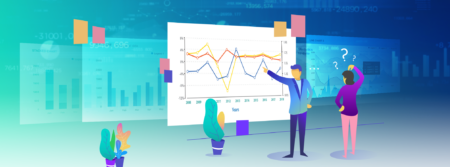
Obviously, there are various kinds of charts, each used for a different type of data analysis. For example, line charts are widely used to analyze trends over time. They help you effectively visualize things like changes in employment rates over the last decade. If you want, however, to understand how a value breaks down into its constituents, pie charting is probably the right choice. Pie charts, for example, can effectively display the breakdown of website traffic into individual sources. It is all a matter of finding the correct context and using the right chart for the job. It is also important to make sure that any charting component you choose supports the chart types you need.
What Reporting Capabilities Can My Application Have?
By utilizing the right chart components, you can provide your users with a rich reporting experience. However, it is important to define what reporting capabilities your users expect. Do your users need to drill down to uncover further information? Simple drill-down is easy to implement. However, the process of multi-level drill-down can be a bit difficult unless you are using the right components. With the right tool, they can be as easy as defining the number of levels of information you need.
How about equipping your chart with zooming and scrolling capabilities? These help you easily display a large number of data points on a single screen. Users can zoom in to view detailed information about a specific data segment. One important thing to remember here is to make sure your component can handle the data label on the X-axis without overlapping or overflowing.
You should also check whether the component allows you to create the custom number scales your application requires. This will allow you to create the appropriate formatting to easily compare data sets. Finally: Do you want editable charts? If you do, make sure that the library that you are evaluating allows users to make the changes to the visualization.
What Are the Available Technical Support Options?
Another consideration to keep in mind is technical support. Often, you can reach out to a community or read technical blogs to fix an issue. If you are on a tight deadline, however, that can be time-consuming. There is also the chance you won’t find a solution to your specific issue online. For this reason, you should choose a charting component that offers personalized technical support from the vendor. It can make your life a lot easier.
Where Can I Find the Right Charting Component?
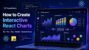
You can find the right charting component for your app at FusionCharts. FusionCharts offers you plenty of useful components to display your data cleanly and dynamically, allowing your users can interact with their chart and find valuable insights both conveniently and effortlessly.