
Most businesses and organizations, big or small, use financial dashboards to measure and manage their key performance indicators. Dashboards track the success of a company. They present data from multiple departments and divisions of a business in a single, complete view. Consequently, executives, CEOs, and other officials gain valuable insights from that data. They pinpoint weak spots and make crucial strategic decisions based on them. FusionCharts is the ideal data visualization package for anyone who wants to create a financial dashboard. This article explains 7 little changes that will make a big difference to your financial dashboard.
Table of Contents
Can you use interactive legends on a financial dashboard?
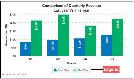
A legend displays the series name for each dataset. Because of this, charts and graphs with interactive legends offer additional value to your financial dashboards. You can use an interactive legend to fade in/out, show/hide, or slice in/out a data plot or a data series. If your data visualization includes numerous data series, the FusionCharts interactive legend allows viewers to focus on a single portion of the data without being distracted. While the legends are interactive by default, users can turn off the interactive legend functionality with a button click.
How important are drill-down charts on a dashboard in finance?
Drill-down charts are vital for financial dashboards since users can view aspects of a single data point from the charts themselves. You can look at the specifics of graphs or charts more clearly using drill-downs. You can also use every data point as a hotspot, thanks to the unique drill-down capability of FusionCharts. Finally, you can even completely tweak their behavior. Based on your needs, when you select a data point, you can also launch a second window with a descendant chart. Tooltips can also show contextual information or launch a URL in a window. You can add many more drill-down levels to your graph as you wish using a single data source.
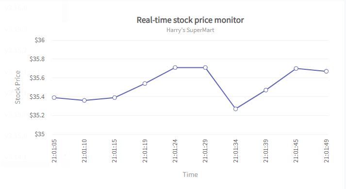
Can I update the charts in real-time on the dashboard?
The real-time dashboard is a style of visualization that updates regularly with current information. All the data visualizations on your financial dashboard should be real-time and dynamic. That is why FusionCharts fully supports real-time charts, commonly known as data streaming charts. These graphs automatically update after each user-defined interval without the need for any page refreshes. Because of this, users can stay informed about any critical performance indicators or parameters changes.
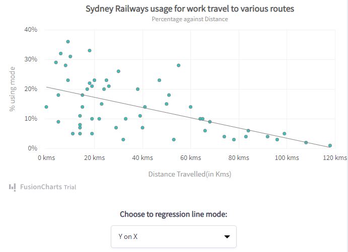
Is it possible to compare the current financial trends in a dashboard?
Users must be able to examine and compare financial patterns and gain relevant insights from the data using financial dashboards. If designed correctly, these dashboards help data analysts make predictions and assist decision-makers to make sound strategic judgments. This, of course, positively impacts the company. In order to support forecasting, charts must support both horizontal and vertical trend lines for data interpretation. These lines are adaptable and establish context. Furthermore, they support limitations and objectives, important for financial dashboards and financial comparisons. You can quickly enable trend lines for your charts and add extra value to them using the trend comparison feature of FusionCharts.
Can I customize charts to be more user-friendly for a dashboard?
When it comes to financial dashboards, users should be able to edit the dashboard based on their requirements. Moreover, you should include all key performance measures, or KPIs, in your financial dashboard. The general idea is to include a unique graph for each key parameter and group similar metrics together in separate charts. All comparison variables and data series must be plotted on the same graph. You can specify several data sources in the financial dashboard using the FusionCharts library. Consequently, you can quickly create a financial dashboard without overcrowded and confusing multiple components.
Can I add and customize the numbers based on the currency requirements in a dashboard?
Basically, financial dashboards are all about numbers formatted based on your requirements. Users should be able to customize these numbers using prefixes and suffixes, decimals, thousands operators, rounding off with trailing zeroes, enabling/disabling automatic formatting of numbers, and scaling following a prescale. You can also include currency symbols, such as £ and €, in the figures presented on charts. Moreover, the ability to format values based on KMB is an additional feature supported by the numberScaleValue attribute of FusionCharts.
Can multiple users collaborate on the dashboard?
A financial dashboard must allow various stakeholders to cooperate, work collaboratively, and discuss ideas. Any administrator or executive viewing the dashboard should be able to comment on a data point or chart, eliminating the need for calls and emails. This functionality transforms a financial dashboard into a social media-like environment where individuals can cooperate, have in-depth discussions, and share their thoughts. It makes the dashboard more interactive, which positively impacts the business. However, all data visualization tools do not offer this functionality. Instead, FusionCharts has a collaborative editing feature that supports the above functionality.
Can we create financial dashboards quickly using FusionCharts?
The experts at FusionCharts have created a wide range of financial dashboards, from sales management and financial assets to advertising opportunity maps. Whatever you desire, our FusionCharts dashboards site will have a dashboard that meets your needs. On top of that, all these dashboards are free and open source. Therefore you can get a head start by downloading the code, customizing it, and creating a robust financial dashboard.
Don’t waste time! Head over to FusionCharts and sign up to enjoy a seamless financial dashboard experience!


