
Table of Contents
Key takeaways of pie chart examples
- Part-to-whole focus: Pie charts work best for showing simple part-to-whole distributions.
- Limited categories: Limit pie charts to five or fewer categories for clarity.
- No 3D effects: Avoid 3D effects to prevent misleading visual comparisons.
- Clear labels: Use labels and distinct colors for accurate interpretation.
Pie charts are ideal for comparing categories and showing part-to-whole relationships. They are simple, visually intuitive, and widely used across industries like business, marketing, education, and finance. In this guide, we explore types, examples, best practices, advantages, limitations, and use cases for 2026.
What is a Pie Chart, its types, and how are they used in 2026?
A pie chart is a circular-shaped chart that visually demonstrates the part-whole relationship of categorical data variables. The circular chart is rendered as a circle that represents the total amount of data while having slices that represent the categories. Each slice in the pie visualizes each variable (or category), with the arc size and length showing its quantity.
Uses Of Pie Chart
Pie charts are essential for data visualization when you’re working with varied data sets and need to compare parts to the whole. Additionally, these charts are easy to interpret and can be utilized in a variety of fields and industries. Here are a few uses of pie charts.
What are the top 4 pie chart examples for 2026?
Here are some pie chart examples and common use cases in different industries.
1. Market Share of Web Servers (2D Pie Chart)
This 2D pie chart shows the market share distribution of popular web servers, making it easy to see which server dominates.
Data table
| Server | Market Share (%) |
|---|---|
| Apache | 44.46 |
| Microsoft | 30.1 |
| Zeus | 0.02 |
| Others | 25.43 |

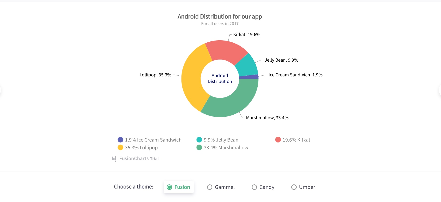
2. Android Distribution (Doughnut Chart)
Doughnut charts emphasize part-to-whole relationships while providing a central space for labeling.
Data table
| Android Version | Distribution (%) |
|---|---|
| Lollipop | 35.3 |
| Marshmallow | 33.4 |
| KitKat | 19.6 |
| Jelly Bean | 9.9 |
| Ice Cream Sandwich | 1.9 |
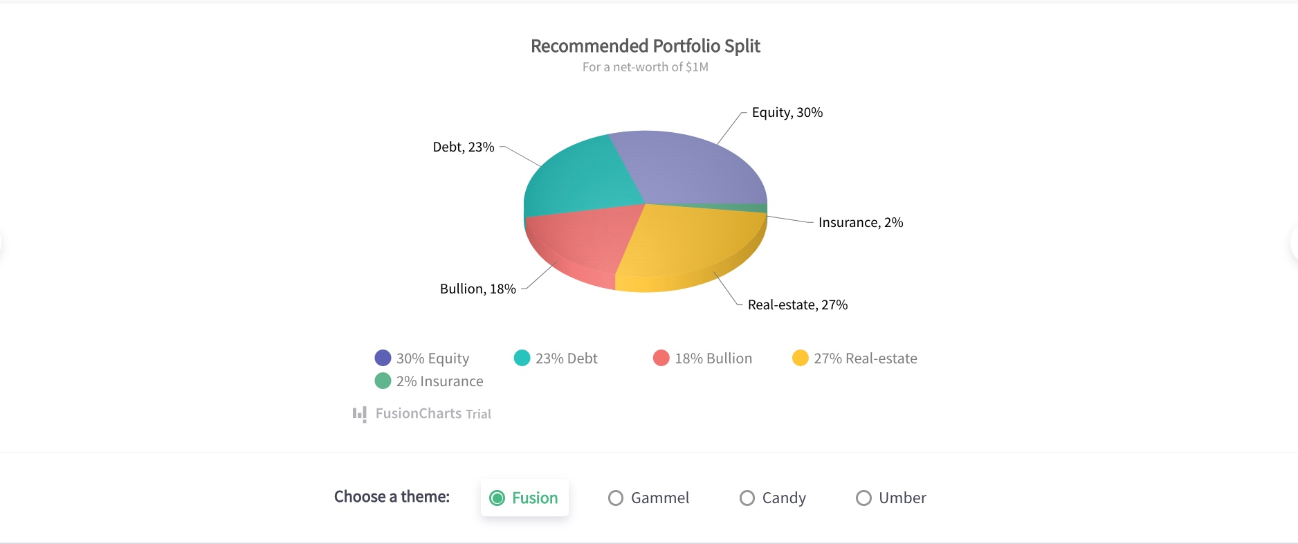
3. Portfolio Allocation(3D Pie Chart)
This 3D pie chart visualizes portfolio allocation across asset classes, emphasizing relative investment proportions.
Data table
| Asset Class | Allocation (%) | Value ($) |
|---|---|---|
| Equity | 30 | 300,000 |
| Real Estate | 27 | 270,000 |
| Debt | 23 | 230,000 |
| Bullion | 18 | 180,000 |
| Insurance | 2 | 20,000 |
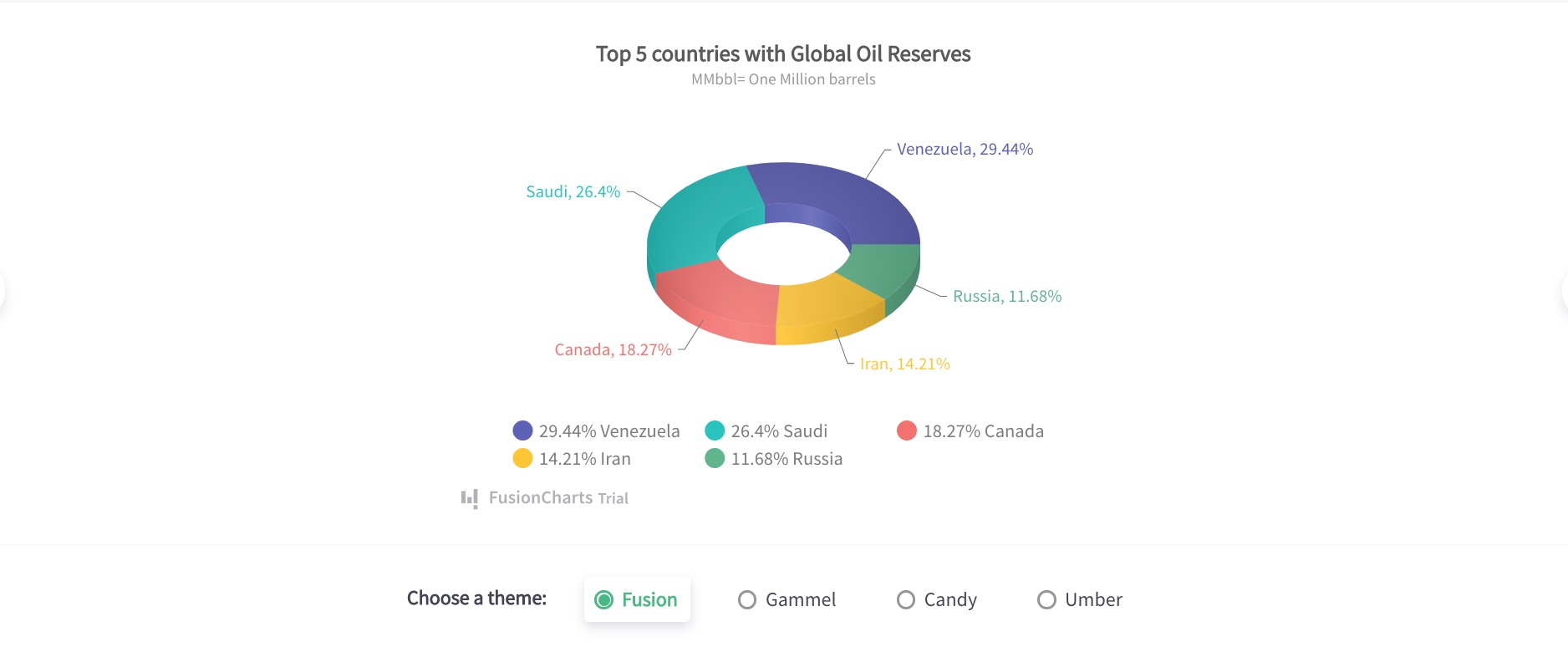
Global Oil Reserves by Country (3D Doughnut Chart)
A 3D doughnut chart highlights the proportional distribution of global oil reserves across leading countries.
Data table
| Country | Share (%) | Reserves (MMbbl) |
|---|---|---|
| Venezuela | 29.44 | 2.944 |
| Saudi Arabia | 26.40 | 2.640 |
| Canada | 18.27 | 1.827 |
| Iran | 14.21 | 1.421 |
| Russia | 11.68 | 1.168 |
What are the tips for understanding pie chart examples?
Here are some major tips to understand and consider when you want to create pie charts.
Avoid negative values
You should avoid using negative values in all the data when you draw your pie chart. Doing this will ensure your pie chart is not affected and your audience isn’t confused during interpretation.
Minimize the number of sections
Having plenty of slices makes the chart cumbersome to understand and is one of the few pie chart disadvantages. It is advisable to draw a minimum number of categories on the circular graph. An ideal range is between 4 and 7 slices.
Use different colors
Slices in pie charts should be distinguished with unique colors. This would make it easy for your audience to differentiate between categories.
Display nominal & original data
Before deciding on using a pie chart, ensure the data categories you need to visualize are nominal and ordinal.
What are the advantages and disadvantages of pie charts?
| Advantages | Disadvantages |
|---|---|
| Easy to interpret | Becomes cluttered with many categories |
| Clear part-to-whole comparison | Not suitable for multiple datasets |
| Effective for percentages | Hard to compare similar-sized slices |
| Visually engaging | 3D effects can distort proportions |
Conclusion
Pie charts remain a powerful visualization tool for part-to-whole comparisons in 2026. When used correctly—with limited categories, clear labeling, and the right chart type—they communicate insights quickly and effectively. The pie chart examples above demonstrate how pie charts can be applied across industries with clarity and precision.
Frequently Asked Questions
Let’s take a look at some commonly asked questions about pie chart examples.
Why do we use pie charts?
We use pie charts to mostly visualize the categories as a proportion of the total value. In a single chart, you’ll find pie slices that represent the percentage of a particular data from the whole pie.
How do you explain a pie chart?
We can describe a pie chart as a full circle divided into areas called slices. Each pie slice in the circle represents a category, and the values of each slice add up to the total. Pie charts are popular in data visualization as a communication tool.
How do you calculate a pie chart?
To calculate the degree for each category, divide the category amount by the total amount and then multiply by 360. Each degree that we obtain for each category is used to create a pie chart.
What are the 2 types of pie charts?
Based on graph dimension, we can group pie charts into two main types namely: 2D pie charts and 3D pie charts.
When should you not use a pie chart?
When working with multiple categories or tracking time-related changes, it is better to avoid utilizing a pie chart as a visualization tool.


