
Table of Contents
Introduction
In a world where we are constantly inundated with how to depict data, it is more important than ever to visualize that data in a way that is easy to understand. A data visualization tool can help you make sense of large data sets, spot trends, and make decisions. There are different ways to visualize data and the best data visualization examples. The right tool for the job depends on the type of data and the question you are trying to answer.
Some common visualization tools include bar charts, line graphs, and scatter plots. With so many choices available, it can be overwhelming to know where to start. This article provides some impressive examples to help you identify the right data visualization tool for your data set.
What is Data Visualization?
Data visualization turns data into a visual representation, such as a graph or chart. Thereby making it easy for stakeholders and decision-makers to identify trends and make data-driven decisions. Data visualization has applications in various industries, including has applications in various industries, including financial, scientific, and social media.
The best data visualization examples have one thing in common— They make it easier for users to understand the following:
- Pattern: The human brain quickly recognizes patterns. Therefore, visual data can help you identify relationships you wouldn’t be able to see just by looking at raw data. For example, you can use a bar chart to determine the sales performance of different products in different locations.
- Trends: The best data visualizations make it easy to identify trends. For instance, if you look at a sales data graph, you can quickly see whether sales are increasing or decreasing. You can also determine the monthly and yearly sales movement.
- Outliers: Data visualization is a powerful tool for outlier analysis. It can help you to identify unusual patterns and trends, and it can also help you to understand the relationships between different variables in your data set.
What are the best data visualization examples?
Take a look at some of the best data visualization examples over the last several years:
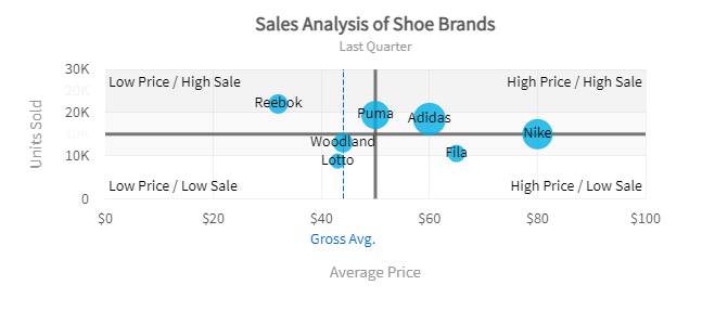
Bubble Chart Visualization
An impressive bubble chart visualization example is the Sales analysis of shoes of different brands for Harry’s SuperMart for a month. An impressive bubble chart visualization example is the Sales analysis of shoes of different brands for Harry’s SuperMart for a month.
Best Scatter Plot
The chart below displays the effect of temperature on beer and ice cream sales revenue.

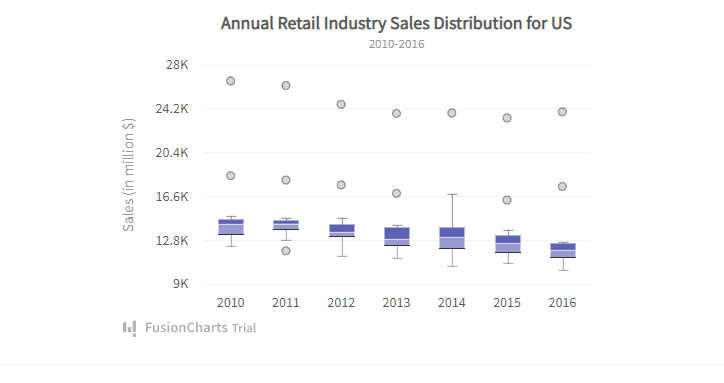
Best Distribution Chart
A box and whisker chart is a great tool for visualizing distributions. An impressive example is the chart below showing US annual retail industry sales distribution.
Radar Chart Visualization
Radar charts have applications in business performance, quality analysis, and product comparison. An example is comparing the results of a customer feedback survey based on five categories.

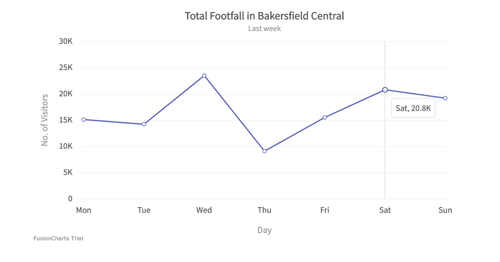
Line Charts Visualization
Line charts may be useful in various contexts, including the analysis of product comparisons, corporate performance, and event and historical data. A typical example can be seen in the chart below, comparing the number of visitors during the week.
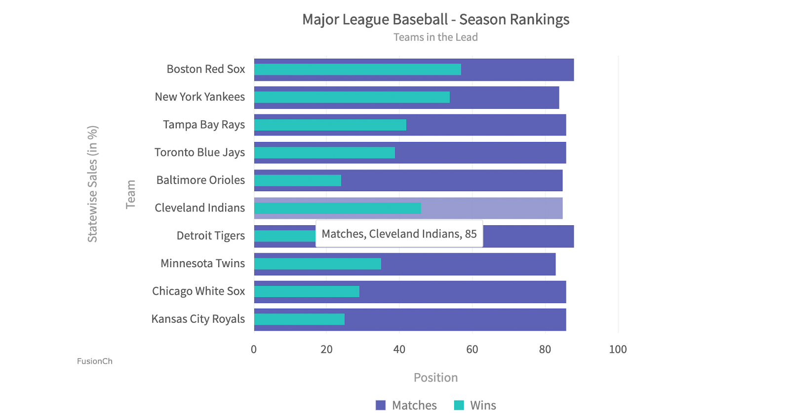
Bar Graph Visualization
In the example below, the bar graph displays the relationship between the number of wins and matches played for each major league baseball team.
What is the importance of Data Visualization?
Data visualization is not just for big businesses. Any company, no matter the size, can use data visualization to improve its bottom line. B2B businesses can use visualizations to make content, and messaging can use visualizations to make content and messaging more engaging and informative. By incorporating charts and graphs into their posts, bloggers can communicate complex ideas more effectively and connect with their readers on a deeper level.
Some general importance of data visualization include:
Easy to Understand
let’s face it, large data sets are often difficult to understand. However, you can easily understand the most complex data sets with data visualization. For example, you can easily represent areas hugely affected by the Covid-19 pandemic using a heat map.
Let’s face it, large data sets are often difficult to understand. However, you can easily understand the most complex data sets with data visualization. For example, you can easily represent areas hugely affected by the Covid-19 pandemic using a heat map.
Spot Patterns
As mentioned earlier, charts and graphs make it easy to spot patterns and identify trends. As mentioned earlier, charts and graphs make it easy to spot patterns and identify trends. This can be extremely helpful in various fields, from spotting trends in the stock market to identifying early warning signs of disease. Identifying patterns can also inform marketing strategies and inform marketing strategies and predictions.
Storytelling Is More Engaging
At a time when human attention is thinly spread across so many things, it’s more important than ever to communicate effectively and efficiently. That’s where the great data visualization comes in. Data visualization is especially well suited to storytelling. A good story can help you make sense of complex data, remember key points, and empathize with the characters involved.
Improve Speed In Decision Making Process
Data visualization is a valuable tool for businesses. It improves the speed of decision-making by allowing managers to spot patterns and data trends quickly. Interactive data visualization can also help businesses identify opportunities and optimize their operations.
What are Common Forms of Data Visualization?
There are different types of data visualization, some of which include:
- Bar graphs: A bar graph is a representation of data using rectangular bars to compare values. The lengths of the bars represent the magnitude of the data. You can use bar graphs to show the relationships between data groups or categories.
- Column charts: A column chart is a graph that shows data using vertical bars. It is often used to compare data among different groups. Column charts are easy to read and understand, making them popular for data visualizations.
- Area charts: An area chart is a two-dimensional graph that uses line segments to connect data points and show areas of the plane that are enclosed by those line segments. The segments can be of any length but are often horizontal or vertical.
- Dual-axis charts: A dual-axis chart is a line graph that uses two independent axes to display data. Dual-axis charts can be used to compare two variables or to show how one variable changes about another.
- Line graphs: A line graph is a data visualization graph that shows how something changes over time. It is made up of a series of points connected by lines. Line graphs can represent changes in weather, population, or sales.
- Pie charts: A pie chart is a circular statistical graphic divided into sectors to illustrate numerical proportions. In a pie chart, the arc length of each sector corresponds to the quantity it represents. Pie charts are popular for showing the proportions of a whole.
- Heatmaps: A heatmap is a graphical representation of data where the individual values contained in a matrix are represented as colors.
- Scatter plot chart: A scatter plot chart, also known as a scatter diagram or a scattergraph, is a type of plot or mathematical diagram using cartesian coordinates to display values for typically two variables for a data set.
What Makes A Great Data Visualization?
Comprehensibility and applicability are two characteristics that are essential for every data visualization tool. However, that is not sufficient.
According to Ben Shneiderman, “The purpose of visualization is insight, not pictures.” Great data visualizations effectively convey the data it represents. This can involve using the right chart type, colors, labels, and legends. Generally, a great data visualization should be easy to understand and interpret.
Let’s see a few points to understand them in detail:
Revealing Complex Connections
- Clarity of Relationships: The visualization should illuminate relationships and patterns within the data, such as correlations, trends, or anomalies, which might be obscured within raw data sets. This clarity helps viewers discern the underlying structures and dynamics, enhancing their understanding.
- Depth of Analysis: A great data visualization allows for deeper analysis by providing interactive elements or multiple layers of information. Users should be able to drill down into specific aspects of the data to uncover insights and explore nuances.
Facilitating Understanding
- Simplicity and Intuitiveness: The visualization should be intuitive and easy to comprehend at a glance. Complex concepts should be distilled into clear visuals, avoiding unnecessary clutter or distractions that could impede understanding.
- Effective Communication: The visual representation should align with the audience’s cognitive processes, leveraging familiar metaphors or design conventions to convey information effectively. Clear labels, annotations, and legends aid interpretation and prevent ambiguity.
- Engagement and Interactivity: Interactive features, such as tooltips, filters, or animation, can enhance engagement and promote active data exploration. Allowing users to manipulate the visualization dynamically encourages a deeper level of engagement and facilitates personalized insights.
Encouraging Informed Decision-Making
- Contextualization: An excellent data visualization provides context around the presented information, helping viewers understand the significance of the data about broader trends, benchmarks, or historical patterns.
- Empowering Action: Beyond mere comprehension, the visualization should inspire action or decision-making based on the insights gained. This could involve highlighting opportunities for optimization, identifying areas of concern, or suggesting potential courses of action.
What are the Principles of Great Data visualizations?
When it comes to data visualization, there are certain principles that you need to follow to create a compelling and impactful visual. Follow the following principles to enhance the look of your data presented:
Defining a Clear Purpose
Data visualization requires a defined goal. This way, you can quickly identify the right data visualization tool for your project. For example, a line chart would be a good choice for spotting trends and outliers. A bar chart would be more appropriate if you want to compare two different data groups.
Know About Audience
The audience is one of the most important aspects when creating interactive data visualizations. It is essential to consider who will view the visualizations of data and their needs.
Remark: Tips for data visualization
What is the Best Tool for Data Visualization?
When we pick the best tool for data visualization, there are a few points to think about:
- Support a wide range of data visualization methods
- Ease of use
- Pricing
- Customer support
- Customization
- Data security
- Ability to share data outside of the tool
FusionCharts
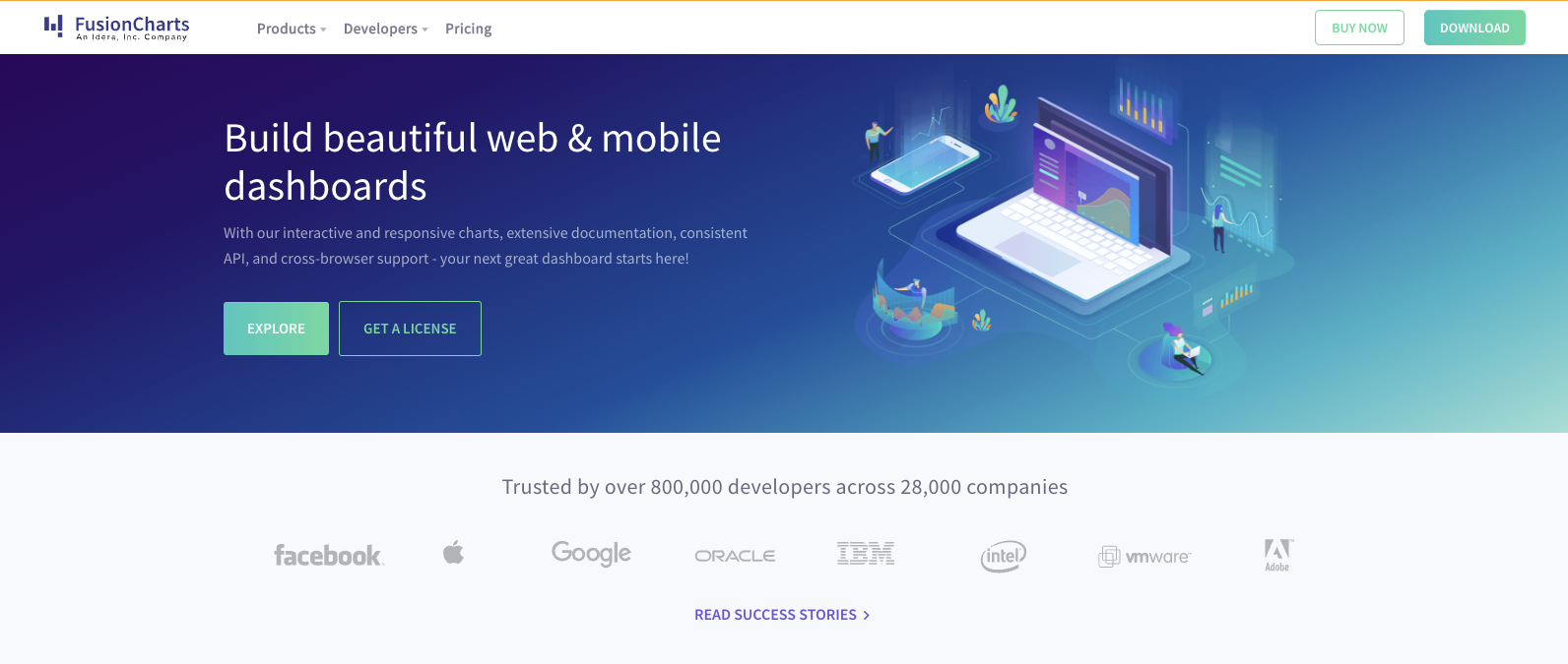
FusionCharts is a powerful and great data visualization tool offering diverse chart types and customization options. It enables interactive and engaging visuals with support for web and mobile applications. Its integration with multiple languages and frameworks makes it versatile, while its user-friendly interface simplifies chart creation. From complex data sets to key performance indicators, FusionCharts helps communicate insights effectively through compelling visuals.
Features
- Diverse chart types
- Extensive customization options
- Interactivity with tooltips, drill-downs, and animations
- Seamless integration with programming languages and frameworks
- Responsive design for optimal display across devices
Tableau
Tableau is a leading data visualization tool renowned for its user-friendly interface and robust capabilities. Seamless integration across various data sources empowers users to craft diverse charts and maps effortlessly.
From desktop to web-based options, its versatility caters to individual users and large enterprises. Moreover, Tableau’s compatibility with advanced databases like Teradata, SAP, and Hadoop makes it indispensable for handling extensive datasets crucial for cutting-edge technologies like artificial intelligence and machine learning.
Features
- Informative dashboards
- Connectivity with live and in-memory data
- Advanced visualization capabilities
- Availability of maps
- Great security
- Easy collaboration and sharing
Google Charts
A free and strong tool for creating interactive charts optimized for online embedding. It seamlessly handles dynamic data and produces outputs in HTML5 and SVG formats, ensuring compatibility across browsers without additional plugins. Offering a broad range of chart types, including maps, scatter charts, and histograms, this great data visualization tool allows for extensive customization through simple CSS editing.
Features
- Customizable Dashboard
- Data Management
- Reporting/Analytics
- Visual Discovery
Plotly
Plotly’s Python graphing library empowers users to effortlessly create interactive, publication-quality graphs. From line plots to bubble charts, it offers a comprehensive range of visualization options catering to diverse analytical needs.
With seamless integration with languages like Matlab, Python, and R, Plotly easily facilitates the creation of complex visualizations. Renowned for its collaborative features and support for both on-premise and cloud deployment, Plotly is a versatile and powerful tool for any scale data visualization task.
Features
- Interactive Visualizations
- Publication-Quality Graphs
- Wide Range of Chart Types
- Integration with Analytics-Centric Languages
Highcharts
A JavaScript-based chart library is simplifying and great data visualization tool across platforms. Its user-friendly documentation and widespread adoption by major companies make it ideal for streaming big data analytics. With support for cross-browser functionality and interactive visualizations, Highcharts offers developers a time-saving solution for creating compelling data visuals.
Features
- Administration via Web Interface
- Live Connection to External Data
- Snapshot of External Data
ChartBlocks
ChartBlocks streamlines chart creation by automatically selecting data segments and managing imports from various sources. With hundreds of customization options and a user-friendly wizard feature, users can swiftly generate and customize charts without needing code.
The platform seamlessly integrates websites, social media sharing tools, and export options for editable vectors and graphics. ChartBlocks provides a hassle-free solution for creating, customizing, and sharing data visualizations.
Features
- Automated data selection
- Extensive customization
- Chart wizard for easy design
- Rapid chart creation
- Versatile data import
- Embedding options for websites
Venngage
Venngage is a user-friendly and versatile data visualization tool designed to help users turn complex information into engaging visuals. With a strong focus on ease of use and customization, it supports various design formats, including infographics, reports, charts, and presentations. Businesses, educators, and marketers use the Venngage infographic maker to simplify data storytelling and enhance communication through visual content.
Features
- AI Infographic Generator for fast and smart visual creation
- Drag-and-drop editor for easy design without technical skills
- Extensive template library for infographics, reports, flyers, and more
- Brand Kit support for consistent branding across all designs
- Collaboration tools to edit and comment with your team in real-time
FusionCharts vs Highcharts & amCharts: A Comparative Analysis
It’s important to weigh the advantages and disadvantages of each data visualization tool available. The comparison between FusionCharts, Highcharts, and amCharts is as follows:
1. Balance of Sophistication
FusionCharts: Strikes a balance between sophistication and simplicity, offering a wide range of advanced features while maintaining user-friendly design.
Highcharts: Known for its sleek and modern visualizations, Highcharts provides sophisticated charting capabilities with a clean and intuitive interface.
amCharts: Offers highly customizable charts with advanced features, targeting users who require extensive customization and functionality, often at the expense of simplicity.
2. Pricing and Flexibility
FusionCharts: This transparent pricing model provides cost-effective and flexible pricing. Annual licenses at $439 per seat include updates and support, making it suitable for teams of all sizes.
Highcharts: Offers annual license options with subscription-based pricing, allowing users to access updates and support for a specified period. However, the pricing may not be as transparent as FusionCharts.
amCharts: The scope and price of amCharts plans are not designed for small teams and may be out of reach for solo or one-person developers, catering more towards larger enterprises with specific customization needs.
3. Ease of Use
FusionCharts: Known for its intuitive interface and extensive documentation, FusionCharts makes it easy for users to create stunning visualizations without a steep learning curve.
Highcharts: Offers a user-friendly experience with a wide range of chart types and customization options, suitable for beginners and experienced developers.
amCharts: While highly customizable, the learning curve for amCharts may be steeper than FusionCharts and Highcharts, requiring more technical expertise to utilize its capabilities fully.
4. Chart Customization
FusionCharts: Provides a wide range of pre-built chart templates and customization options, allowing users to tailor their charts to specific needs with ease.
Highcharts: Offers extensive customization capabilities, enabling users to fine-tune every aspect of their charts, from colors and fonts to animation effects.
amCharts: Known for its unparalleled level of chart customization, amCharts allows users to create highly detailed and interactive visualizations with advanced features like annotations and drill-down capabilities.
5. Community and Support
FusionCharts: Backed by a vibrant community and dedicated support team, FusionCharts offers extensive resources, including forums, and documentation, to help users at every step.
Highcharts: It boasts a large and active community of users and developers, comprehensive documentation, and responsive support channels to tackle any issues or queries.
amCharts: While offering support and documentation, amCharts may not have as large of a community presence as FusionCharts and Highcharts, potentially resulting in slower response times for assistance.
Conclusion
Data visualization is a process of representing data in a visual format. It is an effective way to communicate information to your audience. The right data visualization tool gives you limitless customization control to suit your specific needs. When used correctly, stakeholders and decision-makers can make faster, more informed, data-driven decisions that ultimately boost the bottom line.
Looking to add visualizations to your project? FusionCharts, a javascript charting library with 100+ charts, can help you get started.
Download a trial today
FAQs
👉 What are the best data visualization techniques?
The best data visualization techniques vary depending on the type of data and the message you want to convey. Some effective techniques include bar charts, line graphs, scatter plots, heat maps, and treemaps. Choosing the technique that best represents the data and helps viewers understand the insights easily is essential.
👉 How important is data visualization?
Data visualization is crucial because it allows for the clear and concise communication of complex information. Presenting data visually makes patterns, trends, and relationships more apparent, facilitating better decision-making and understanding. Effective data visualization can lead to insights that drive innovation, improve efficiency, and solve problems.
👉 What should you look for in a data visualization tool?
When choosing a great data visualization tool, consider versatility, ease of use, customization options, interactivity, scalability, and compatibility with data sources and platforms. Additionally, look for features like advanced analytics capabilities, integration with other tools, and responsive design for optimal viewing across devices.
👉 Is Microsoft Excel a good data visualization tool?
Microsoft Excel can be a good data visualization tool for simple or basic visualizations thanks to its familiarity and ease of use for many users. It offers various chart types and basic customization options, making it suitable for straightforward data presentations. However, specialized data visualization tools like Tableau, Power BI, or Python libraries like Matplotlib or Seaborn may be ideal for more complex or interactive visualizations.
Ready to Elevate Your Data Visualization With FusionCharts?
With a plethora of great data visualization tools at your disposal, there’s no limit to what you can achieve with your data. From interactive dashboards to insightful charts, FusionCharts stands out as the top choice for creating stunning visualizations that captivate and inform.
Download FusionCharts to start creating your next great dashboard today!


