This week’s data digest features some unique visualizations, and the big news of Hadoop 2.0’s stable release earlier this month.
Foursquare Visualizes Check-ins in Major Cities
Foursquare is a great way to let friends know what we’re up to, or check reviews of a local restaurant. With the popularity of Foursquare, and the numerous ‘check-ins’ by users, it has a pretty good idea of what people are doing at different times of the day. Recently, Foursquare decided to use the data users give them to visualize how we move about in some major cities. They took check-in data over the period of a year, and plotted it over a map, updating it by hour of day. The result is quite fascinating, especially if you live in one of these cities.
The visualization has a legend indicating a unique color for each type of check-in, and a map over which all the check-in data is visualized in the form of moving dots.
The day typically starts with an inactive 6am scene, after which people travel from the suburbs and residential areas to the downtown area. This is seen by the light blue points denoting travel. Even someone not familiar with one of the cities can easily pick out a glowing light blue blob outside a city which is likely an airport, or a prominent straight line which is a highway, or metro. Right after travel, the corporate downtown areas are lit up in yellow as the workday begins. Around lunch time, you’ll notice the green food label in the left column increasing. Then, in the evening yellow gives way to blue signifying nightlife, which as in the case of New York is in and around the working areas, and lasts almost all night. City that never sleeps, of course. It’s interesting to notice that some of the other cities have little or no nightlife 🙂
While a video works just fine, I wish Foursquare posted this as an interactive JavaScript visualization instead. A JavaScript version would have allowed unique ways of exploring this data. For example, an interactive legend could have been used to hide all other data, and only show data about travel & transport. This would allow us to explore the not-so-prominent data which gets overshadowed by the yellow, for example. Or, how about adding zoom functionality to the visualization. That way, we can zoom in to a particular neighborhood or section of the city and observe activity there. This kind of interactivity takes the user from being a passive viewer, to an active participant in the visualization. Nevertheless, this is a great visualization, and the video doesn’t take much away from it.
Do check out the visualizations of the other cities on Foursquare.
Internet Empires Visualized – Google & Facebook Dominate
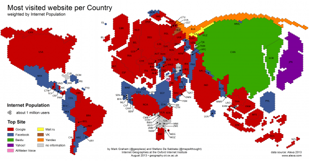
This visualization from the Information Geographies website portrays which are the most visited websites in different countries in the world. The data is from Alexa.

This visualization works powerfully because of how it portrays the quantitative data of internet population. It plots internet traffic in the form of hexagons, making the countries with more traffic appear bigger. This is the first thing shown in the legend. What makes this technique so powerful is that we’re not used to seeing such a distorted map of the world, and it takes us by surprise. This surprise makes us want to dig deeper to see what kind of data is behind this awkwardly shaped map. Quantitative information can be presented in odd, yet effective ways, to communicate with data.
Hadoop Builds on its Core Strengths for Version 2.0
HortonWorks, the company with the most number of contributors to the open-source Hadoop project, recently released Hadoop 2.0, which is a stable version of the beta that’s been out since the past few months. Hadoop is the most popular tool used in big data today. Naturally, this release of Hadoop is big news for the many enterprises that it’s become integral to.
Here are the main updates in this release:
- 2x performance across the board, in both HDFS & MapReduce
- MapReduce is now based on YARN, a resource management system which allows it to run multiple jobs simultaneously unlike before when it could only run single jobs in batch mode
- Another major change that YARN brings to Hadoop 2.0 is the ability to use 7 other algorithms instead MapReduce. This is done keeping in mind that MapReduce is not the ideal algorithm for all processing jobs, and now companies can use other algorithms that are more suited to their specific processing needs
These updates promise to give Hadoop the next generation architecture so it can evolve quickly, and allow even more scalability for enterprises. You can read more about this in the release announcement.
Here’s a video of Arun C Murthy, Founder, Hortonworks, and VP, Apache Hadoop, discussing this release:


