Analytical dashboards are reporting tools that assist organizations in analyzing data in order to understand historical trends and predict outcomes. Because analytical dashboards plot a large amount of data, advanced features such as drill-down are used to create them. Users may want to filter the data for the simplest and most complicated queries, so advanced features are required.
There are numerous analytics tools available that can easily be integrated to collect data directly from your website or app. Nothing, however, understands your data and the results you seek better than you. Most analytical tools are also known for failing to meet all of their users’ needs.
This is where customized dashboards come into play. How about designing an analytics dashboard that meets all of your needs?
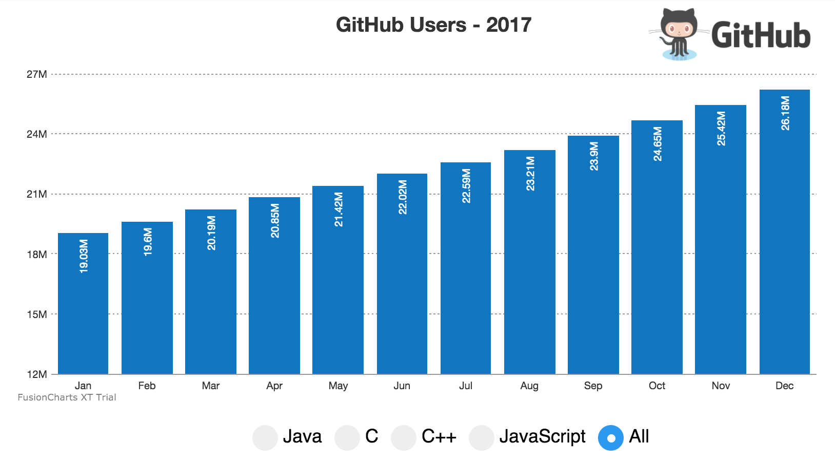
The FusionCharts team has created an analytical dashboard that allows you to examine the number of users who accessed GitHub in each month of 2017. It also shows the number of users filtered by programming languages.
In this post, we will introduce you to Dashboard Creation and its technical implementation so that you can create your own using React and GraphQL with FusionCharts.
Table of Contents
The GitHub Users Dashboard
The dashboard gives a monthly distribution of the number of users to have accessed GitHub. According to the programming language, you can use the radio buttons below the chart to see the number of users every month.
This dashboard was created using the FusionCharts Suite XT charting library, React, and GraphQL.
FusionCharts Suite XT
FusionCharts Suite XT is a JavaScript-based charting library consisting of 90+ standard, advanced, and domain-specific charts and 1000+ maps for all continents, major countries, and all US states. The GitHub Users dashboard is created using a simple column 2D chart from FusionCharts Suite XT. Visit here to know more about the charts and features that are a part of this library.
React
React is the framework of choice when you want to build websites and applications rich in UI.
FusionCharts Suite XT comes with a React-FusionCharts component that lets you add interactive JavaScript charts, widgets, and maps to your web and mobile-based applications using only a single React component.
Click here to read more about rendering charts using the React-FusionCharts component.
GraphQL
A query language, GraphQL, is used to query the API and get just the required results. An advantage of using GraphQL to query your data is the predictability of the results—the user gets just what they are looking for, not a thing more, not a thing less. GraphQL works with your code and data without backing from a specific storage engine or even a database.
GraphQL also scores well in terms of speed and stability. GraphQL-based applications control the data they retrieve, making them faster and more stable than applications that don’t use GraphQL.
In the GitHub Users dashboard, data for the number of users to access GitHub is obtained using the GitHub API. GraphQL is used to query the data retrieved from the GitHub API and filter it according to the results needed.
Technical Implementation of the GitHub Users Dashboard
We’ll now take a look at the process of creating this dashboard:
Step 1: Setting up the Environment
Before we begin developing the GitHub Users dashboard, follow the steps given below to set up the development environment:
Step 1.1
To install React CLI on your system, open the cmd shell and execute the command given below:
npm install -g react-cli react
Step 1.2
To install the create-react-app modules for React globally, execute the command given below on the command line:
npm install -g create-react-app
Step 1.3.1
From the cmd shell, navigate to the directory where you want to save your project.
Step 1.3.2
To create the project skeleton, execute the following command on the command line:
create-react-app my-app
Step 1.4
To install FusionCharts on your system, execute the command given below:
npm install fusioncharts --save
Step 1.5
To install the React-FusionCharts plugin, execute the command given below:
npm install react-fusioncharts --save
Step 2: Importing the Library Files and Passing Them as Dependencies
To import the FusionCharts library files, add the following code in your app.js file:
import fusioncharts from 'fusioncharts';
import charts from 'fusioncharts/fusioncharts.charts';
import ReactFC from 'react-fusioncharts';
import theme from 'fusioncharts/themes/fusioncharts.theme.fint';
To pass these files as dependencies, use the code snippet given below:
charts(fusioncharts)
theme(fusioncharts)
Step 3: Building Data Using the Fetch API
To define a method that will fetch the data from GitHub using the GraphQL query language, use the code snippet given below:
function grabUsers(query) {
  const promises = [];
let i = 1;
for(; i<=12; i++) {
  const promise = fetch("https://api.github.com/graphql", {
    method: "POST",
    async: false,
    headers: {
      "Authorization": 'bearer d23e97911c0554fe8e1e13010cea0e7e85580781',
      "Content-Type": 'application/json'
    },
    body: JSON.stringify({
      query: `
        {
          search(type: USER, query: "created:<2017-${i < 10 ? ('0' + i) : i + ''}-01 ${query}") {
            userCount
          }
        }
      `
    })
  })
  .then((r) => r.json())
  promises.push(promise);
}

return Promise.all(promises);
}
Click here to read more about the JavaScript Fetch API.
Step 4: Creating the Chart’s Data Source
Now that we have our data, we need to restructure it according to the format prescribed by FusionCharts.
To create the chart’s data source, we will define a method that will return the complete data source for rendering the chart using the code given below:
function generateChartConfig(data,chartAttr,chartType){
   const monthNames = ["Jan", "Feb", "Mar", "Apr", "May", "Jun",
  "Jul", "Aug", "Sep", "Oct", "Nov", "Dec"
];
  const chartData = data.map((d, i) => {
    return {
      label: monthNames[i],
      value: d.data.search.userCount
    };
  });
  const dataSource = {
    "chart": chartAttr,
    "data": chartData
  };
  var revenueChartConfigs = {
    type: chartType,
    width:800,
    height: 400,
    dataFormat: 'json',
    dataSource: dataSource

  };

  return revenueChartConfigs;
}
Step 5: Creating the React Component
To split the UI into independent, reusable pieces and render our chart, we will call the component function inside the react class using the code given below:
class App extends Component {
  constructor(props) {
    super(props);
this.state = {
      msg: "Loading....."
    };

render() {
    return (
// code to be written
);
  }

  }
}
Next, to load the chart data from the methods defined above, we will call the componentDidMount() method from the component life cycle using the code given below:
componentDidMount(){

grabUsers("")
.then((data) => {
  var chartConfig= generateChartConfig(data,{
    "caption":"GitHub Users - 2017",
    "captionfontsize":"20",
       "theme":"fint",
   "logoURL":"https://19386-presscdn-pagely.netdna-ssl.com/wp-content/uploads/2017/10/github-logo-1.png",
    "logoAlpha": "80",
    "logoScale": "8",
    "canvastopmargin":"75",

    "logoPosition": "TR",
    "logoleftmargin":"-20",
    "logotopmargin":"10",

    "yaxisminvalue":"12000000"
  },"column2d");
 ReactDOM.unmountComponentAtNode(document.getElementById('chart-viewer'));
  ReactDOM.render(<ReactFC {...chartConfig} />, document.getElementById('chart-viewer'));
  //ReactDOM.render(<radio/> , document.getElementById('radio'));
})
.catch((err) => {
  console.log(err);
  this.setState({
    msg: String(err)
  });
});
}
Click here to know more about the componentDidMount() method:
Finally, to render the chart, we will create the chart container inside the render() method using the <div> element as shown in the code below:
render() {
    return (


      <div>

     <div id="chart-viewer">
          {this.state.msg}
      </div>
);
}
Step 6: Creating the Radio Buttons
We’ll now create the radio buttons for filtering the data and view the number of all users and the number of users according to the programming language.
To create the radio buttons, use the code snippet given below:
render() {
    return (


      <div>

     <div id="chart-viewer">
          {this.state.msg}
      </div>

      <br />

      <div id="radio" onChange= {this.setlang.bind(this)}>

      <label id="container">Java
        <input type="radio" value="java" name="lang" />
         <span id="checkmark"></span>
         </label>

         <label id="container">C
        <input type="radio" value="C" name="lang" />
         <span id="checkmark"></span>
         </label>

         <label id="container">C++
        <input type="radio" value="cplus" name="lang" />
         <span id="checkmark"></span>
         </label>


         <label id="container">JavaScript
        <input type="radio" value="javascript" name="lang" />
         <span id="checkmark"></span>
         </label>

         <label id="container">All
          <input type="radio" value="all" name="lang" defaultChecked="true"/>
           <span id="checkmark"></span>
           </label>
      </div>
      </div>

    );

  }
The above code will render simple radio buttons. You can customize the radio buttons’ cosmetics according to your requirements using an external CSS file.
Step 7: Configuring the Radio Buttons
In this step, we will configure the functionality of the radio buttons (created in the above step) by defining a function that will fetch the chart data for the individual and all programming languages using GraphQL and render the chart in the browser using React.
To do this, we will use the code snippet given below:
setlang(event) {
    console.log(event.target.value);
    if(event.target.value==="java"){
      console.log("Hi I am on Java");


grabUsers("language:java")
.then((data) => {
  var chartConfig= generateChartConfig(data,{
    "caption":"Java Users - 2017",
    "captionfontsize":"20",
       "theme":"fint",
    "logoURL":"https://19386-presscdn-pagely.netdna-ssl.com/wp-content/uploads/2017/10/github-logo-1.png",
    "logoAlpha": "80",
    "logoScale": "8",
    "canvastopmargin":"75",

    "logoPosition": "TR",
    "logoleftmargin":"-20",
    "logotopmargin":"10",
      "yaxisminvalue":"1000000"
  },"column2d");
 ReactDOM.unmountComponentAtNode(document.getElementById('chart-viewer'));
  ReactDOM.render(<ReactFC {...chartConfig} />, document.getElementById('chart-viewer'));
  //ReactDOM.render(<radio/> , document.getElementById('radio'));
})
.catch((err) => {
  console.log(err);
  this.setState({
    msg: String(err)
  });
});

    }
  else if (event.target.value==="C"){
 console.log("Hi I am on C");

grabUsers("language:C")
.then((data) => {
  var chartConfig= generateChartConfig(data,{
    "caption":"C Users - 2017",
    "captionfontsize":"20",
    "theme":"fint",
    "logoURL":"https://19386-presscdn-pagely.netdna-ssl.com/wp-content/uploads/2017/10/github-logo-1.png",
    "logoAlpha": "80",
    "logoScale": "8",
    "canvastopmargin":"75",
    // "valueFontColor":"#000000",
    "logoPosition": "TR",
    "logoleftmargin":"-20",
    "logotopmargin":"10",
    "yaxisminvalue":"245000",
    "plotfillalpha":"90",
  },"column2d");
 ReactDOM.unmountComponentAtNode(document.getElementById('chart-viewer'));
  ReactDOM.render(<ReactFC {...chartConfig} />, document.getElementById('chart-viewer'));
  //ReactDOM.render(<radio/> , document.getElementById('radio'));
})
.catch((err) => {
  console.log(err);
  this.setState({
    msg: String(err)
  });
});


    }
    else if(event.target.value==="cplus"){
 console.log("Hi I am on C++")

grabUsers("language:C++")
.then((data) => {
  var chartConfig= generateChartConfig(data,{
    "caption":"C++ Users - 2017",
    "captionfontsize":"20",
    "theme":"fint",
    "logoURL":"https://19386-presscdn-pagely.netdna-ssl.com/wp-content/uploads/2017/10/github-logo-1.png",
    "logoAlpha": "80",
    "logoScale": "8",
    "canvastopmargin":"75",
      // "valueFontColor":"#000000",
    "logoPosition": "TR",
    "logoleftmargin":"-20",
    "logotopmargin":"10",
    "yaxisminvalue":"350000"
  },"column2d");
 ReactDOM.unmountComponentAtNode(document.getElementById('chart-viewer'));
  ReactDOM.render(<ReactFC {...chartConfig} />, document.getElementById('chart-viewer'));
  //ReactDOM.render(<radio/> , document.getElementById('radio'));
})
.catch((err) => {
  console.log(err);
  this.setState({
    msg: String(err)
  });
});


    }
     else if (event.target.value==="javascript"){
 console.log("Hi I am on JavaScript")

grabUsers("language:JavaScript")
.then((data) => {
  var chartConfig= generateChartConfig(data,{
    "caption":"JavaScript Users - 2017",
    "captionfontsize":"20",
    "subCaption":"Of 2017",
    "theme":"fint",
    "logoURL":"https://19386-presscdn-pagely.netdna-ssl.com/wp-content/uploads/2017/10/github-logo-1.png",
    "logoAlpha": "80",
    "logoScale": "8",
    "canvastopmargin":"75",
      // "valueFontColor":"#000000",
    "logoPosition": "TR",
    "logoleftmargin":"-20",
    "logotopmargin":"10",
    "yaxisminvalue":"1200000"
  },"column2d");
 ReactDOM.unmountComponentAtNode(document.getElementById('chart-viewer'));
  ReactDOM.render(<ReactFC {...chartConfig} />, document.getElementById('chart-viewer'));
  //ReactDOM.render(<radio/> , document.getElementById('radio'));
})
.catch((err) => {
  console.log(err);
  this.setState({
    msg: String(err)
  });
});

}

 else{


grabUsers("")
.then((data) => {
  var chartConfig= generateChartConfig(data,{
    "caption":"GitHub Users - 2017",
    "captionfontsize":"20",
    "theme":"fint",
    "logoURL":"https://19386-presscdn-pagely.netdna-ssl.com/wp-content/uploads/2017/10/github-logo-1.png",
    "logoAlpha": "80",
    "logoScale": "8",
    "canvastopmargin":"75",

    "logoPosition": "TR",
    "logoleftmargin":"-20",
    "logotopmargin":"10",
    "yaxisminvalue":"12000000"
  },"column2d");
 ReactDOM.unmountComponentAtNode(document.getElementById('chart-viewer'));
  ReactDOM.render(<ReactFC {...chartConfig} />, document.getElementById('chart-viewer'));
  //ReactDOM.render(<radio/> , document.getElementById('radio'));
})
.catch((err) => {
  console.log(err);
  this.setState({
    msg: String(err)
  });
});


}
}
And that’s it! The dashboard is complete.
Step 8: Deploying the Project
To deploy the GitHub Users dashboard, you go to the React CLI and type npm start.
Doing this will start the server. If everything has been done as explained in the steps above, then this is how your dashboard will render. You can try the live example here.
Troubleshooting
If you see any errors in your code, you can download the complete source code for the GitHub Users dashboard from here.
Please note that you need to install the dependencies using npm install.