FusionTime is a product which we released a little over 6 months back. After speaking with many developers who have implemented FusionTime in their production environment, we learnt that they need more control in terms of both cosmetic and functional possibilities. This to us is a validation of the acceptance of the product and it gives me immense pleasure in highlighting the things which we covered in this release:
Table of Contents
Full cosmetic customisation
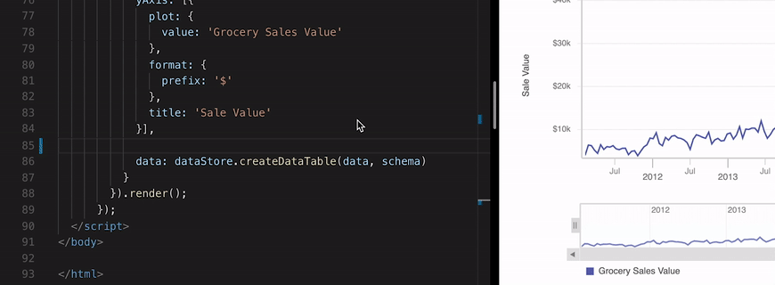
All important components of FusionTime are now completely customisable. Being true to the philosophy of being a white-labelled charting library, we have reached this feat wherein we can promise that you will not be restricted by the styling possibility of the components – custom range selector, standard range selector, styling line for missing data points, etc.
Reference zone in time series charts
Extending the concept of reference lines, a new feature called reference zone is now available. One can draw ‘n’ number of reference zones in one canvas and also draw reference zones on multivariate charts. Hovering on a zone, highlights the data points falling in it. It aids it channelising focus to important data points.
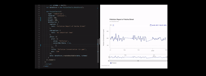
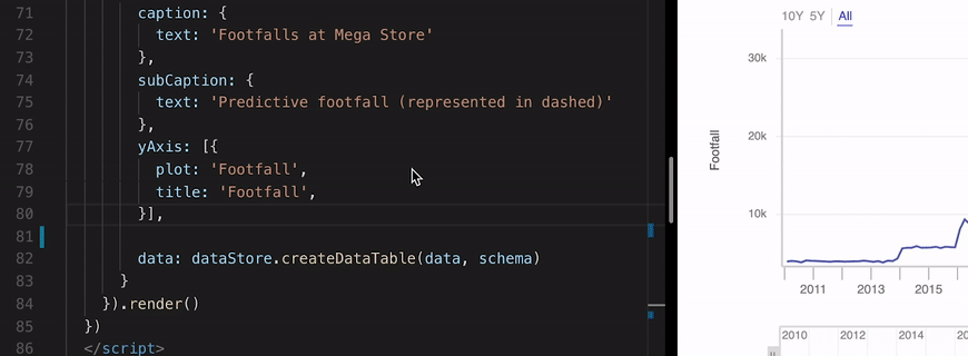
Predictive data representation
With this release, a basic possibility of representing predicted data will be available. It will expect the developer to specify the date beyond which the data points are predictive and then style them accordingly. Here too, complete customisation of the representation of predicted data is possible.
Binning control to developers
Expanding on the initial approach of auto-binning data based on the number of data points and size of the chart; the developers will now be able to control and specify their bin sizes. They just need to specify the multipliers of the time unit for which they want to control the binning. One will also be able to specify the max. bin size, min. bin size and fixed bin size.

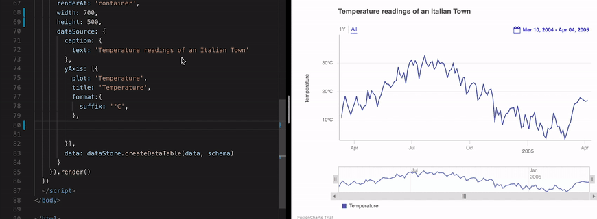
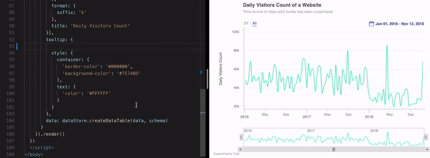
Output time format on time axis and tooltip
The possibility of using the date-time tokens to control the display of date-time on time axis and tooltip is a possibility now. Based on their preference, people can now specify the display value of time at tick marks of xAxis (or time axis) and the tooltip which is visible on hovering a data plot.
Initial interval spread on chart render
You can now specify the spread of the mask of time navigator on initial rendering by mentioning the dates for which you want the time axis to be spread out. Obviously, these dates should be within the date range of the data.
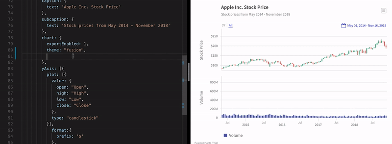
Stock charts with volume on same canvas
Stock charts and volume of trade can now be plotted on the same canvas. Referring to the example, the volume of trade of stock is plotted on a dual Y axis chart, as column plot, whereas, the price (Open, High, Low, Close) is plotted on the primary axis as a candlestick chart.
Along with this some critical issues were solved which enhance the experience of the time series charts. More specifics can be read in the release notes.
If you have any suggestions on improving FusionTime? Do not hesitate to drop an email on [email protected]. I would love to hear your thoughts. Finally, do not forget to subscribe to our newsletter to get the latest news on FusionCharts.
Download the FusionTime v1.2 here.
Buy or upgrade here.