Style Definition
Unlike FusionCharts in which cosmetics of the elements in a chart are controlled by defined attributes, FusionTime comes with a different approach. In FusionTime, the styling of the elements is handled by defined CSS. CSS is used to define styles for the chart components in FusionTime. For example, the caption could be styled as bold-text and large-text.
In this article, we will discuss the CSS styling to set the cosmetic properties of a chart. You can, however, set the styling of the individual components of the chart as well.
To set the styling, instead of creating a separate CSS file, you can define the styling using styleDefinition object.
Style definitions are specified at the root of the dataSource in FusionTime.
Syntax:
{
"styleDefinition": colorStyle
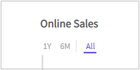
}Let's take an example of the styling on the caption of the chart. The caption of the chart is specified as shown below:
{
"caption": {
"text": "Online Sales" //caption
}
}The caption in the chart looks as shown below:
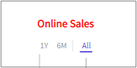
Now, let's define a txt-red style and apply on the caption of the chart.
{
"styleDefinition": {
"txt-red": {
"fill": "red"
}
},
"caption": {
"text": "Online Sales",
"style": {
"text": "txt-red"
}
}
}After applying the text color, the caption looks as shown below:
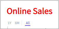
Let's also define a txt-big style to specify the font size of the caption.
{
"styleDefinition": {
"txt-red": {
"fill": "red"
},
"txt-big": {
"font-size": 30
}
},
"caption": {
"text": "Online Sales",
"style": {
"text": "txt-red txt-big"
}
}
}The caption looks as shown below:
Alternatively, styling can also be applied to the specific component just like an inline CSS within an HTML file.
Let's take the same example to set the color and font size for the caption of the chart.
{
"caption": {
"text": "Online Sales",
"style": {
"text": {
"fill": "#ff0000",
"font-size": "30"
}
}
}
}The output of the above code is the same as that of the image shown above. Similarly, you can also apply most of the SVG attributes using style. Some of the supported attributes within the style definition and style objects are:
fillfill-opacityfont-familyfont-sizefont-weightopacitystrokestroke-dasharraystroke-opacitystroke-widthtext-anchorvertical-align
The above attributes can be used to style every FusionTime components (Reference lines, Data plots, Caption, Subcaption, etc).
Now, let's see how to apply style to these FusionTime components. These components have their own configuration sections in the JSON from where they can be styled using the SVG presentation attributes mentioned above.
Caption
Styling can be applied to the text of the caption using the text object under style object.
Syntax:
{
"caption": {
"style": {
"text": Style
}
}
}Subcaption
You can apply style to a subcaption is the same way as caption.
Syntax:
{
"subcaption": {
"style": {
"text": Style
}
}
}X-Axis
Styling can be applied to three elements of the X-axis:
Labels
Title
Tick marks
FusionTime allows to the style the major and minor ticks of the time axis individually. The values of the style properties for major and minor tick marks and their labels are derived from the provided style.
Syntax:
"DataScource": {
"xAxis": {
"style": {
"tick-mark": SVGStyle | String,
"tick-mark-major": SVGStyle | String,
"tick-mark-minor": SVGStyle | String,
"label": SVGStyle | String,
"label-major": SVGStyle | String,
"label-minor": SVGStyle | String,
"label-context": SVGStyle | String
}
}
}Y-Axis
Styling can be applied to four elements of Y-axis:
Tick marks
Label
Title
Grid Line
The title of the Y-axis and the grid lines appear against the ticks on the canvas.
Syntax:
{
"yAxis": [{
"style": {
"tick-mark": Style,
"label": Style,
"title": Style,
"grid-line": Style
}
}]
}Reference Line
Styling can be applied to two elements of a reference line:
The marker, i.e., the line, the knob (appears at the end of the line) and the value tag on the axis.
The marker text, i.e., the label of the reference line, which is visible only when we hover on the knob.
Syntax:
{
"yAxis": [{
"referenceLine": [{
"style": {
"text": Style,
"marker": Style
}
}]
}]
}Tooltip
You can add style to the tooltip using style object under tooltip object.
new FusionCharts({
type: "timeseries",
dataSource: {
tooltip: {
enabled: Boolean,
style: {
container: {}, //HTMLStyle | String
text: {}, //HTMLtyle | String
header: {}, //HTMLStyle | String
body: {} //HTMLStyle | String
}
}
}
});Time Navigator
Time Navigator of a time-series chart can be divided into two sub-sections:
- Window
- Scroll Bar
You can add style to the time marker components using style object under window and scrollbar object.
new FusionCharts({
type: "timeseries",
dataSource: {
navigator: {
enabled: Boolean,
scrollbar: {
style: {
"button": {}, //SVGStyle | String
"arrow": {}, //SVGStyle | String
"scroller": {}, //SVGStyle | String
"grip": {}, //SVGStyle | String
"track": {} //SVGStyle | String
}
},
window: {
style: {
"handle": {}, //SVGStyle | String
"handle-grip": {}, //SVGStyle | String
"mask": {} //SVGStyle | String
"label": {}, //Style : String
"label-background": {} //Style : string
}
}
}
}
});Time Marker
Styling can be applied to two elements of the time marker.
The marker
The text on the marker
For a time span marker, the marker refers to the band which marks the time and the text refers to the text on top of the bond whereas, for a time instant marker, the marker is the box on top of the axis, the line extending to the top and the nub at the top of the line.
Syntax:
{
"xAxis": {
"timeMarker": [{
"style": {
"text": Style,
"marker": Style
}
}]
}
}Data Marker
Styling can be applied to two elements of a data marker:
Marker
Text on the marker
Syntax:
{
"dataMarker": [{
"style": {
"marker": Style,
"text": Style
}
}]
}The components following underneath can only be styled using the common style properties defined in the styleDefinition object. To apply the style to following components, customize it from the style section within the chart object of the dataSource.
Data Plots
Applying style to the data plots of a time-series chart is totally different from any of the components stated above. Although the style object supports the SVG attributes mentioned above, the color of the data plots cannot be changed from their style sections. The color can be customized using the palelleColors attribute within the chart object.
Data plots can either be styled:
using plot configuration
using Y-axis configuration
Plot Configuration
Style defined using plotConfig object are scoped to the entire chart, i.e., if you define a line plot and set the value of stroke-width to 4, all the line plots in the chart will have stroke width set to 4 pixels.
Syntax:
{
"plotConfig": {
...
}
}You can also apply style across all the chart types using generic object within the plotConfig object. It applies the style to any chart type, even in multiple canvases.
Syntax:
{
"plotConfig": {
"style": {
"generic": { ... }
}
}
}All the supported chart types of time-series chart can be customized using the
plotConfigobject. To know more click here.
Y-Axis Configuration
In FusionTime, you can also style the data plots specifically. These styling will be scoped to only the set of plots for which the style has been defined. In the yAxis object the style object is defined under the plot object. The rest of the steps are the same as the plot configuration method.
Syntax:
{
"yAxis": [{
"plot": [{
"style": {
/* bear, bull, plot, ... */ }
}]
}]
}Canvas
Chart canvas refers to the area in which the chart data is plotted, excluding the area where titles, legends, and axis names are rendered.
Syntax:
{
"chart": {
"style": {
"canvas": Style
}
}
}In the above code, the canvas attribute is applied in the style object to apply styling to the canvas of the chart.
Canvas of the chart can only be styled from the common style definition in
styleDefinitionobject.
Chart Background
A chart's background refers to the whole area, or the container in which it is drawn.
Syntax:
{
"chart": {
"style": {
"background": Style
}
}
}In the above code, background attribute is applied in the style object to apply styling the chart background.
Canvas of the chart can only be styled from the common style definition in
styleDefinitionobject.
Standard Range Selector
Styling can be applied to the buttons of the Standard Range Selector.
You can add style to the Standard Range Selector using style object under standardRangeSelector object.
The
standardRangeSelectorobject should be created underextensionsobject.
Syntax:
new FusionCharts({
type: "timeseries",
dataSource: {
"extensions": {
"standardRangeSelector": {
"style": {
"button-text": {}, //Object | String
"button-background": {}, //Object | String
"button-text:hover": {}, //Object | String
"button-background:hover": {}, //Object | String
"button-text:active": {}, //Object | String
"button-background:active": {}, //Object | String
"separator": {} //Object | String
}
}
}
}
})
Custom Range Selector
Styling can be applied to following elements of the Custom Range Selector:
Title
Container
Label
Button
You can add style to the Custom Range Selector using style object under customRangeSelector object.
The
customRangeSelectorobject should be created underextensionsobject.
Syntax:
new FusionCharts({
type: "timeseries",
dataSource: {
"extensions": {
"customRangeSelector": {
"style": {
"title-text": {}, //Object | String
"title-icon": {}, //Object | String
"title-text:hover": {}, //Object | String
"title-icon:hover": {}, //Object | String
"title-text:active": {}, //Object | String
"title-icon:active": {}, //Object | String
"container": {}, //Object | String
"label": {}, //Object | String
"button-apply": {}, //Object | String
"button-cancel": {}, //Object | String
"button-apply:hover": {}, //Object | String
"button-cancel:hover": {}, //Object | String
"select": {}, //Object | String
"input": {} //Object | String
}
}
}
}
})
You can also add a different style to the calendar of the Custom Range Selector by adding following style attributes under style object of customRangeSelector object.
new FusionCharts({
type: "timeseries",
dataSource: {
"extensions": {
"customRangeSelector": {
"style": {
"cal-month": {}, //Object | String
"cal-month:hover": {}, //Object | String
"cal-header": {}, //Object | String
"cal-header:hover": {}, //Object | String
"cal-subheader": {}, //Object | String
"cal-subheader:hover": {}, //Object | String
"cal-body": {}, //Object | String
"cal-body:hover": {}, //Object | String
"cal-monthname": {}, //Object | String
"cal-monthname:hover": {}, //Object | String
"cal-navprev": {}, //Object | String
"cal-navprev:hover": {}, //Object | String
"cal-navnext": {}, //Object | String
"cal-navnext:hover": {}, //Object | String
"cal-weekend": {}, //Object | String
"cal-weekend:hover": {}, //Object | String
"cal-days": {}, //Object | String
"cal-days:hover": {}, //Object | String
"cal-date": {}, //Object | String
"cal-date:hover": {}, //Object | String
"cal-activedate": {}, //Object | String
"cal-activedate:hover": {}, //Object | String
"cal-selecteddate": {}, //Object | String
"cal-selecteddate:hover": {}, //Object | String
"cal-disableddate": {}, //Object | String
"cal-disableddate:hover": {}, //Object | String
}
}
}
}
})
Y-Axis
Styling can be applied to the y-axis elements using following style objects.
Syntax:
{
"yAxis": [{
"style": {
"tick-mark": {}, //Style
"label": {}, //Style
"title": {}, //Style
"grid-line": {} //Style
},
"plot": [{
"value": {}, //String | Object
"type": {} //String
"style": {
"plot": {}, //Style
"plot:highlight": {}, //Style
"plot:hover": {}, //Style
"line": {}, //Style
"area": {}, //Style
"column": {}, //Style
"column:highlight": {}, //Style
"column:hover": {}, //Style
"anchor:highlight": {}, //Style
"anchor:hover": {}, //Style
"bear": {}, //Style
"bear:highlight": {}, //Style
"bear:hover": {}, //Style
"bull": {}, //Style
"bull:highlight": {}, //Style
"bull:hover": {} //Style
}
}]
}]
}