Digital transformations have impacted a wide range of industries, enabling them to think out-of-the-box and imaginatively integrate technology into their existing operational procedures. Data analytics and visualizations in the form of a performance and quality dashboard is a prime example of how digital transformations allow enterprises to use data in their decision-making and thought processes.
One such example of a technology-driven transformation is using data visualization to keep track of your manufacturing performance and quality control. Simply put, it is advantageous to experience, manage, and interpret data associated with your product quality through the medium of beautiful charts and interactive visualizations. This is precisely where FusionCharts helps you. FusionCharts provides a seamless set of libraries that make it simple to create business dashboards that measure your enterprise’s manufacturing performance and quality.
The best part about FusionCharts is that it makes its complete source code available to developers. This means that to start using it, you only need to download it and plug it into your projects.
Table of Contents
How Can I Build a Manufacturing Performance and Quality Dashboard with FusionCharts?
FusionCharts offers enterprises a more straightforward method for building manufacturing quality dashboards. These dashboards highlight the critical metrics related to your business’s performance and sales growth. Using our dashboards, enterprises can track specific metrics and KPIs enabling management teams to visualize and interpret these metrics and make informed enterprise-level decisions accordingly.
With the ideal manufacturing quality dashboard, you can easily:
- Track KPIs for effective production.
- Monitor the performance and take necessary decisions to optimize production.
- Figure out the production performance of each site, especially with distributed production cycles.
- Identify and understand defective production scenarios.
How Can I View the Summary of Aggregated Data in My Manufacturing Performance and Quality Dashboard?
When it comes to manufacturing quality dashboards, having your essential metrics displayed meaningfully front and center with all aggregated information visible is instrumental. That is why FusionCharts has a full suite of Bootstrap-based libraries and supports React.js to showcase aggregated data in your existing React applications and dashboards.
Here is an example of the dashboard code required to display a summary of your aggregated data:
<div className="row kpi-container">
    <div className="col-6 col-lg-3">
        <div className="kpi" id="kpi1">
            <p className="kpi-header">Total Production</p>
            <p className="sub-header">(units)</p>
            {len ? (<p className="kpi-value">.{NumberFormatter.format(kpiGenerator('kpi1', serverData, ''))}</p>) : Loader()}
        </div>
    </div>
    <div className="col-6 col-lg-3">
        <div className="kpi" id="kpi2">
            <p className="kpi-header">Defective Production</p>
            <p className="sub-header">(%)</p>
            {len ? (<p className="kpi-value">{kpiGenerator('kpi2', serverData, '')}</p>) : Loader()}
        </div>
    </div>
    <div className="col-6 col-lg-3">
        <div className="kpi" id="kpi3">
            <p className="kpi-header">Production Rate</p>
            <p className="sub-header">(units/hour)</p>
            {len ? (<p className="kpi-value">{NumberFormatter.format(kpiGenerator('kpi3', serverData, ''), '0,0.00')}</p>) : Loader()}
        </div>
    </div>
    <div className="col-6 col-lg-3">
        <div className="kpi" id="kpi4">
            <p className="kpi-header">Average Cycle Duration</p>
            <p className="sub-header">(hours)</p>
            {len ? (<p className="kpi-value">{NumberFormatter.format(kpiGenerator('kpi4', serverData, ''), '0,0.00')}</p>) : Loader()}
        </div>
    </div>
</div>
Using col-6 and col-lg-3, you can place FusionCharts visuals into the Bootstrap grid system for a pleasant user experience.
How Can I Add a Process Performance Visual in React Component?
When using conventional platforms, adding a performance tracker is not as simple as it seems. It involves lots of data, responsive and interactive visualizations, and designing and coding an effective display. To clarify, if handled from scratch, then all these things can cause a wide range of problems. Also, they may require an enormous amount of developer effort.
To address this, FusionCharts provides a simple mechanism that involves just a few lines of code.
Everything is internally handled by the FusionCharts library itself. Take a look!
export default class ProcessPerformance extends Component {
    render() {
        let serverData = this.props.serverData,
        // sort the doughnut chart that needs to be rendered by the name of process step
        doughnutNames = getUniqueElementsArray(serverData, 'processStep').sort((a,b)=> a > b),
        len = serverData.length;
        return (
            <div className="row">
                <div className="col-12">
                    <div className="chart">
                        {len ? (<ReactFC {...chartGenerator({type: 'line', dataSource: processCountByTimeBucket}, serverData)}/>) : Loader()}
                    </div>
                </div>
                {
                    // Display the number of doughnut charts according to the server data
                    doughnutNames.map(stepName => (
                        <div className="col-xl-3 col-sm-6 col-12" key={stepName}>
                            <div className="chart chart-doughnut">
                                {len ? (<ReactFC {...chartGenerator({type: 'doughnut2d', dataSource: countOfEachProcessStep}, serverData, stepName)}/>) : Loader()}
                            </div>
                        </div>
                    ))
                }
            </div>
        )
    }
}
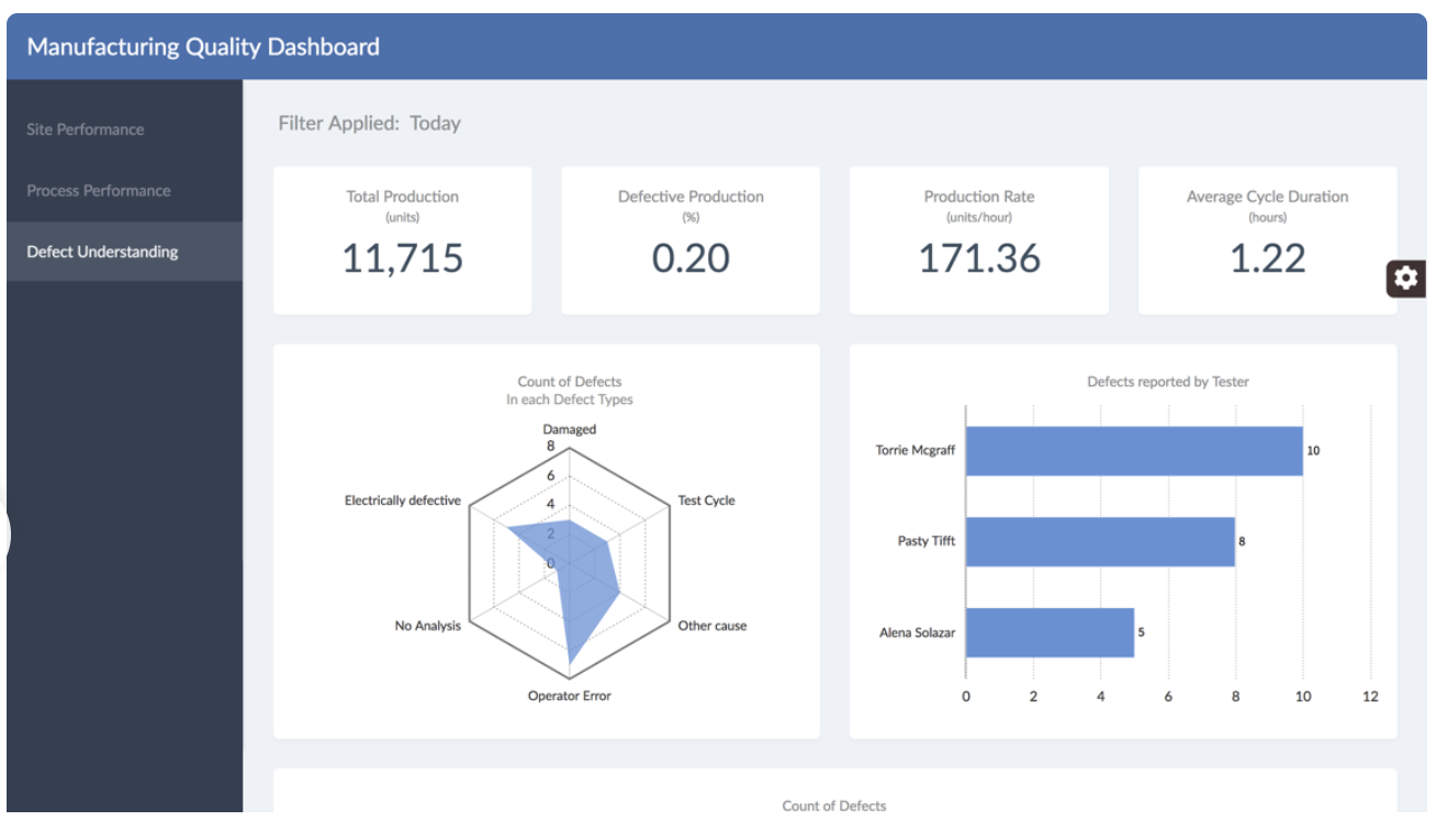
What is an Easy Way to Add a Defect Understanding Component?
The ability to Track enterprise or product performance is excellent in itself, but with FusionCharts, it doesn’t stop there. Detecting flaws and potential defects in your process or products is also essential.
That is why your FusionCharts dashboard provides a complete overview, allowing you to integrate defect metrics into your console.
FusionCharts offers a ready-to-use codebase that you can basically plug into your manufacturing quality dashboard and start getting meaningful insights out of them.
export default class DefectUnderstanding extends Component {
    render() {
        let serverData = this.props.serverData,
        len = serverData.length;
        return (
            <div className="row">
                <div className="col-md-6 col-12">
                    <div className="chart">
                        {len ? (<ReactFC {...chartGenerator({type: 'radar', dataSource: defectCountByDefectType}, serverData)}/>) : Loader()}
                    </div>
                </div>
                <div className="col-md-6 col-12">
                    <div className="chart">
                        {len ? (<ReactFC {...chartGenerator({type: 'bar2d', dataSource: defectCountByTester}, serverData)}/>) : Loader()}
                    </div>
                </div>
                <div className="col-xl-12 col-12">
                    <div className="chart">
                        {len ? (<ReactFC {...chartGenerator({type: 'treemap', dataSource: defectCountByProductFamily}, serverData)}/>): Loader()}
                    </div>
                </div>
            </div>
        )
    }
}
Source Code for Manufacturing Quality Dashboard
Manufacturing Quality Dashboard Demo
So, here we are! FusionCharts has made it to design and develop a manufacturing quality dashboard for your use case. Another critical point is how FusionCharts supports a wide variety of bindings out of the box. Bindings supported, for instance, including Javascript, Angular, React, jQuery, Vue.js, Ember, React Native, AngularJS, Svelte, ASP.NET, PHP, Java, Ruby on Rails, and Django.
Let us know in the comment section below how you use FusionCharts to create your manufacturing quality dashboard.
Download FusionCharts and get started today!