This week’s data digest covers some interesting arguments and use cases for and against the hype around Big Data. We also revisit the question of ‘buy vs build’ when it comes to software libraries.
-
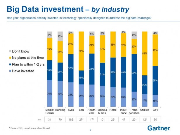
- Big Data – Are we there yet…?This is an interesting, slightly skeptical, read about Big Data. It’s a blog post on Gartner, written by their CEO, Ian Bertram. He questions ‘why call it “Big Data” at all, what makes it big? Rather why not call it just “data” or “Information” as aren’t we just talking about different sources and extracting value from the combination of these sources?.’ He goes on to talk about a study that Gartner conducted last year, that asked people what their biggest issue with big data is, and ‘it wasn’t the volume of data that was the issue, it was the variety, such as video and audio, that dominated.’ I find it ironic that the company that coined the phrase ‘volume, velocity, and variety,’ blowing the bullhorn for Big Data about a decade back, and even staked their claim over the phrase when others used it, are the very same ones questioning the hype around it.A Gartner statistic, which is actually the purpose of the post, shows that the media and communications industry has invested most in Big Data.
 This brings us to the next post, which shows an example of how Big Data is visualized by a media company – The New York Times.
- Big Data – Are we there yet…?This is an interesting, slightly skeptical, read about Big Data. It’s a blog post on Gartner, written by their CEO, Ian Bertram. He questions ‘why call it “Big Data” at all, what makes it big? Rather why not call it just “data” or “Information” as aren’t we just talking about different sources and extracting value from the combination of these sources?.’ He goes on to talk about a study that Gartner conducted last year, that asked people what their biggest issue with big data is, and ‘it wasn’t the volume of data that was the issue, it was the variety, such as video and audio, that dominated.’ I find it ironic that the company that coined the phrase ‘volume, velocity, and variety,’ blowing the bullhorn for Big Data about a decade back, and even staked their claim over the phrase when others used it, are the very same ones questioning the hype around it.A Gartner statistic, which is actually the purpose of the post, shows that the media and communications industry has invested most in Big Data.
- How the New York Times Uses Big Data to Drive User Engagement & RevenueThe HBR blog has a great post by Sinan Aral, who worked on Project Cascade for the New York Times. In his words the project aims to ‘understand and predict when an online cascade or conversation will result in a tidal wave of content consumption on the Times, and also when it won’t. More importantly we are interested in how the word-of-mouth conversation drives readership, subscriptions, and ad revenue.’
To explain how they do this, Sinan gives 3 great visualizations of online reactions to NYT articles, which draw correlations between the virality of a post, and its impact on user engagement.
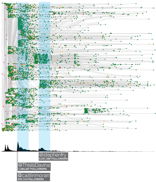 While the visualization does reveal interesting insights, Sinan is aware that ‘the visuals cannot tell the whole story… it’s necessary to build more sophisticated causal statistical models that will generate true, reliable insights about word-of-mouth influence.’
Sinan’s key learning from project Cascade is that ‘visualization is one of the most important guideposts in this search for knowledge, essential to understanding where we should look and what we should look for in our statistical analysis.’ Media companies are indeed using innovative visualizations as they navigate the new world of data.
 - LinkedIn and a Lesson on How to Build Big Data Applications
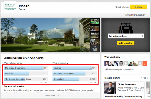
Linkedin recently launched a new feature – University Pages – which aims to help students do intelligent research on which school to join. While this is an interesting move for LinkedIn from a product perspective, I’m more interested in their blog post talking about how they made this possible. In the post, Josh Clemm, says that the effort began three years ago when the team started to structure LinkedIn’s member, and institution data, and making it searchable using Bobo and Zoie, LinkedIn’s proprietary search tools.They use graph models to draw connections between institutions as parents or children, and identified members who went to a particular school. Those graphs are stored in LinkedIn’s new flagship database technology, EspressoDB. The data is then queried using hadoop to find information like similar schools, and notable alumni. This data is then used to power the university pages.
If you take a look at the University Pages, you’ll see that data is given prime importance with charts appearing right up front:
 GigaOm covered this post observing that ‘there’s a right way to build “big data” applications, and web companies seem to understand this better than most.’
Tip: Check out one of our older posts on how LinkedIn uses FusionCharts to power its dashboards.
Lastly, we come to an interesting interview of Localytics founder, Raj Aggarwal.
 - Localytics Would Rather Buy than Build Charting Libraries Foreseeing the explosion of mobile apps, Aggarwal started Localytics, a mobile app analytics solution, back when the iPhone was launched. In this interview, he talks about important business decisions that were made along the way like choosing Amazon Web Services to host their data in the cloud. However, the more interesting part of the interview is a bit later, when he talks about the proverbial ‘build vs buy’ when it comes to software tools. He understands that engineers build, and many prefer fixing a problem themselves, their own way. However, he suggests that startups should spend their time on the more important aspects of the product, and try not to reinvent the wheel where possible. Giving an example from Localytics, he says ‘We needed to build our own dashboard… But then for simple charts, other people have built simple charting libraries, so we don’t need to build our own charting libraries. So we’ll buy again on that.’ He concludes saying ‘I probably encourage our development team to look at ways to buy, because these people are a valuable resource and if someone else has done the work, we don’t want to be reinventing the wheel.’Have you had to make a choice between ‘build vs buy’ recently? What did you decide? And why?

