
Data visualizations. In today’s data-driven world, they’re just about everywhere. Charts, plots, diagrams—you name it. Visualizations are present in nearly every industry and discipline from the sciences to the humanities. Data science is booming. There’s a great demand for professionals who can analyze, visualize, and report on data.
But how do you decide which chart is the right one for your data science project?
Data visualization helps make complex data easier to digest. A data science engineer is responsible for making sure people can understand data through effective visualizations.
Visualizing data is an important part of the data science process. If data is not presented properly, it may not be easily understood by others, especially when you don’t know how to select the right chart. It is important that the chart you use displays your data and the message you wish to make.
I came across a famous quote by Professor Hans Rosling, the visualization pioneer who made data dance.
“The world cannot be understood without numbers. But the world cannot be understood with numbers alone.” ― Hans Rosling
With that in mind, let’s take a look at how to choose the right chart for your data science project. There are two main aspects you are going to need to consider — getting familiar with chart types and how to integrate your charts for the best results.
Table of Contents
A. Get familiar with a variety of chart types
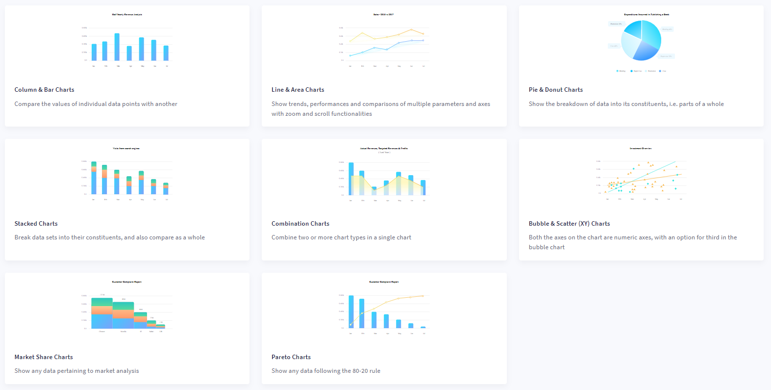
Sometimes all you need is a chart, one that visualizes your information and makes a point. But which chart should you choose? Creating the right chart can be difficult, especially when the choices involve so many different chart types. Well, in this section, you’ll get familiar with a variety of chart types.
- Column and bar charts
- Line and area charts
- Pie and doughnut charts
- Stacked charts
- Combination charts
- Bubble and scatter (XY) charts
- Market share charts
- Pareto charts
Let’s take a closer look at each type of chart.
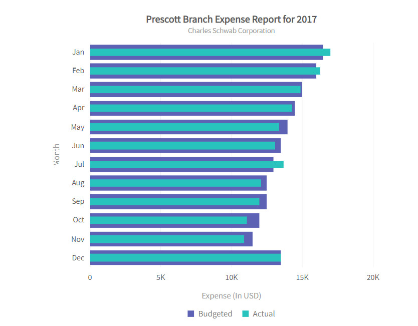
1. Column and bar charts
Column charts are used to compare data from similar categories. For example, sales by month or sales by region. They compare this data over time. Each column in the chart represents a specific category. The category’s value is represented by the length of a column, and the columns all begin at the same value. This way, users can easily see differences in values among categories or differences in value over time.
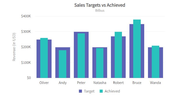
Bar charts convey information to help you compare the values of different categories. These charts use bars of equal width with lengths proportional to the values they represent. This makes comparing across categories easier. One axis plots categories and the other axis represents the value scale.
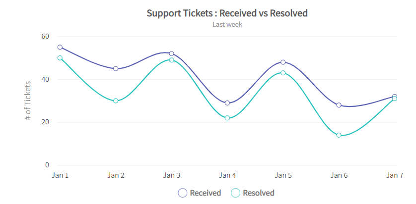
2. Line and area charts
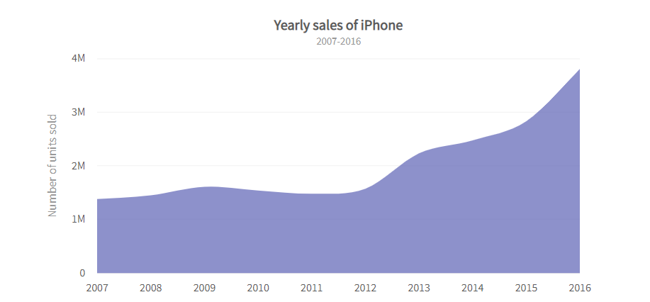
A line chart is a form of charting where you use a line to connect points that correspond to data values. Line charts often illustrate trends or changes over time. They are the most common type of chart for illustrating changes in data over time.
Next, an area chart is like a line chart in that it shows changes in data over time. An area chart, however, uses bars instead of lines to connect the data points with the x-axis values. In addition, each bar includes color as well as filled space. This can give a visual representation of overall change within a time frame.
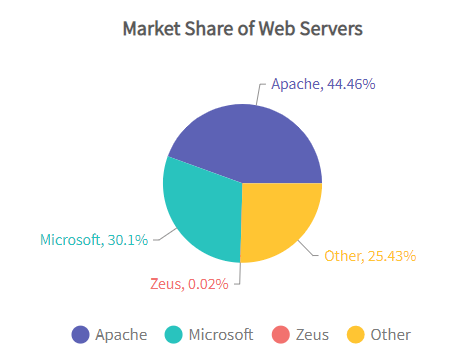
3. Pie and donut charts
After that, a pie chart is a circular graph divided into segments. Pie charts compare parts to the whole. The number and size of similar values in a data set determine each segment’s size. The length of a slice’s arc on the graph’s perimeter represents the percentage value of the variable. Radial lines connect the arcs to the circle’s center.
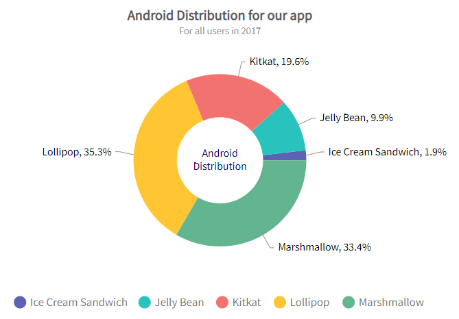
Then, a doughnut chart is a graphical representation of data. It uses a pie chart, but instead of a circle in the middle, it has an empty space. The space generally shows important information about the chart. You can highlight information by “slicing out” different portions of the doughnut.
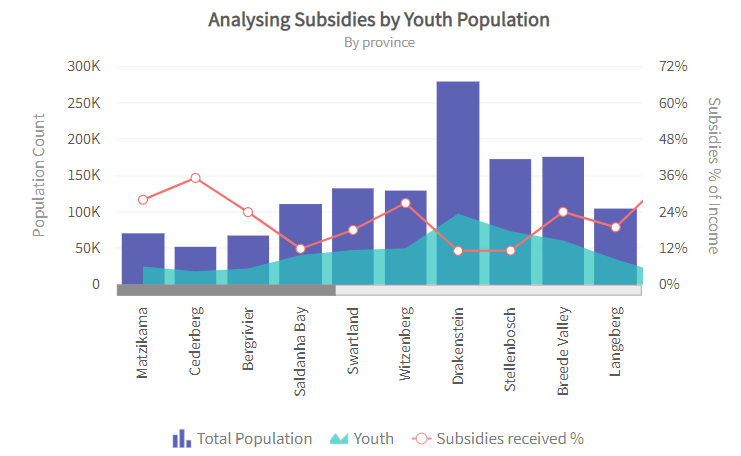
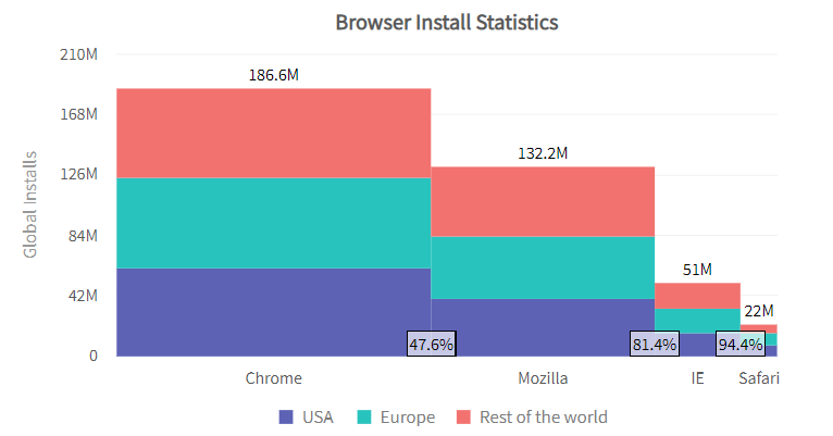
4. Stacked charts
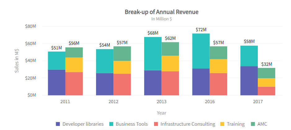
There is also the stacked graph. It visualizes data like expenditures or profits. Stacked charts combine different layers into one chart. This is useful because it is easier to compare changes across multiple categories when you see the values on the same chart. Stacked graphs are often used in bar charts and line charts.
Sometimes you need to see the big picture, and that’s when a stacked bar graph comes in handy. They combine groups of values into one simple bar graph so you can quickly grasp the total amount of change over time across several products or services.
5. Combination charts
Combination charts, like multi-series charts, allow you to plot multiple categories. They also let you show different representations of your data. This can help you better analyze and understand the information shown on your chart. They’re also for displaying and comparing multiple categories within a single view.
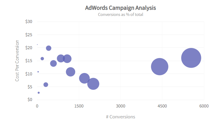
6. Bubble and scatter (XY) charts
Next, the bubble chart visualizes three variables. Two values locate the point on the x- and y-axis, and the third variable is represented by the size of the bubble. A common way to use it is to compare and depict relationships among variables by means of positioning and proportions. It can be used to analyze patterns and trends in data.
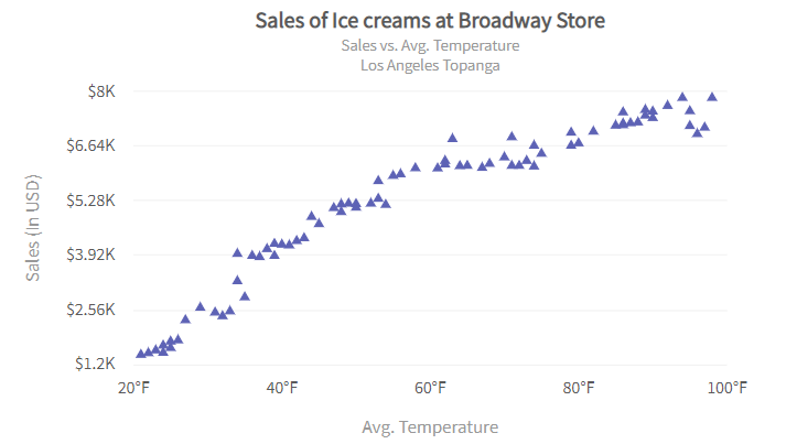
A scatter chart shows two numerical parameters and how they are related. Scatter charts use a Cartesian coordinate system to display the value of one parameter on one axis and the value of another parameter on another. If both parameters are numeric, this chart type shows how one parameter impacts the other. For example, you might use a scatter chart to plot the relationship between income and expenditure or temperature and sales.
7. Market share charts
A Marimekko chart (also called a mekko or market share chart) is a two-dimensional chart that shows the relationship between categories of data and their segments in terms of percentages as well as varying column widths to represent the data. The x-axis represents the relationship between sums of values within categories and the y-axis represents the percentage scale. This visualization is primarily for sales data and marketing analysis.
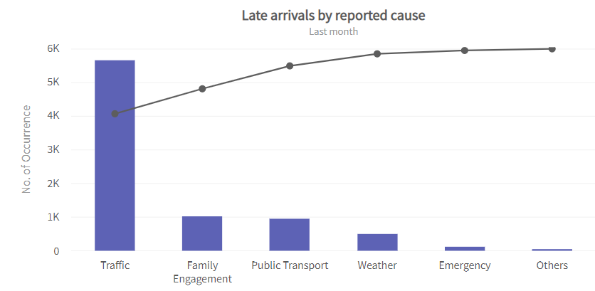
8. Pareto charts
A Pareto chart shows the frequency of problems or causes in a process. Pareto charts focus on problems or causes. They help you determine which ones are most significant. A Pareto chart can also show the components of a problem, as well as how it affects related processes. They are useful when communicating with others about your data.
The Pareto chart is a graph that shows frequencies or costs by arranging the bars of different lengths. The bars are arranged from the highest frequency (or cost) on the left to the lowest on the right. The chart is used to demonstrate which situations are more significant.
B. Integrate ready-made charts for faster and better results
As a data scientist, the last thing you want to worry about is how to make the pretty visualizations you need for your project’s deliverables. You would rather focus all of your energy on the results.
That’s where FusionCharts comes in handy.
FusionCharts provides charting solutions for businesses across all industries, from health care and education to finance and energy. It simplifies the creation of highly interactive data visualizations for business and technical users.
It is a great option for a data science project.
FusionCharts is an awesome visualization library. It provides a selection of charts and graphs you can use on your project and tons of customization capabilities. It also has a ready-made open-source integration with most popular tech stacks. This includes back-end integration (e.g., ASP.NET, Java, PHP) as well as front-end integrations (e.g., Vue.js, Angular, or React), all ready to help you ship your projects faster.
Let’s see how you can get these charts installed on your server and customized to your liking.
If you’ve ever tried installing an open-source charting library of your own, you know how challenging it can be. It’s not always obvious what types of charts are available and how to get them up and running on your project.
FusionCharts makes creating charts easy by providing premade charts with the code ready to copy and paste into your data science projects. These are high-quality charting libraries that have been battle-tested by being used in companies like Facebook, Apple, Google, Oracle, IBM, Intel, Adobe, and more!
Create over 150 charts and more with the Django plugin for FusionCharts
- Quick demo: Django Module for FusionCharts
- Here’s a step-by-step documentation guide to creating charts using the Django Python framework.
Case Study
In this video, we’ll take a look at some concepts of how to work with FusionCharts in Python. (It’s part of a business data science project called Lead Analytics.)
You can use Python with the FusionCharts library to get a better understanding of how to deal with FusionCharts.
Wrap Up
As an advanced charting tool, FusionCharts offers a powerful feature set with an easy user interface that can help data science professionals create visually appealing and detailed charts. The FusionCharts series is our effort to fill in the gaps and create a full solution to most of your data visualization needs. We hope you find it useful and possibly gain inspiration from our code and examples!

To sum it up, FusionCharts provides a comprehensive solution for the entire spectrum of visualizing data for your data science project. You can create a wide variety of charts and maps, much more than are present in other libraries and tools. What you’re getting into is a deep and rich ecosystem with a lot of support and good documentation that will help you make the most of your work.
Explore Interactive, responsive charts for all your projects
FusionCharts provides everything you need, including documentation, API, and customization options.


