Data visualization can be a powerful tool for communicating critical business information. It contributes to the presentation of a visual narrative that is easier to digest for those who do not have the time to read large chunks of text (think CxOs, busy senior management, or even millennials with a time crunch).
In fact, that’s most of us these days – a generation that’s always on the go while also being data-hungry and information-curious. We are frequently inundated with information, whether at work or in our personal lives. The impact could be far greater if this information is presented visually rather than in spreadsheets, reports, or tables. Using best practices to distill the points and present them in a more appealing format can help to simplify comprehension and provide deeper insights.
As a result, it’s no surprise that companies all over the world are considering data visualization as a valuable methodology. In this post, we’ll show you the top six modern data visualization trends to be aware of, which may help you create charts and graphs for data visualization in the future. If you’re looking for a Data Visualization Tool, we recommend FusionCharts.
Table of Contents
Redundancy: It’s a Good Thing?
For all the word-wizards out there, redundancy is generally cringe-worthy. Marketers and graphic designers, however, have an entirely different take on this, using repetition to create lasting impressions. In fact, one of the oft-cited principles of graphic design is the mnemonic CRAP: contrast, repetition, alignment, and proximity.
Repetition, or redundancy, is an important element of visual design, especially when communicating data.
Visual data relies on cursory or ‘at-a-glance’ analysis, measured in seconds, not minutes. When you’re communicating visually, there’s no guarantee the audience will actually start at the “beginning.” It’s important to lead the eye to those key points that need to be communicated quickly and effectively, and a powerful strategy for doing so is the crux of your message in unique ways.
(A dot chart vs. a version with six encodings. Source: Displayr)
Some rules of thumb for your redundancy toolkit include spelling out numbers underneath the digits, repeating shapes and colors for those things that must stand out the most, and even copying and pasting the exact same information, such as location, into multiple spaces with different visualizations.
Mobile-First: Keep It Simple, Silly
When a business sends an email to its customers, launches a website, or posts shares a post on social media, it essential to check the look-and-feel both on desktop and mobile. We rely on our mobile devices for everything these days, whether it’s a business and personal pursuits task. Therefore, a mobile impression is often the first impression.
A company’s communication or visual grammar must be as mobile-friendly as possible. That means making it clear, simple, compact, and concise.

(What’s simpler than the red and green of Google Maps’ traffic data? Source: Google Maps)
You don’t have much space to work with, and you must immediately capture the audience’s attention — and keep it. Data visualizations have to factor this in, for maps, charts, graphs, web pages, presentations, or elsewhere. You have to make the data as engaging as possible, while also streamlining it. The major points must be clear and easy for audiences to understand and digest.
Of course, this trend also bleeds out of just mobile. Keeping in mind how busy we are, simplicity in visualization is a general the best practice.
Machine Learning: More is More
Artificial intelligence (AI) and machine learning are now popular technologies for analyzing data and developing visualizations. And with both AI and ML rapidly evolving, this will soon become a mainstream model.
Your data could come from any number of disparate sources, including internal systems such as enterprise resource planning (ERP) and customer relationship management (CRM) applications, or external sources like the web and streaming data. They have to be integrated, formatted, and customized for a particular user.
Now, users expect a good mobile experience, spot-on geolocation information, and consistent access to a large amount of data – often without being aware of the voluminous numbers that actually make those insights. Developers providing anything less risk being left behind in a competitive market.
However, are being by AI can help collect and process these massive amounts of information at rates human beings just can’t match. In fact, AI could even parse and analyze the information for the points most relevant to the user.
Some AI solutions can express this information visually for you or other audiences. This process is called “visual analytics,” as it combines the advanced automatic and visual analysis methods of AI, with human interaction to gather insights.
Here’s a simple use-case: college students doing a report on contemporary American history might find a timeline with visual cues and highlighted texts highlighting key years more useful than endless details about every event that has happened in the past century or so. That’s a benefit for a rushed student – and also for the graphic designer. (Do you think they have time to painstakingly generate every visual representation of data you see in your search results? Much of this is handled by AI.)
Virtual Reality: In the Middle of the Data
Advances in technology and big data has unlocked new options and capabilities in data visualization. For example, you no longer have to use just a paper map or a simple digital counterpart. Now, more often than not, not only are maps digital, they’re interactive. You can place pins, have GPS automatically pinpoint your location (which you can edit), and define personal preferences such as favorite routes.
https://www.youtube.com/watch?v=wacNaAVGXdU
This saves time and provides more opportunities for user interaction. Take virtual and augmented reality as examples. Users are right in the middle of the data and can engage and interact with it in multiple ways.
Imagine a map of your neighborhood with restaurants and businesses marked. With a click, a tap, or even just a twitch of the eye (a la virtual reality helmets), you can conjure reviews, inventories, and menus. Technology capable of presenting contextual data, especially visually, is becoming more sophisticated every day.
Accuracy and Transparency
Standing out from the competition will require an emphasis on more accurate information. Data can easily be manipulated or misrepresented, leading people to the wrong conclusions. As audiences become more educated and aware, they can easily spot these deceptions. And with the users’ time paramount, it’s hard to forgive an organization for manipulating data and wasting time on corrections.
News platforms with more accurate and better-presented information will command, if not bigger, then more at least a more engaged and loyal reader pool. Maps and location services that give better directions and more accurate traffic reports will have more downloads. Weather apps that offer more accurate forecasts will gain more trust. Ultimately it all comes down to the data and how useful it is.
Similarly, accurate data visualizations can help businesses maintain an image of transparency. Developing infographics, for instance, that do not over exaggerate or overtly lie about the data is, and will continue to be, a powerful public relations tool.
Accessibility: Data for All
Consumption of data begins and ends with our senses. If the viewer is lacking or struggling with anyone, and the data is completely dependent on that mode of communication, the message will be lost.
The answer to this is a focus on accessibility.
Accessibility means making your communications, including data visualizations, available or consumable to the widest cross-section of people. When creating visualizations, designers should consider color palettes that are colorblind-safe, like those provided by ColorBrewer.
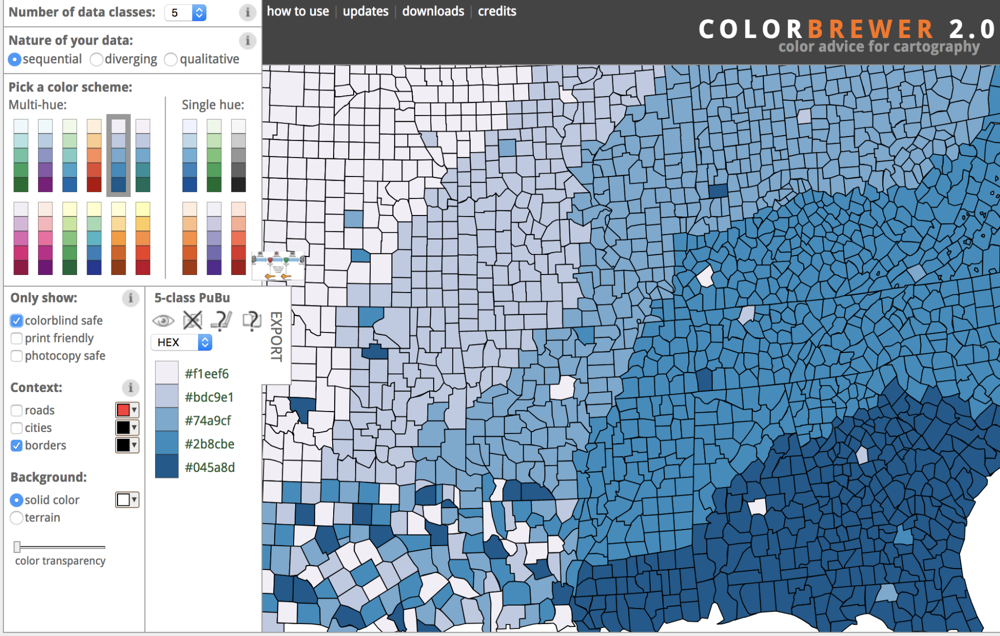
(Image source: ColorBrewer)
For users with a total loss of sight, text-to-speech technology helps interpret visuals. When adding graphics to web pages, this is usually addressed with the <image alt =””> and <image title =””> tags.
For charts, accessibility-focused web developers traditionally recreate the chart data in a table view that can be interpreted using screen-reading software. But this can be clunky or and might look out of place to sighted users.
New collaborations are enabling a more sophisticated systems of descriptive tags for charts and graphs. Not only does this open your business up to a much broader audience, but it also improves search ranking, as websites are ranked based on accessibility.
Guest Author – Quincy is part of the team at Springboard and is passionate about online learning and strong coffee.