
With the rise of global startup culture, venture financing has taken the lead in facilitating early-stage companies with their finances and expenditures. This allows startups to focus and put all of their attention on executing their ideas and worry less about their finances.
If you are involved in venture financing, having a powerful dashboard that provides a visual summary of recent deals, investments, and recent financial trends is especially critical. With this purpose in mind, FusionCharts allows you to create interactive financial dashboards. With a venture financing dashboard, you get an overall summary of investment activity in your preferred sectors. You can also compare them over a period of time. Venture financing dashboards also help you identify any anomalies in your investments and help you make wiser, more informed decisions.
The best part about FusionCharts is that it has full source code available for developers. To start using these data visualizations with React, you only need to download and plug them into your own projects.
Table of Contents
How Can I Build a Powerful Venture Financing Dashboard with FusionCharts?
FusionCharts offers an easy way for companies to create powerful venture financing dashboards that highlight investment trends on a monthly and also quarterly basis. With this kind of dashboard, dashboard, companies and individual investors can track specific financial metrics and investment KPIs and evaluate them accordingly.
Here are some key features of a powerful venture finance dashboard.
- Track deals and finances.
- Keep an eye on important trends.
- Analyze the trends within custom adjustable time frames.
- Get an overview of average deals by sector.
How Can I View the Summary of Aggregated Data in My Finance Dashboard?
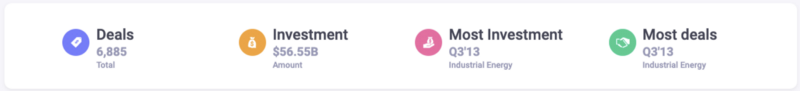
As an investor, having important metrics as well as meaningful aggregated information displayed at the top of your venture finance dashboard is particularly useful. For this reason, FusionCharts has a full suite of Bootstrap-based libraries and support for React.js to showcase aggregated financial data in your existing React applications and dashboards.
<section className="rounded-corners-2">
    <KPIContainer data={KIPData} dataLoaded={dataLoaded} />
</section>
Here is how your aggregated data component in the dashboard looks like.
How Can I Add a Trend Comparison Component to My Dashboard?
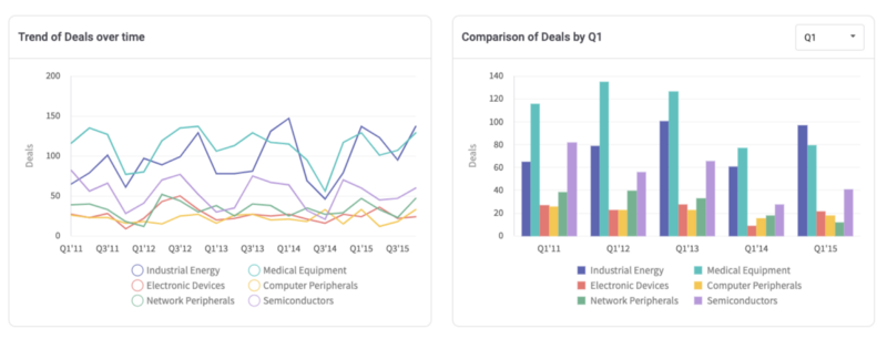
Displaying and analyzing financial trends is an important role for a finance dashboard. Responsive visualizations of financial data trends provide meaningful insights into deals and investments. Done right, you can use them to perform various analyses and make predictions as well.
FusionCharts provides an easy approach to implementing visualizations that involves just a few lines of code. Everything is handled internally by the FusionCharts library itself. Take a look!
<div className="row pt-15 pb-15">
    <div className="col-12 col-xl-6 mb-4 mb-xl-0">
        <Card
            title={
                'Trend of ' + getCustomLabelFromFieldName(getFieldByLocalFilterStatus(filterOnInvestment)) +
                ' over time'
            }
            chartContainerID="chart-11"
            dataLoaded={dataLoaded}
            config={chartData}
        />
    </div>
    <div className="col-12 col-xl-6">
        <Card
            title={
                'Comparison of ' + getCustomLabelFromFieldName(getFieldByLocalFilterStatus(filterOnInvestment)) +
                ' by ' +
                lclFilterOn
            }
            chartContainerID="chart-12"
            showFilterControl="true"
            filterPlaceHolder="Select Time Frame"
            filterItems={getFilterComboItems()}
            filterSelectedIndex="1"
            onApplyFilter={this.localFilterHandler}
            dataLoaded={dataLoaded}
            config={chartData1}
        />
    </div>
</div>
When you are done your trend comparison component looks like this in the dashboard:
What is an Easy Way to View Average Deals by Sector?
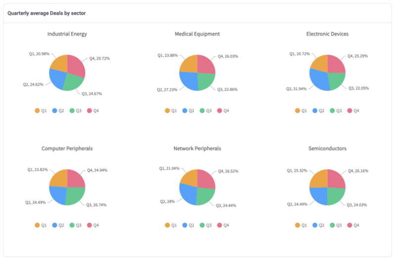
Tracking average deals by specific industry sectors is particularly important information to have on your venture financing dashboard. The average deals by sector component show you an overall view of which industry is most active and can help you decide the best field for investment.
To make it happen, FusionCharts offers you a ready-to-use codebase that you can just plug into your venture financing dashboard.
<div className="row pt-15">
    <div className="col-12">
        <Card
            title={
                'Quarterly average ' +
getCustomLabelFromFieldName(getFieldByLocalFilterStatus(filterOnInvestment)) +
                ' by sector'
            }
            chartContainerID="chart-13"
            dataLoaded={dataLoaded}
            config={chartData2}
        />
    </div>
</div>
And here is the average deals component in the venture finance dashboard:
What Does an All-in-One Venture Financing Dashboard Look Like?
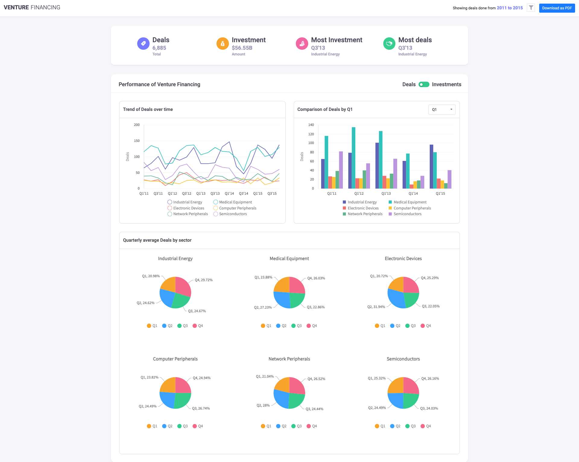
For a complete view, you can combine all of the FusionCharts components into an are even more powerful single-page venture financing dashboard. To build your all-in-one dashboard, just combine all of the code snippets here. This is the final result:
Source Code for Venture Financing Dashboard
Venture Financing Dashboard Demo
So, here we are! FusionCharts has made it really easy and effortless to design and develop a venture financing dashboard for your use case. FusionCharts supports a wide variety of bindings out of the box for Javascript, Angular, React, jQuery, Vue.js, Ember, React Native, AngularJS, Svelte, ASP.NET, PHP, Java, Ruby on Rails, and Django.
Let us know in the comment section below how you used FusionCharts to easily build a venture financing dashboard for your application.
Download FusionCharts and get started today!


