
Sales dashboards are an essential part of any business. These dashboards illustrate sales data and present cost fluctuations, transactions, and purchases in addition to other important parameters. Moreover, sales dashboards present these metrics on time scales that range from seconds to years. Most importantly, sales dashboards run on a centralized server, where all managers and executives have access to real-time data. Because of this, they are an invaluable tool that not only saves you time, but also helps you plan efficiently, design great market strategies, and also promotes your long-term sales.
Are you interested in learning more? Then keep reading for five different ways to build effective and efficient sales analytic financial dashboards. Above all, these dashboards are an invaluable tool for any retail or trading company looking to improve planning, sales analytics, and progress monitoring.
Table of Contents
1. How Can I Build a Sales Management Dashboard?
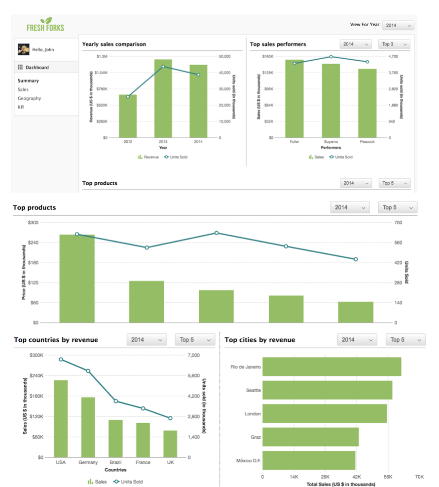
The Sales Management Dashboard presents your key sales numbers. The dashboard uses jQuery and FusionCharts XT. Important characteristics of this dashboard are:
- Login using a unique id and password to gain insight into important company information, top salespersons, high sales regions, and best-selling products.
- Illustrate sales locations using maps. Clicking on an area shows data in more detail for that location.
- Generate a summary of performance metrics with a single click. Display results over different years by condensing knowledge from different datasets.
- Analyze different product categories and determine your most popular and highest selling items by clicking on each column.
- Keeping track of employee performance and determining your best salespeople with year-over-year reports.
2. How Can I Build a Sales Opportunity Dashboard?
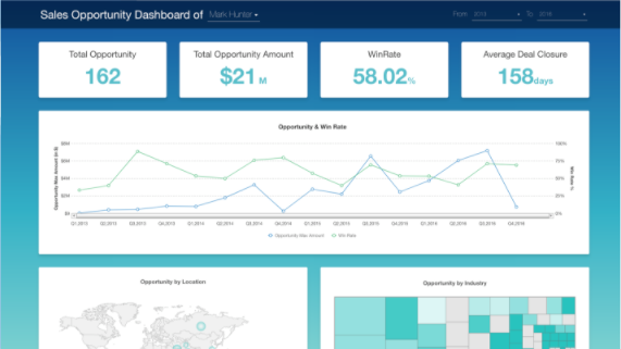
The sales opportunity dashboard enables viewing and exploring your opportunities by region, industry, win rate and opportunity value. The dashboard is built using modern technologies. These include React JS, Node JS, and Express JS as well as MySQL. FusionCharts XT and FusionMaps XT are the main data visualization and presentation tools. The key features of this dashboard are:
- Identify and view opportunities over different time ranges.
- Pinpoint various opportunities by sales executive.
- Identify maximum opportunity at any given point in time.
- Illustrate opportunities by different parameters including location, industry, opportunity value, and win rate.
- Provide a holistic view of contributions from other industries.
3. How Can I Build a Sales and Collaboration Dashboard?
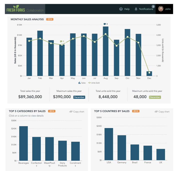
The FusionCharts Sales and Collaboration Dashboard facilitates conversations and collaborations. This dashboard is built using PHP as well as JavaScript.
The important features of this dashboard are:
- Comments and feedback added directly on the dashboard.
- Built-in notifications or alerts that update about the current conversation.
- Built-in ‘click-to-copy chart’ allows users to share charts.
- Dual-Y axis plots units sold and revenue concurrently, giving analysts and managers a holistic picture of all sales.
- Complete record of comments and feedback on various metrics to simplify audits.
4. How Can I Build a Sales Performance Tracker (3D)?
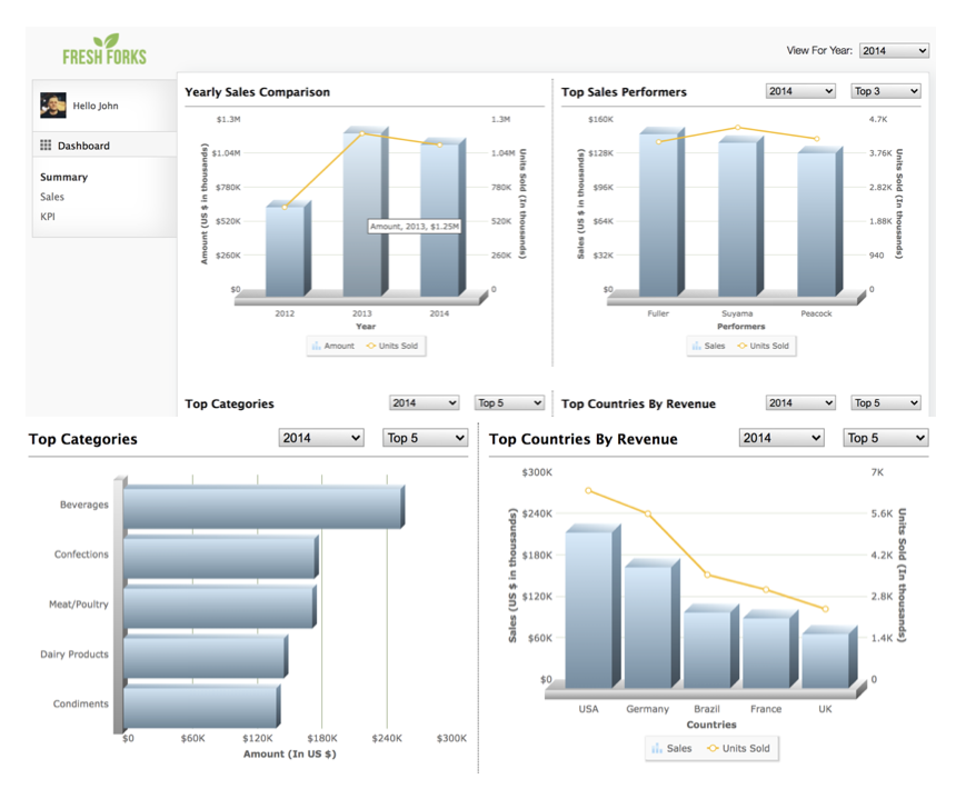
The Sales Performance Tracker (3D) uses FusionCharts XT and JavaScript. It has the following attractive features:
- Presents all-important sales data metrics effectively using easy-to-understand 3D charts.
- Allows managers and executives to monitor and track yearly sales, sales by countries in addition to top-selling products.
- Enables tracking by managers of individual sales-persons as well as different sales teams to speed up your yearly process appraisals.
- Dashboard data can also be loaded from a single file less than 400 KB in size.
5. How Can I Build a Product Rating Dashboard?
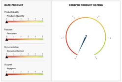
The unique FusionCharts Product Rating Dashboard allows direct customer interaction to rate your different products. It uses FusionCharts XT together with FusionWidgets XT.
Its important features include:
- Consumers can rank products according to four different criteria. These are product quality, features, and documentation, as well as support.
- Ratings for each product between 0 and 5, with up to 2 decimal points for enhanced accuracy.
- Overall scores provide a summary of how users are rating your product.
- Users can edit scores or ratings by simply interacting with the dashboard.
Leverage FusionCharts, FusionWidgets, and FusionMaps to Create Real-Time Interactive Dashboards
FusionCharts is a comprehensive data visualization library. It comes with 100+ charts, graphs, and also gauges. In addition, FusionCharts includes 2000+ choropleth maps. Depending upon the nature of your data, you can create beautiful illustrations using different types of graphs and charts. Your options include column charts, combination charts, line plots, chord diagrams, Sankey charts, and bubble plots, as well as donut charts. Finally, you can build interactive and effective dashboards that display real-time changes in data on different time scales.
Your developers can build dashboards in minutes using the FusionCharts library. Moreover, the library features consistent APIs that simplify coding to make it easy for novice programmers to create complex data presentations. FusionCharts is accompanied by extensive documentation as well as a plethora of tutorials and live examples to aid development. In other words, you can also use FusionCharts in your favorite development environment including React, Javascript, Angular, PHP, Python, Java, and much more.
Take your dashboard to a whole new level. Sign up now for your free trial of FusionCharts!


