Integrating a charting library with an administration template can be a great way to improve the data readability and usability of your application. By using FusionCharts, you can create interactive charts that can be quickly and easily embedded into your templates.
FusionCharts provides the ability to create high-quality charts, graphs, and maps quickly and easily. Charts can be used to display data in a graphical way. Graphs can be used to visualize data in a way that is easy to understand, while maps help to represent and compare data based on a specific continent, country, or city.
By integrating FusionCharts into your administration template, you can create powerful visual representations of your data. This can help users understand the data more easily and make more informed decisions.
FusionCharts is loaded with 100+ charts, graphs, and gauges along with 2,000+ choropleth maps to help take your dashboard to a whole new level. All you need to do is select the correct chart type from the wide variety provided by FusionCharts.
Additionally, by using FusionCharts, you can create dynamic charts that can be updated automatically as new data is collected. This makes it easy to keep your charts up-to-date and responsive to user needs.
Let’s take a look at how the Crema React admin dashboard template uses charts to visualize data inside it.
Table of Contents
Why Crema
We selected Crema because it’s one of the top-selling admin dashboard templates on the Envato Market. It has been built with the modern web developer in mind; therefore, it is available with MUI, React-Bootstrap, and Ant design and supports a wide range of components that you can use to create your own custom admin dashboard such as the Froala WYSIWYG editor and Filestack, the sleek file uploader Javascript library.
Crema uses React Hooks to write components more intuitively without using classes, and it is integrated with Redux and Context API for state management, making it fast and reliable.
Crema uses a fake API creator “Axios-mock-adapter” to fetch data, making it very easy to integrate with real servers. It’s also available with both Pure Context API and Redux + Context API to manage states.
Crema Template Features
- 11 navigation styles
- Seven inbuilt apps
- Thousands of color combinations
- Six languages supported
- Three theme styles (dark, semi-dark, light)
- Two layouts (full width, boxed)
- Best coding practices implemented
- RTL support
- Fully responsive
- 300+ widgets and metrics
- E-commerce app
- Login and authorization system
- Well documented
- Slack channel for community members
- GitHub repository access
How Crema uses charts inside its different applications
Crema has seven inbuilt apps.
- Crypto
In this app, Crema uses:- Area chart to represent the changes in the cryptocurrency amount yearly, monthly, weekly, or daily
- Doughnut chart to represent the BTC volume by currency
- Stacked columns chart to display crypto market activity data
- CRM
In this app, Crema uses:- Area chart to display statistics about projects, new clients, and income of the application
- Doughnut chart to display earnings in monthly information
- Stacked columns chart to display goal in progress versus actual goal
- Columns chart to display social media advertising per social media platform
- Analytics
In this app, Crema uses:- Area charts to represent data about the application’s daily visits
- Stacked column chart to display sales statistics for a week or month
- Multiseries line chart to compare the number of visitors to page views
- A map graph to display earnings by country
- A bar chart to display data about support tickets
Crema uses charts in other apps as well, but this is enough to demonstrate the importance of using charts inside a dashboard. All the above types of charts and more are supported by FusionCharts. Rebuilding the above charts with FusionCharts will enhance their look and feel and will display the data in a clearer way. Moreover, you will be able to display advanced options like filtering and zooming.
FusionCharts integration
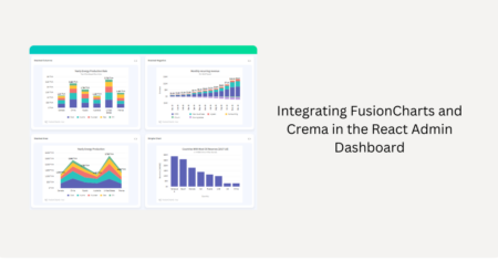
Crema already has integration with FusionCharts. Crema showcases six demos of FusionCharts. You can see how charts fit into the theme, look, and feel without needing to write any CSS code. Its responsive features make the data representation look good in any screen size. In the top right is a code button that displays the initialization code of each example. Notice how it was easy to render these stunning charts with a few lines of code.
Takeaway
Charts are a very important component of admin dashboards. If you are looking for an admin dashboard template, select one that is already integrated with a beautiful yet powerful charting JavaScript library.
Crema is a good example of that. It not only has integration with a powerful charting library, FusionCharts, but also provides you with a wide range of useful third-party libraries for any admin dashboard. For example, Froala WYSIWYG editor allows you to create and edit HTML content with an easy-to-use user interface. Crema has also integrated with Filestack, the sleek file uploader JavaScript library that will facilitate the file upload process, making it super fast and more reliable.
If you already have your own admin dashboard and are looking for a powerful charting library, then you should look at FusionCharts. It offers all the features and chart types you’re looking for with a small subscription fee.


