
As organizations accumulate more data, and third-party data becomes more available, the role of business dashboards in how organizations and institutions make decisions increases. Dashboards help users visualize data summaries, track key performance indicators, and forecast future trends. Today’s best business dashboards leverage data visualization techniques that churn large amounts of raw data into useful information and knowledge.
Whether you work for a startup, a small business, or a large corporation, dashboards can help you make the most of your data and achieve better results.
In this post, we’ll show you how to improve your dashboards by utilizing the FusionCharts library, why fusioncharts is the best choice for building dashboards, and adhering to a few fundamental principles.
Table of Contents
Why Should I Use FusionCharts For Building Dashboards?
FusionCharts is a graphing and charting library that helps you create beautiful and stunning dashboards that present your data meaningfully and effectively. The library offers a variety of charts, graphs, gauges, and maps to choose from. You can quickly and easily put together different charting components to build engaging and useful dashboards. FusionCharts is also accompanied by a wide range of dashboards for web and mobile. You can quickly download the source code and easily customize it for your requirements.
Read on to find out how you can use FusionCharts to take your dashboards to an entirely new level and bring more value to your organization.
Build Your Dashboard With the Right Components
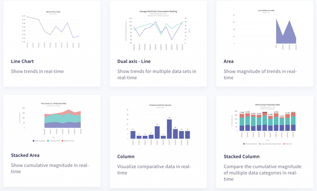
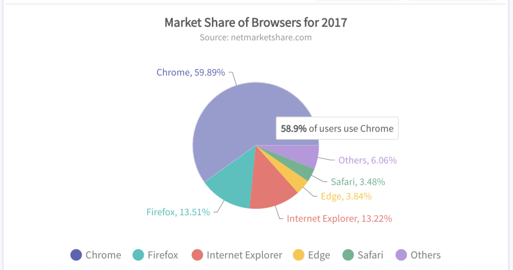
To get better results out of your dashboards, you need to choose the most relevant chart or graph for your data. This will make your dashboard more intuitive and insightful. For example, you can use a column chart to compare several items over time, a line graph to show fluctuations in daily prices, and a pie chart for breakdowns or compositions of costs.
FusionCharts comes with over 100 graphs, charts and gauges, and 2000+ choropleth maps. No matter how complex or large your data is, FusionCharts offers the right components to help you best visualize data summaries, understand changing trends, and predict future values. Explore all the varieties of charts and graphs offered by FusionCharts.
Make Your Dashboards Interactive
Designing your dashboards to be interactive and responsive gives your users an engaging and immersive experience. FusionCharts is one of the few libraries that allows you to write event handlers for all types of events. These include mouse, keyboard, chart, and data events. FusionCharts also allows panning, zooming, and scaling. Learn how to handle different types of events in FusionCharts.
Update Your Dashboards in Real-Time
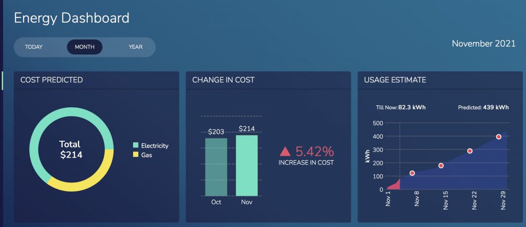
Instead of making static dashboards, make your dashboards responsive to changing data. With FusionCharts you can build dashboards that allow you to monitor different parameters in real-time. This lets you incorporate real-time charts into your dashboard. You can update these data streaming charts at regular, user-specified intervals.
Add Drill-Downs to All Charts in a Dashboard
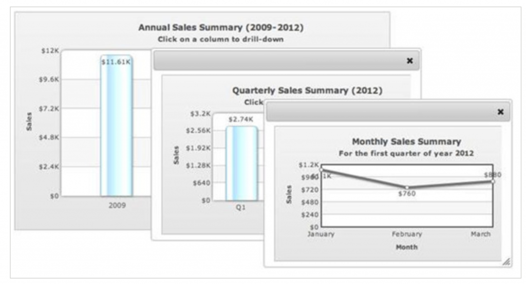
In a drill-down chart, each data point or data series in the chart acts as a hot spot. This allows you to create descendent-level charts with as much fine detail as you want. You can add a drill-down to your chart to create descendent charts on either the same page or in a new tab. They can also display more information in a popup window. Learn how to add drill-down features to your charts using FusionCharts.
Use Your Dashboard to Disseminate Information
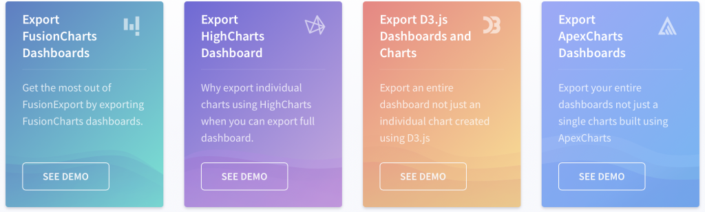
You get better results out of your dashboard if you can share information. FusionCharts comes with our FusionExport component. It exports charts into pdf, jpeg, and png formats. These formats are convenient for sharing snapshots of changing data with colleagues or peers over email.
Your Dashboard Should Be Accessible Anytime, Anywhere
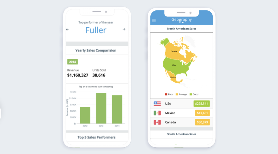
When you build a dashboard, make sure it is accessible. Customizing your dashboards for mobile phones, tablets, and laptops lets your users view data any time, whether they are at work or at home. In addition, the JavaScript-based FusionCharts library is both device and platform-independent. You can build dashboards for all types of devices and platforms including iOS and Android.
Are You Ready to Create Your Next Dashboard With FusionCharts?
Of course you are! FusionCharts is clearly superior and smarter than any other charting library. In terms of data plotting, interactivity, customizability, event handling, documentation, and integration with other platforms, FusionCharts offers the best solution for your dashboards. It’s simple to use and provides a wide range of options for creating amazing dashboards that are simple, effective, and meaningful.
Don’t put it off any longer; begin exploring FusionCharts’ fantastic features today and sign up for a free trial.


