
Business dashboards have taken a lead role in all small and large enterprises for reporting, tracking, and monitoring key performance indicators. Business managers, executives, and key decision-makers have also realized their importance and use them regularly to uncover key data insights and make future strategic decisions.
If you are looking to develop your own business dashboard, then you have come to the right place. Continue reading for a comprehensive guide on how to resolve different types of issues with your dashboards.
Table of Contents
Which Platform Should I Use to Create Robust and Reliable Business Dashboards?
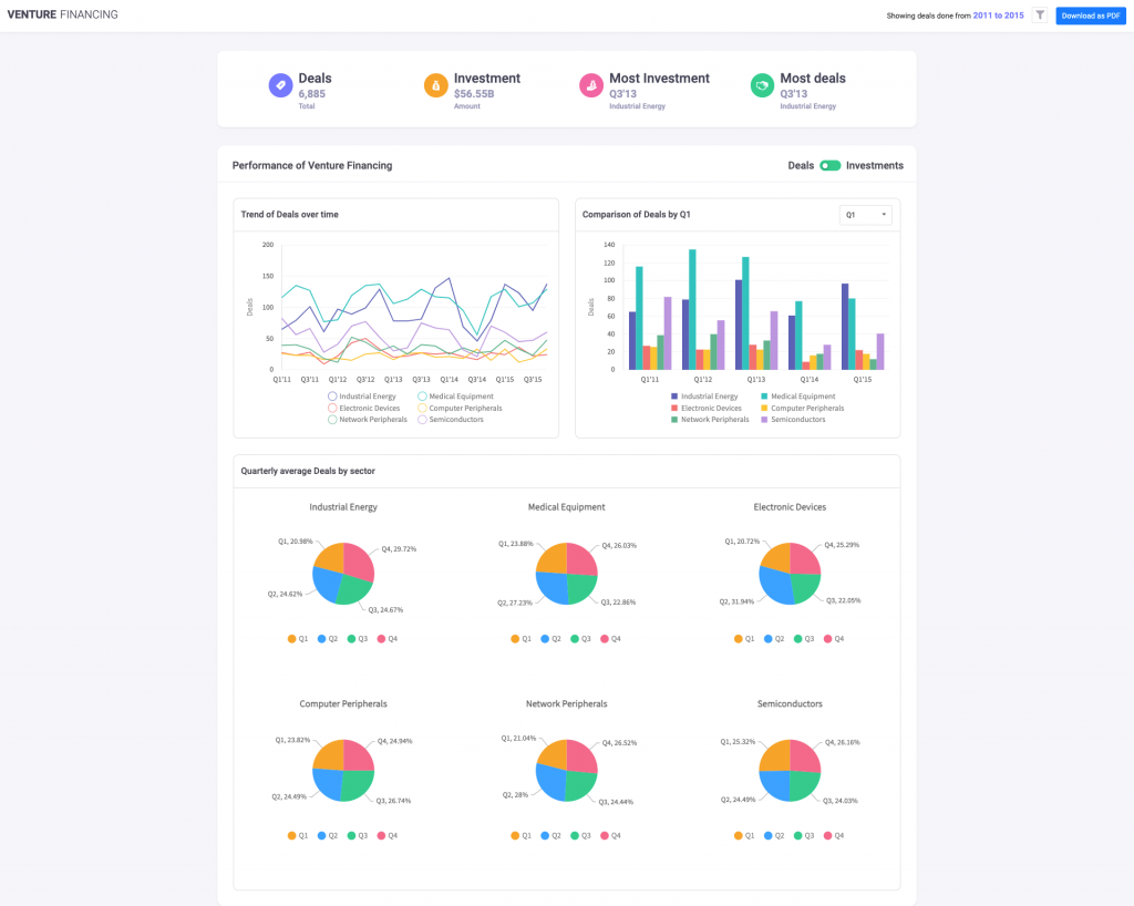
This is the first question that comes to mind when you decide to create a business dashboard. You want your dashboard to be robust and reliable. In addition to effectively developing beautiful, effective, and meaningful data visualizations, you expect your business dashboard to be free of all types of runtime errors. You also want your users to have the best data presentation experience on any platform without slowdowns or bugs. The best way to create a reliable and error-free business dashboard is to use the best graphing and charting library out there. That library is the FusionCharts Javascript library. It beats all other platforms in terms of robustness, speed, aesthetic color schemes, efficiency and so much more.
What are the Possible Design Issues with My Business Dashboards and How should I Solve Them?

When solving issues with your business dashboard, make sure to resolve all types of design flaws. Here is a list of issues to check when designing your dashboard.
Are You Showing Excessive Information?
The goal of the business dashboard is to provide the users with important insights and a summary of all the key performance indicators. It is a common design flaw to include too many data points on your charts and graphs. Make sure that all your charts have a clean design, with easy to comprehend information. If there are too many data points, present summaries. If there are too many parameters, use multiple charts or visualizations. You should also make sure that related parameters are illustrated in graphs laid side by side.
Are You Using Too Many Colors?
Using too many colors can be distracting and cause confusion. You want your users to focus on the key information being presented in the charts and graphs on the business dashboard. In order to achieve this, make sure that you use a clean and simple design. To make your life easier, you can choose FusionCharts’ default color schemes. The themes in FusionCharts include Fusion, Gammel, Candy, and Umber. All these themes have been optimized with the goal of a beautiful, yet simple presentation, and giving the user the best data visualization experience.
Are You Using Consistent Scales?
When presenting data in a business dashboard, it is important you compare data using a consistent scale. This is especially important when comparing two data series. For example, if you are comparing apples and oranges by weight, their weight scale should be the same. If one of them is in kilograms and the other is in pounds, you need to apply a scale conversion.
Is Your Dashboard Accessible to All?
Another issue with a business dashboard is its accessibility. Most of the commonly available charting and graphing libraries run only on a few platforms or a limited set of devices. This causes accessibility issues, especially if your business dashboard displays critical data. Restricting your users to certain platforms and devices is not an option.
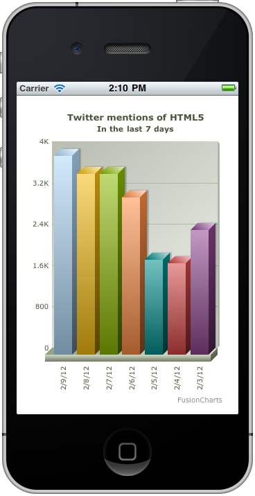
When you develop your business dashboards using FusionCharts, they are automatically run on all platforms and device types. Whether a user likes Windows or Mac, FusionCharts business dashboards work. In addition to this, you can access FusionCharts dashboards from any device, whether it is a mobile phone, desktop machine, laptop, or tablet. The display automatically adjusts itself for an effective presentation on smaller screens. This way your business dashboards are accessible to a wide range of users, who can view them in the office, while traveling, or from the comfort of home.
Does Your Dashboard Respond to All Types of Events?
Another major issue with business dashboards is that they are often static and unresponsive. For example, many charting libraries do not support scrolling and zooming. FusionCharts, however, has default functionality that makes its charts interactive and responsive. Users can pan, scroll, zoom and scale. In addition to this, you can make your business dashboards more responsive by adding event handlers for all types of data, mouse and keyboard events. You can also choose its default functionality, which suffices for most events. However, if you want a more flexible and personalized user experience, then you can override the default behavior and customize it to suit your needs.
Is There a Debugger for FusionCharts for Fixing Runtime Issues?
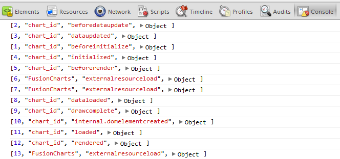
Yes, absolutely! FusionCharts has a debugger with a detailed guide so you can trace errors within different charts and graphs. You can also use the debugger to verify the flow of events in a chart. The debugger logs all activities that are a consequence of events firing within the framework. If you are looking to fix runtime issues with your business dashboard or want to resolve any unexpected behavior, you can quickly do so by using the debugger.
Where are the Technical Articles for FusionCharts Business Dashboards?

FusionBrew is the official site for FusionCharts blogs. There are loads of technical articles on best practices, design principles, and how-to guides for business dashboards and data visualization. You can browse the dashboard topics if you are looking for specialized dashboard-related topics.
There are also free white papers on business dashboards, data visualization principles, and charting guidelines. These resources contain a wealth of information that you can use to design beautiful dashboards and resolve any issues that you encounter during various development stages.
Does FusionCharts have Any Technical Forums to Solve Issues with Business Dashboards?
Indeed, yes! You can post your question, report a bug, or start a discussion at the FusionCharts technical forum. Use these forums to quickly resolve any issues that you encounter during the development, production, or deployment phase of your business dashboards. Our technical support team is there to help and answer your queries.
How do I Sign Up for FusionCharts?
FusionCharts takes your data visualization experience to a whole new level. Whether you are developing a dashboard related to sales, finance, medicine, demography, manufacturing, or any other domain, FusionCharts caters to all your data visualization needs under one framework. You can quickly and easily develop business dashboards optimized to run on all platforms and devices.
Don’t miss out on the best data visualization experience. Leverage the power of FusionCharts today and sign up for your free trial.


