
One of the most common forms and useful ways to represent data is the time series chart. This is because time series charts are a familiar, easily-interpreted visual format that allow businesses and researchers to graphically represent two correlated pieces of information at once. Known as time series charts, times series graphs, or time series plots, these visualizations illustrate data points across a progressive time interval. Each point on the chart corresponds to two measurements — time and quantity.
Conventionally the horizontal axis of the chart represents the passage of time and the vertical axis provides a numeric value for a measured variable. While time series live charts may seem simple, the best and most visually effective examples can be customized both visually and functionally.
Table of Contents
FusionTime and FusionExport
One example of this is FusionTime, a popular Javascript library that aids executives, data scientists, and researchers create time series plots of data. The graphs of time series are unique and different from the ones created by other tools as they allow users to pan, zoom and scroll through the time series. Users can interactively zoom through different portions of data ranging from milliseconds to years.
Of course, merely creating a chart is just the beginning. Data is meant to be shared. When it comes to making presentations or sending regular updates of data via email, you need to be able to export your graphics in a way that doesn’t reduce their visual impact or functionality. In most cases, this means exporting time series plots as PDFs or digital images suitable for emailing. That is where FusionExport comes to the rescue by allowing you to export your charts, graphs, and even live dashboards. You can even add your branding or logo design to the exported visualizations.
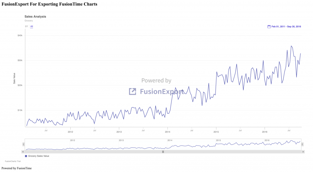
If all this interests you, then read on to find out how you can export a FusionTime plot to a high-quality digital image using FusionExport in Node.js. In the example below, the exported time series includes both the main plot as well as a time navigator.
How Do I Use FusionExport To Convert FusionTime Plot To Image In Node.js
Wondering how you can export your time series? It is easy to convert FusionTime plots to digital images or PDFs using FusionExport. Here we list 5 easy steps for converting time series plots to png files. You can also convert them to PDF files, and add any additional text, logos, icons, or visuals to your file.
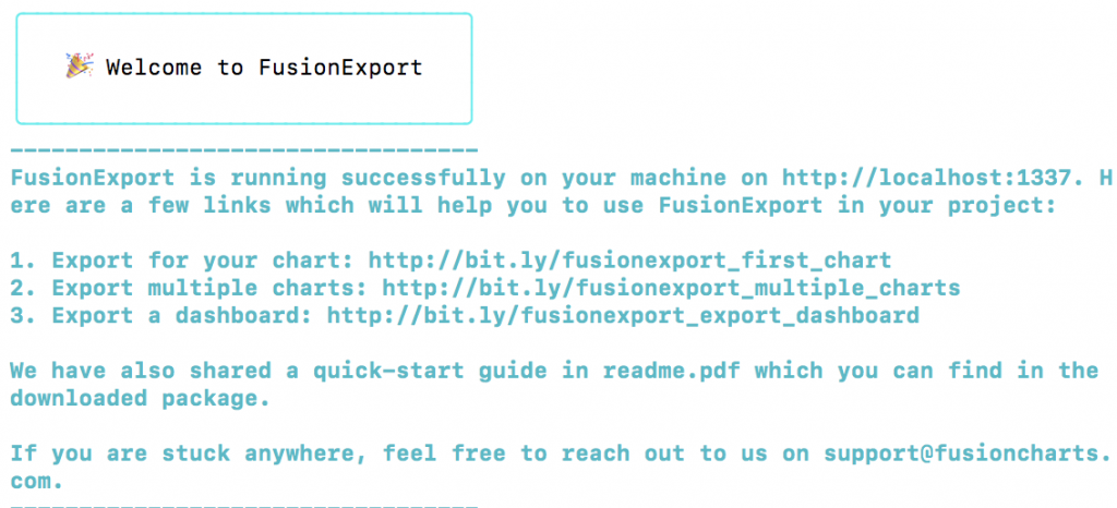
Step 1: Download and Run FusionExport Server
To get started, first you need to Download the FusionExport server and follow the instructions for your machine. Find the location of the downloaded server and run it by entering the following command at the console. Make sure you replace YOUR_PATH with the server path.
YOUR_PATH/fusionexport
If the server runs successfully, you’ll see the following messages:
Step 2: Install FusionExport SDK for Node.js
The next step is installing the FusionExport SDK. To get started, create a project directory called fusion-time-export-node-js. At the console, move to this directory and install the FusionExport SDK for Node.js by typing:
npm install fusionexport-node-client --saveStep 3: Create the ChartConfiguration
Now you need to configure your charting preferences. In the main project folder, create a resources folder. Add a file time-series-config.json to this folder. Copy the following contents to this file:
[
  {
    "type": "timeseries",
    "renderAt": "chart-container",
    "width": "100%",
    "height": "100%",
    "creditLabel": false,
    "dataSource": {
      "data": {
        "schema": [
          {
            "name": "Time",
            "type": "date",
            "format": "%d-%b-%y"
          },
          {
            "name": "Grocery Sales Value",
            "type": "number"
          }
        ],
        "data":"https://s3.eu-central-1.amazonaws.com/fusion.store/ft/data/line-chart-with-time-axis-data.json"
      },
      "caption": {
        "text": "Sales Analysis"
      },
      "subCaption": {
        "text": "Grocery"
      },
      "yAxis": [
        {
          "plot": {
            "value": "Grocery Sales Value"
          },
          "format": {
            "prefix": "$"
          },
          "title": "Sale Value"
        }
      ]
    }
  }
]
Let’s take a look at the JSON text for the configuration of FusionTime chart. It requires a dataSource.data key, which again has two nested keys, i.e., schema and data. The schema is the meta description of data and specifies the formats for X and Y-axis data. The dataSource.data.data specifies the actual data array of points for plotting. We’ve used a URL for this tutorial, however, you can replace this with your own data.
Step 4: Create the HTML Template
Next, in the resources folder, create another file called time-series-template.html, which specifies the style of the plot. We have kept its format simple but you can add your own text, icon, or brand logo to it.
<html>
<head>
<style>
.myDiv {

  padding: 0px 12px;
  width: 1600px;
  height: 800px;
}
</style>
</head>
<body>

<h2>FusionExport For Exporting FusionTime Charts</h2>

<div class="myDiv" id = "chart-container">
</div>

<p>Powered by FusionTime</p>

</body>
</html>
Step 5: Call ExportConfig and ExportManager
Finally, create a file called export-timeseries.js. In this file, create an instance of ExportConfig and ExportManager. Then, load the time series configuration and its template via ExportConfig. Create an instance of ExportManager and call its export method to export the time series. Paste the following code into export-timeseries.js:
const fs = require('fs');
const path = require('path');
const {ExportManager, ExportConfig} = require('fusionexport-node-client');

// Instantiate ExportManager and ExportConfig
const exportManager = new ExportManager();
const exportConfig = new ExportConfig();

//Read the configuration from JSON
let jsonStr = fs.readFileSync("resources/time-series-config.json", "utf8");
let chartConfig = JSON.parse(jsonStr);

//Set the options for exportConfig
exportConfig.set("chartConfig", chartConfig);
exportConfig.set('templateFilePath', path.join('resources', 'time-series-template.html'));
exportConfig.set('type', 'png');
exportConfig.set('quality', 'best');

// Export the chart
exportManager.export(exportConfig, outputDir = '.', unzip = true).then((exportedFiles) => {
  exportedFiles.forEach(file => console.log(file));
}).catch((err) => {
  console.log(err);
});
How Do I Run The Code?
To run the code at the console type:
node export-timeseries.jsThis program will create a file called export.png that contains an image of your FusionTime chart. That’s it! We just exported an awesome FusionTime time series chart via FusionExport in 5 easy steps.
You can download the source code for this app from here and try it out. Happy coding!
Are There More Features of FusionExport?
FusionExport is not only easy to use, but it also includes options for exporting charts, graphs, maps, and gauges created via FusionCharts and other Javascript charting libraries. These libraries include D3.js, chart.js, and many more. You can use its SDK or call its services via API endpoints from many programming languages like C#, PHP, Python, and Java.
Don’t wait! Get started with FusionTime and FusionExport today. Download the free trial for FusionExport now.