Over the past few weeks we’ve been discussing predictive analytics at length. We started with an overview, and then went on a tour of 9 unique businesses that are leading innovation in predictive analytics. So far, we’ve just set the stage for this and the next post, where we take a focused look at the visualization methods and concepts used in predictive analytics products today.
In this post, we do an in-depth review of three dashboards created by Recorded Future, who we previously mentioned as being the poster child of predictive analytics. When it comes to visualizations, Recorded Future has some of the best dashboards around. Let’s dive straight into the three dashboards.
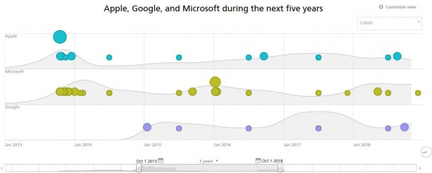 The first dashboard compares 3 companies – Apple, Google, and Microsoft – based on the coverage they’ve received from a multitude of sources on the internet. It picks out forward-looking statements about these companies within articles, and plots them in a chart. While it’s a marvel that they can extract such unstructured data, and plot it accurately on a graph, it only gets more interesting when we explore the kind of visualization they’ve used.
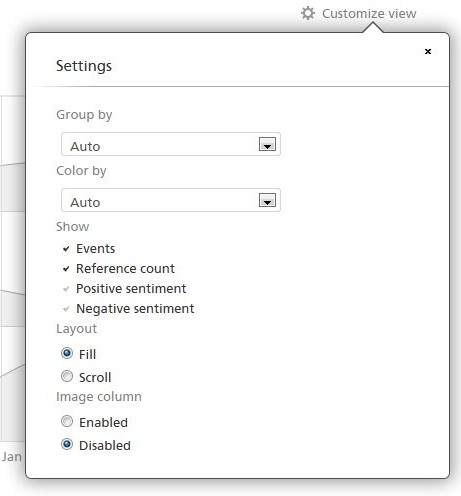 It starts with a ‘Customize view’ option which allows users to customize the chart by a variety of pre-set filters like product, country, language, and a host of other criteria. This enables extremely targeted research. Further, you can segment the chart by positive or negative sentiment based on the type of analysis being conducted. But it doesn’t stop here.
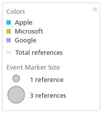 There’s an interactive legend which can be moved across the chart area, making you want to play around with it. Hovering over a company refreshes the chart to show results only for that company. Very intuitive, and informative. Finally, being a bubble chart, the legend doesn’t leave it to the user to guess what the size of the bubble means, it clearly indicates that the small bubbles are a single mention, and the bigger ones are 3 mentions. This adds a lot of perspective, when viewing the chart.
 At the bottom of the chart, there’s an interactive scroll bar which can be moved to set the timeframe for the chart. Just above the scroll bar are two calendar thumbnails to enter an exact data – that’s very considerate for those users who are particular about exact date ranges. In the background of the scroll bar is a lightly shaded area chart that represents the total number of mentions or data points, and how it’s changed over the years. This packs a lot of information in a dense manner, allowing for a very high-level analysis at a glance.
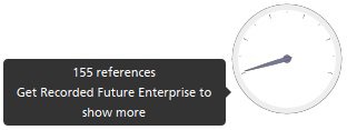 At the bottom-right corner of the chart there’s a small, easy-to-miss speedometer gauge that shows what percentage of total data points are being seen currently. Hovering over the gauge pops a tooltip with the exact number of data points being seen, specifying the percentage number. That little piece of data puts the entire chart in perspective.
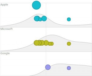 Now, coming to the main chart itself, it’s divided into three stacks, one for each of the companies, which makes comparison very easy. Users can easily see which companies get more mentions over time, and compare them across different time periods. In the background of the bubbles is an area chart showing the number of mentions over time, similar to the one in the scroll bar, but bigger. It’s also easy to spot changes within a particular year. The bubbles plot three parameters of data – time (year of mention), quantity (number of mentions), and entity (Apple, Google, or Microsoft).
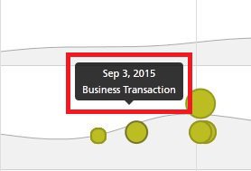
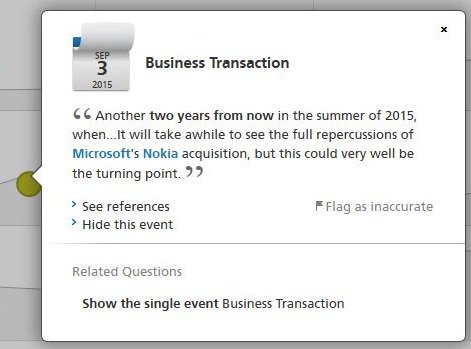 The bubbles have interactive tooltips which appear on hovering over them. This serves to quickly scan all bubbles and probe deeper into those that are interesting. When a particular bubble is clicked on, it pops up a snippet card with tons of information for further research. The card starts with the date for context, is titled with the main phrases from the article, below which is an excerpt from the article. Clicking on ‘See references’ shows another card with more specific information like the country of the mentioning website, and exact URL. At the bottom of the card is a ‘Related Questions’ section which suggests researching on parallel, similar topics, which can be an interesting tangent from the current topic. This type of layered presentation of information is key to designing great dashboards. It doesn’t overwhelm users with all the information at once, and gives them the flexibility to choose the route they’d like to take. Much like the choose your own adventure novels we grew up reading.
This seemingly simple dashboard has behind it the workings of intricate algorithms that crawl the internet to make sense of unstructured, and semi-structured data. Naturally, the visualization methods used to create the dashboard are many and diverse. The chart types used are bubble chart, area chart, and stacked area chart, and speedometer gauge. It also employs features like interactive legend, scroll bar, solid coloring, tooltip, and cards. The dashboard exemplifies how to use many different visualization elements, and yet keep presentation simple and elegant. The data sorting features as present in the ‘Customize view’, interactive legend, and scroll bar give the user tremendous control over how much and what type of information is being displayed. The varied chart types, and interactive features used make the dashboard meet its objective of facilitating open-ended, exploratory research. This dashboard is a stellar example of how to visualize predictive analytics data the right way.
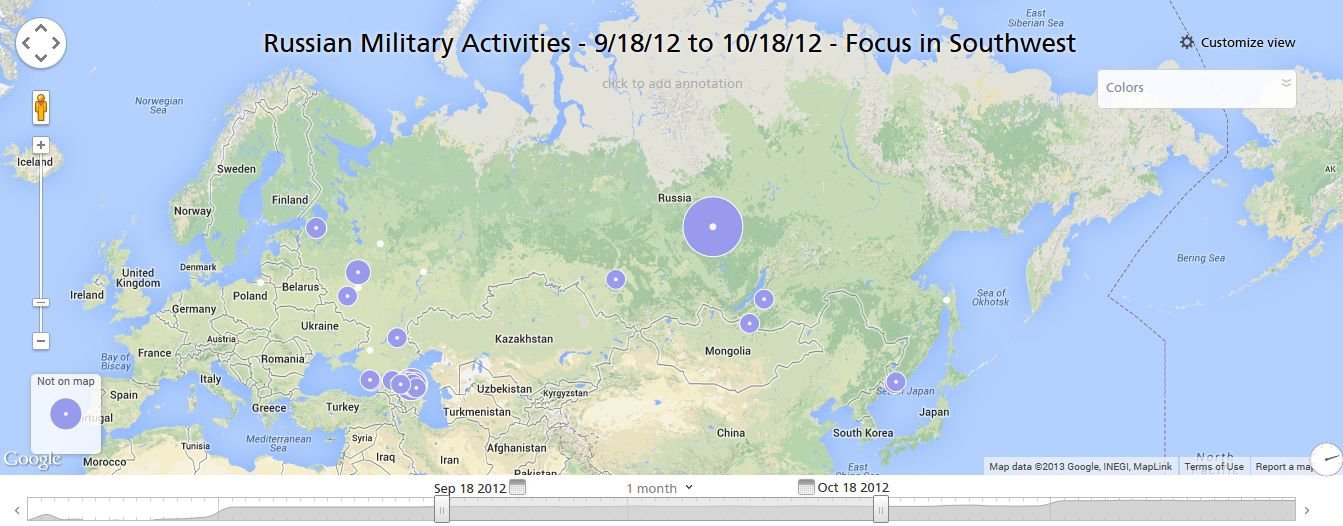 The next dashboard from Recorded Future plots similar text data from websites, but uses a different approach – maps-based visualization. There are some similarities between this and the earlier dashboard like the ‘Customize view’, interactive legend, speedometer gauge, and scroll bar. These are a staple of Recorded Future dashboards.
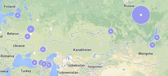
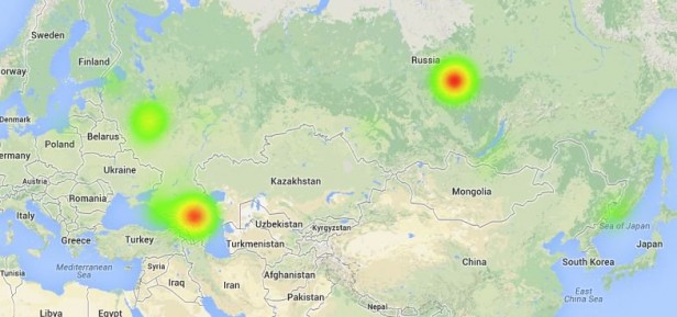 There are a few variations between this and the previous dashboard. For example, the ‘Customize view’ option now has options to present the data in the form of pie charts or heatmaps. While this is a useful feature, this is one of the few details I think the dashboard gets wrong. What it calls pie charts are actually bubble charts. Pie charts are made up of at least 2 data points, and are used to show a breakdown of total data. The bubble charts used here show volume of data based on their size, and visualize the mentions in a cumulative rather than comparative manner. Also, I’m not a big fan of the heatmap feature in this dashboard as it yields little insight. Heatmaps work well when there’s a large number of data points, which isn’t the case in this dashboard. But perhaps on a more popular topic over a longer period of time, a heatmap may work well to get a bird’s-eye view of the regions with most buzz.
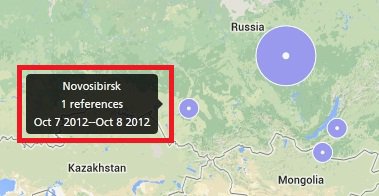 Just as the previous dashboard, the bubble chart here uses tooltips to show a brief snippet of the type of content it contains. Mousing-over a bubble gives the user an overview of the info it contains, prompting the user to probe further.
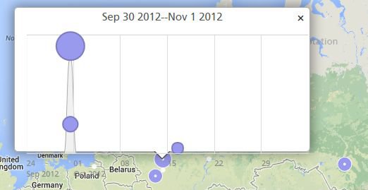 If there are multiple data points within a bubble, clicking on it shows a drilled-down visualization in the form of a line chart layered over with bubbles again.
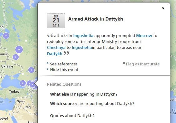 Then, clicking on a bubble shows a card rich with data and links for further analysis. This is similar to the card we saw in the previous dashboard, and is a staple of Recorded Future dashboards.
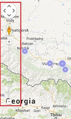 Next, we come to the zoom feature of the map, which is a default feature of Google Maps, the mapping platform used for this dashboard. This is particularly useful to drill deeper into the most active region like the former Soviet Union.
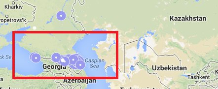 You’ll notice this region is densely packed with bubbles, and a mouse-over doesn’t work to get glance through all the information contained in that area.
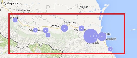 With a couple of clicks, you can zoom into the region and explore it at a granular level.
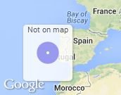 On the lower-right corner of the dashboard, we notice a useful ‘Not on map’ bubble which includes all data points that couldn’t be plotted on the map. Clicking into it allows to explore some apparently orphaned data. It may be that Recorded Future’s algorithms couldn’t find an exact location to plot them on, or that there were too many locations to pick from. Only the folks from Recorded Future can comment on this. However, what’s significant about this minute detail, is that it could easily have been left out as it doesn’t fit into the pre-designed structure of the dashboard like the rest of the data. But instead, realizing it can still contain nuggets of useful information, it’s included in an unobtrusive manner. This is a significant factor when dealing with predictive analytics. A lot of the data can be unstructured, or semi-structured, but that alone need not disqualify it from being visualized. An inclusive mindset towards data is imperative when creating a predictive analytics dashboard.
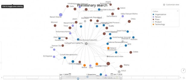 Both previous dashboards use traditional visualization methods like bubble charts, area charts, speedometer gauges, and maps. This last dashboard, however, visualizes data in an unorthodox form of bubbles that are randomly ordered and are linked to each other by connectors or nodes, creating an intricate web of connected bubbles.
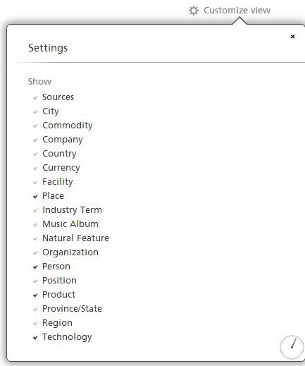 In this dashboard, the ‘Customize view’ box is key to the visualization. Clicking on it shows many more dimensions of data than the previous two data points. This shows that the data being visualized here is more unstructured than the previous examples, and a rigid visualization framework can’t be applied to this data. You can start from something as simple as a ‘Country’ and ‘Person’ and get more complex visualizations by adding parameters.
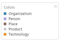 The next most important part of the dashboard is the legend. With the numerous types of data being plotted, it’s easy to lose track of what each bubble represents. The legend adds much needed stability to this otherwise wacky visualization 🙂
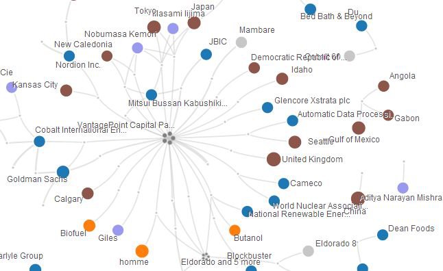 Lastly we look at the bubbles itself, and they seem to be ready to get into a flurry of movement when a cursor approaches them, repelling and attracting each other like restless little magnets. This makes for a very lively visualization, and we can let the kid in us gaze in wonder for a while before actually resuming our quest for insight.
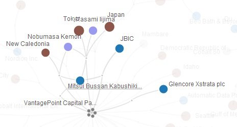 Mousing-over a bubble highlights that bubble along with all the nodes and bubbles related to it. This is where the exploration starts, when a user can view a term, and information related to it like country, people, or any other parameter as selected from the ‘Customize view’ box.
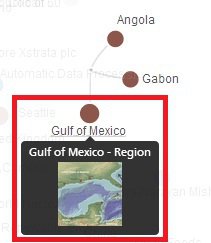 Hovering over some bubbles shows an image, which makes for an even more visual experience.
While this dashboard scores high on visual appeal, it’s doesn’t immediately yield usable insights, and can be categorized as experimental. However, these types of visualizations are becoming popular, and are the new breed of visualizations stemming from the big data revolution. While nobody seems to have figured out exactly how to put them to use, they can’t be discounted as useless either. As we get familiar with unstructured, and semi-structured data, these types of visualization could become mainstream, and change the way we consume data.
With that, we come to the end of this long, rather entertaining, and hopefully insightful post on how Recorded Future is setting the bar for top-notch visualization in predictive analytics. These are just three of a big list of dashboards in the Recorded Future gallery, which you may want to check out. The gallery has a number of really interesting topics to explore.
Next week, we’ll take a look at how other businesses are visualizing predictive analytics data in their dashboards. While Recorded Future is indeed the pinnacle, there are quite a few interesting dashboards from other companies, which we’ll be talking about in our next post.
If you enjoyed reading this, be sure to check out the other posts in this series:
Part 1 – Predictive Analytics: No More the Way of the Analytics Ninjas
Part 2 – 5 Businesses on the Frontier of Predictive Analytics
Part 3 – 4 More Businesses on the Frontier of Predictive Analytics
Part 5 – Stripping Down the Gorgeous Sift Science Dashboard
Part 6 – 9 Ways We Use Predictive Analytics Without Even Knowing It
1. Dashboard comparing online mentions of three companies
 The first dashboard compares 3 companies – Apple, Google, and Microsoft – based on the coverage they’ve received from a multitude of sources on the internet. It picks out forward-looking statements about these companies within articles, and plots them in a chart. While it’s a marvel that they can extract such unstructured data, and plot it accurately on a graph, it only gets more interesting when we explore the kind of visualization they’ve used.
 It starts with a ‘Customize view’ option which allows users to customize the chart by a variety of pre-set filters like product, country, language, and a host of other criteria. This enables extremely targeted research. Further, you can segment the chart by positive or negative sentiment based on the type of analysis being conducted. But it doesn’t stop here.
 There’s an interactive legend which can be moved across the chart area, making you want to play around with it. Hovering over a company refreshes the chart to show results only for that company. Very intuitive, and informative. Finally, being a bubble chart, the legend doesn’t leave it to the user to guess what the size of the bubble means, it clearly indicates that the small bubbles are a single mention, and the bigger ones are 3 mentions. This adds a lot of perspective, when viewing the chart.
 At the bottom-right corner of the chart there’s a small, easy-to-miss speedometer gauge that shows what percentage of total data points are being seen currently. Hovering over the gauge pops a tooltip with the exact number of data points being seen, specifying the percentage number. That little piece of data puts the entire chart in perspective.
 Now, coming to the main chart itself, it’s divided into three stacks, one for each of the companies, which makes comparison very easy. Users can easily see which companies get more mentions over time, and compare them across different time periods. In the background of the bubbles is an area chart showing the number of mentions over time, similar to the one in the scroll bar, but bigger. It’s also easy to spot changes within a particular year. The bubbles plot three parameters of data – time (year of mention), quantity (number of mentions), and entity (Apple, Google, or Microsoft).

 The bubbles have interactive tooltips which appear on hovering over them. This serves to quickly scan all bubbles and probe deeper into those that are interesting. When a particular bubble is clicked on, it pops up a snippet card with tons of information for further research. The card starts with the date for context, is titled with the main phrases from the article, below which is an excerpt from the article. Clicking on ‘See references’ shows another card with more specific information like the country of the mentioning website, and exact URL. At the bottom of the card is a ‘Related Questions’ section which suggests researching on parallel, similar topics, which can be an interesting tangent from the current topic. This type of layered presentation of information is key to designing great dashboards. It doesn’t overwhelm users with all the information at once, and gives them the flexibility to choose the route they’d like to take. Much like the choose your own adventure novels we grew up reading.
This seemingly simple dashboard has behind it the workings of intricate algorithms that crawl the internet to make sense of unstructured, and semi-structured data. Naturally, the visualization methods used to create the dashboard are many and diverse. The chart types used are bubble chart, area chart, and stacked area chart, and speedometer gauge. It also employs features like interactive legend, scroll bar, solid coloring, tooltip, and cards. The dashboard exemplifies how to use many different visualization elements, and yet keep presentation simple and elegant. The data sorting features as present in the ‘Customize view’, interactive legend, and scroll bar give the user tremendous control over how much and what type of information is being displayed. The varied chart types, and interactive features used make the dashboard meet its objective of facilitating open-ended, exploratory research. This dashboard is a stellar example of how to visualize predictive analytics data the right way.
2. Map-based dashboard plotting Russian military activity
 The next dashboard from Recorded Future plots similar text data from websites, but uses a different approach – maps-based visualization. There are some similarities between this and the earlier dashboard like the ‘Customize view’, interactive legend, speedometer gauge, and scroll bar. These are a staple of Recorded Future dashboards.

 There are a few variations between this and the previous dashboard. For example, the ‘Customize view’ option now has options to present the data in the form of pie charts or heatmaps. While this is a useful feature, this is one of the few details I think the dashboard gets wrong. What it calls pie charts are actually bubble charts. Pie charts are made up of at least 2 data points, and are used to show a breakdown of total data. The bubble charts used here show volume of data based on their size, and visualize the mentions in a cumulative rather than comparative manner. Also, I’m not a big fan of the heatmap feature in this dashboard as it yields little insight. Heatmaps work well when there’s a large number of data points, which isn’t the case in this dashboard. But perhaps on a more popular topic over a longer period of time, a heatmap may work well to get a bird’s-eye view of the regions with most buzz.
 Just as the previous dashboard, the bubble chart here uses tooltips to show a brief snippet of the type of content it contains. Mousing-over a bubble gives the user an overview of the info it contains, prompting the user to probe further.
 If there are multiple data points within a bubble, clicking on it shows a drilled-down visualization in the form of a line chart layered over with bubbles again.
 Then, clicking on a bubble shows a card rich with data and links for further analysis. This is similar to the card we saw in the previous dashboard, and is a staple of Recorded Future dashboards.
 Next, we come to the zoom feature of the map, which is a default feature of Google Maps, the mapping platform used for this dashboard. This is particularly useful to drill deeper into the most active region like the former Soviet Union.
 You’ll notice this region is densely packed with bubbles, and a mouse-over doesn’t work to get glance through all the information contained in that area.
 With a couple of clicks, you can zoom into the region and explore it at a granular level.
 On the lower-right corner of the dashboard, we notice a useful ‘Not on map’ bubble which includes all data points that couldn’t be plotted on the map. Clicking into it allows to explore some apparently orphaned data. It may be that Recorded Future’s algorithms couldn’t find an exact location to plot them on, or that there were too many locations to pick from. Only the folks from Recorded Future can comment on this. However, what’s significant about this minute detail, is that it could easily have been left out as it doesn’t fit into the pre-designed structure of the dashboard like the rest of the data. But instead, realizing it can still contain nuggets of useful information, it’s included in an unobtrusive manner. This is a significant factor when dealing with predictive analytics. A lot of the data can be unstructured, or semi-structured, but that alone need not disqualify it from being visualized. An inclusive mindset towards data is imperative when creating a predictive analytics dashboard.
3. Bubble chart visualization of related terms
 Both previous dashboards use traditional visualization methods like bubble charts, area charts, speedometer gauges, and maps. This last dashboard, however, visualizes data in an unorthodox form of bubbles that are randomly ordered and are linked to each other by connectors or nodes, creating an intricate web of connected bubbles.
 In this dashboard, the ‘Customize view’ box is key to the visualization. Clicking on it shows many more dimensions of data than the previous two data points. This shows that the data being visualized here is more unstructured than the previous examples, and a rigid visualization framework can’t be applied to this data. You can start from something as simple as a ‘Country’ and ‘Person’ and get more complex visualizations by adding parameters.
 The next most important part of the dashboard is the legend. With the numerous types of data being plotted, it’s easy to lose track of what each bubble represents. The legend adds much needed stability to this otherwise wacky visualization 🙂
 Lastly we look at the bubbles itself, and they seem to be ready to get into a flurry of movement when a cursor approaches them, repelling and attracting each other like restless little magnets. This makes for a very lively visualization, and we can let the kid in us gaze in wonder for a while before actually resuming our quest for insight.
 Mousing-over a bubble highlights that bubble along with all the nodes and bubbles related to it. This is where the exploration starts, when a user can view a term, and information related to it like country, people, or any other parameter as selected from the ‘Customize view’ box.
 Hovering over some bubbles shows an image, which makes for an even more visual experience.
While this dashboard scores high on visual appeal, it’s doesn’t immediately yield usable insights, and can be categorized as experimental. However, these types of visualizations are becoming popular, and are the new breed of visualizations stemming from the big data revolution. While nobody seems to have figured out exactly how to put them to use, they can’t be discounted as useless either. As we get familiar with unstructured, and semi-structured data, these types of visualization could become mainstream, and change the way we consume data.
With that, we come to the end of this long, rather entertaining, and hopefully insightful post on how Recorded Future is setting the bar for top-notch visualization in predictive analytics. These are just three of a big list of dashboards in the Recorded Future gallery, which you may want to check out. The gallery has a number of really interesting topics to explore.
Next week, we’ll take a look at how other businesses are visualizing predictive analytics data in their dashboards. While Recorded Future is indeed the pinnacle, there are quite a few interesting dashboards from other companies, which we’ll be talking about in our next post.
If you enjoyed reading this, be sure to check out the other posts in this series:
Part 1 – Predictive Analytics: No More the Way of the Analytics Ninjas
Part 2 – 5 Businesses on the Frontier of Predictive Analytics
Part 3 – 4 More Businesses on the Frontier of Predictive Analytics
Part 5 – Stripping Down the Gorgeous Sift Science Dashboard
Part 6 – 9 Ways We Use Predictive Analytics Without Even Knowing It
One response on “Recorded Future: 3 Stellar Predictive Analytics Dashboards 2026”