While discussing a chart during a presentation, you’d probably have to talk at length about each plotted value. The lengthy discussions become particularly unavoidable if you have to cite reasons for declining sales or for an extended period of stagnation. In situations such as this, tooltips come in handy since you can easily display a lot of text on them.
FusionCharts v3.1 allows you to introduce line breaks in tooltip text. So, you can now have a lot of info in the tooltips neatly broken down into multiple lines. This helps in eliminating labels placed right next to the data plots, thereby making the charts litter-free.
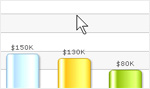
Let’s take the half-yearly analysis of a hotel as an example to drive home the point:

Cluttered Column Chart with long data labels

Neater Column Chart with details delegated to tooltips
How to define custom tooltips with line breaks
Following is the XML for the chart above:
The custom tooltip text is defined with the help of the tooltext attribute. Within the tooltip text you can add {br} wherever you want to insert a line break. Customizing the tool tip is that simple.