
In business, competitive companies are always seeking new ways to solve old problems. One of the ways they do this is by adopting cutting-edge, or emergent technologies. One such technology is location analytics, a form of applied business intelligence. Basically, it is the process of referencing location-specific data from maps. Location Analytics is valuable for storing, querying, and visualizing user location information.
What can you do with FusionCharts Suite XT?
FusionCharts has a JavaScript API for building interactive charts and regional maps on a personalized dashboard. It is a powerful data visualization tool. The Suite XT library delivers seamless chart integrations on many accepted frameworks from React to jQuery. With FusionCharts Suite XT, you can explore over 2000 map templates. Each is ready to display insights about your site visitors or the amount of attention your app receives.
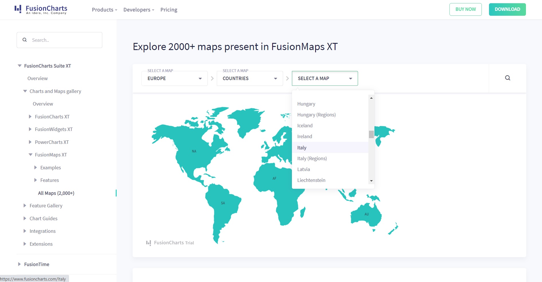
This article will walk you through what FusionMaps XT has to offer. It is suitable for experienced and inexperienced JS developers curious about making custom geographical maps. For a quick demo, try testing the world map. First, selecting a continent, then narrow your scope down to your preferred region. Notice how the map zooms in on a specific country with its sub-regions already abbreviated for you. You can even scroll down to find all possible countries on a continent.
What are some new features of FusionMaps XT?
If you cant find the data-driven map you need on Google, you can easily create one that is accurate and easy to understand in FusionMaps XT. The suite has many features that make the FusionMaps XT library useful for mapping location data from surveyed results. Some of these features include:
Setting custom labels
You can assign labels to your map UI on a variety of frameworks. The code is available for you to copy into your own workspace. After that, you can change the key values and the format in addition to running previews to check your progress.
With FusionMaps XT you can limit your chart to a min or max range. You can also edit your markers or captions, and import a density plot of different ids. The tool text displays information on a measured statistic when you hover over each country or state.
Drill-down from map to chart
Gain more control over what labels are shown in the chart container by choosing what the API shows in each region on your map.
You can also customize a map’s properties by sorting names and categories, in addition to inserting new values that affect previous distributions. Finally, you can also decide how your chart is rendered. For example, you can select the colors you use to shade areas with higher counts.
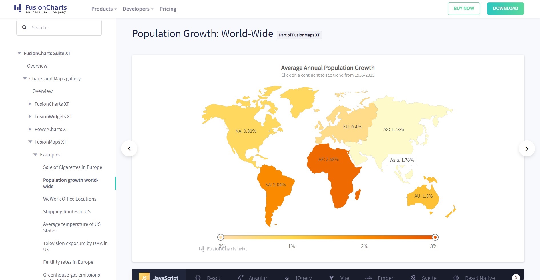
Let’s take a look at the average annual population growth on the world map. Here, you can click on a continent to see the percent of growth over decades as a linear graph versus the annual percentages on the main map. FusionMaps automatically calculates the average growth rate and places it in your labeled area.
Show specific regions only
Whenever you zoom in on an area, the map blacks out everything else so only your focus regions are visibly colored.
Adjusting the sliders excludes areas that fail to meet established criteria. Similarly, toggling the minimum and maximum color range values determines which regions are hoverable, and reveals their data.
Custom tool-tips
Many of the map templates show a list of ranges indicated as tooltips or map keys by color or shade. When you submit your data to the API, the map updates to reflect the new values. To edit the tooltips, change the chart object values or use abbreviated ids for your individual data points.
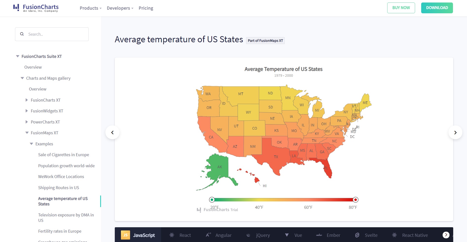
To illustrate this on a map, go ahead and take a look at the Average Temperature of the US States. You see a range of temperatures on a gradient bar. Using the min and max limit slider, you can exclude states that exceed your specified range. For instance, the chart illustrates the temperature range and clearly shows that, on average, temperatures in the south are higher.
Overlay icons
On FusionMap templates, icons mark your regions of interest. The icons are on a separate layer from the map to make them easier to identify, especially with a zoomed-out map of the continents as opposed to just a single country. Captions and tooltips explain the icons and the insights they provide, whether it is the distance between two cities or the wages of the people living there.
Another way to visualize connections between overlay icons is by importing connector lines onto your chart, to show they are related. The lines draw paths from one location to another to help you approximate how far apart locations are.
If you were planning a visit to Australia and wanted to choose the shortest flight between two destinations, consulting a map of the flight routes would provide that information.
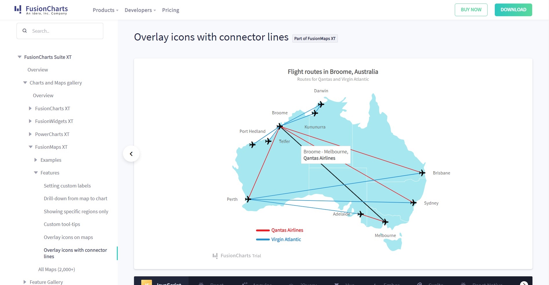
On this chart demo, the connector lines are color-coded to distinguish them by airline and indicating which flight paths are linked. This is done by coordinating x and y values to mark your locations and editing your labels and tooltips. You can also group locations by category using the designated item object with its id and text attribute.
Why is FusionMaps XT one of the leading map APIs?
Responsive web maps provide you with the analytical tools you need to survey large datasets, which make them handy especially for marketing activities. Location intelligence is a crucial step in the right direction for companies in need of visual representations to expose user behavior data on their websites, webinars, or quarterly reports.
FusionMaps XT has many layered maps to use on your dashboard. These smart configurations go beyond the numbers and labels to provide you with the in-depth analytics your business requires.
Customs maps are a dime a dozen, but FusionMaps builds them on JavaScript frameworks so that front-end developers can export their data onto a well-organized map. To perform a map integration, just download a template and adapt it to your web project.


