
React is among the most popular open-source JavaScript libraries for front-end development. Thousands of developers and many major enterprises use React to build scalable and robust web apps. This is because React enables developers to build well-designed user interfaces quickly and easily. In addition, React easily integrates with other modern technologies and frameworks required to build efficient web apps. It also allows developers to create beautiful and modern UIs for web apps. React is a great choice for hosting data visualizations, especially React graphs and charts.
People often think creating a React graph is a complex process, but it’s not as difficult as you think if you’re using FusionCharts. FusionCharts is a beautiful data visualization library that comes with a powerful React component for quickly creating an effective React graph.
Table of Contents
Why Use FusionCharts to Create A React Graph?
Using an efficient data visualization library like FusionCharts to create React graphs has several benefits. Firstly, FusionCharts simplifies the creation of robust React graphs – it does most of the job for you, so you don’t have to create a React graph from scratch. Secondly, the graphs and visualizations you make with FusionCharts are dynamic, sleek, and visually appealing. Finally, React graphs made with FusionCharts instantly respond to changes in the data variables.
Another benefit of FusionCharts is that it offers tons of pre-developed visualization options that you can easily integrate into your projects. FusionCharts also handles big data efficiently.
What Type Of React Graphs Can I Make Using FusionCharts?
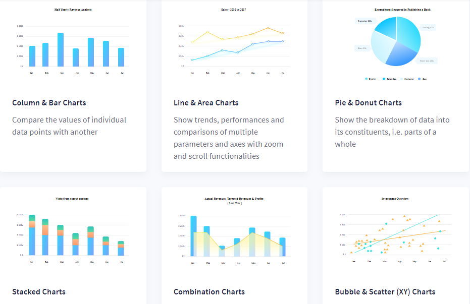
The FusionCharts React component lets you create more than 100 different types of charts and graphs for different use cases. From column and bar charts to pie and donut charts, you can create any type of React graph with FusionCharts. To make your dashboards or reports more meaningful and insightful, you can also choose from over 2000 maps.
Some of the most commonly used React graphs and charts offered by FusionCharts include:
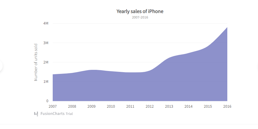
Area Charts
You can show trends and performances over time with area charts and graphs. Here is an example of a React area graph made with FusionCharts:
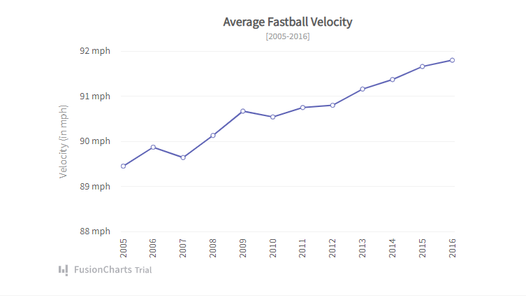
Line Charts
A React line graph is the best option for depicting continuous data over time. For example, you can use these charts to represent values such as fluctuations in hourly temperature, foreign currency rates, and daily earnings. You can also use a multi-series line chart if you want to represent more than one data series on the same React graph.
Take a look at this React line chart:
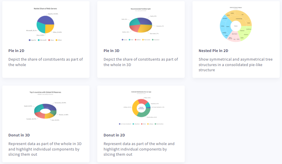
Pie and Donut Charts
Pie charts are best for showing percentages of a whole. A Donut chart is like a pie chart but with a blank space at the center to show key points about your plotted data.
Here are some examples of React pie and donut charts you can create with FusionCharts
Can I Update a React Graph in Real-Time Using FusionCharts?
Real-time graphs and charts are critical for good decision-making. These charts update themselves after a specific interval, ensuring your viewers get the most up-to-date data. The FusionCharts React component allows you to create data streaming or real-time React graphs and charts that update automatically. These charts don’t need any page refreshes.
Can I Make Interactive React Graphs Using FusionCharts?
Interactive charts and graphs help users better understand your data. With FusionCharts’ React component, you can create interactive and responsive charts and graphs that users can modify using sliders and buttons. With FusionCharts, you also have control over events. It lets you define event handlers for user events like mouse events and keyboard presses.
How Do I Create a React Graph Using FusionCharts?
Creating a React graph with FusionCharts is super quick and easy. Here are the key steps you need to follow:
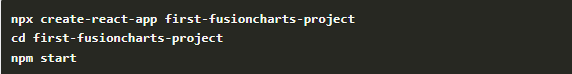
1. First, make a React project using the code below:
2. Next, you need to install dependencies of the FusionCharts React component.
To install the dependencies, use this code:

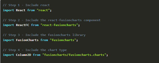
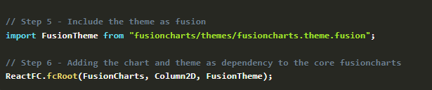
Once you’ve installed the dependencies, replace the code in the App.js file with this:
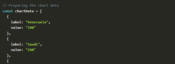
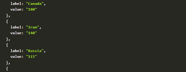
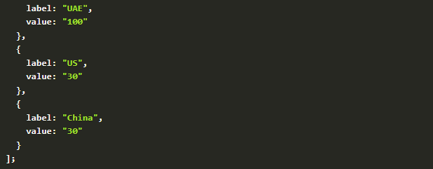
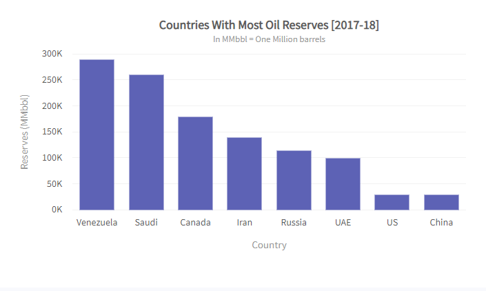
3. Then prepare the data for the type of chart or graph you want to create. For example, to create a column 2D chart showing the “Countries With Most Oil Reserves,” you can represent the data in JSON format:
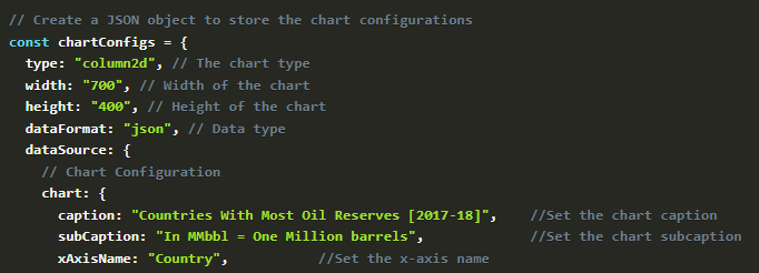
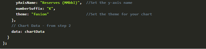
4. Next, you can configure the graph for positioning and styling and give your graph a context using the code below:
5. Finally, render the graph.
Your React graph will look as follows:
Can I Make Dashboards With React?
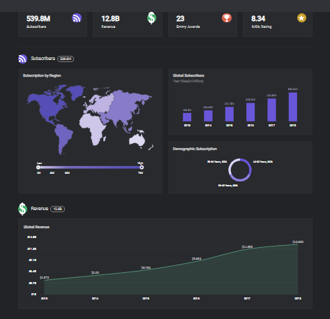
FusionCharts offers more than 20 React dashboards for different industries and use-cases. This means you can build dashboards with React quickly and easily using FusionCharts. All these dashboards are open-source, so you can get started quickly by downloading them. Some of the most commonly used dashboards include the SaaS dashboard, web series dashboard, and marketing dashboard.


