
Stakeholders and decision-makers today can’t afford to pore through pages and pages of spreadsheet data in this fast-paced economy. Particularly when a few button clicks can turn those almost unending rows and columns into visually appealing and easy-to-understand versions. Data charts are great visualization tools that allow for quick access, analysis, and understanding of complex data. However, it’s no news that most people cringe at the thought of maneuvering through rows and columns in Microsoft Excel. That’s why we’ve created this easy-to-follow guide on how to make a graph in Excel.
But before diving in, let’s go over the Excel graph and the different data charts you have access to in Excel.
Table of Contents
Excel Graph
Excel graphs are visual representations of the row and columns in an Excel worksheet. They make it easier to understand and analyze large data sets quickly. The human brain comprehends visuals faster than numbers and texts. For this reason, interpreting data using an Excel graph is more efficient than scrolling through rows and columns. Excel provides a wide range of charting options for different data types and goals. And, with a few button clicks, you can quickly tell your data’s story in a visually compelling manner.
Types Of Graphs
Excel offers numerous graph types for representing data. That said, the key to choosing the right graph is understanding your data and the uses of each Excel graph. Once you clearly understand your visualization goals, you can easily match your data to the chart that best suits these goals. Below are the most popular graph types in Excel.
Bar Graph
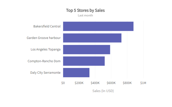
Bar charts or graphs are great visualization tools for data sets with values divided into categories. Businesses use bar graphs to determine the relationship between categories—for example, the relationship between product sales in different store locations.
Check out bar chart guidelines here.
Line Graph
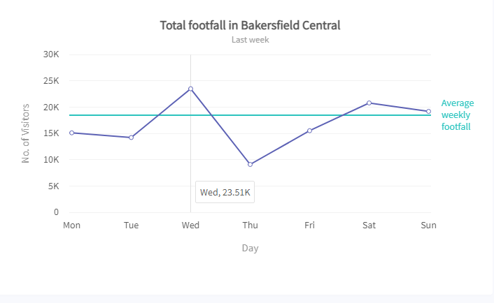
Excel offers both two-dimensional and three-dimensional line graphs. They’re typically used to display data values that change over time. This way, users can quickly identify trends, patterns, and outliers. Line charts or graphs can also contain more than one data parameter. In this case, Excel automatically distinguishes each line using different color codes. Examples of data types you can represent using the line graph include:
- Employee compensation
- The average number of hours worked in a week
- Average number of annual leaves
The Scatter Graph
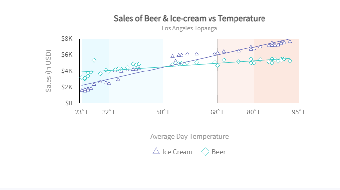
The scatter graph is useful for comparing or determining the relationship between two numerical data variables. Data values are plotted using dots on a two-dimensional or Cartesian plane. The dot positions, relative to the horizontal axis and vertical axis, denote the value of the data points they represent. Examples of the data type that best suits the scatter graph includes:
- Outside temperature versus ice cream sales
- Monthly store sales versus the number of monthly visitors
Other chart types available in Excel include:
- Pie charts
- Area graphs
- Column charts
Data Cleaning
Data cleaning is an essential first step for creating a graph in Excel. To get an accurate representation, you must ensure consistent data that contains only what’s part of the data set. Below are steps you can follow in cleaning your data:
Remove Duplicate Values
Duplicate values not only affect your graph, but they can also significantly skew the inferred values. Make sure your data is clean, well-organized, and devoid of duplicates. Fortunately, you don’t have to scroll through rows and columns to delete duplicates manually. By highlighting your data rows and columns and clicking on ‘Remove Duplicates’, you can automatically eliminate duplicate values. This option is available on the Data Tab.
Using the Find and Replace Tool
In some cases, Excel can convert your data values into decimals or exponential values. This is where the find and replace tool can come in handy. You can find all the zeros or figures after the decimal and remove them. You can also find and replace formula references.
Use Trim
Unwanted spaces or extra spaces between words and numbers can result in inaccurate graphs. Fortunately, you remove these spaces using the Excel TRIM function— TRIM(text). This function takes in ‘text’ as an argument and removes all trailing or extra spaces. The end result is no more than a single space between words.
Steps On How To Make A Graph In Excel
Making a graph in Excel doesn’t have to be difficult, even if this is your first foray into the Excel world. Follow the steps below to arrive at your desired graph quickly.
Fill Your Excel Sheet
The actual first step towards creating a graph in Excel is importing your data into the Excel spreadsheet. If your data source is a software or online resource, it’s probably only available in a .csv file format. In this case, you need to convert your .csv file to an Excel file. You can do this using an online CSV to Excel converter. Or, open the CSV file in Excel and save it as an Excel extension.
Or, you can simply copy and paste into your Excel sheet. Either way, just get your data into your Excel spreadsheet. After which, you engage in the data cleaning discussed above.
Assign The Data Types
Navigate to the ‘Number Section’ under the ‘Home Tab’ to assign the correct data type to your data. This is important to ensure the fluid execution of your graph. Excel requires valid data types to plot a graph successfully.
Choose The Type Of Excel Graph
The graph you choose depends on your data type and visualization goals. For example, if your goal is to plot product sales in different stores, your dataset will include data values divided into categories (stores). In this case, you need a bar graph. So, define your visualization goals and select the graph that best suits your data type and goals.
Select Your Data Parameters
Highlight the columns containing the data for which you want to create a graph. You select data to inform Excel of the data you’re plotting.
Create Your Excel Graph
Navigate to the ‘Insert’ tab and choose your graph option. It is at the top section of the Excel UI. Excel will automatically display your graph below your data columns. You can navigate through the Excel chart tools to customize your chart or add a chart element, such as chart title or color. We recommend adding a chart title, axis labels, or data labels to easily describe your graph.
Ready to get started with an Excel chart alternative?
Graphs and charts make it easier for the human brain to understand and analyze large and complex data sets. Creating a graph in Excel offers different visualization options. However, to choose the right graph for your data, you must understand your data and define your goals. There are many Excel chart alternatives to help you do that.
That said, there are numerous charting options not available in Excel. For almost unlimited graph options and customizability, check out FusionCharts.


