
Charts and graphs are visual representations of data. They are arguably the most significant and beneficial tools because they can be applied to tasks like data analysis, emphasizing a point, or contrasting different data sets, in a simple way to comprehend and remember. A bar chart, in particular, is one of the fundamental and most useful ways of exploring and understanding your data. They are a very powerful tool that everyone must know. However, they are also the most underutilized resource. So in this article, we will look at how to make a bar chart and provide you with a complete guide on bar charts in Excel.
Table of Contents
What Is A Bar Chart?

Bar charts are common for categorical data or data sorted into groups. It comprises numerous rectangles arranged in a row with the same baseline. In a bar chart, numerical levels of a categorical feature are represented by bars. Values are plotted on one axis of the chart, and levels are plotted on the other. Each categorical value claims one bar, and the value of each bar determines the length of the bar. To make value comparisons simple, bars are plotted on a common baseline.
A bar chart is used when displaying the distribution of data points or comparing metric values across various subgroups of your data.
Another way of displaying your data is by using flowcharts. You can take on bar and flow chart creation using FusionCharts.
There are numerous programming languages used in the field of information technology. Even though most programming languages share a common syntax, each has unique properties. React is perhaps the most popular JavaScript framework for creating different charts, including bar charts. The React chart framework enables you to alter your chart however you’d like, whether for practical or aesthetic reasons. Moreover, FusionCharts Suite also allows you to customize your charts and alter colors for React charts.
What Are Common Types Of Bar Charts?

Vertical Bar Charts
One of the most popular types is the standard vertical bar or column chart, and almost all tools have built-in functionality to make them. Additionally, they are also known as column graphs. In vertical bar charts, vertical bars with lengths proportional to the quantities represent the numerical value of research variables based on categorical data arranged on the x-axis.
Horizontal Bar Charts
A horizontal bar chart is a bar graph that uses proportional horizontal bars to represent data variables. The graph, in this instance, has the numerical value on the horizontal axis and the data categories on the vertical axis. Comparisons between nominal variables can be shown using horizontal bar charts. With this tool, you can use horizontal rectangles to display lengthy data labels while leaving room for textual information.
Therefore, horizontal bars generally resemble the vertical version turned sideways. Because there is room on the left side for horizontally positioned text, they are a fantastic choice for long category names (an alternative to diagonal text on the x-axis of a vertical bar chart).
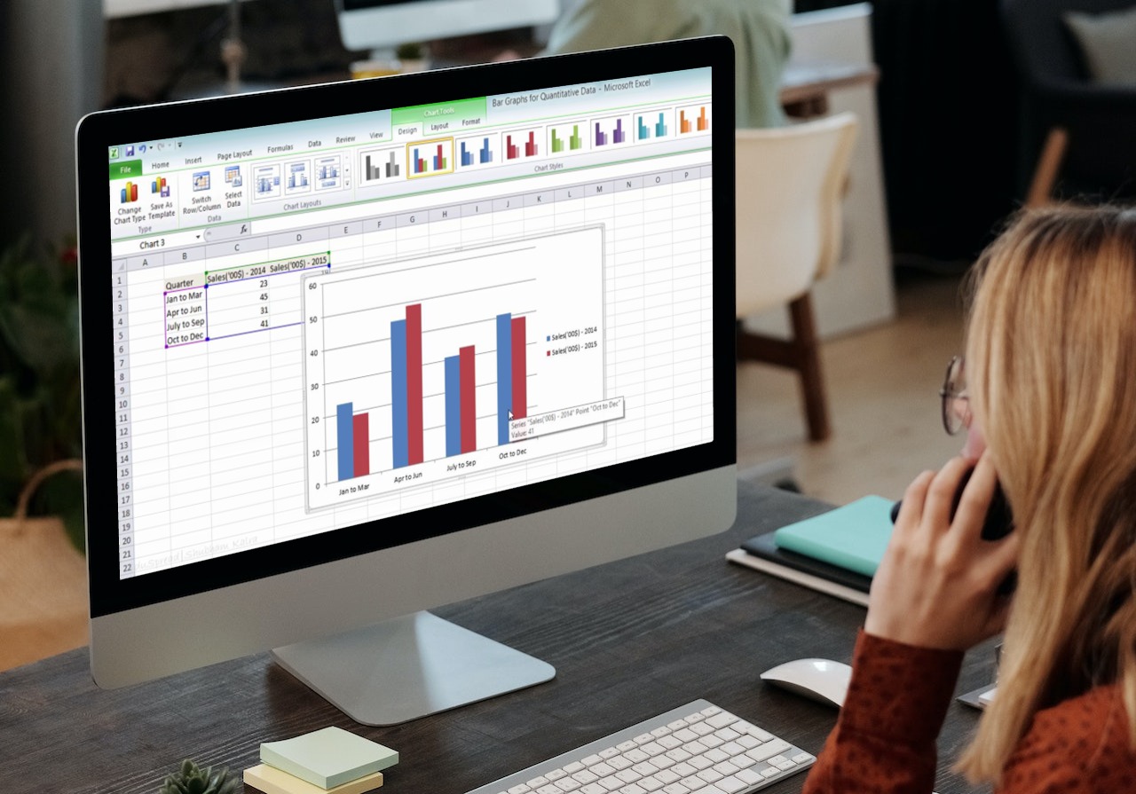
Clustered Bars
Clustered bars can display multiple series in both vertical and horizontal orientations. Addition of multiple data series to a bar chart can make focusing on and identifying key takeaways much more difficult. However, remembering that a natural grouping is crucial, so pay attention to how the series is organized within each cluster.
Comparison of multiple data categories can be done in a horizontal bar chart, and a specific color is used to denote a clear series across all data categories represented.
A vertical clustered chart provides details about various data set subcategories. It can display several subgroups within each category, but if the chart contains excessive data, it may become confusing and challenging to read and understand.
Stacked Bars
There are both vertical and horizontal versions of stacked bars. They display the component pieces within each category and allow you to compare the totals by scanning the ends.
Horizontally stack of bar charts are a graphic variant that can show data segmentation. Typically, each horizontal bar in the graph corresponds to a data category, with each bar’s subcategories represented by a different color.
Use of this bar graph style shows the various components of a data variable. Therefore, knowing which subcategory contributes the most to a data variable is useful.
A vertically stacked bar chart compares individual data variables using vertical bars. Stacking of data categories allows the bars to display the total number of subcategories in a data set with the help of this statistical tool.
Waterfall Chart
A more complex but less popular bar chart variant is the waterfall chart. It explains the reasoning behind the overall difference in value between the two points. A waterfall chart breaks down and displays each element that made up the net change, rather than just showing the beginning value in one bar and the ending value in another.
This graph, where the first bar represents a starting value and the last bar displays the ending quantity, can occasionally help visualize the change.
The waterfall chart gets its name from its shape. In a waterfall chart, the first bar typically starts at zero and represents the initial value of the measure under consideration. One final bar, starting from the zero baselines of our x-axis, represents the ending quantity of our chosen measure, and a series of smaller bars follow, that appear to be floating in space.
How To Make A Bar Chart In Excel?

Here are the steps you need to follow to create a bar chart in Excel:
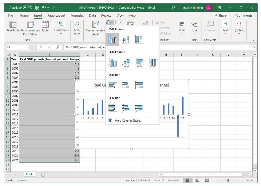
Step 1: First, insert all your data into a worksheet. Select your data.
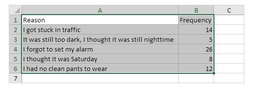
Step 2: Next, click on the Insert tab.
Step 3: Finally, select a 2D bar chart from the various chart options.
Your bar chart will appear on the same worksheet as your data, ready for further styling and adjustment.
 In Excel, you don’t need to start over if you need to change any of your data. Just make the necessary changes, and your chart will update itself.
What Are Excel Chart Formatting Options?
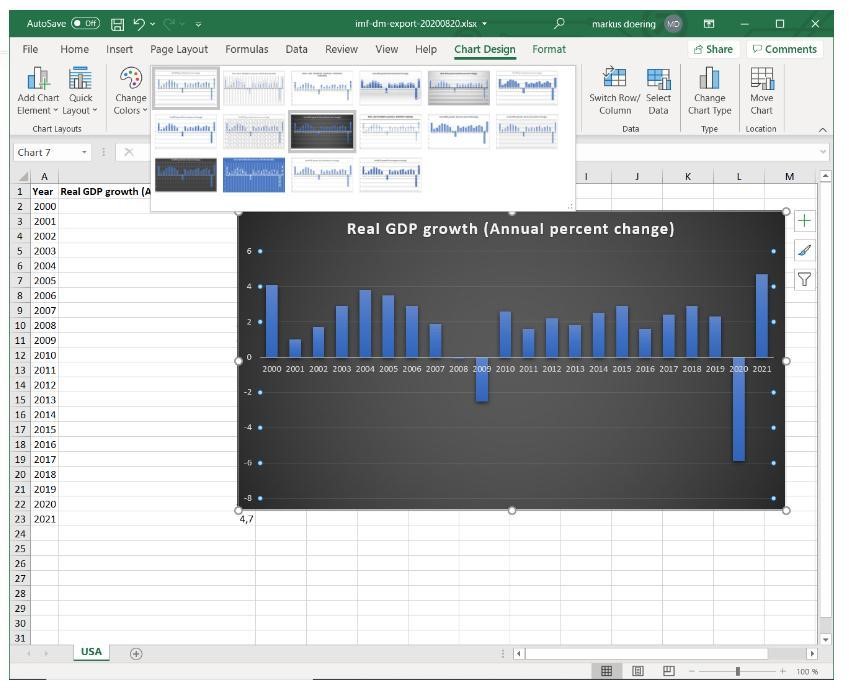
After creating your bar chart, you can edit its appearance by choosing one of the ready-made designs that Excel provides under the Design tab. Alternatively, you can use your various color schemes by selecting Format data series from the context menu when you right-click the bar chart.
Change The Chart Style
The chart style impacts the background, bar fill color, and many other things. After left-clicking on your chart and choosing one of the options in the Chart style tab, you can change the chart style.
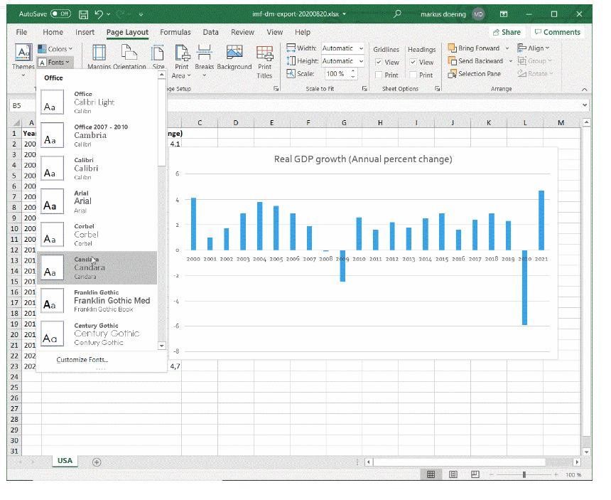
Change The Themes
With Excel, you can also change the theme. Click the Page Layout tab on the toolbar, then browse the themes. Here you can also change fonts and color palettes.
Change The Colors of Your Bars
Once you create a bar chart, you can change the default color of a single bar or all bars altogether. For the latter, left-click on any bar, then right-click to open a dialog where you have to change the Fill color.
Adjusting Axis & Gridlines
To adjust the different axis in your graph, you can either right-click the desired axis or grid lines. Select “format axis”, “format grid lines” or, in the format tab of your home bar, use the dropdown list on the left-hand side.
Why Should We Use A Bar Chart?

Here are a few things that make bar charts a go-to chart type:
They’re Easy To Make
Creating and customizing a bar chart requires a few mouse clicks when your data is simple.
Excel is good at extracting headings and data. Also, it is simple to organize your data.
They’re Easy To Understand
It won’t be difficult for people to understand your chart. Bar charts are as straightforward as they come, which is good for everyone, but some charts call for interpretation skills.
Some charts make it difficult to display more than a couple of words long categories. Bar charts, however, can have long titles. Although it might not seem like much, it matters a lot!
Final Thoughts

Charts are the best visualization tools that one can have in their arsenal. Clear, compelling, and easy-to-read bar charts and visualizations can boost a presentation’s credibility and help others understand complex information more quickly.
Most individuals recognize that seeing information in an image rather than words is considerably easier to comprehend and retain, whether in their personal or professional lives. As data interpretation and management become more important responsibilities for employees, they must understand how to produce and use bar charts.
On FusionCharts, you may access 2000 maps and more than 100 charts, including a jQuery organizational chart. You can learn more about organizational charts using this guide on organizational chart. Among all other JavaScript libraries, FusionCharts even features the most extensive pure JavaScript library, with thorough documentation. A consistent API, and various customization possibilities.


