
Nowadays, marketing is more than just providing audiences with useful information. It is also important to weave that information into compelling stories in order to make the most of it.
Data visualization makes this possible by combining the informative power of words with the visual power of images. You can create truly compelling content by combining copy and data visualizations.
In this post, we’ll let you take a look at five ways marketers have used data visualization to tell stories. These stories are compelling, and they encourage a lot of sharing and participation. If you’re looking for a Data Visualization Tool, we suggest using fusioncharts for data visualization.
Table of Contents
Ryan Robinson: How to be a Marketing One-Man-Band
Some marketers work in teams, and some take a more solo approach.
Entrepreneur and content marketer Ryan Robinson presents slick, personable, and engaging content directed towards an audience of budding entrepreneurs and small startups.
This infographic walks freelancers through how to calculate their hourly rate. It drills down deep into the process of freelancing. It also guides readers through the intricacies of breaking out on their own in a visually engaging way.
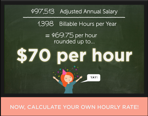
The visualization garnered 1,500 shares on Pinterest and a healthy amount of social media engagement. Because he is primarily a one-man marketing band, Ryan emphasizes finding creative ways to create unique, engaging content.
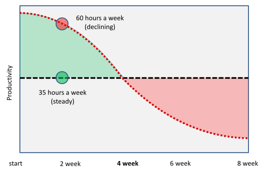
“I’m always thinking about more unique and interesting ways to engage my audience,” he tells us. He explains how, when making the point that working 35 hours per week offers optimum productivity. Furthermore, it added extra impact to integrate a visual representation of his argument.
 [Tweet Source]
There’s something about the way the graph illustrates the falling trend of productivity that brings his point home in a way that copy alone can’t do. Also, his work is peppered with these kinds of examples.
Datapine: Exposing the Use and Abuse of Data Visualization
Using data visualization doesn’t mean you have to create the data visuals yourself. Datapine is database software that helps users analyze data without the need for being a genius number cruncher. Their blog features a data visualization strand where they dive into the world of data presentation. Furthermore, they consider how it can be efficiently used, what it means, and even how it can be misused.
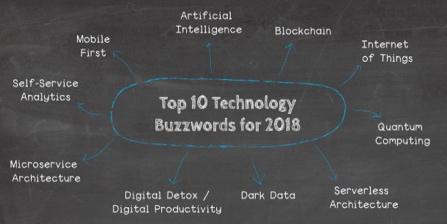
Their blog also makes a good trade-in “Top 10” infographics. Also, it uses a simple word cloud in chalkboard format, adding interest to what is, after all, a blog about data. No offense intended; we love data too!
 [Source]
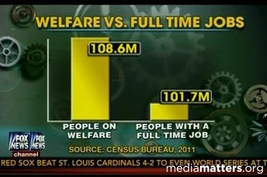
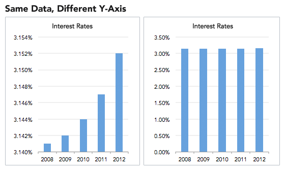
Datapine shows us how persons can use the power of data visualization to mislead. They point to this example of how Fox News misrepresented a graph comparing people on welfare in the US to those in full-time work. Although they presented reliable facts from the Census Bureau, Fox News used visuals to mislead.
 [Source]
In their post, Datapine goes into detail about misleading data visualization. Also, they offer advice on how to avoid these sorts of practices in your work.
Slate: Turning Confusion into Clarity
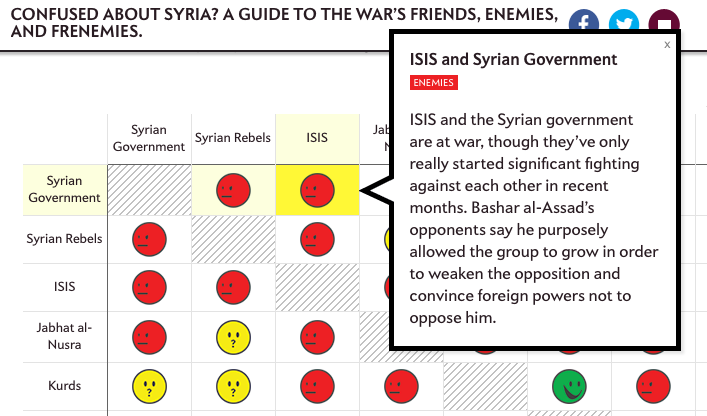
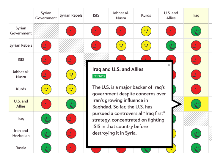
Online current affairs magazine Slate knows how to use data visualization to weave a compelling story. Their infographic on the complex web of relationships in the Syrian conflict was a great way of simplifying an eye-watering complicated affair.
 [Source]
The visualization used a grid of emoticons to break the various political relationships down into categories of friends, enemies, and “it’s complicated.” Therefore, readers could use the handy grid system to cross-reference how different players in the civil war-related to each other. Also, a pop-up would offer a text summary of each group’s role in the conflict by clicking on each emoticon.
The Slate data visualization was an ingenious way to show the contradictions of the situation. For example, the US and allies are friends with Iraq, even though Iraq is friendly with the Syrian government, which the US opposes. We told you it was complicated! But, Slate’s Syria infographic made such complexities accessible to the average reader.
Podio: Great Minds Don’t Think Alike
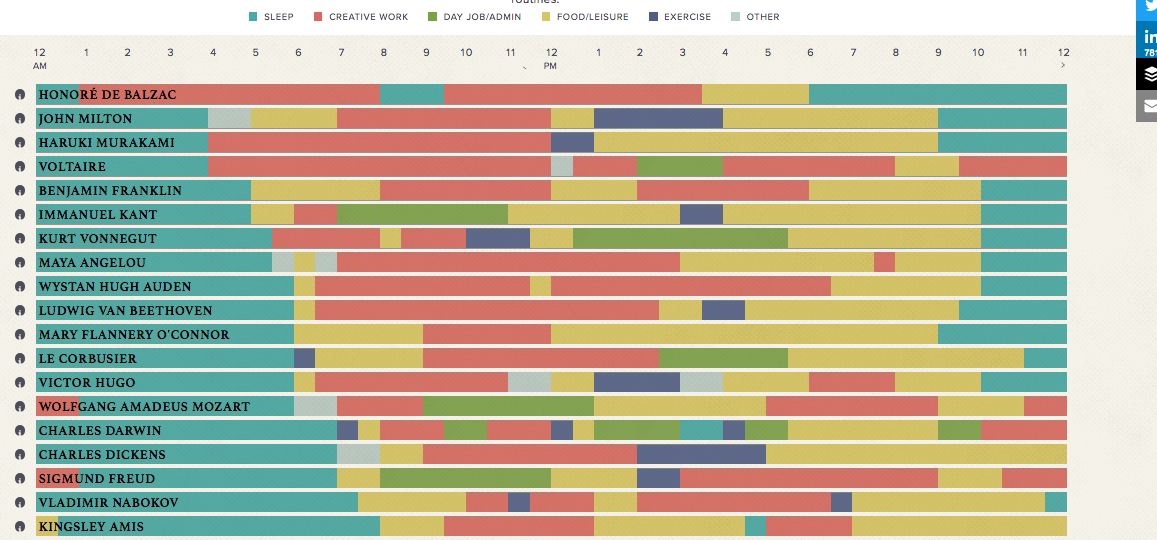
This infographic from Podio nailed it. We are all fascinated by how famous creative artists from history produced such fantastic work. They color-coded the daily routines of great artists into a handy reference grid. By doing so, it is easy to compare the routines of figures as diverse as Mozart, Dickens, and Benjamin Franklin.
[Source]
The above chart is an excellent example of using data visualizations to tell a compelling visual story. Furthermore, such a story could also become a viral sensation. Just look at these shared stats, courtesy of Buzzsumo: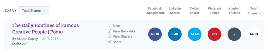
[Source]
The result was tens of thousands of shares and comprehensive coverage across major content-sharing platforms.
Austria Solar: Illuminating Data
This example shows that when it comes to data visualization, the sky is the limit. Or, more specifically, the sun’s the limit. Energy research organization Austria Solar drew on their own USP to create a data visualization video that would be viewed over 100,000 views on Vimeo.
The innovative tech company produced an annual report on special solar paper. But, the best thing is that this paper only displayed its content when exposed to direct sunlight.

[Source]
This combination of data visualization, cutting-edge solar tech, and savvy press stunt is out of the budgetary reach of many marketers. However, it stands as an awe-inspiring example of data visualization possibilities to craft compelling stories that resonate with our curiosity.
Conclusion
What do these examples tell us about how to boost our storytelling prowess through data visualizations?
It’s All About the Execution
If we look at the Ryan Robinson example, it’s the level of thought and detail that went into his freelancer rate calculation infographic that knocked it out of the park. After carefully breaking down the steps involved in calculating earnings, he set about presenting them in a visually engaging way. Furthermore, his use of beautiful artwork helped turn his points into something tangible (and shareable). Also, you should consider using a free infographic creation tool like Venngage, Visme or Canva to transform your content into a compelling visual story.
With the rise of automation, marketers now have access to advanced tools that simplify design even further. An AI infographic Generator can help you quickly turn complex data into polished, shareable graphics with no design skills required. This makes it easier to focus on storytelling while the technology handles the visuals.
Contextualize the Data
Datapine creates engaging stories by diving deep into the fascinating world of data presentation and drawing out the stories that help us make sense of our information-drenched age. They show that you don’t have to create visuals yourself to use them in your storytelling. However, by contextualizing existing data visualizations, you can create greater engagement with your audience.
Clarify Any Complexity
Slate took a famously complex subject (the Syrian civil war) with a high level of media interest and found an innovative way to offer insights for readers. The grid system they used to show political relations worked similarly to Podio’s creative routines graphics. Also, they used visual referencing to expose the relationships that exist in complex data.
If you want to illuminate complex data in such a way, consider hiring a designer to do the heavy lifting for you. Then, publish it on your blog with accompanying copy. Sites like Fiverr and People Per Hour offer you affordable creatives who can get the job done creatively and efficiently.
We hope these tips and examples have demonstrated how data visualizations can craft compelling stories that take your marketing to the next level. The point is not to copy these examples but to use them as a jumping-off point for your content.
Ultimately, success in marketing is about the unique stories you tell. Data visualization is a powerful way to make those stories come alive.
- Guest Author – Nabeena Mali, Head of Marketing at AppInstitute, a DIY app builder for small businesses.


