
Data visualization is one of the most critical skills for any analyst and most business people to know. No matter how good you are at analyzing data, if you cannot package it in a way that communicates what you have learned and is easy for other people to understand, then a lot of that analysis gets lost. There are a lot of options out there. It is tough to go wrong with any of them, but some are more important to learn before learning others.
This article will discuss the best advice you could ever get about a great Google Charts alternative.
Table of Contents
Why FusionCharts is a Great Alternative to Google Charts?
Following are some of the criteria, you need to take into consideration regarding FusionCharts:
What is Availability in FusionCharts?
The first criteria are availability and usage; for instance, how many customers do you have? Meaning, how many potential employers do you want you to have the skill as your visualization tool? These are key factors when deciding the package and offering which FusionCharts use or which skill-set to build for a job.
Is it Difficult to Learn in FusionCharts?
The second criteria are how easy it is to learn and combine with how easy it is to use? Some products offer fantastic options if you know a lot of coding, and there are others that you need to know no coding whatsoever to use. That is an important criterion because it can also mean how long it takes you to be somewhat proficient with using that tool.
What is the Quality of FusionCharts Services?
Let us be honest. If it looks like crap or like you hand drew the visualization, it does not belong in your list of skill sets to learn unless you are in a company or want to get into a company that uses a legacy system. And even in those cases, I still recommend learning one of these newer tools. You want to learn a tool with great visualizations – a quality that reflects the quality of the inputs you are giving it.
Is FusionCharts Scalable?
You need to figure out whether the tool is better suited for big data or smaller amounts of data. Because this makes a difference, which one you should learn depending on the industry and the company you are working with.
Many of them translate well from one to another. Still, most programs are set up that are geared towards lots of information and a heavy IT setup. On the other hand, some are geared towards user-entered data – whether it is spreadsheets that make them much more flexible with small amounts of data but can sometimes make connecting vast amounts of data very difficult or bog the system down.
Does FusionCharts Provide the Cost and Ease of Setup in FusionCharts?
This is again linked with the idea of the scale of your data, which also gets into what size company or industry you are getting into. Suppose you are getting into a company that is a start-up or a smaller company, small to mid-size. In that case, they will probably be going with a cheaper solution because they just cannot afford the investment of some of the more expensive tools out there.
Even if, in some cases, the more expensive tools are better. At the end of the day, there are so many equivalent tools, and it is just a matter of the application you have. Some are more suited to certain companies or industries than others, which is not a bad thing. That customization makes it nice for companies to pick what they need and also for you to know what type of program you should learn to boost your data visualization skills.
Is Dashboard of the FusionCharts Interactive?
The software should allow you to create an interactive dashboard so both technical and non-technical users can understand the business leverages to make an informed choice. This also helps users create contrast and analyze the data to gain insight and make meaningful analyses. Also, having the ability to collaborate virtually or in an office space can help large teams stay on the same page.
Why FusionCharts is the best alternative?

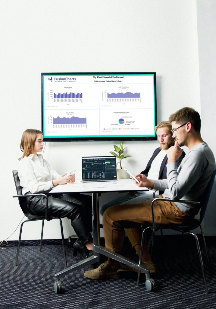
FusionCharts is an excellent google charts alternative. Whether you are building a dashboard for desktop or mobile, with simple or complex data, FusionCharts has you covered. The software is simple to use, works well, and looks good. You can use it for almost all of your tasks, customize it, and have a nice setup to give it your data and automatically generate your charts.
Why Does FusionCharts Stand Out?
FusionCharts provides over 100+ charts and 2000+ maps template to choose from so that your dashboard can make an impact. However, it is better suited for big data than small data, and part of that is because of the setup. While FusionCharts provides all the features like Google Charts, it goes a mile further by providing other services to improve the customer experience.
A. FusionCharts Suite
FusionCharts assists you with building delightful dashboards for your web and versatile activities. With comprehensive documentation, cross-program support, and a predictable API, it is more straightforward than at any other time to add intelligent and responsive outlines. We take care of you from straightforward outlines like line, segment, and pie to area explicit graphs like heatmaps, radar, and stock diagrams.
FusionCharts Suite comes with FusionCharts XT, which has over 50 chart types to choose from and makes a powerful interactive dashboard. We have got developers of a wide variety of tech stacks covered to help you ship the project faster. Developers also can customize the plugins as they are available as open-source projects.
B. FusionTime
FusionTime assists you with envisioning time-series and stock information in JavaScript, with only a couple of lines of code. So regardless of whether it is a straightforward time-series diagram, stock outline, a huge number of elements in a graph, or even complex multivariate investigation, you can deliver every one of them with no sweat of utilization.
The data visualization tools such as time guide, date range selectors, tooltips with crosslines, interactive legend, and substantially more, provided in FusionTime, helps to discover complex patterns in the data. Also, you can plot your information as section, line, region, candle, OHLC, and even variations like stacked segment and region and overlay them with occasion and information markers.
Furthermore, the best part is – a similar outline stumbles into the work area, tablet and versatile, through responsive formats, on every single present-day program – with practically no extra exertion on your side.
C. FusionExport
FusionExport empowers you to change your live dashboards over to PDF or pictures. It works with all JavaScript outlining libraries (FusionCharts, HighCharts, d3, Chart.js, or others) and is not difficult to introduce. It incorporates SDKs for Java, Node.js, C#, Go, and some more.
Not exclusively would you be able to trade a dashboard with no guarantees; however, you can likewise add new components to the sent-out dashboard on the fly, including your image logo, colors, extra information in the type of tables, and whatever else that you need.
Ready to get started with our powerful Google Charts alternative?
FusionCharts is a JavaScript charting library for your web and enterprise applications, used by over 27,000 companies and 750,000+ developers worldwide. It includes over 90 charts & 1000+ maps that transform all your data into interactive and meaningful dashboards.


