
React supports a variety of graph libraries to help you visualize the data in your web application. However, there are some issues. Not all React graph libraries can help you visualize data easily and quickly. Some of their documentation is very difficult to follow. That can make things difficult. So, how can you avoid the hassle? In this post, you will find all the details.
Table of Contents
What is the biggest problem with your React graph?
These days, most developers don’t get much time to implement charts into their web applications. Clients want everything done yesterday. Sure, you can create your own graphs without the React graph library components, but it’s inefficient to start everything from scratch. It’s also difficult to maintain.
That’s why developers around the world rely on React graph libraries to quickly create data visualizations. The React libraries ease the process of building graphs. They can boost your development workflow. However, there are plenty of React graph libraries available and they are not all easy to use. Some of their documentation is very difficult to comprehend making it hard to use the library in your application.
In addition, not every React graph library has easy-to-follow live code examples, nor can all of them visualize data beautifully. This makes it harder for you to effectively convey your message.
How can you fix the problem with your React graph?
You can fix all these problems by using FusionCharts. It is a powerful JavaScript charting and visualization library. By using it, you can create interactive React graphs with ease and help people uncover key insights effortlessly. It is very easy to use. It also provides numerous live code examples so you can create beautiful React graphs in minutes.
Why should you use FusionCharts?
- Offers graph examples with source code to help you get started quickly
- Provides easy-to-follow documentation
- Has a huge collection of graphs to help you visualize the data effectively and beautifully
- Ships regular updates and bug fixes
- Gives personalized support to help you fix the issues
How can FusionCharts help you to fix the problem with your React graph?
FusionCharts helps you to fix React problems by allowing you to create interactive and easy-to-understand graphs with just a few lines of code. Take a look at this example:
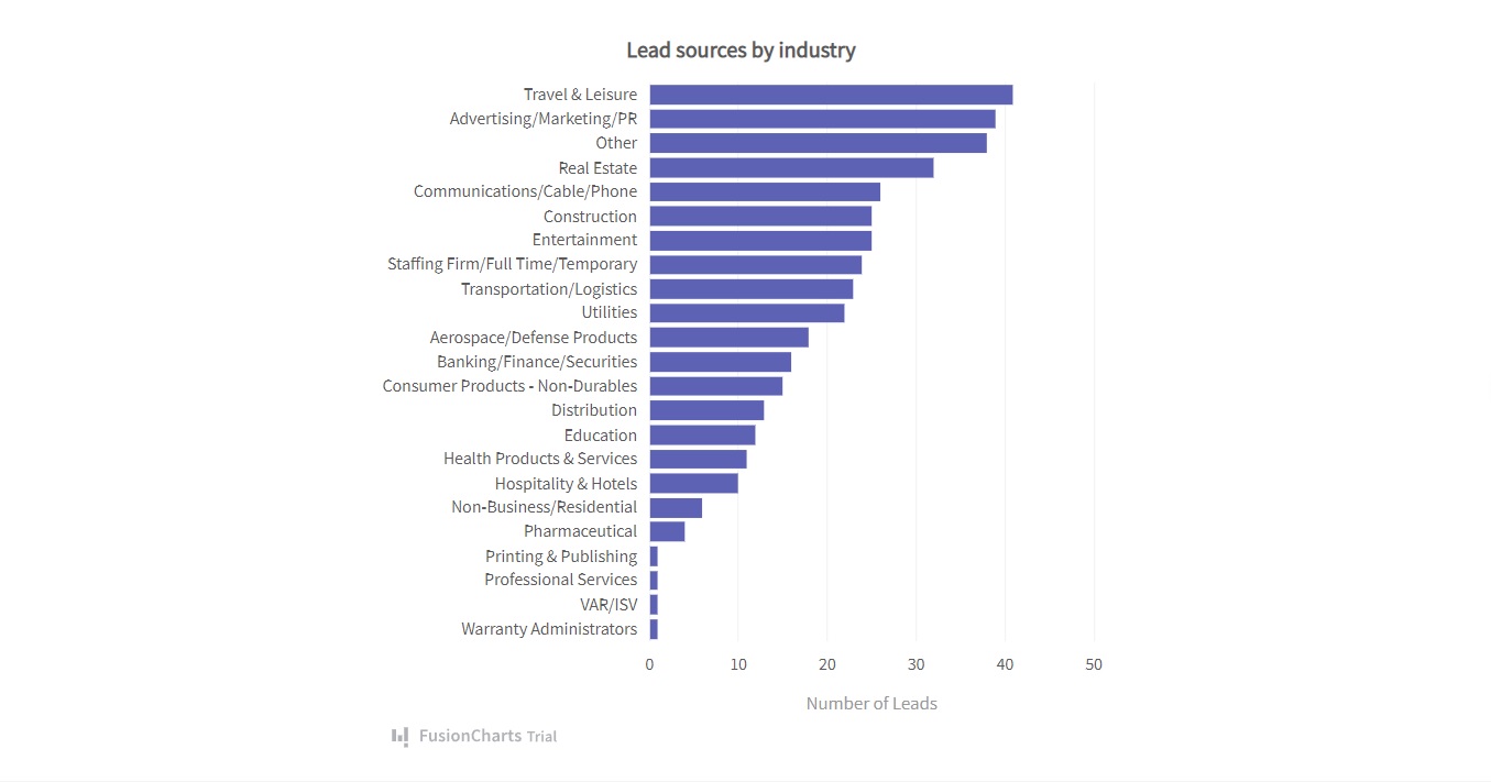
This is a bar graph in React. It effectively reveals data of lead sources by industry. It is clean so users can clearly understand all the information quickly. To create this bar graph in React using FusionCharts, you have to follow these steps:
1. First, you have to import all the required libraries, including FusionCharts, ReactFusionCharts, and charts.
import FusionCharts from "fusioncharts";
import charts from "fusioncharts/fusioncharts.charts";
import ReactFusioncharts from "react-fusioncharts";
2. Next, you have to resolve the chart dependency.
charts(FusionCharts);3. Then you have to add the data source.
const dataSource = {
  chart: {
    caption: "Lead sources by industry",
    yaxisname: "Number of Leads",
    aligncaptionwithcanvas: "0",
    plottooltext: "<b>$dataValue</b> leads received",
    theme: "fusion"
  },
  data: [
    {
      label: "Travel & Leisure",
      value: "41"
    },
    {
      label: "Advertising/Marketing/PR",
      value: "39"
    },
    {
      label: "Other",
      value: "38"
    },
    {
      label: "Real Estate",
      value: "32"
    },
    {
      label: "Communications/Cable/Phone",
      value: "26"
    },
    {
      label: "Construction",
      value: "25"
    },
    {
      label: "Entertainment",
      value: "25"
    },
    {
      label: "Staffing Firm/Full Time/Temporary",
      value: "24"
    },
    {
      label: "Transportation/Logistics",
      value: "23"
    },
    {
      label: "Utilities",
      value: "22"
    },
    {
      label: "Aerospace/Defense Products",
      value: "18"
    },
    {
      label: "Banking/Finance/Securities",
      value: "16"
    },
    {
      label: "Consumer Products - Non-Durables",
      value: "15”
    },
    {
      label: "Distribution",
      value: "13"
    },
    {
      label: "Education",
      value: "12"
    },
    {
      label: "Health Products & Services",
      value: "11"
    },
    {
      label: "Hospitality & Hotels",
      value: "10"
    },
    {
      label: "Non-Business/Residential",
      value: "6"
    },
    {
      label: "Pharmaceutical",
      value: "4"
    },
    {
      label: "Printing & Publishing",
      value: "1"
    },
    {
      label: "Professional Services",
      value: "1"
    },
    {
      label: "VAR/ISV",
      value: "1"
    },
    {
      label: "Warranty Administrators",
      value: "1"
    }
  ]
};
4. Now, you can render the graph.
class MyComponent extends React.Component {
  render() {
    return (
      <ReactFusioncharts
        type="bar2d"
        width="100%"
        height="100%"
        dataFormat="JSON"
        dataSource={dataSource}
      />
    );
  }
}
Source Code:
You can view the source code right here.
Here is another example of a chart that you can easily create with FusionCharts:
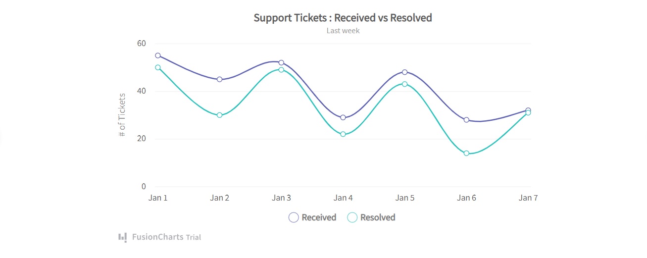
It’s a multi-series spline graph that reveals the relation between the support tickets received and resolved. Just like the previous graph, it shows all the information clearly so the audience can easily understand it. To create this graph, you have to follow these steps:
1. Import FusionCharts, ReactFusionCharts, and charts.
import FusionCharts from "fusioncharts";
import charts from "fusioncharts/fusioncharts.charts";
import ReactFusioncharts from "react-fusioncharts";
2. Then you need to resolve charts dependency.
charts(FusionCharts);3. Next, you have to include the data.
const dataSource = {
  chart: {
    caption: "Support Tickets : Received vs Resolved",
    yaxisname: "# of Tickets",
    subcaption: "Last week",
    numdivlines: "3",
    showvalues: "0",
    legenditemfontsize: "15",
    legenditemfontbold: "1",
    plottooltext: "<b>$dataValue</b> Tickets $seriesName on $label",
    theme: "fusion"
  },
  categories: [
    {
      category: [
        {
          label: "Jan 1"
        },
        {
          label: "Jan 2"
        },
        {
          label: "Jan 3"
        },
        {
          label: "Jan 4"
        },
        {
          label: "Jan 5"
        },
        {
          label: "Jan 6"
        },
        {
          label: "Jan 7"
        }
      ]
    }
  ],
  dataset: [
    {
      seriesname: "Received",
      data: [
        {
          value: "55"
        },
        {
          value: "45"
        },
        {
          value: "52"
        },
        {
          value: "29"
        },
        {
          value: "48"
        },
        {
          value: "28"
        },
        {
          value: "32"
        }
      ]
    },
    {
      seriesname: "Resolved",
      data: [
        {
          value: "50"
        },
        {
          value: "30"
        },
        {
          value: "49"
        },
        {
          value: "22"
        },
        {
          value: "43"
        },
        {
          value: "14"
        },
        {
          value: "31"
        }
      ]
    }
  ]
};
4. Finally, you have to render the graph.
class MyComponent extends React.Component {
  render() {
    return (
      <ReactFusioncharts
        type="msspline"
        width="100%"
        height="100%"
        dataFormat="JSON"
        dataSource={dataSource}
      />
    );
  }
}
Source Code:
You can get the source code right here.
As you can see, the code is almost the same as the previous example. The only difference is that you are changing the type in the render() function. With FusionCharts you can effortlessly integrate different types of graphs into your React web application. You don’t have to write a lot of code. It’s one of the biggest advantages of using FusionCharts.
Should I use FusionCharts with React?
FusionCharts helps you create beautiful graphs for your React application with a few lines of code. There is no complexity. It also supports a wide range of graphs you have plenty of options to choose from. In addition, FusionCharts has an excellent support team. If you are looking for an efficient React graph library for your application, FusionCharts is definitely the best option for you in 2022.


