
Implementing user-friendly charts can be challenging. You don’t want to spend a lot of time creating the visualizations from scratch. To avoid this, React charting libraries can be a huge time-saver. By using the right React library, you can quickly create beautiful data visualizations. You can also help your users more easily uncover valuable insights. There are a variety of React chart libraries available online. But which is the best one in 2021? In this post, you will find the answer.
Table of Contents
What is the top React chart library in 2021?
The top React chart library in 2021 is FusionCharts. It helps you create responsive and interactive charts. In addition, all of its charts also come with live example code. This means you can create beautiful charts effortlessly in a matter of minutes. FusionCharts also comes with easy-to-follow documentation that can make your life a lot easier.
Why is FusionCharts 2021’s top React chart library?
Here are some of the things that put FusionCharts at the top of the pile.
- Provides ready to use chart examples and industry-specific dashboards with source code to save you development time
- Has easy to follow comprehensive documentation
- Offers a huge collection of charts, gauges, and maps to help you visualize any data in any form from a single place
- Supports powerful time-series charts to help you plot millions of data points effortlessly
- Offers frequent updates and bug fixes
How can FusionCharts help you easily create beautiful charts?
FusionCharts lets you create amazing data visualizations with just a few lines of code. For example:
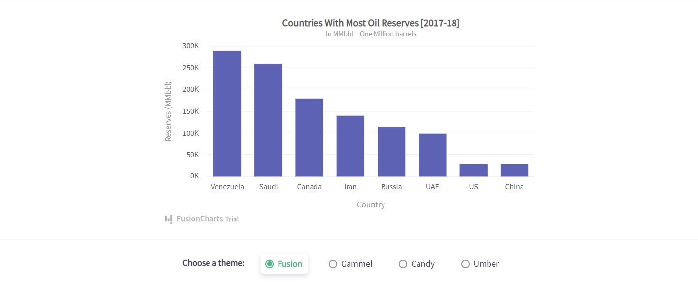
To create this chart, you just need to go through these simple steps:
1. Import all the necessary libraries, like FusionCharts and ReactDOM.
import React, { Component } from 'react';
import ReactDOM from 'react-dom';
import FusionCharts from 'fusioncharts';
import Charts from 'fusioncharts/fusioncharts.charts';
import ReactFC from 'react-fusioncharts';
import FusionTheme from 'fusioncharts/themes/fusioncharts.theme.fusion';
2. Then you have to call the ReactFC.fcRoot() function with the parameters of FusionCharts, Charts, FusionTheme.
ReactFC.fcRoot(FusionCharts, Charts, FusionTheme);3. Next, you have to declare a constant, called chartConfigs. Specify the type, width, height, data format, and data source of the chart.
const chartConfigs = {
  type: 'column2d',
  width: 600,
  height: 400,
  dataFormat: 'json',
  dataSource: {/* see data tab */ },
};
4. Now, you can render the chart.
class Chart extends Component {
  render () {
    return <ReactFC {...chartConfigs} />;
  }
}

ReactDOM.render(
  <Chart />,
  document.getElementById('root'),
);
Source Code:
Want another look? You can get the source code right here.
As you can see, FusionCharts allows you to create charts very easily. You don’t need to write a lot of code. There is no complexity.
Now, let’s take a look at another example:
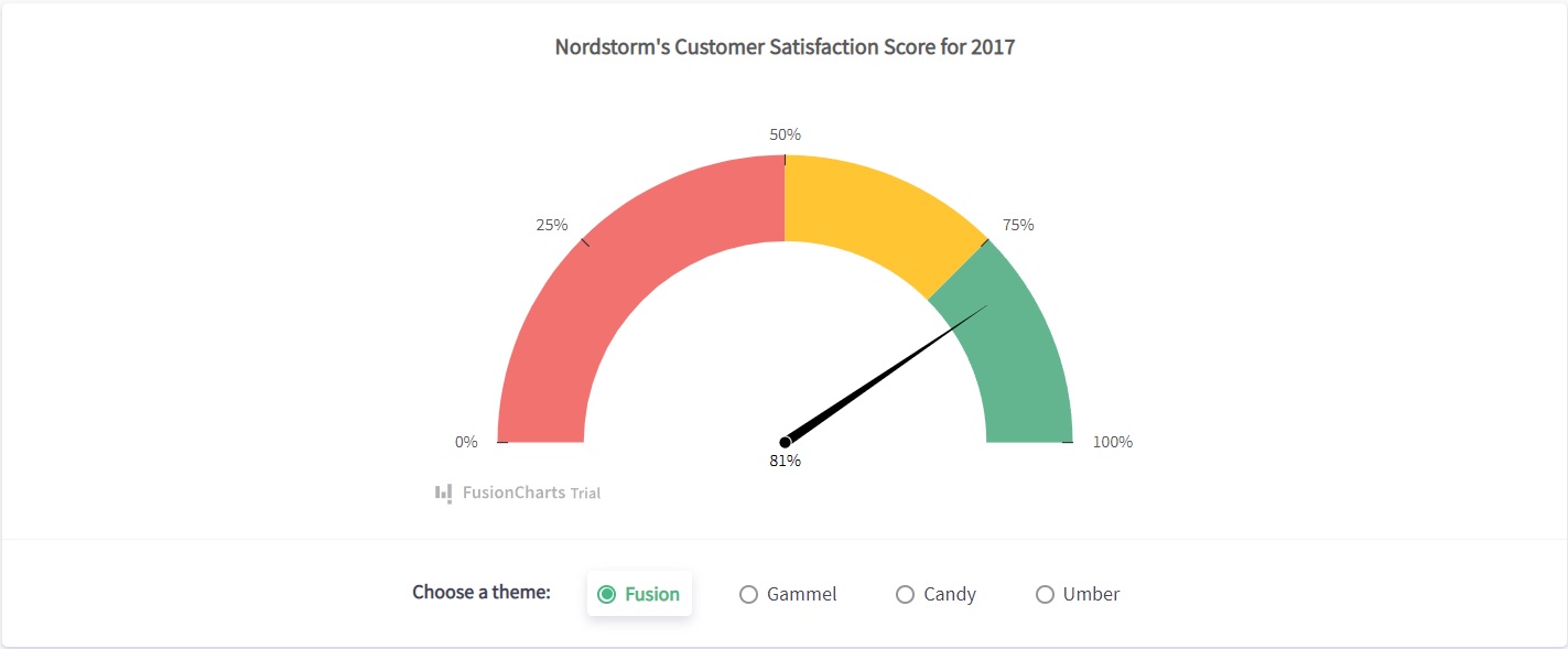
To create this gauge, you need to use this code:
import React, { Component } from 'react';
import ReactDOM from 'react-dom';
import FusionCharts from 'fusioncharts';
import Widgets from 'fusioncharts/fusioncharts.widgets';
import ReactFC from 'react-fusioncharts';
import FusionTheme from 'fusioncharts/themes/fusioncharts.theme.fusion';

ReactFC.fcRoot(FusionCharts, Widgets, FusionTheme);

const chartConfigs = {
  type: 'angulargauge',
  width: 600,
  height: 400,
  dataFormat: 'json',
  dataSource: {/* see data tab */ },
};

class Chart extends Component {
  render () {
    return <ReactFC {...chartConfigs} />;
  }
}

ReactDOM.render(
  <Chart />,
  document.getElementById('root'),
);
Live Demo:
You can view the Live Demo right here.
As you can see, the code is almost the same as the previous example. The only difference is that you are importing Widgets and changing the type to ‘angulargauge’. That’s the power of FusionCharts. It enables you to effortlessly integrate different types of charts into your React web application.
Documentation: Does FusionCharts have easy-to-follow guides?
Each FusionCharts library comes with extensive documentation. The documentation is very easy to follow. You will have no problem comprehending it. Besides, there are a lot of live examples, which can make your life a lot easier.
Support: Can I talk to a real person?
Even with the easy-to-follow documentation, there will be times when you will need support. FusionChart provides personalized support. It has a team of highly skilled and knowledgeable experts. They can help you efficiently fix your issues.
Pricing: How much does FusionCharts cost?
The Basic plan of FusionCharts costs $499/year. However, if you are looking for full-source code and professional support, you will have to go for the Pro plan, which costs $1,299 annually. For more flexible features, including the support for the unlimited number of products, you will need to subscribe to the Enterprise plan. It will charge you $2,499/year.
What do the developers think about FusionCharts?
FusionCharts helps the developers effortlessly build and integrate interactive and responsive charts. Solar power equipment manufacturer SolarWorld used it to create interactive charts for their Suntrol Portal, a solar module performance logging system. It also helped them significantly enhance the portal’s usability and functionality. According to SolarWorld Systems Engineer Carsten Hellweg, “FusionCharts was fairly easy to implement its JavaScript fallback charting required no extra coding to implement.” Hellweg also found FusionCharts documentation very easy to follow. “The documentation is good and easily searchable through Google. It was also easy to find workarounds for solving dicey issues.”
How can you get started with FusionCharts?
FusionCharts makes your life easy by helping you create beautiful, hassle-free charts with only a few lines of code. FusionCharts also provides a wide range of charts and maps, giving you plenty of options to choose from. In addition, its support team is highly efficient. If you are developing in React, try using FusionCharts now.


