
The price of Bitcoin has risen from less than $10 to almost $50k in just ten years! Given the magnitude of Bitcoin’s popularity and its soaring exchange rates, businesses, as well as individual investors, are now avidly tracking and visualize its price trends. Because it is so volatile, financial analysts and data scientists need the most up-to-date Bitcoin price information. They need a currency exchange server that accurately provides the exchange rate in real time.
coinlayer is a currency exchange server that provides the real-time and historical exchange rates of both digital and international currencies. Its platform supports easy-to-use APIs using HTTP. The coinlayer API returns its response in the JSON format.
That’s not all you need to effectively track and analyze a crypto though. In addition to a resource for retrieving crypto market data, you also need a tool for charting and plotting your data. FusionCharts is the smart choice for building interactive dashboards, graphs and maps. In this case it is also great for building a financial dashboard.
Interested in creating your own charts to track Bitcoin prices? Read on to find out how you can build a Javascript app that calls the Coinlayer API and plots historical Bitcoin rates using the FusionCharts library. The app we’ll build displays a 10-year spline chart showing Bitcoin prices. This simple spline chart clearly depicts Bitcoin’s massive price growth.
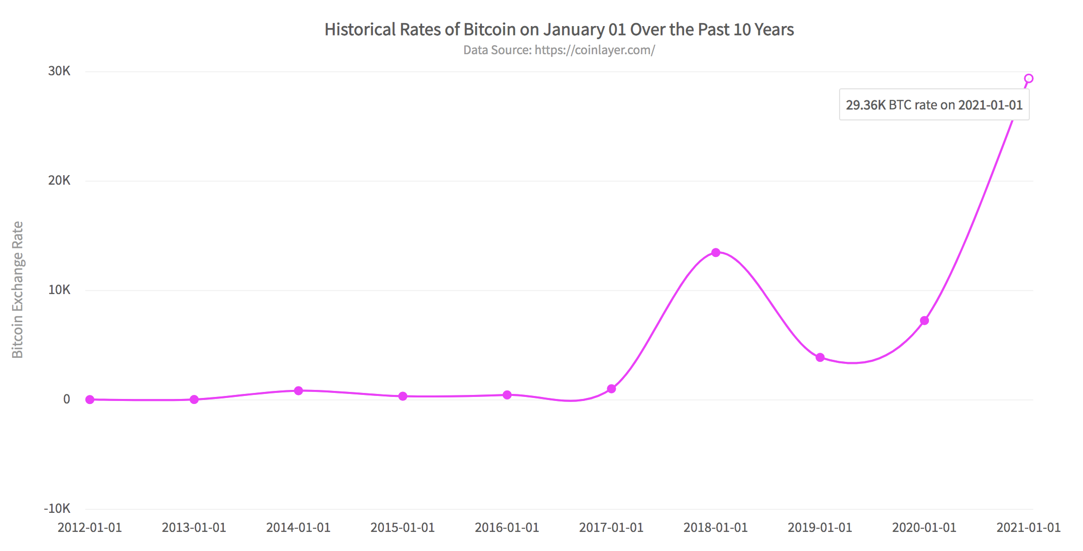
Table of Contents
What Is A Spline Chart?
A spline chart is a plot of data points where each point is connected using FusionChart’s curve fitting algorithm. In normal line charts the data points are connected via straight line segments depicting a linear series of data. In a spline chart, however, the points are joined together using curves. This makes the graph smoother.
With FusionCharts libraries your spline charts are 100% customizable. From the caption text to the axis text, you can specify everything using simple JSON. FusionCharts also allows hover effects so when the mouse moves over a point, it displays that point’s information.
How To Call Coinlayer APIs?
To get started with coinlayer, you need an access key to call its API. Don’t worry though, you can register for free. The free subscription plan allows 500 requests per month.
Now that you have your API key, let’s get going. Below is an example that shows how you can request the Bitcoin rate for January 01, 2021. Make sure to replace YOUR_KEY with your subscription key.
https://api.coinlayer.com/2021-01-01?access_key=YOUR_KEY&symbols=BTCThe response is JSON as shown below:
{"success":true,
 "terms":"https:\/\/coinlayer.com\/terms",
 "privacy":"https:\/\/coinlayer.com\/privacy",
 "timestamp":1609545545,
 "target":"USD",
 "historical":true,
 "date":"2021-01-01",
 "rates":{"BTC":29364.338135}}
What Are The Steps For Creating A Spline Chart Of Historical Bitcoin Rates?
Here we outline three easy steps to create a Webpack app that uses Coinlayer’s APIs to retrieve historic Bitcoin rates. It then plots them using the FusionCharts library in a Javascript client. We assume that you have already signed up for a subscription key at Coinlayer.
Step 1: Install Webpack And FusionCharts
Create a project directory called fc_coinlayer_js_demo. At the console switch to this directory and type:
npm i -D webpack-dev-server html-webpack-plugin path webpack-cli fusionchartsStep 2: Configure The Project
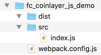
Next, in the project directory, create two directories namely src and dist. In the src directory create an index.js file. In the main project directory create your webpack.config.js file. The final directory structure looks like this:
After that, open the webpack.config.js file and copy the following code to it. The code specifies the configuration of the project and adds a proxy for Coinlayer to avoid getting a CORS error. The entry point for the app is set as your index.js file.
// webpack.config.js
const HtmlWebPackPlugin = require( 'html-webpack-plugin' );
const path = require( 'path' );
module.exports = {
   context: __dirname,
   entry: './src/index.js',
   output: {
      path: path.resolve( __dirname, 'dist' ),
      filename: 'main.js',
   },

   plugins: [
      new HtmlWebPackPlugin()
   ],
   devServer: {
       headers: {
           "Access-Control-Allow-Origin": "*",
           "Access-Control-Allow-Methods": "GET, POST, PUT, DELETE, PATCH, OPTIONS",
           "Access-Control-Allow-Headers": "X-Requested-With, content-type, Authorization"
         },
       proxy: {
         '/CoinlayerAPI': {
            target: 'https://api.coinlayer.com',
            changeOrigin: true,
         },
       },

     }
};
Step 3: Add Code For Calling Coinlayer API And Plotting The Spline Chart
Finally, we’ll add the main code to our index.js. We need to do the following in this code file:
- Import the FusionCharts library.
- Add a div tag for the HTML page, where the spline chart will be rendered.
- Call the Coinlayer API and fetch the Bitcoin for January 01 for the past 10 years.
- Create the JSON object with specifications of the FusionCharts spline chart.
- Create an instance of FusionCharts with the chart specification JSON object and render the chart.
Here is the JSON object that contains the configuration for the spline chart object created in this app:
{
 "type":"spline",
 "renderAt":"chart-container",
 "width":"80%",
 "height":"600",
 "dataFormat":"json",
 "dataSource":{
	"chart":{
		"caption":"Historical Rates of Bitcoin on January 01 Over the Past 10 Years",
		"subcaption":"Data Source: https://coinlayer.com/",
		"xAxisName":"Date",
		"YAxisName":"Bitcoin Exchange Rate",
		"ynumbersuffix":"$",
		"xnumbersuffix":"",
		"theme":"fusion",
		"plotToolText":"<b>$dataValue</b> BTC rate on <b>$label</b>",
		"anchorbgcolor":"#ff00ff",
		"palettecolors":"#ff00ff"
		},
	"data":[
		{"label":"2012-01-01","value":5.27},
		{"label":"2013-01-01","value":13.3},
		{"label":"2014-01-01","value":815.94},
		{"label":"2015-01-01","value":314.89},
		{"label":"2016-01-01","value":433.99},
		{"label":"2017-01-01","value":995.44},
		{"label":"2018-01-01","value":13444.88},
		{"label":"2019-01-01","value":3861.347988},
		{"label":"2020-01-01","value":7231.458803},
		{"label":"2021-01-01","value":29364.338135}]
	}
}
You can copy the following code into your index.js file. Make sure to replace SUBSCRIPTION_KEY with your Coinlayer API key.
// Include the core fusioncharts file from core
import FusionCharts from 'fusioncharts/core';

// Include the spline chart from viz folder
import Spline from 'fusioncharts/viz/spline';

// Include the fusion theme
import FusionTheme from 'fusioncharts/themes/es/fusioncharts.theme.fusion';

// Add the div tag for the chart container
const myDiv = document.createElement('div');
myDiv.id = 'chart-container';
document.body.appendChild(myDiv);

// Specify your key here
let YOUR_KEY = SUBSCRIPTION_KEY


// Construct a query for each year and fetch the data
// Create a data JSON and datasource JSON for rendering the chart
async function main() {
    var dataJson = [];
    let queryPrefix = 'https://api.coinlayer.com/';
    let querySuffix = '?access_key=' + YOUR_KEY + '&symbols=BTC';
    //Construct the query string for 10 years starting from 2012
    for (var i=0;i<10;++i){
        var dateStr = parseInt(2012 + i) + '-01-01';
        var queryStr = queryPrefix + dateStr + querySuffix;
        //Call coinlayer API
        let response = await fetch(queryStr);
        let responseJson = await response.json();
        if (response.ok){
            //construct the data JSON
            dataJson.push({label: dateStr, value:responseJson.rates.BTC})
        }
        else {
            alert('Error reading data from Coinlayer API');
            return;
        }
    }
    var dataSource = constructDataSource(dataJson);
    renderChart(dataSource);
}


//constructs JSON text for 'dataSource' key
function constructDataSource(data){
  var dataSource = {"chart": {
        "caption": "Historical Rates of Bitcoin on January 01 Over the Past 10 Years",
        "subcaption": "Data Source: https://coinlayer.com/",
        "xAxisName": "Date",
        "YAxisName": "Bitcoin Exchange Rate",
        "ynumbersuffix": "$",
        "xnumbersuffix": "",
        "theme": "fusion",
        "plotToolText": "<b>$dataValue</b> BTC rate on <b>$label</b>",
        "anchorbgcolor": "#ff00ff",
        "palettecolors": "#ff00ff"
    },
    data: data};
    return dataSource;
}

// Draw the chart
function renderChart(dataSrc){

    FusionCharts.addDep(Spline);
    FusionCharts.addDep(FusionTheme);

    //Chart Configurations
    const chartConfig = {
        type: 'spline',
        renderAt: 'chart-container',
        width: '80%',
        height: '600',
        dataFormat: 'json',
        dataSource: dataSrc
    }

    // Create an instance of FusionCharts object with chart options
    // and render the chart
    var chartInstance = new FusionCharts(chartConfig);
    chartInstance.render();
    console.log(JSON.stringify(chartConfig));
}

//Call main method
main();
That’s it! We just created a beautiful spline chart illustrating how the price of Bitcoin grew over the last 10 years.
How Do I Run The Webpack FusionCharts App?
To run the app, at the console type:
npx webpack serve --mode=developmentThe app will run in your browser at localhost:8080.
You can download the complete source code for this app and run it on your machine.
Are there More Ways Of Rendering Historical Crypto Charts?
FusionCharts gives its users the option to choose from 100+ charts, gauges and graphs along with 2000+ maps. You can create effective and beautiful illustrations and presentations that will help you understand your data and gain new insights about its trend.
Sign up for your free FusionCharts trial today!


