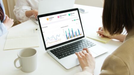
Financial dashboards are a data visualization tool that allows businesses to display their critical financial data in the form of different charts. Essentially, dashboards make financial data easy to interpret so that organizations can see how they are progressing towards their financial goals. Simply put, financial dashboards help businesses track financial key performance indicators (KPIs) in real-time and make critical strategic decisions accordingly.
In this article, we’ll discuss why it’s essential for every business, small or large, to use financial dashboards. We’ll also tell you how you can create beautiful financial dashboards using FusionCharts, the best data visualization library.
Table of Contents
Why Do Businesses Need Financial Dashboards?
As competition in the business world increases, every organization needs to understand its financial numbers to succeed. Businesses, however, have a plethora of financial data, and it can be difficult to process. This is where a financial dashboard comes in.
Financial dashboards allow businesses to visualize their key financial data so that they can analyze and understand different performance metrics. In addition, displaying data in the form of charts and graphs makes information easier to process. Because of this, financial dashboards help managers and CEOs understand their business’s financial performance, its business needs, and the indicators of its success. Simply put, financial dashboards are critical for the success of any business.
What Are Some Different Types of Financial Dashboards?
There are several different financial dashboards that businesses need to track their key performance indicators (KPIs). For example, you can use a sales management dashboard to analyze key sales stats. Similarly, you can use a wealth management dashboard to track the performance of your financial assets.
FusionCharts offers all types of financial dashboards that help businesses financial KPIs. FusionCharts also comes with over 100 different types of graphs and charts and more than 2000 choropleth maps. It has everything you need to easily create any kind of financial dashboard.
Some examples of FusionCharts dashboards include:
Venture Financing Dashboard
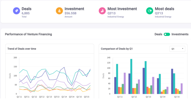
The Venture Financing Dashboard is a great way to analyze venture finance trends over time. This dashboard also allows you to track your investments and deals on a quarterly or yearly basis. Finally, you can use it to pinpoint your best quarter.
Wealth Management Dashboard
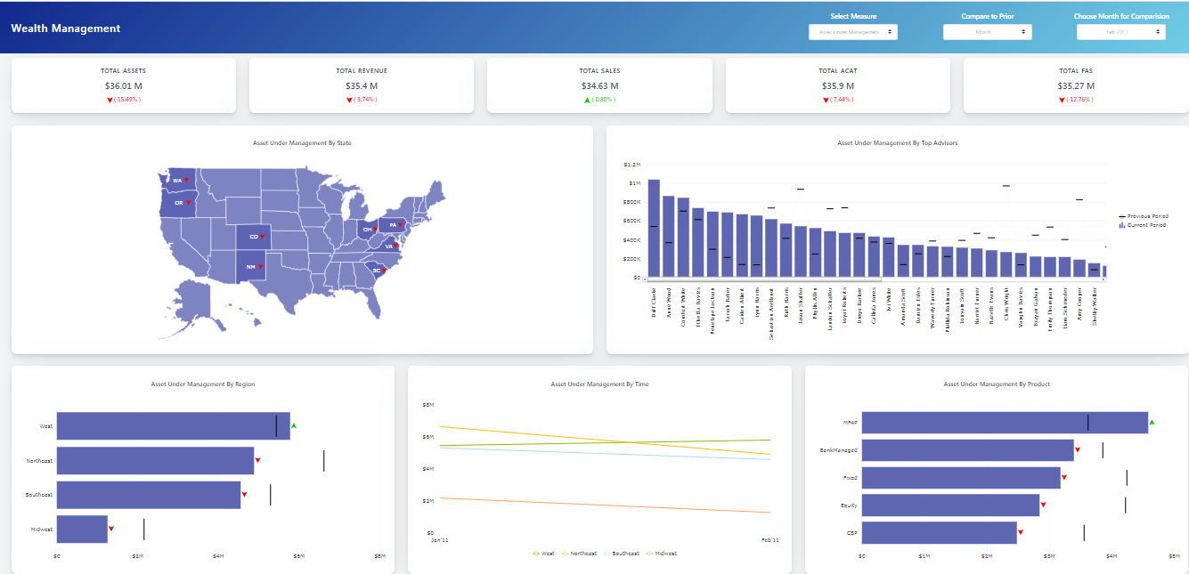
The Wealth Management Dashboard tracks and monitors your business’s financial asset distribution and performance. As a result, your business can better manage its wealth. You can use this dashboard to understand the distribution of assets by state, region, time, top advisors, and product. You can also compare asset performance over a month, quarter or year.
Sales Management Dashboard
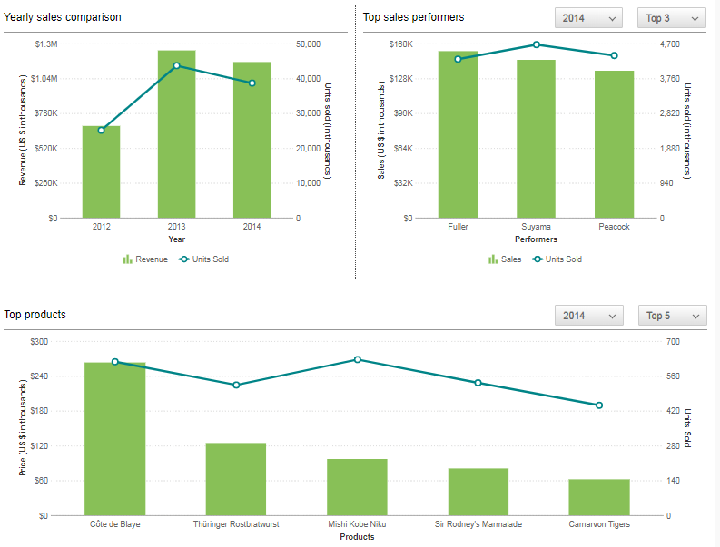
When you want to view important sales numbers, a sales management dashboard is the best option. This dashboard allows you to deeply analyze different product categories and individual sales locations, see your organization’s performance across different years, and monitor the performance and progress of your employees.
Investment Portfolio Dashboard
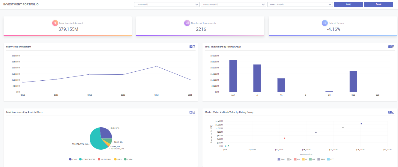
The Investment Portfolio Dashboard is an exploratory dashboard that you can use to analyze the rate of return, investment distribution, and portfolio risk associated with your investments. You can also use it to analyze investments by different asset classes, rating groups, and countries.
How Can I Build A Good Financial Dashboard?
To benefit from a financial dashboard, you need to build it properly. This means your dashboard should be visually appealing and visually represent your financial KPIs. It’s best to create a separate visualization for each key parameter and place visualizations with related metrics next to each other. However, if you want to compare different parameters, it’s best to place them on the same visualization, chart, or graph. Another best practice to create a good dashboard is to add important summaries and aggregate values at the top. You also need to ensure that key parameters such as net profit or sales are prominent.
FusionCharts lets you quickly build eye-catching and meaningful financial dashboards. It also allows you to define more than one data source for your dashboard. Next, FusionCharts supports different types of user interactions. For example, you can switch between values on the charts, zoom in and out, see more data points, drill down to endless levels to get deeper insights, and show and hide data series. Interactive legends are another useful FusionCharts feature that make your financial dashboards even better. Interactive legends allow you to show/hide, slice in/slice out, or fade in/fade out data plots.
What Should I Customize on my Financial Dashboard?
You need to add titles, labels, and annotations to your dashboard so that viewers can quickly understand and interpret it. You also need to have real-time data visualizations in your dashboards, and users should be able to interact with them.
FusionCharts lets you create beautiful financial dashboards with real-time data visualizations. It also allows you to customize your dashboards. For example, you can add axis labels, trend lines, and legends to the visualizations on your financial dashboard. You can also arrange the charts and graphs on your dashboards column-wise or row-wise to get a more organized look.


