The President’s State of the Union address generates a lot of tweets and is a great candidate for visualization. That’s just what Twitter did this year in their #SOTU2014 visualization. In this post, we take a look at what the visualization gets right, and what it could have done better.
Edward Tufte, a data visualization expert, says that the goal of a visualization is to give the viewer ‘the greatest number of ideas in the shortest time with the least ink in the smallest space.’ The President’s talk itself lasted for a little over an hour. However, you can get an overview of the entire talk in under a minute using this streamgraph:
 The streamgraph beautifully shows the ebb and flow of each topic during the talk. Now, another chart type like the stacked area chart could have done the job, but it wouldn’t have worked as well. The streamgraph here shows the fluid form of the talk, and is the ideal chart to be used here.
Selecting any section within it simultaneously updates the text area, map, and bar chart. This makes for an interactive, and data-driven experience. More importantly, it lures the viewer into exploring the finer details.
This visualization particularly stands out for its clever use of color. Notice how it grays out the time units along the axis, and uses color to draw focus to the main chart area, where the data actually is. This is in line with Tufte’s famous ‘Chartjunk‘ principle.
 The streamgraph, map, and bar chart maintain unity in their use of color. It’s fascinating to scroll across the streamgraph and watch the topics change accordingly in the map. The map doesn’t show multiple categories simultaneously, which can be confusing. Instead, it shows just one category at a time, and varies the intensity of the color by state. This is the recommended way to use color on a map. There is a legend for the map, but with the exceptional use of color here, the map can be understood just as well without it.
There is unity not just in the use of color, but even in interactivity. When scrolling through the text one paragraph gets highlighted at a time. Along with it, the map, and bar chart are automatically updated. This keeps everything in context, and invites the viewer to not just read, but analyze the talk.
Now, while this visualization does a lot of things right, there are a couple of things we think it can do better. First, the bar chart seems pointless. It shows the same data as the timeline chart on top, and doesn’t do a better job of it. Yes, it’s slightly more accurate, showing exact differences in volume of tweets, but we wonder if that’s enough to justify its need. Instead, this space could have been used to show more granular information like a wordcloud of the tweets. It would have taken some more data crunching, but hey, it’s Twitter we’re talking about here, they have one of the best data systems in the world.
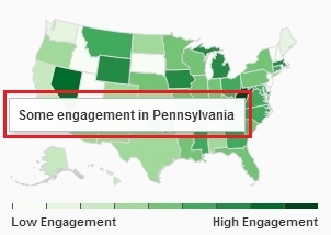 Next, mousing over the map or the streamgraph shows a tooltip. In both charts, the tooltip adds very little new information. In case of the streamgraph, it orders each topic by volume of tweets, which we could already see better without the tooltip. In the map it shows something like ‘High engagement in California’ for example, which again we could see from the map itself. Instead, the tooltips could have been used to drill down to the approximate number of tweets from that region. This would have put focus on the data itself.
To conclude, this visualization is interesting because of the importance of the data it represents – the State of the Union address. However, it excels because of its choice of chart types, the unity between the different parts of the visual, and the careful use of color. It’s a another great example of how to visualize big data.
P.S. – Oh, and while we’re talking about the President, did you know he uses FusionCharts!

 The streamgraph beautifully shows the ebb and flow of each topic during the talk. Now, another chart type like the stacked area chart could have done the job, but it wouldn’t have worked as well. The streamgraph here shows the fluid form of the talk, and is the ideal chart to be used here.
Selecting any section within it simultaneously updates the text area, map, and bar chart. This makes for an interactive, and data-driven experience. More importantly, it lures the viewer into exploring the finer details.
This visualization particularly stands out for its clever use of color. Notice how it grays out the time units along the axis, and uses color to draw focus to the main chart area, where the data actually is. This is in line with Tufte’s famous ‘Chartjunk‘ principle.
 The streamgraph, map, and bar chart maintain unity in their use of color. It’s fascinating to scroll across the streamgraph and watch the topics change accordingly in the map. The map doesn’t show multiple categories simultaneously, which can be confusing. Instead, it shows just one category at a time, and varies the intensity of the color by state. This is the recommended way to use color on a map. There is a legend for the map, but with the exceptional use of color here, the map can be understood just as well without it.
There is unity not just in the use of color, but even in interactivity. When scrolling through the text one paragraph gets highlighted at a time. Along with it, the map, and bar chart are automatically updated. This keeps everything in context, and invites the viewer to not just read, but analyze the talk.
Now, while this visualization does a lot of things right, there are a couple of things we think it can do better. First, the bar chart seems pointless. It shows the same data as the timeline chart on top, and doesn’t do a better job of it. Yes, it’s slightly more accurate, showing exact differences in volume of tweets, but we wonder if that’s enough to justify its need. Instead, this space could have been used to show more granular information like a wordcloud of the tweets. It would have taken some more data crunching, but hey, it’s Twitter we’re talking about here, they have one of the best data systems in the world.
 Next, mousing over the map or the streamgraph shows a tooltip. In both charts, the tooltip adds very little new information. In case of the streamgraph, it orders each topic by volume of tweets, which we could already see better without the tooltip. In the map it shows something like ‘High engagement in California’ for example, which again we could see from the map itself. Instead, the tooltips could have been used to drill down to the approximate number of tweets from that region. This would have put focus on the data itself.
To conclude, this visualization is interesting because of the importance of the data it represents – the State of the Union address. However, it excels because of its choice of chart types, the unity between the different parts of the visual, and the careful use of color. It’s a another great example of how to visualize big data.
P.S. – Oh, and while we’re talking about the President, did you know he uses FusionCharts!


