
Data is a valuable asset for any business. However, it is usually available in raw form in spreadsheets. Because of this, it can be difficult to draw insights from the random rows of numbers by simply glancing at them. This is where you need a data visualization tool. With an efficient data visualization tool, you can display raw data points using easy-to-understand and interpret charts. Simply put, a data visualization tool helps identify and understand current and historical trends. That, in turn, helps you make plans.
Not all data visualization tools come with all the features your business needs. A good data visualization tool like FusionCharts, however, offers every feature a business needs to visualize different types of data in the best possible way.
In this article, we’ll discuss what a data visualization tool is and why you need one.
Table of Contents
What is a Data Visualization Tool?
As the name suggests, a data visualization tool helps you visualize your valuable data using charts and graphs. This visual context makes it easier to interpret your data and draw insights. Keeping that in mind, the most efficient and helpful data visualization tool is FusionCharts. It supports many different types of charts and graphs. These include bar, line, area, and pie charts. FusionCharts can also efficiently process millions of data points. Moreover, with FusionCharts, you can make interactive charts and graphs that are also aesthetically pleasing and engaging.
Why Do You Need A Data Visualization Tool?
Understanding current and historical data trends helps organizations make effective future plans and strategies. Although identifying trends from data in the form of random numbers in spreadsheets can be quite difficult, with a data visualization tool, you can plot your data in easy to interpret charts and graphs. This gives you a clear idea of what it means. For instance, with a data visualization tool, businesses can illustrate key performance indicators (KPIs) and track other valuable metrics like profits, sales, and resource allocation.
What Are The Different Ways To Present Data With a Data Visualization Tool?
An efficient data visualization tool like FusionCharts gives you different ways to display different types of data. FusionCharts has over 100 types of charts and graphs. In addition, FusionCharts supports over 2000 choropleth maps that cover countries and cities to make your reports more insightful.
Some of the ways to represent data using FusionCharts include:
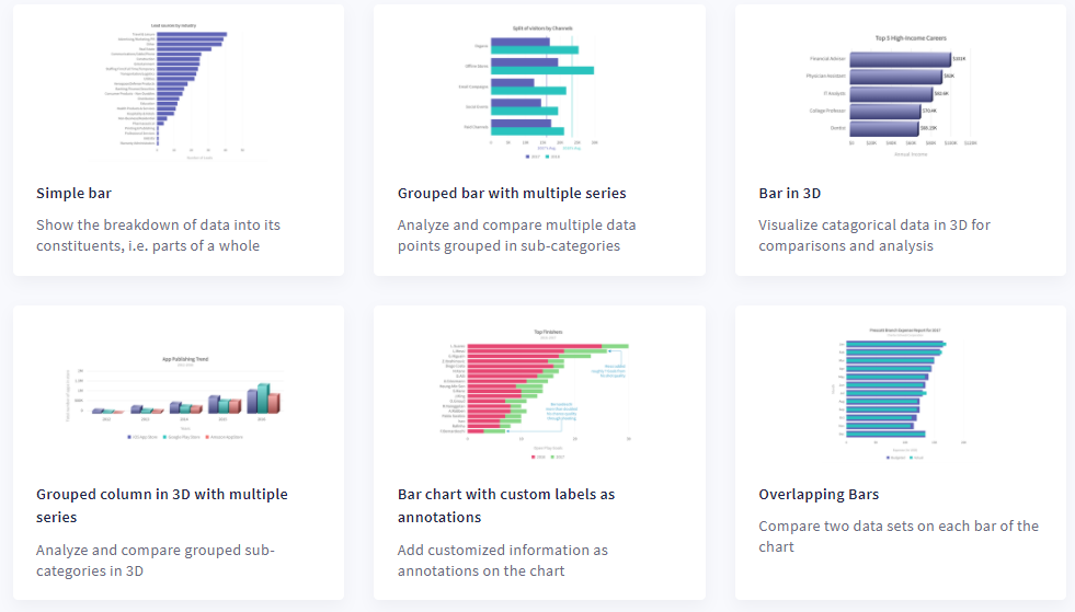
Column and Bar Charts
Column charts are a great way to compare numeric values and data over a period of time. Bar charts usually represent quantitative information and consist of horizontal bars with equal widths.
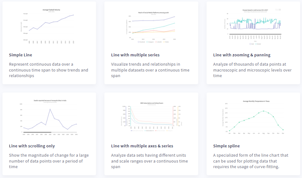
Line and Area Charts
Line graphs and area charts represent your data over time.
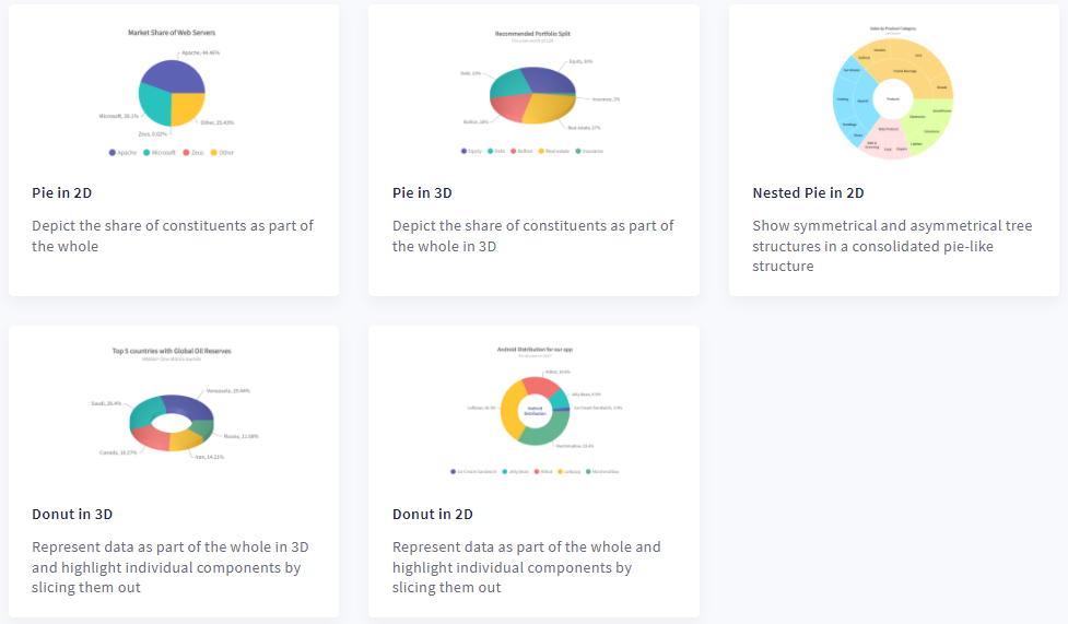
Pie and Doughnut Charts
A pie chart is essentially a circle divided into sectors. They show the percentages of a whole. Next, Doughnut charts are a variation of pie charts and have a blank space at the center to display important information regarding the data being plotted.
Domain-Specific Charts
Most data visualization tools only offer a few common chart types. FusionCharts, however, offers several domain-specific charts. These include heat maps, chord diagrams, and radar and spider charts.
What Are The Other Key Features of A Data Visualization Tool?
An efficient data visualization tool like FusionCharts also offers the following useful features:
Customization Options
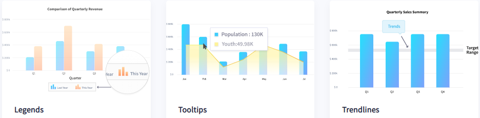
Most importantly, your viewers should easily understand your charts and graphs. This is why it’s essential you add titles and labels as well as legends to your charts. Your charts should also include trend lines to highlight important landmarks within your data. Next, your users should be able to switch between numbers or values on your graph. FusionCharts provides all these customizable features to make your charts even easier to interpret. With FusionCharts, you can even drill down endlessly for deeper insights.
Interactivity
Interactivity is another key to making charts easy to understand and interpret. Many data visualization tools, however, don’t offer this feature. Instead, they produce static, image-based charts. FusionCharts, on the other hand, supports all types of user interactions. For example, you can show and hide data series in column charts, create drag and drop charts, and zoom in and out to see more data points with scrolling charts. In FusionCharts, there are many different interactive features you can incorporate.
Time-Series Charts
Time-series charts are very useful charts, especially when you want to display data points over successive time intervals. These charts are also helpful for presenting how key metrics change over time. In this way, time-series charts help you identify and highlight trends in your data. FusionCharts provides powerful time series charts that you can use to visualize thousands of data points. Some practical applications include tracking a sensor in an IoT app or displaying fluctuations in price over time in a financial app.
Real-Time Charts
Real-time data visualization is critical to the success of any business. That is why a good data visualization tool like FusionCharts comes with data streaming charts or real-time charts. These charts update after a specified number of seconds by automatically fetching data from the server. In addition, they don’t require manual page refreshes.
Can I Integrate A Data Visualization Tool In My App?
You can easily integrate charts and graphs created with FusionCharts into your software app. FusionCharts, in particular, supports all the common frameworks. These include Angular, Vue, React, and Ember, as well as PHP, Django, Ruby on Rails, and more to help you get started quickly.
Ready to visualize your data more efficiently? Start using FusionCharts today and create aesthetically pleasing and interactive charts of your choice.


